
How to Choose Colors for your Watercolor Palette

Just one poor choice can make all the difference between a watercolor painting with bright colors and another that looks muddy, dull, and lifeless. Choosing your colors is not something you do on a whim: you need to know your palette, identify the most suitable tones, and understand how to combine them to achieve clean and vibrant results. This is exactly what we will explore in this article.
Choosing the right watercolor palette: essential criteria
Before showing you which colors to use for your mixes, here are some guidelines for choosing a good palette. Read the following recommendations carefully.
Quantity or quality?
Sets with a wide variety of shades have something hypnotic about them; the abundance of colors is alluring and often leads us to choose them over sets that are less extensive but of better quality. First piece of advice: avoid this type of watercolor. Instead, opt for a set where the pigments appear more creamy and more concentrated; this is a sign of better results and greater durability.
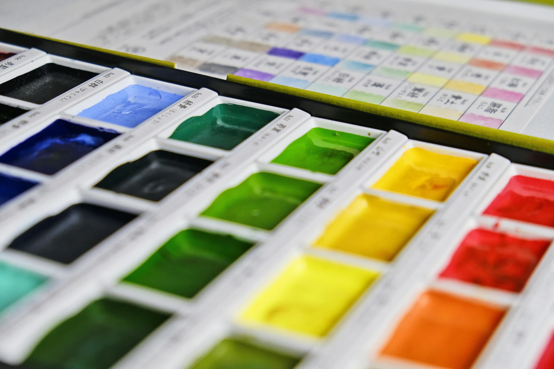
Choose a full set
In art supply stores, you can also find thematic palettes: flesh tones for portraits, cool tones ranging from aquamarine to intense violet… They are certainly tempting, but if you are buying your first set, it is better to choose a complete basic palette. Make sure that it covers all the tones you might need for your mixes.
The ideal color palette for watercolor painting
All colors derive their hue from the physical properties of their pigments, which means that sometimes a mix resembles more of a cooking recipe than a mathematical operation. To avoid unpleasant surprises, here is a selection of colors that have proven successful with great artists:
1 - Lemon yellow
2 - Alizarin crimson
3 - Gamboge yellow
4 - Pyrrole red
5 - Ultramarine blue
6 - Burnt sienna earth
7 - Sap green
8 - Quinacridone rose
9 - Cerulean blue
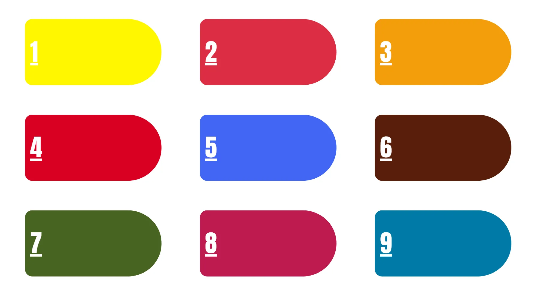
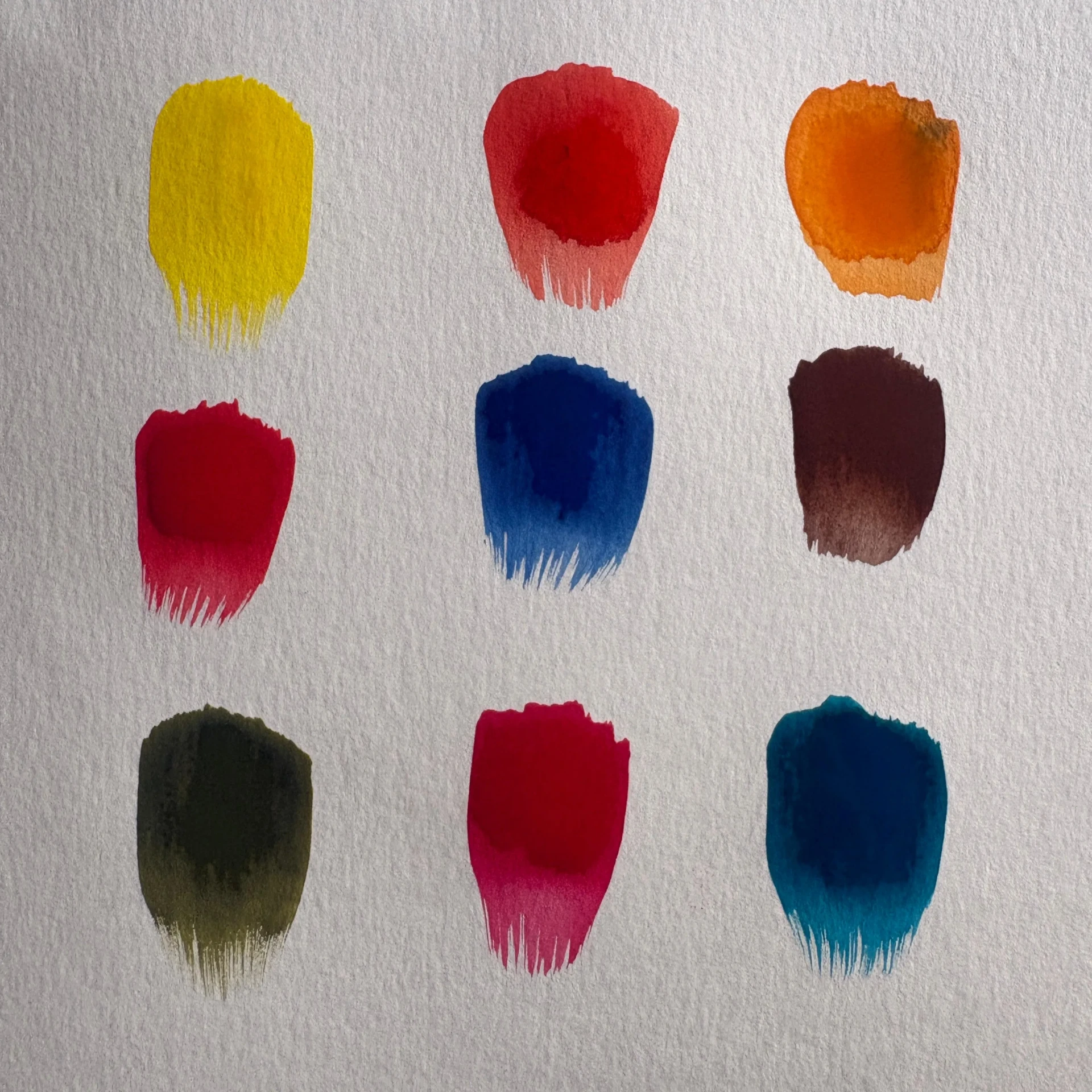
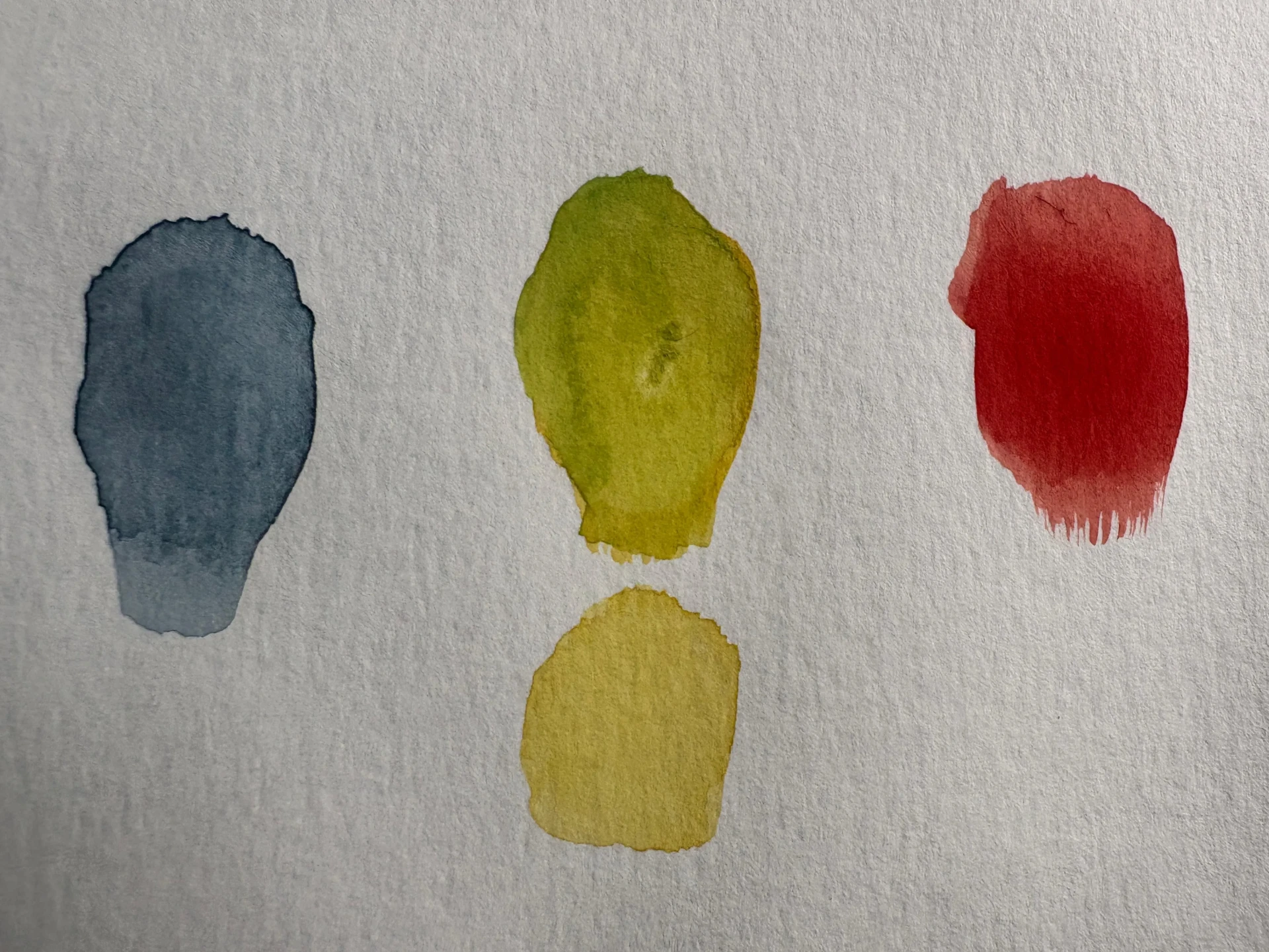
Using a color chart, find the exact or closest shade in your palette. Below is an example of these shades using my own watercolors.
How did the great masters use color in watercolor?
Here are some leading artists and explanations of how they used color with restraint and intelligence to achieve particularly striking effects.
J.M.W. Turner
A prominent figure in watercolor painting, he used the white of the paper to form highlights and created atmosphere with yellow and ocher tones.
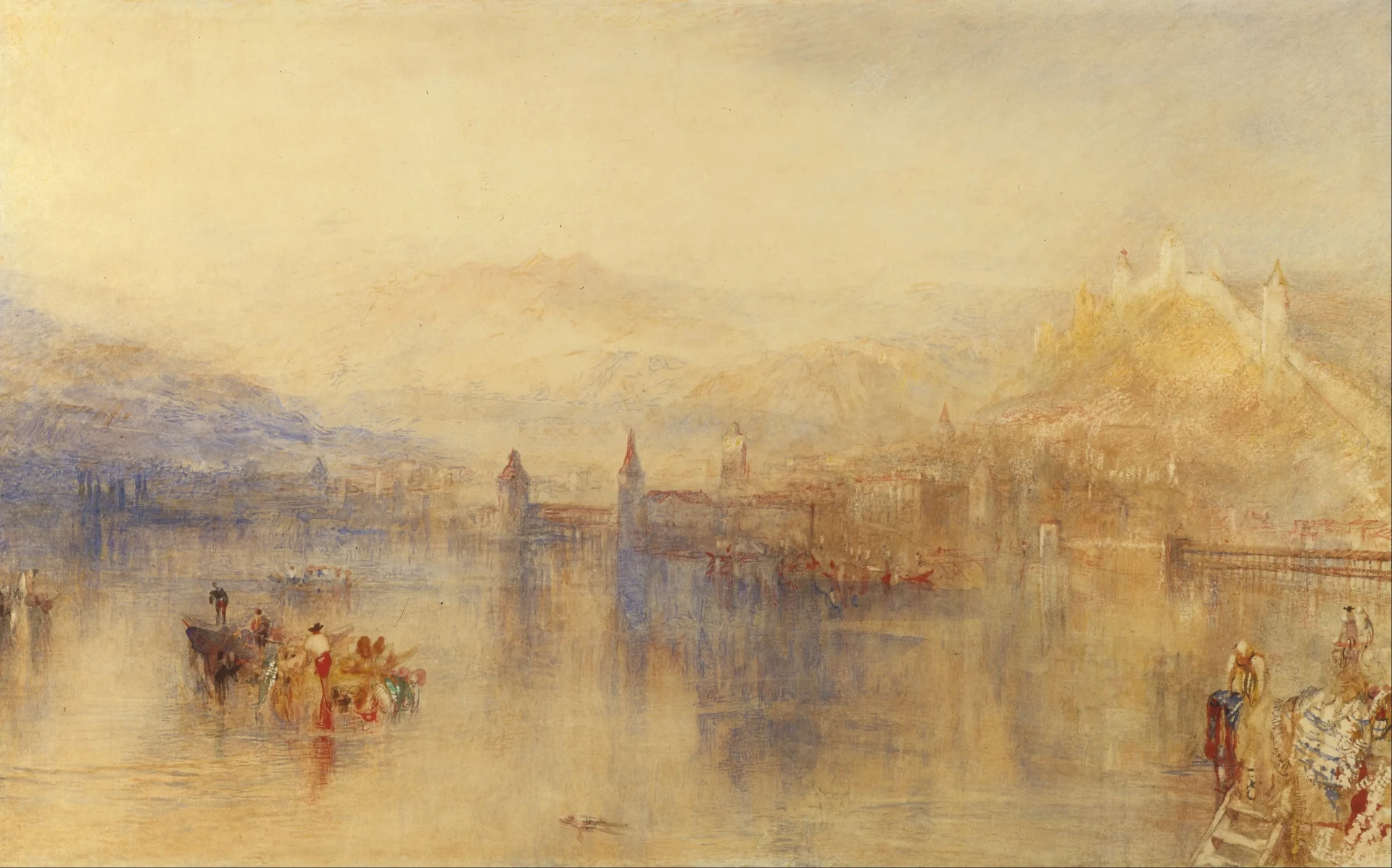
Lucerne from the Lake (1800)
John Singer Sargent
A master of color, he achieved deep tones by combining blue and sienna, which added warmth to the shadows.

The Lady with the Umbrella (1900)
Georgia O’Keeffe
She mastered color in all its intensity, creating striking works with saturated and pure hues that almost evoked oil painting.
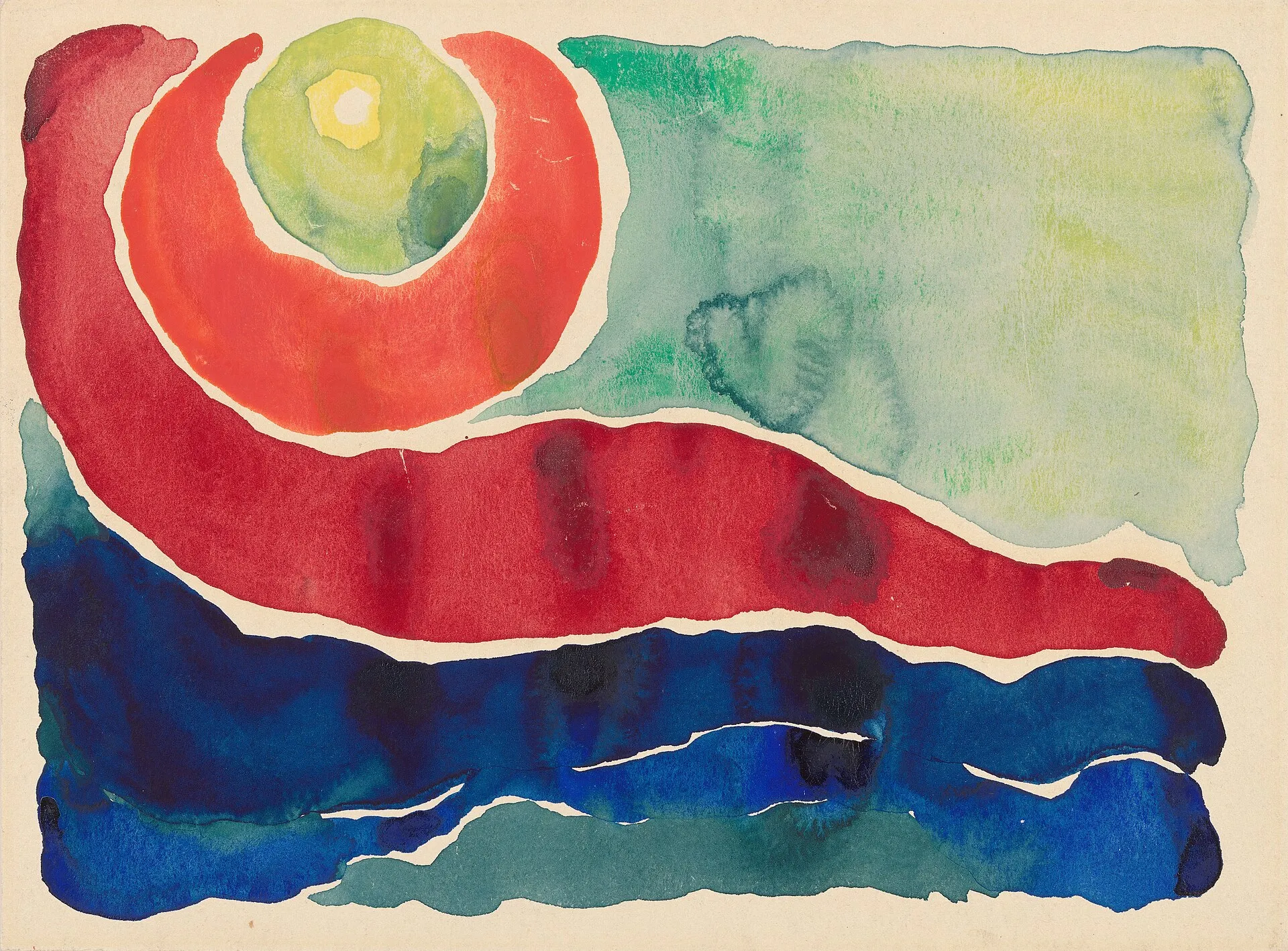
Evening Star No. IV (1917)
Watercolor mixes: how to achieve the right shades
Now that you know the essential colors, let’s look at how to combine them to obtain a wide range of vibrant tones.
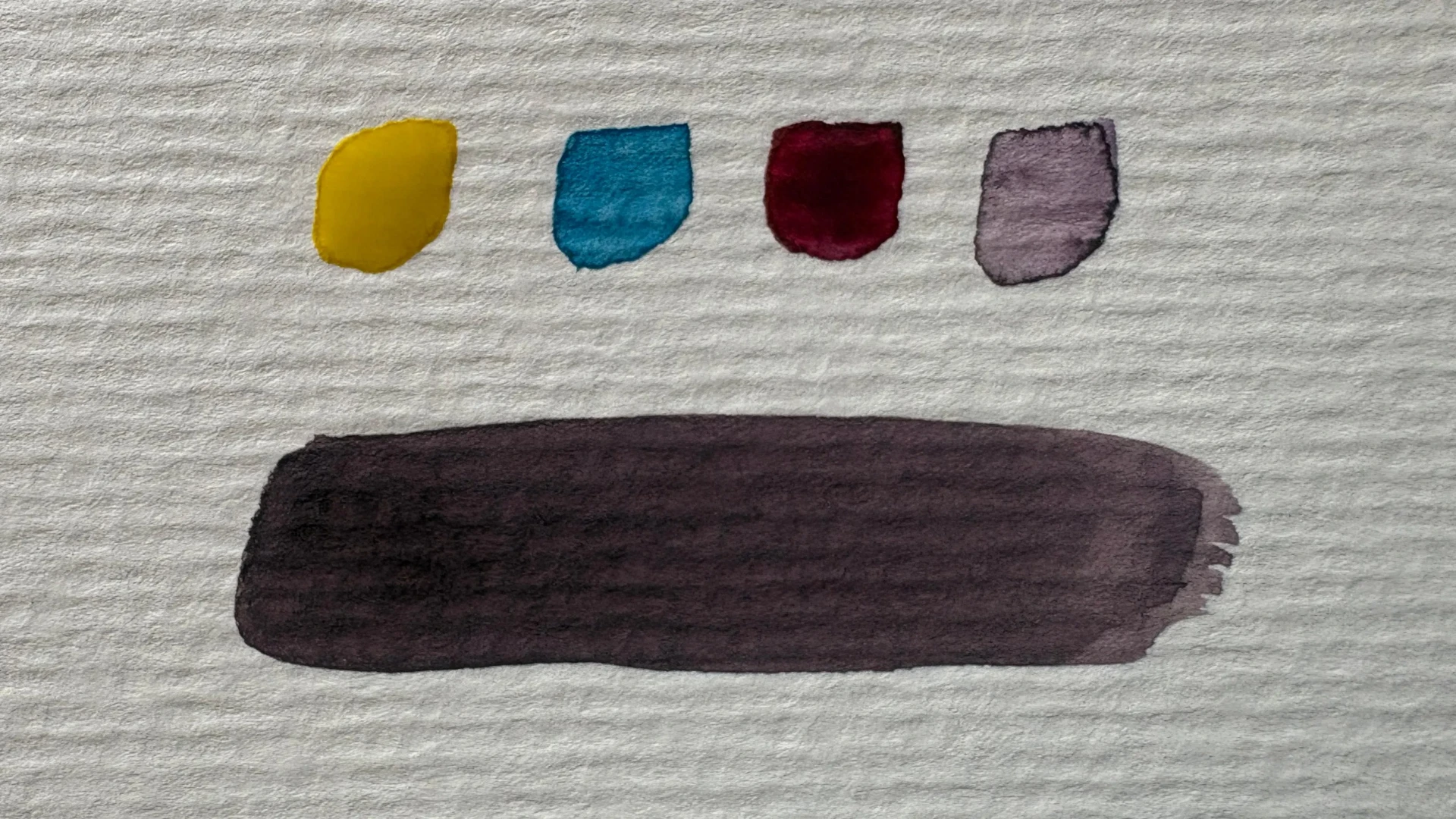
- For shadows: Mix ultramarine blue and burnt sienna. You will obtain an achromatic gray that naturally adapts to the tone on which it is applied.
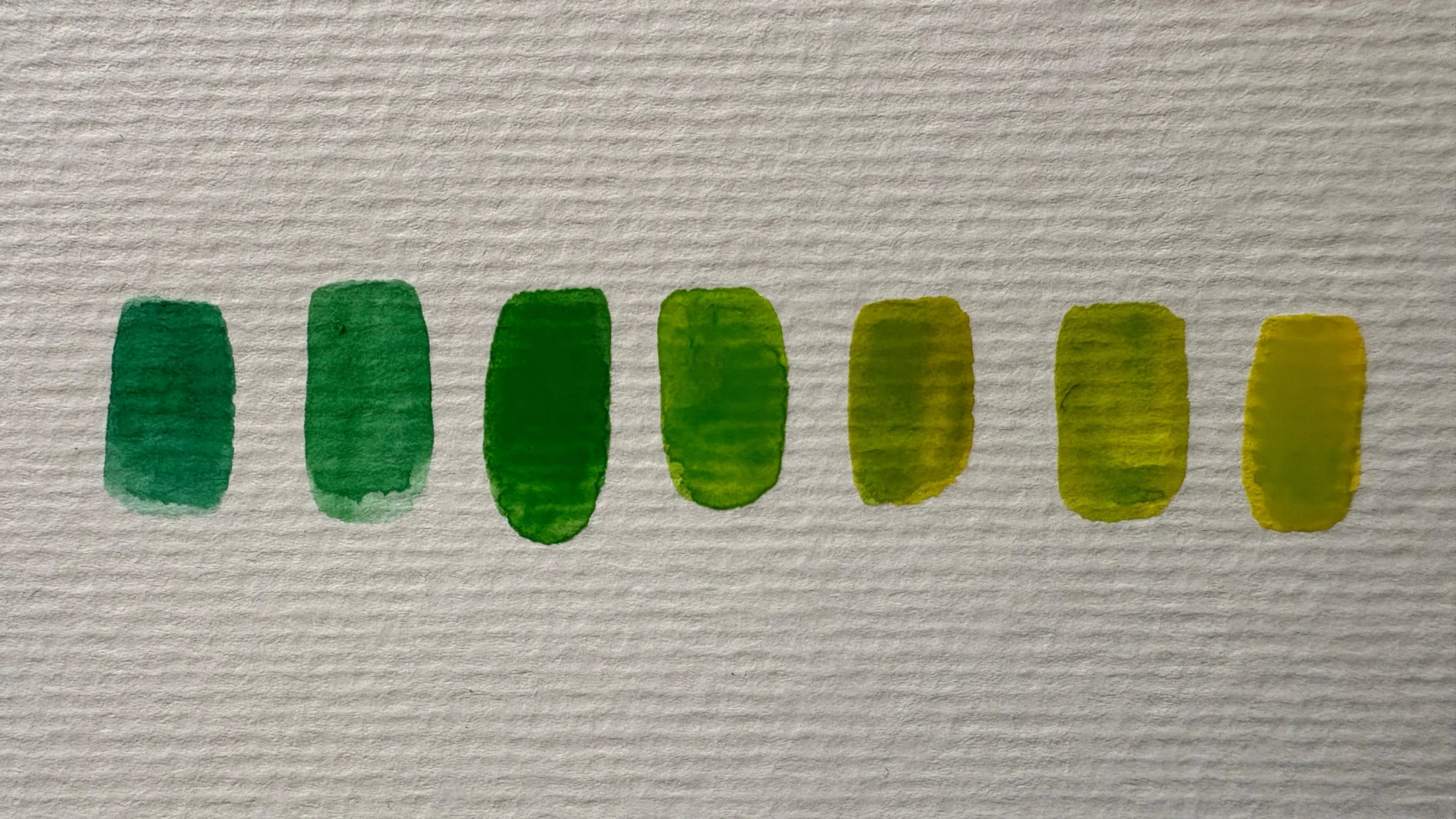
- For greens: Start with a lemon yellow as your base and neutralize it with a touch of red. Result: a perfect olive green for foliage.
- For skin tones: Generously dilute a mixture of yellow ochre and cadmium or pyrrole red to obtain a warm, luminous base.
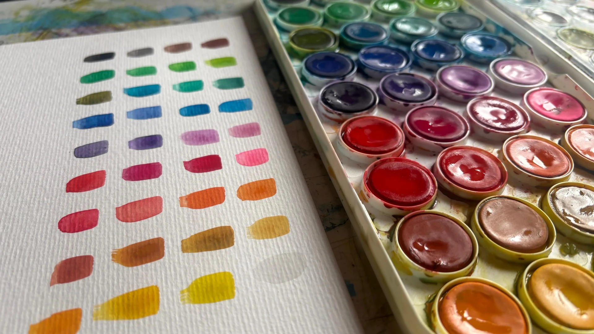
Create your own color chart to better understand your palette
From one set to another, the pigments vary, both in composition and concentration. These differences can be significant from one brand to another. The best way to keep track of them is to create your own color chart.
Take a blank sheet of paper and apply a dab of each color in the same order as your palette, using a similar amount of water and pigment. Then, create some mixes, noting the colors used and the result obtained.
Color theory in watercolor: learn the basic rules
A few simple principles can help you make better decisions for each painting:
Limited palette: Limit yourself to 4 or 5 colors per scene to ensure consistency in the image.
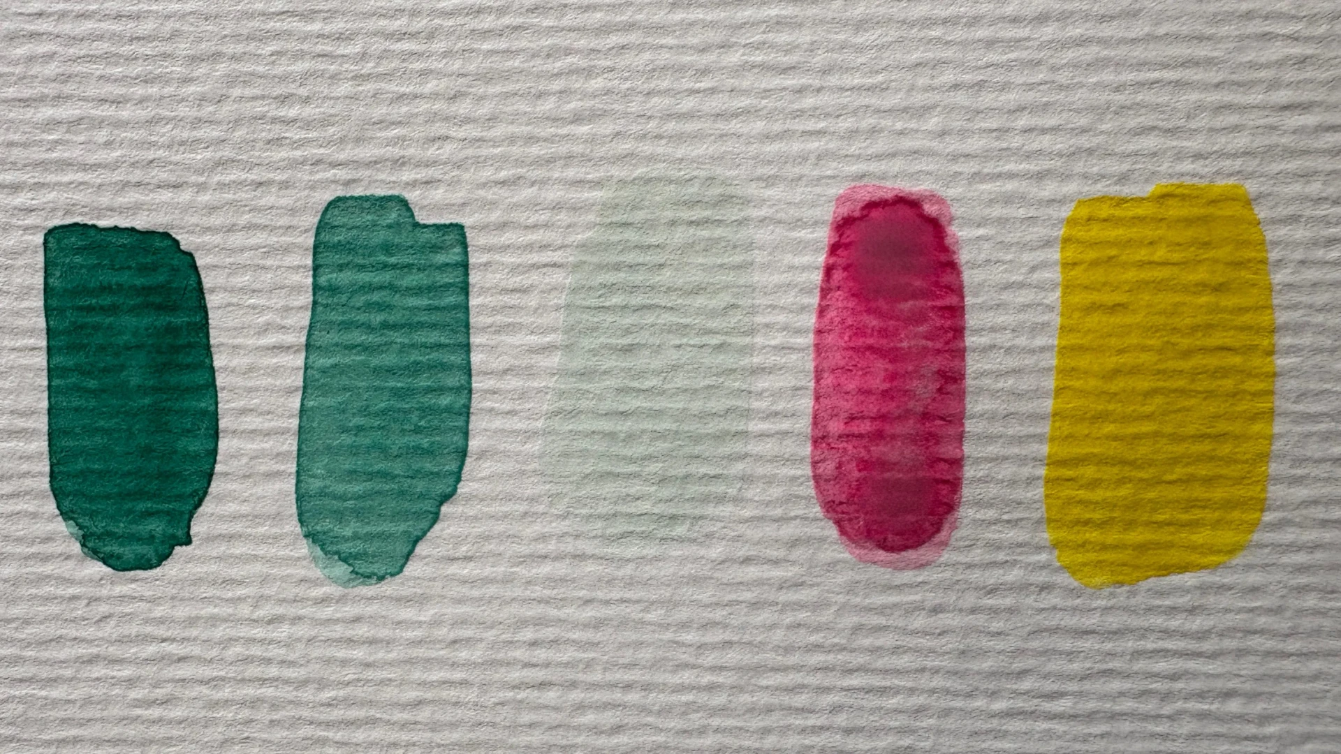
Avoid pure black: it doesn’t really exist in nature. Instead, opt for dark tones achieved through contrast, which will appear more natural.
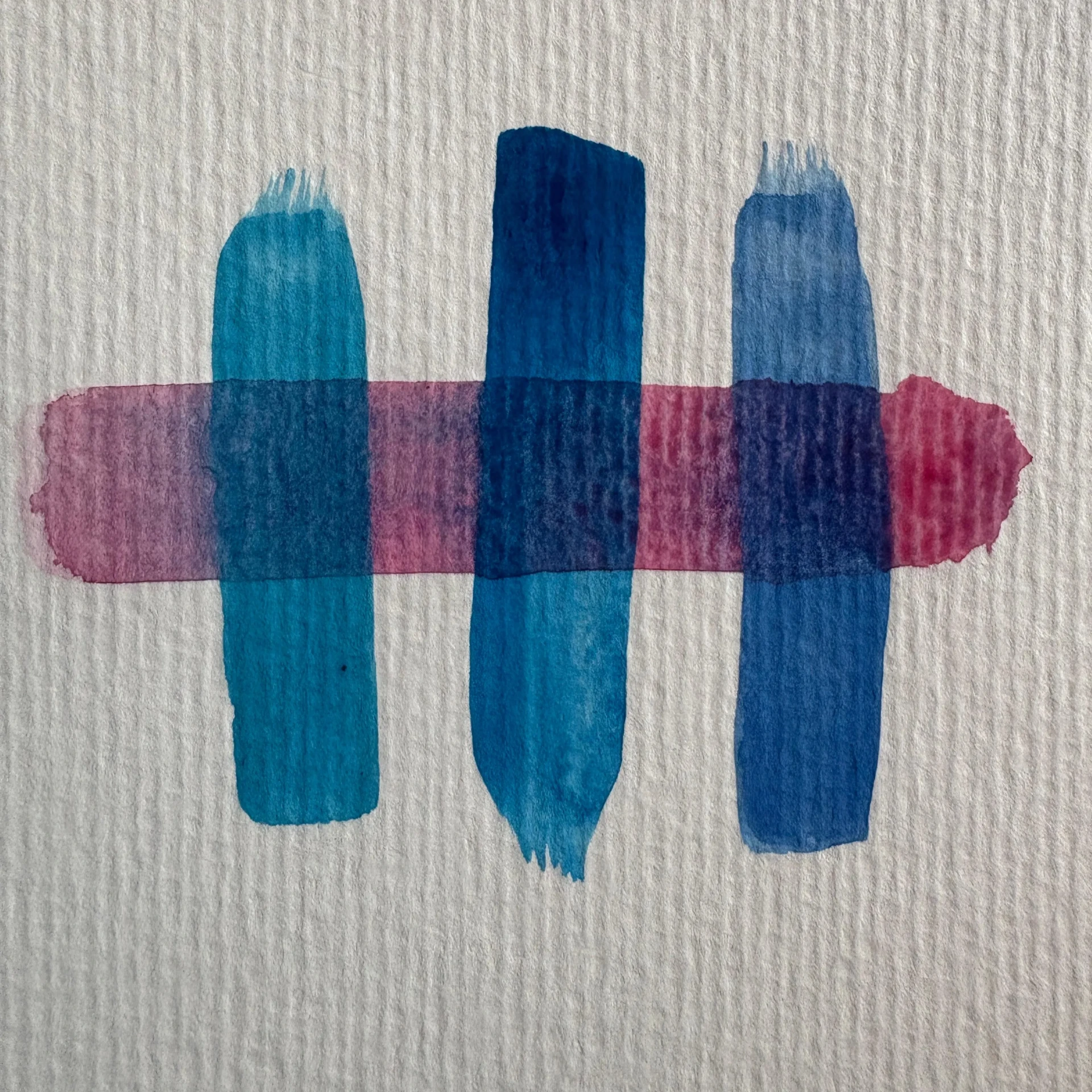
Play with transparency: layering allows you to achieve very rich color effects without resorting to complex mixing techniques.
To lighten a tone: Combine it with its lighter neighboring color (green + yellow, for example). To darken it, its complementary color generally gives better results than its darker neighboring color.
Choosing the right watercolor colors is much more than just an aesthetic consideration - it determines the success of each painting. A quality set, a complete basic palette, a few mastered color mixes, and a good understanding of values: these are simple foundations that make all the difference on paper.
Take the time to create your color palette, experiment with your mixes, and observe how the great masters knew how to get the most out of just a few colors. You will quickly see that the richness of a watercolor painting does not come from the number of colors used, but from the way they are chosen and combined.
Now it’s your turn to find your own palette, the one that matches your style and your vision.
Discussion
Thank you for these details, very interesting as always
thank you very much for these explanations. just what you need to start aquaelle!
An article that gets to the point while making you want to experiment. Thank you for sharing this!
super interesting and inspiring we can create an infinite palette by playing with colors
Thank you for this article. Ideal and necessary for starting out in watercolor.
very interesting article concerning the basis of a watercolor palette. You must of course take the time to make your own palette with the colors you have, in order to then know how to use them wisely. But watercolor is a difficult technique and even with a well-made palette, using it is still complicated. I think you have to do a lot of testing before you get what you want to portray.
Thank you Brayam for all these details.
I too at the beginning wanted to buy lots of boxes of watercolors like many others. Then I understood that to progress, you had to know your colors and mixes well. So I made a split palette with cold and warm primary colors. Primary blue, ultramarine blue, carmine or permanent pink, vermillion or cadmium red, lemon yellow, cadmium yellow or Indian plus an emerald green for mixtures, and some very useful earth colors: ocher or sienna, burnt sienna, umber or sepia. I also like bladder green.
Thank you for this very interesting information for getting started with watercolors.