How to Choose Your Watercolor Paints
When you start watercolor painting, choosing your palette is an important step that is often underestimated or, on the contrary, overestimated. Don't panic! In this article, we will explore how to select quality watercolors that are perfectly suited to your needs and your progress.
THE DIFFERENT WATERCOLOR FORMATS
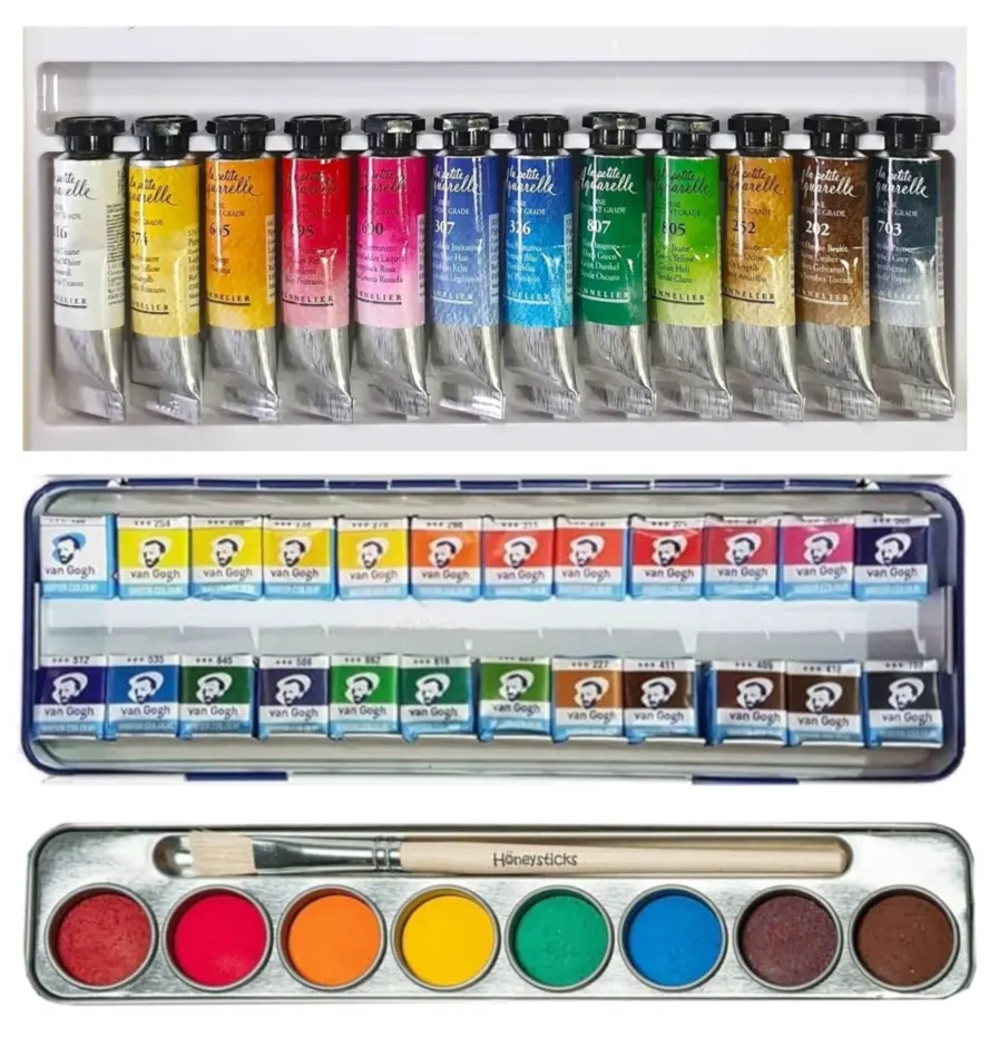
Watercolor comes in three main formats: tubes, pans and tablets. Tubes provide highly fluid watercolor and are perfect for broad washes and more precise control of mixes. Pans are solid tablets, ideal for beginners as they allow for a less technical approach to watercolor. They are also easier to transport. Tablets are similar to pans but smaller, often included in pre-assembled palettes or in samples. The choice between these formats depends on your personal preferences: for example, for traveling, opt for pans, while for bigger projects, it's better to use tubes.
THE DIFFERENT WATERCOLOR RANGES
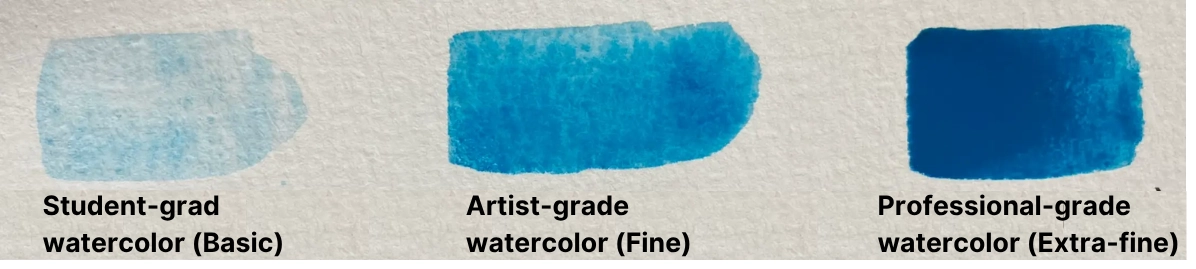
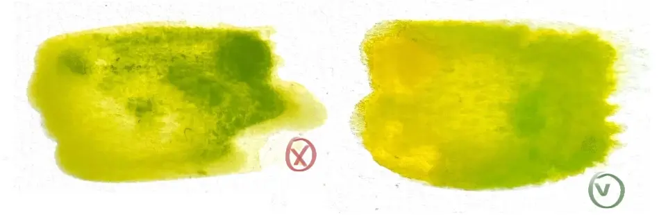
Watercolor ranges correspond to the concentration of pigments and thus to the intensity of colors. Watercolors are generally classified into three ranges: basic (school), fine (student) and extra fine (artist). School watercolors are the most accessible but they are often less concentrated in pigments and do not allow for as vivid or durable colors. Student watercolors offer a better quality/price ratio, with superior quality pigments. Artist watercolors are made with the highest quality pigments, offering rich color, enhanced transparency and superior durability. They are ideal for professional artists or those seeking optimal rendering and great finesse in their works.
Extra fine watercolors sometimes resemble inks and therefore require very good mastery, so for beginners I advise you to turn to fine watercolors.
Here is an example of the watercolor rendering according to each range using the same color.
WHAT MAKES A GOOD WATERCOLOR?
Here are the criteria to consider when choosing your watercolor:
THE QUALITY OF PIGMENTS
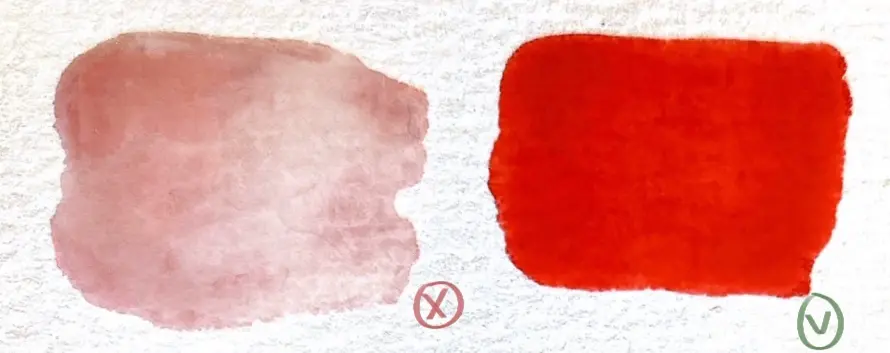
A good watercolor must contain high-quality pigments, offering intense, lasting and bright colors. The pigments must be well dispersed to ensure even application and good transparency.
THE TEXTURE AND CONSISTENCY
A good watercolor has a smooth and creamy texture that allows precise control of the paint. It should not be too pasty or too liquid.
MIXING CAPACITY
Quality watercolors blend easily with each other, allowing for the creation of a wide range of shades while maintaining good fluidity.
TRANSPARENCY
Watercolors should have a transparency that allows layers to be overlaid without the colors becoming opaque or muddy. This creates the depth and light effects sought with this technique.
THE QUALITY/PRICE RATIO
You don't need to buy the most expensive watercolor on the market to ensure quality; it might not suit your needs and there's no guarantee that it will be exceptional. There are good palettes for about €20 that offer excellent value for money.
ESSENTIAL COLORS TO START
To get started with watercolors, it is essential to choose a basic color palette. The primary colors, namely blue, red and yellow, are indispensable because they allow you to create a wide range of shades by mixing them together.
If you choose to create your own palette, here are some essentials I recommend to help you create a rich color range.
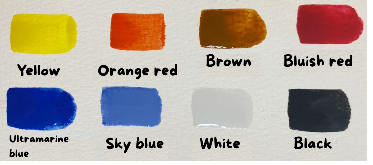
Generally, if you're a beginner, I recommend starting with a limited number of colors, as this will allow you to learn how to create your own shades and you will improve even faster.
SOME ADVICE
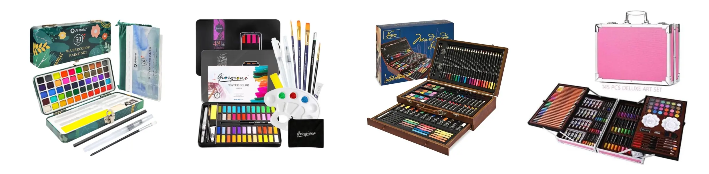
AVOID WATERCOLORS PROVIDED IN LARGE PACKS OF SUPPLIES
These sets (bottom right) often contain lower quality products that are not suitable for learning the technique properly. It is better to invest in quality watercolors, even in small quantities, to start. If you want to invest in a pack, you can opt for a kit specifically dedicated to watercolor; the materials provided will probably not be the best, but they should still be better quality. This will also have the advantage of providing you with everything you need to get started.
RESEARCH PAINTS
Before buying a watercolor, if you are unsure, look at reviews on the internet. You can also find demonstration videos to get an idea of the quality of the watercolor. Do not rely on a single review, do further research order to get a more general idea of consumer feedback, this way you can get started without taking too much risk.
DO NOT USE OTHER TYPES OF DILUTED PAINT
Some people try to use acrylic paints or other diluted paints thinking it can replace watercolor. Obviously, this is a misconception because the properties of watercolor, its intensity and transparency, cannot be replicated with other paints.
THINK ABOUT THE STORAGE ENVIRONMENT
Store your watercolors away from humidity and heat. This will help preserve their quality and keep them in good condition for optimal use.
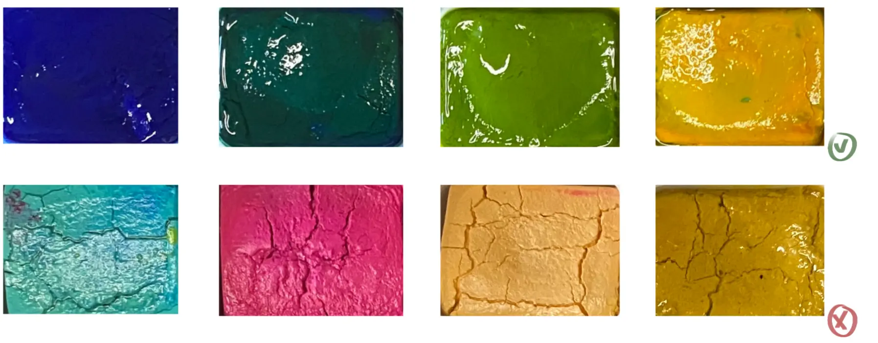
TAKE CARE OF YOUR WATERCOLORS
To prevent them from hardening, it is important to regularly moisten them if they are in the form of cups or tablets. This helps maintain their ideal consistency and ensures good performance on paper. Well-maintained watercolors should remain smooth and shiny.

To conclude, choosing a good quality watercolor is crucial to getting the best use out of it later on. You can opt for a pre-made palette or compose your own. Ideally, it's better to start with a limited range of high-quality colors and gradually expand it according to your needs.
Remember to carefully maintain your watercolor so that it lasts a long time and retains its quality.
And most importantly, have fun!
Discussion
Thank you for all this information which is important when starting with watercolor.
Marie-Claire
Great article on choosing watercolors! Your advice on pigments and transparency is super useful for beginners like me. I loved your comparison of the brands - it saved me from costly mistakes. I have a small question: do you have any tips for properly dosing the water? Thanks for this clear guide!
Thank you for your feedback, it is really appreciated! 😊 To properly measure the water in watercolor, a simple tip: prepare your color on the palette, then test it on a paper towel. Dip your brush in the mixture, then make a stroke. If the color is too light or runs too much, you’ve added too much water. If it’s too dark or dries too quickly, add a little water. By repeating this exercise, you will quickly learn to find the right balance between water and pigment. It's a simple step that will help you better master the transparency and durability of your painting!
hello
I would like more details about the colors.
Yellow yes but which one etc
Aside from the so-called ultramarine blue
There is so much variety in every color
Thank you