Adding Volume to Your Drawing
Hello everyone, today I propose to focus on a fundamental aspect of drawing: volume! It is not always easy to figure out how to add volume to your drawing, so in this article I offer some tips that can be applied to all your drawings.
Prepare your pencils, your paper or your tablet and most importantly, your creativity! Let's go!
DRAWING IN VOLUME IS THINKING IN VOLUME
This first piece of advice may seem a little elementary, yet it is essential: when we draw, especially if we are drawing imaginatively, our brain tends to want to flatten the drawing so that it is easier to execute, at the expense of volume. In order to give volume to the drawing, it is therefore necessary to use visualisation and project our drawing not in 2D, as our brain tempts us to do, but in 3D.
To achieve this in the simplest way possible, we must break down our drawing into simple volumes.
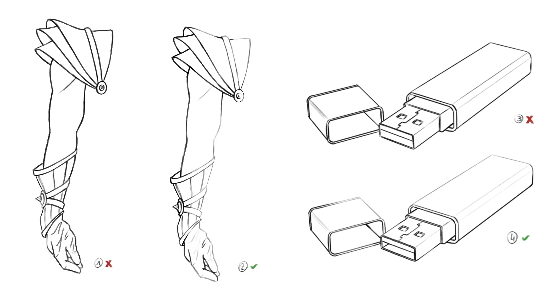
Let us take the following example: when drawing a USB stick, we often tend to create it as in example 1, we recognise the USB stick but the drawing appears very flat; we need to break it down into several volumes, in this case rectangular parallelepipeds, to recover the lost volume. All drawings, even the most complex, can be simplified with simple geometric shapes to recreate the initial volume of the objects.
To get the USB drive in 3, all that's left is to add a few details and you're all set.
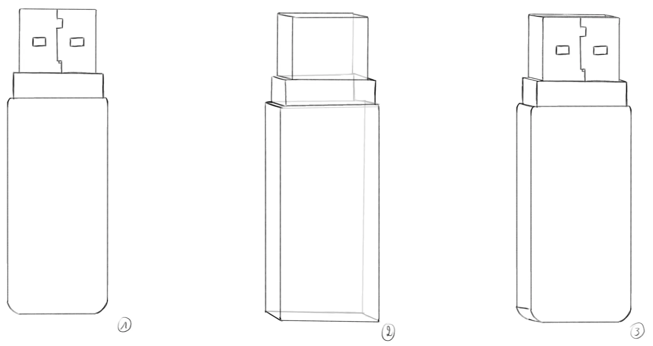
It may take you some time to learn to think in volume and sometimes it can be a bit confusing, but you'll see that with a little practice your drawings will greatly improve in volume and it will even become easier for you to draw more complex things.
FIND INTERESTING ANGLES
Another very important aspect of volumetric drawing is the perspective from which we highlight our drawing. Very often, we use front and full-length viewpoints because it seems more natural to draw all the elements, however, this is also a perspective that tends to flatten the volumes.
I therefore advise you to seek different points of view and less rigid ways of presenting the topic.
If we return to the example of the USB stick, portraying it in a ¾ angle with a slight framing from below as in example 2 emphasises the volume of the object even more: the open lid and the different parts of the USB stick reveal some open sections, others smaller... it is also much more common to see a USB stick resting on a desk rather than in a vertical and static position as in example 1. This staging therefore creates the impression of a much more pronounced volume.
Example 3 revisits the same ideas by playing with the perspectives of the key and the cap, creating an interaction between the two elements that suggests the volume of each.
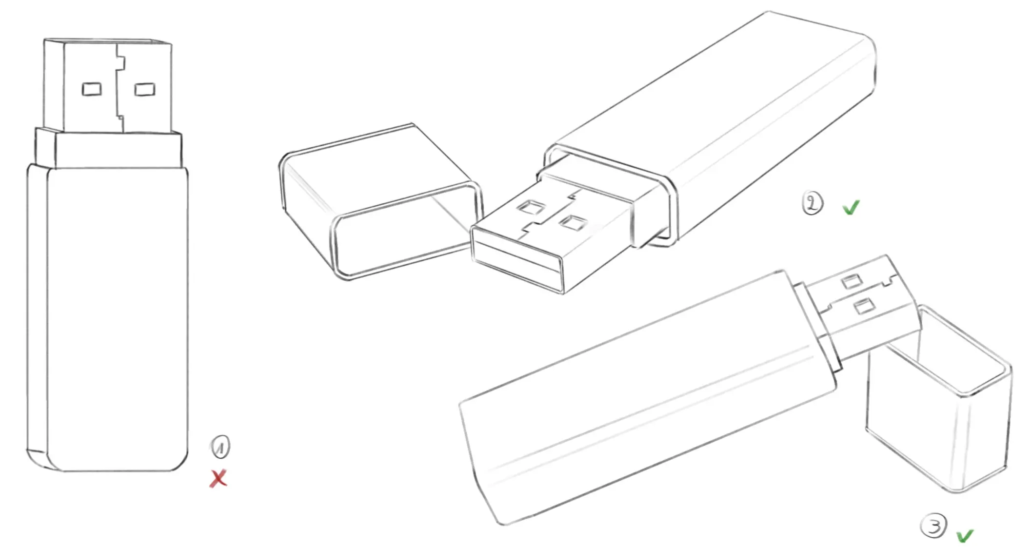
Finding interesting angles can sometimes seem more complex than it really is. Often a 3/4 view works very well and will allow you to easily convey volume. If you wish to draw a slightly more complex scene, I recommend making very simple sketches with rough shapes to see how to position the different elements and get an idea of the most interesting viewpoint.
HOW TO VARY THE VOLUMES IN YOUR DRAWING?
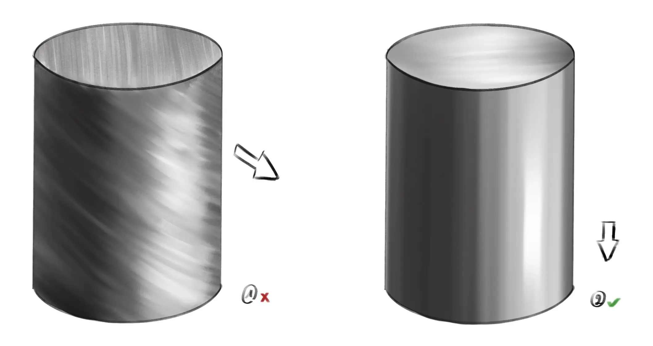
In order to accurately convey volume, it is also interesting to vary the volumes: if you draw a cylinder with a perfect volume, it will always appear flatter than if you add a sphere or a cube to the cylinder. By varying the different volumes, we create visual roughness and thus generate interest for the eye. Moreover, this helps bring out very thin and very thick volumes, creating a kind of visual contrast.
The following example illustrates this very well: Drawing 1 shows an arm with the correct but somewhat boring volume, it looks almost flat because no particular element stands out. Drawings 2, 3 and 4 all show elements with very exaggerated volumes and others with much less, thus creating visual interest.
The basic anatomy of the arm is the same for all drawings, but the volume that emerges is different solely because of the different elements that are added, creating more levels of volume.
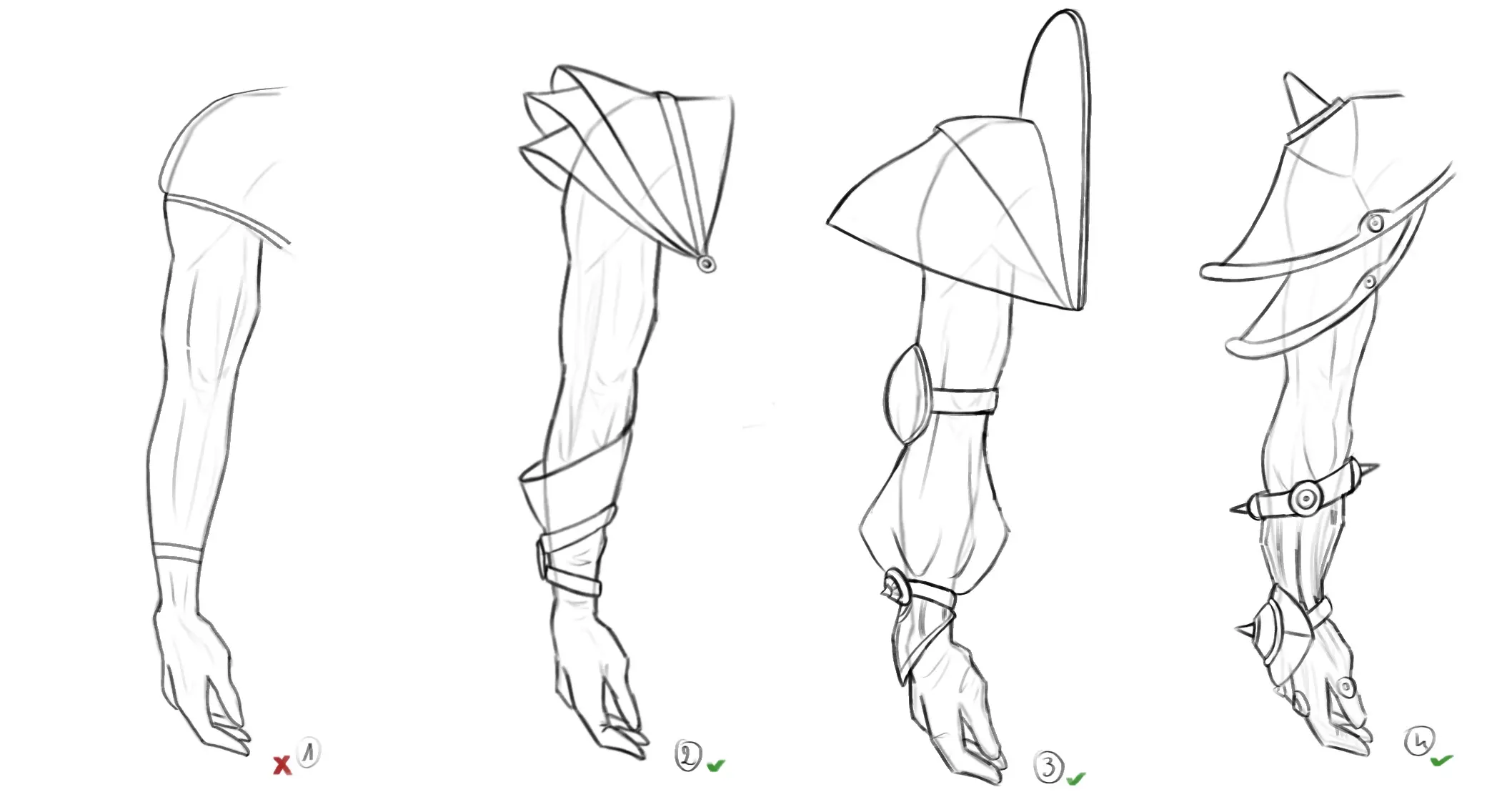
We have just seen an example with clothes, but it is true for anything: if you play with volume levels, all elements will become more interesting and the whole design will gain in volume.
LINE IN SERVICE OF VOLUME
This point is less striking, but is nevertheless used very often. You may be very proud of your drawing, dynamic and with well rendered volumes, but when you switch to inking everything seems to get lost and you wonder how it is possible that the volume has disappeared. The answer is simple: you have inked everything with the same stroke and intensity, thus flattening the drawing.
Playing with the thickness of lines to create volume is what we call thick and thin strokes. The "full" corresponds to a thick line and the "fluid" to a much finer line. Generally, thick and thin strokes are useful for suggesting light through the sketch and creating more volume.
Playing with thick and thin strokes can make all the difference in the quality of the stroke of your drawing, as long as they are well placed, otherwise you risk obtaining the opposite effect to the one desired. It takes a little practice, but you will see that the volume during inking will no longer be lost and your drawings will only be more interesting.
COLOURING YOUR DRAWING CORRECTLY
This point is generally the easiest to work on and makes a huge difference. When colouring or shading the design, it is very important to do so in the direction of the volume you were working on, otherwise you risk flattening it completely.
I'm directing you to this video The URL you provided leads to a YouTube video, but without additional details or context, I can't provide a meaningful translation. Please provide the specific French content or text you'd like to translate into English to see how with hatching and, by extension, colouring, you can preserve the volume of your design and even make it stand out even more.
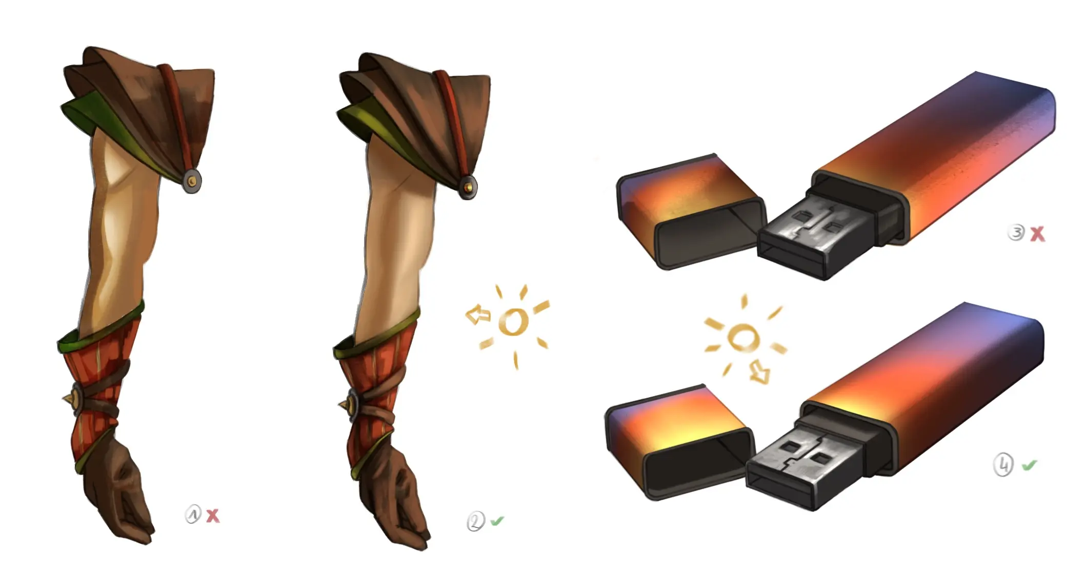
MAINTAIN A COHERENT LIGHT SOURCE
Finally, this last point might be the most complex, but it is also one of the most common mistakes. When you add color to your drawing, it is very important to choose a light source and stick to it.
Very often when we start, we struggle to set up light sources, so we color without really knowing, just adding some shadows and lights at random. This has the immediate effect of flattening the entire drawing because consistency is lost.

To correctly highlight the volume of the entire drawing, I invite you to set up a simple light source and colour everything according to it. If you find it difficult to position shadows and light, I invite you to spend some time observing different light sources (lamp, candle, sun...) and their impact on the environment, this will allow you to better replicate them in your drawing.
We have just reviewed some tips for adding more volume to your drawings; I recommend that you start by choosing one and mastering it before adding another. The more comfortable you feel, the more you will be able to use the different tips to continuously add volume to your drawings.
I hope you enjoyed this article 😊
Discussion
No comments yet.