Improve the Contrast of Your Drawings
One thing is certain: contrast is one of the most powerful elements for making your drawing strong and readable. Whether you are drawing in black and white or in color, playing with contrasts helps to highlight your subject, create volume, and direct the gaze. In short, it adds a real artistic intention to your drawing.
In this tutorial, we will explore how to improve the contrast of your drawings with a simple and progressive method.
What is contrast?
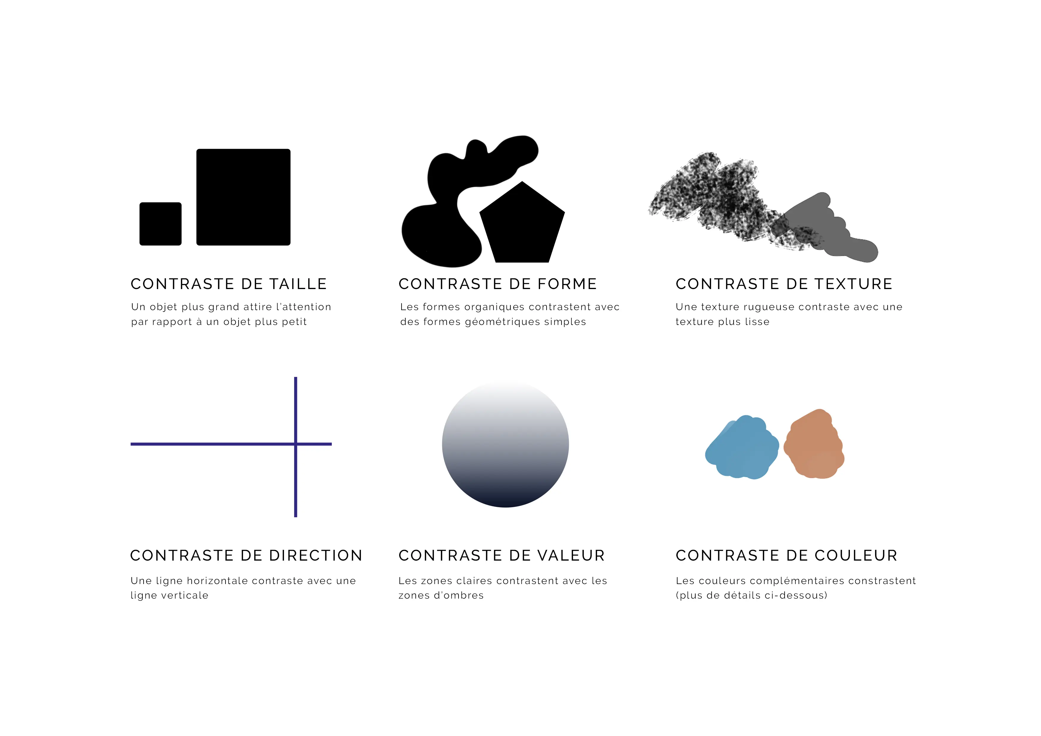
Contrast is a visual difference between two elements. It is an opposition that can be created in several ways: by size, shape, texture, direction, value, or by color.
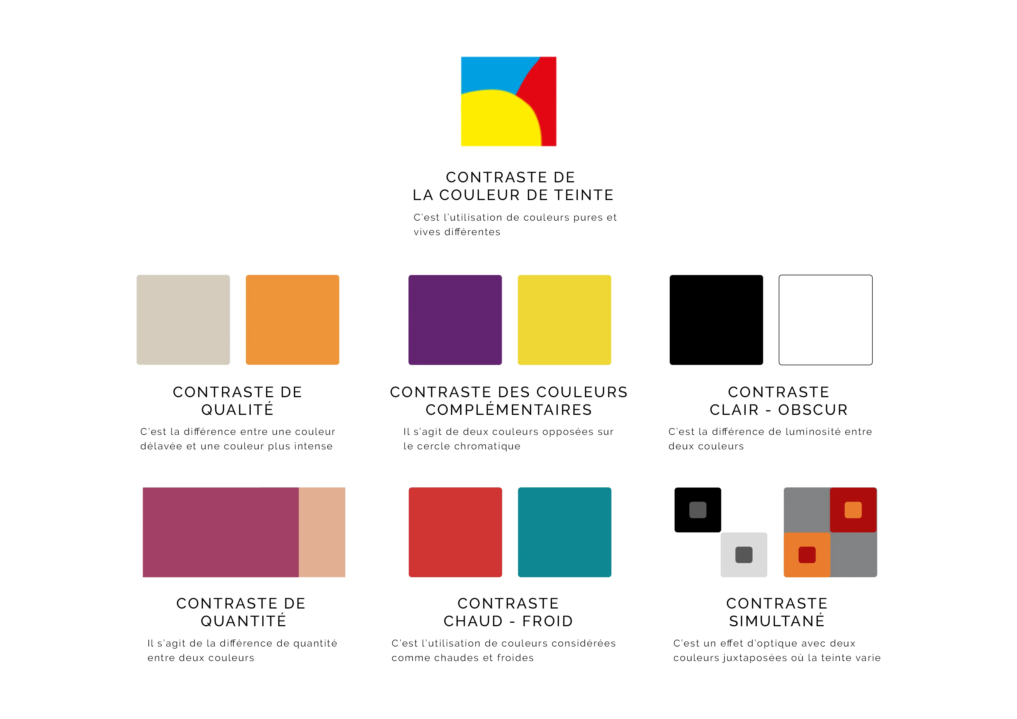
According to painter and theorist Johannes Itten, there are 7 color contrasts: hue contrast, light-dark, warm-cold, quality, by complements, simultaneous, and quantity.
If we look at the example below, an apple treated without contrast and with contrast, we can easily see the importance of working on them. One seems distant and bland, and the other seems lively and well-rounded.
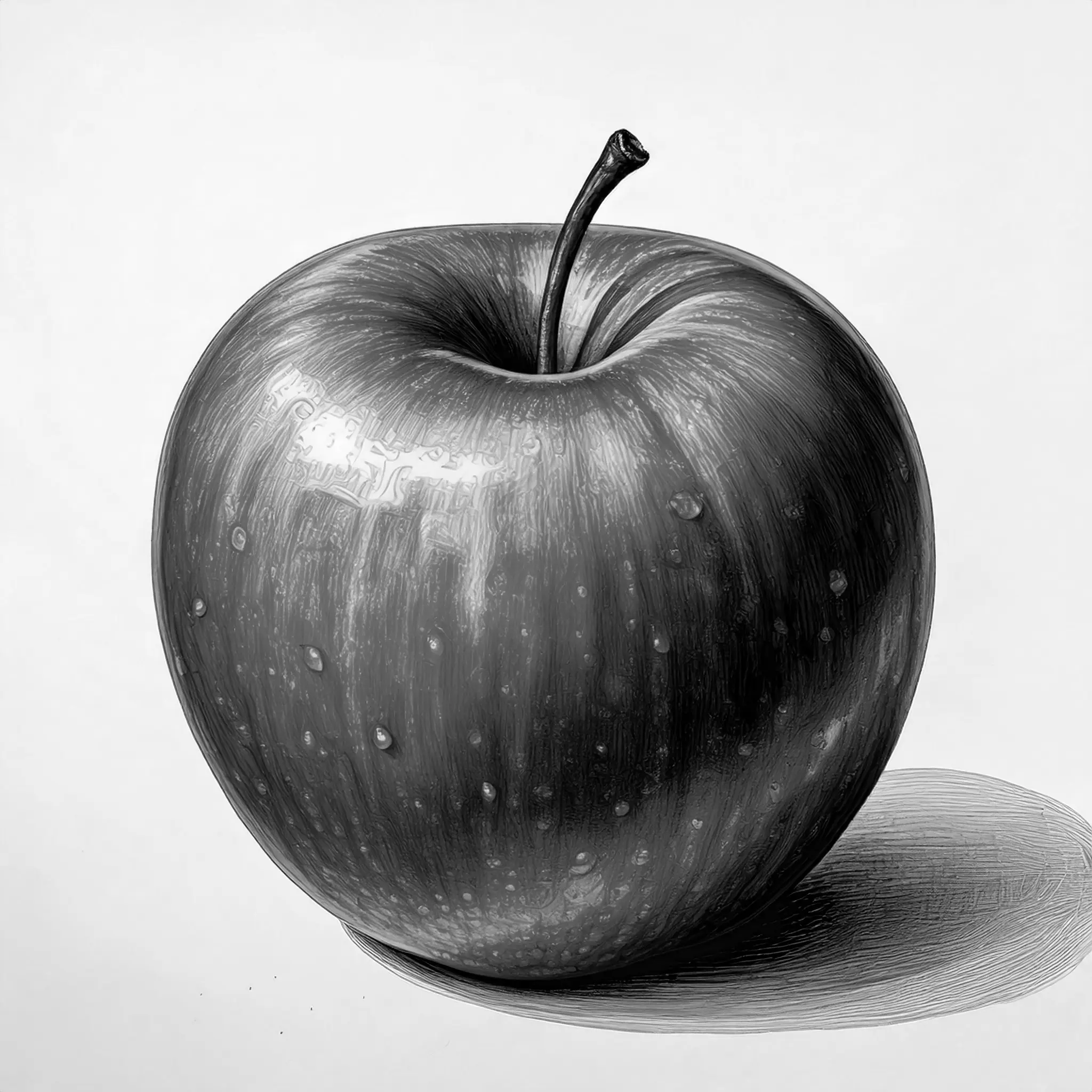
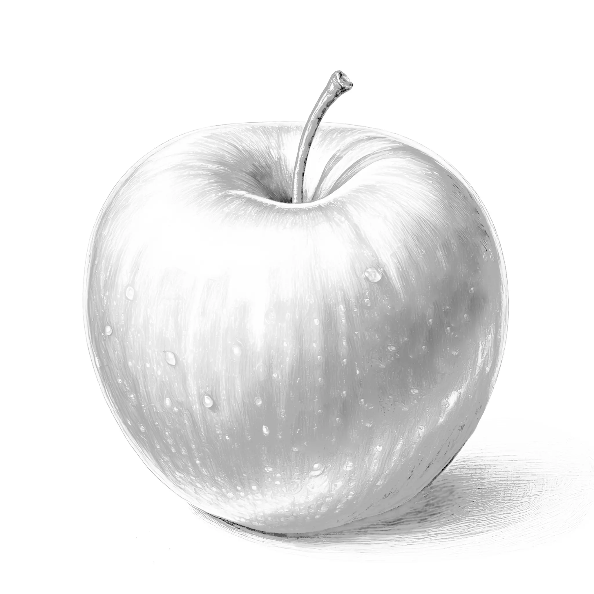
In this tutorial, we will focus specifically on the strongest contrast that exists, the chiaroscuro contrast. This involves creating bright and dark areas close together.
An example of a contrasting drawing to reproduce
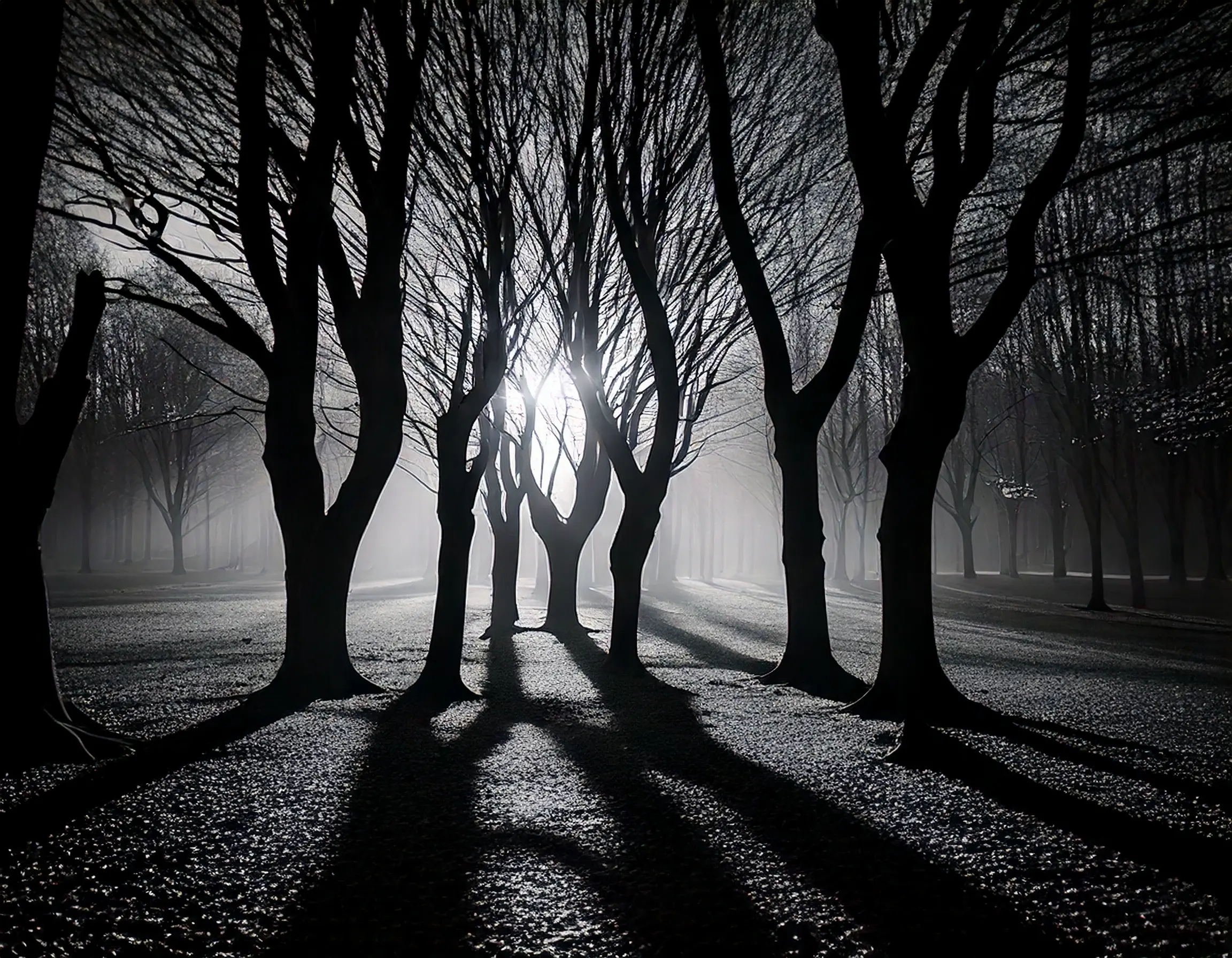
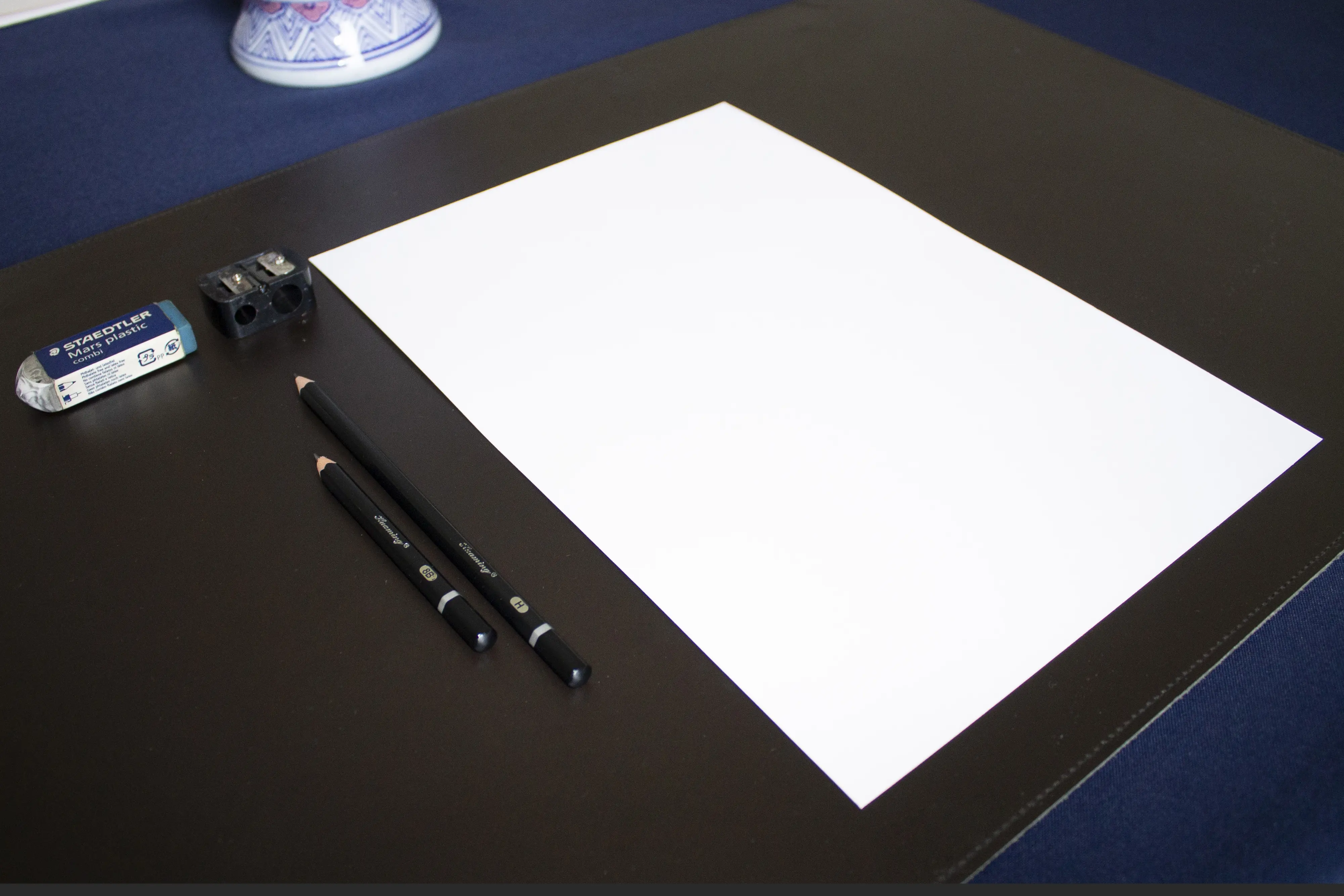
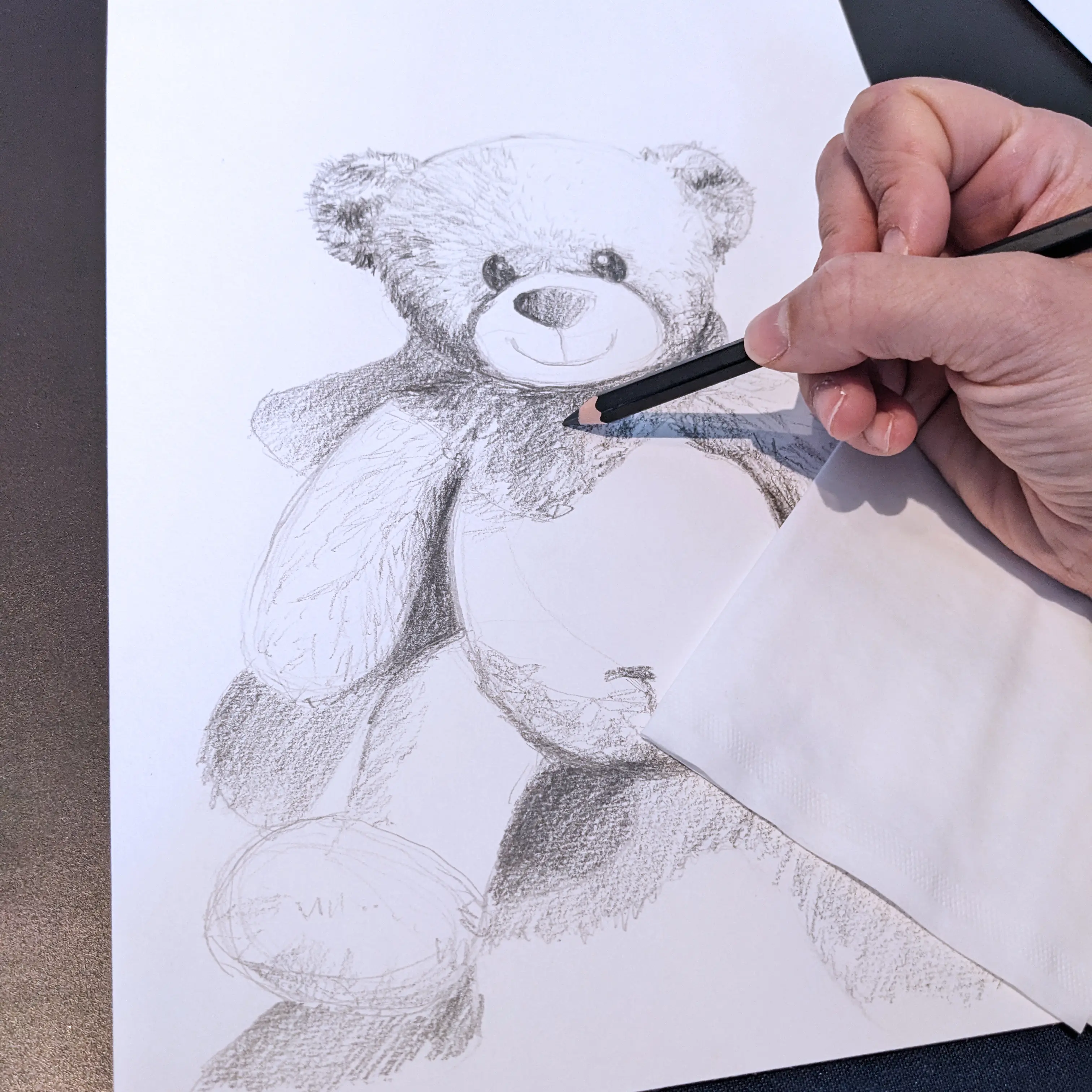
Before you start your drawing, choose a photo with well-defined lighting. Equip yourself with an A4 drawing sheet, a hard pencil (type HB-2H), a soft pencil (type 6B-8B), and an eraser if necessary.
A tip: turn your photo into black and white to better see your contrasts and get a better overall view.

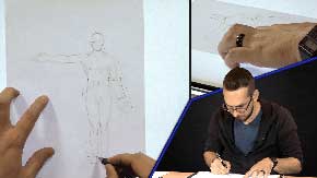
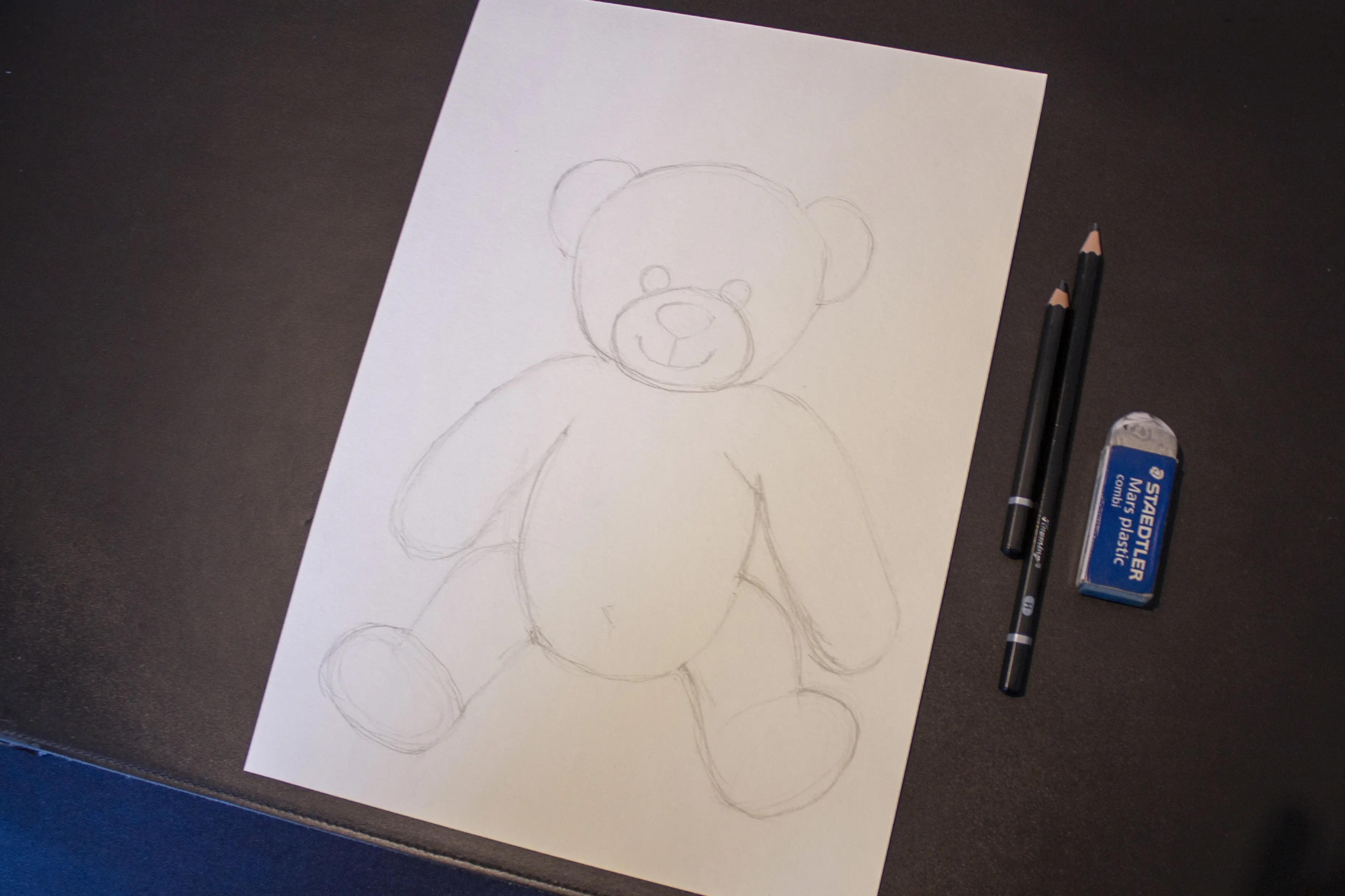
Then, start with a simple sketch using your pencil, marking out the large shapes of your subject. Check the proportions by stepping back.
Tip: hold your drawing at arm's length in front of you and spend a few seconds observing your drawing, then your subject, in order to correct any possible proportional errors.
Before delving into the details of shadows, it can sometimes be useful to identify the different shadow areas (light, medium, and dark). To do this, you can simply define these areas with a pencil.
Tip: If you have trouble distinguishing dark, medium, and light areas on your subject, squint your eyes until your vision becomes blurry. With the details being less visible, it will be easier to spot these zones.
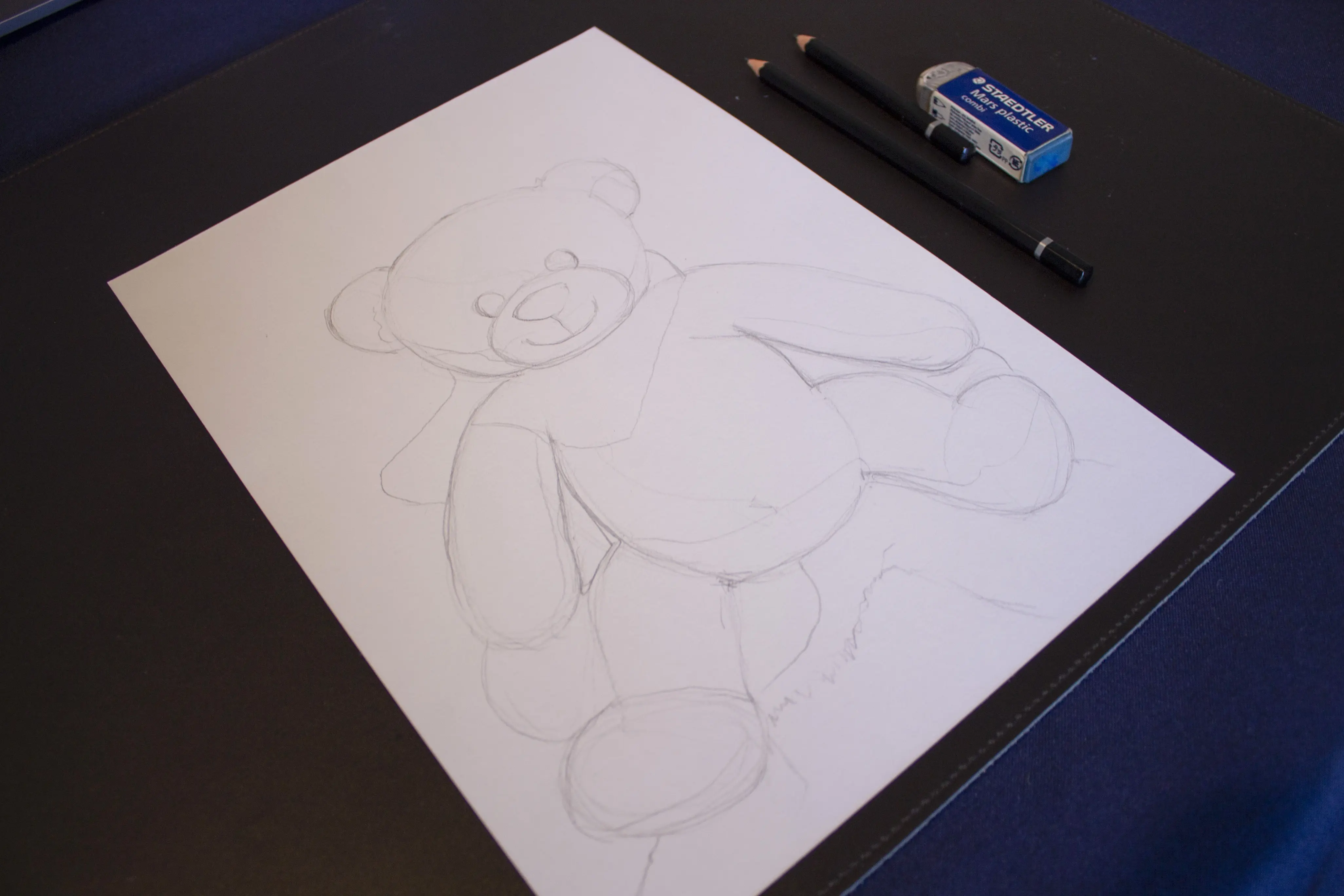
Once these areas are identified and marked, start with the heavy pencil for the large masses, making sure to be consistent in your strokes, then refine the edges by varying the pressure and only then should you add the details.
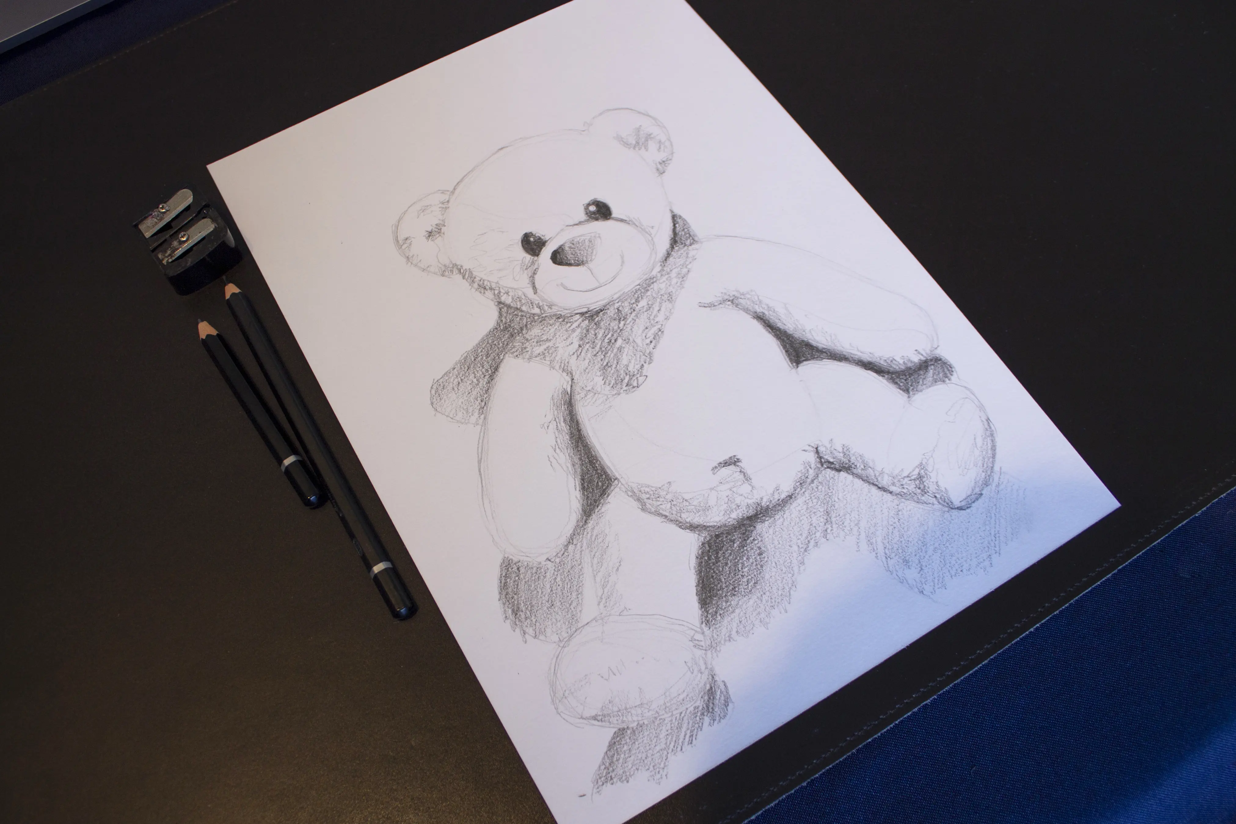
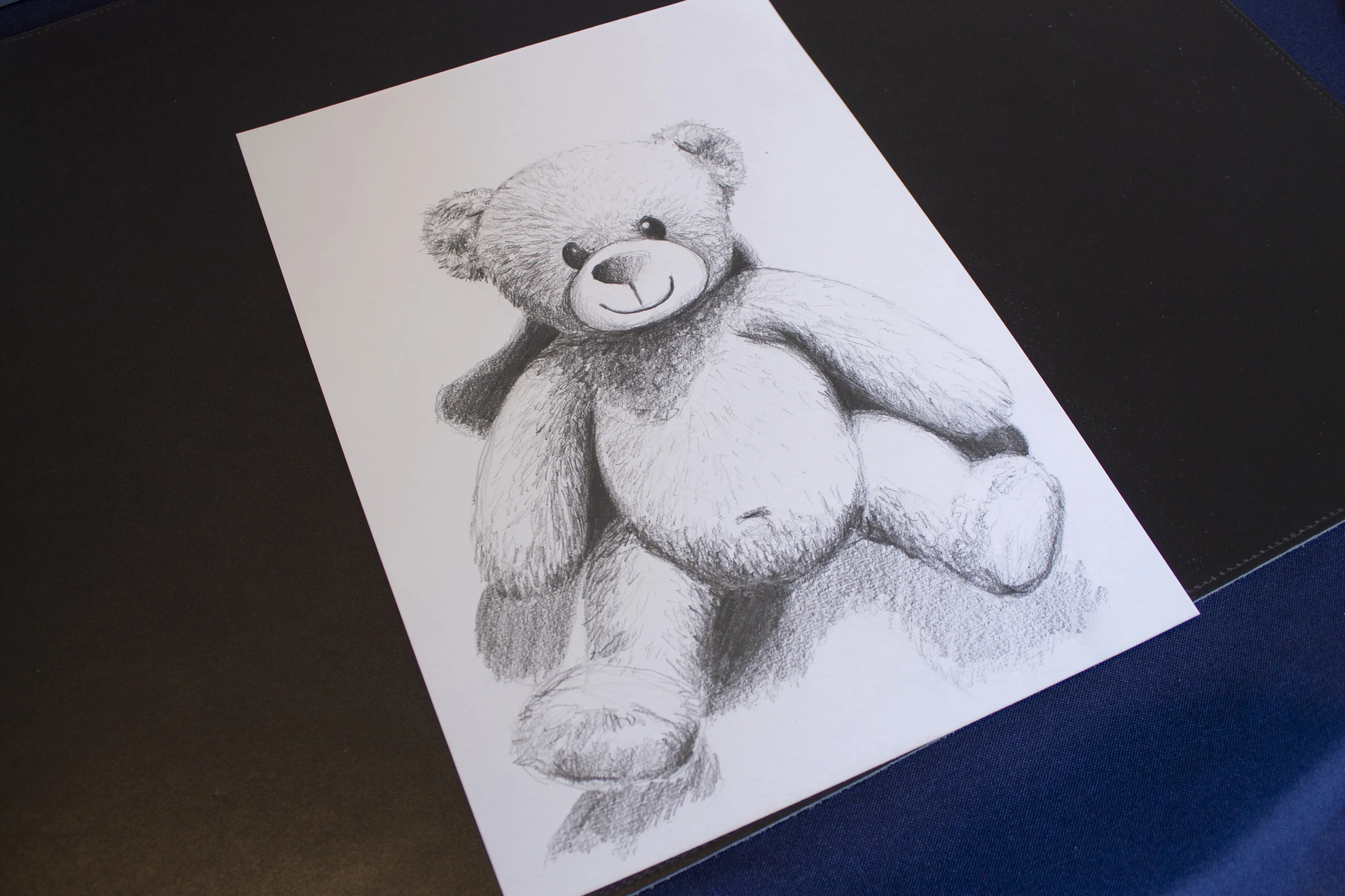
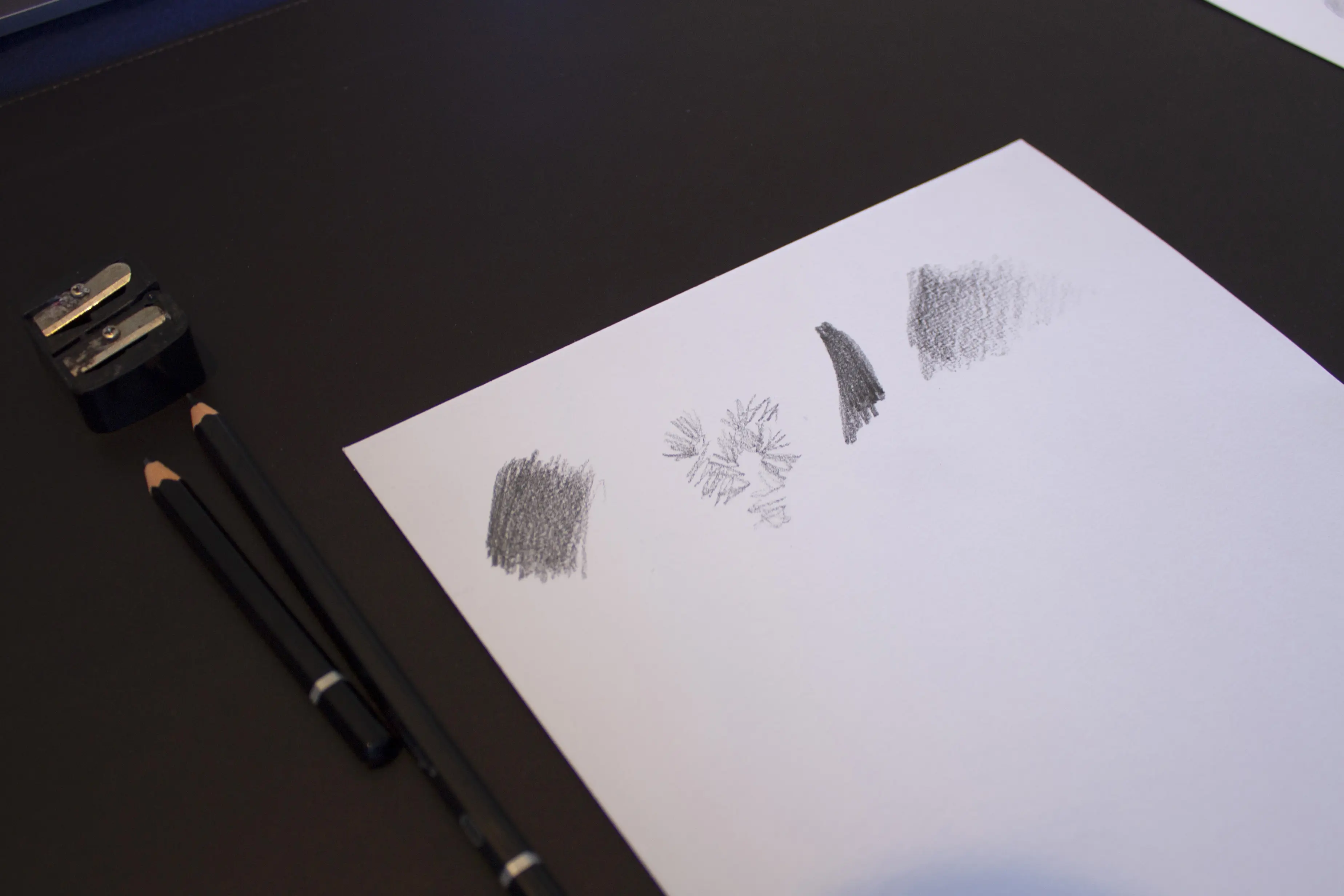
How to address the shadow areas in drawing
In the image below, you will see the different ways to treat shaded areas as well as the texture in my drawing. You can see that I mix flat washes with medium and strong tones using a system of hatching and gradients. Feel free to reproduce them on a separate sheet.
Vary the contrast level
Keep in mind that not all elements of your drawing should have the same level of contrast. Varying the edges of your drawing, sometimes using a soft gradient, sometimes using a sharper contrast, allows you to play with hierarchy and create a focal point.
For example, enhance the contrast in certain areas with textures or conversely by leaving white spaces to let your drawing breathe.
Tip: It's not always necessary to detail every part of your drawing. Instead, choose specific areas to detail and leave others more general by leaving blank spaces; the imagination does the rest and your drawing will be all the more successful.
Throughout your drawing, take the time to observe it, compare it to your reference image, analyze it, and adjust it if needed.
Tip: If you're unsure, take a break and come back to your drawing later. Indeed, it's better to use contrasts sparingly to avoid an overloaded effect.
To conclude, as you may have noticed, contrast is a fundamental tool for bringing your drawings to life, enhancing their impact, and guiding the viewer's gaze. If it is designed in a holistic way, it will enrich your drawing and give it a true graphic strength.
Of course, it's not always easy, but you'll see that with regular practice, your drawings will improve.
Writer and Illustrator: Sacha Fatticcioni