
How to Draw Atmospheric Perspective
When we look at the horizon, the most distant mountains and buildings seem to gradually fade away, almost dissolving into the air. This fascinating effect, which we perceive naturally in real life, can also be reproduced in our drawings and paintings. This is precisely what we will explore in this article.
What is atmospheric perspective?
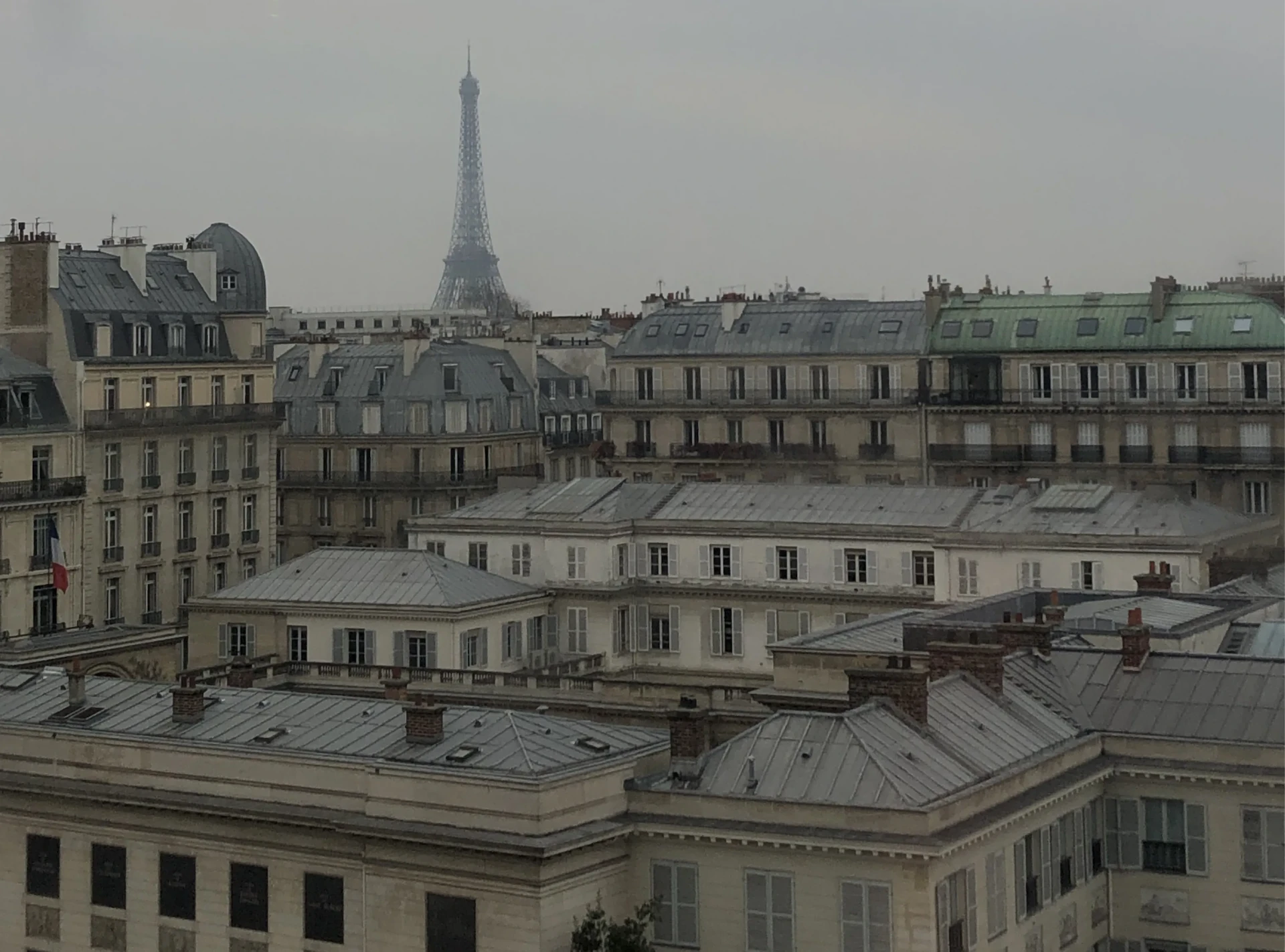
Atmospheric perspective is the effect that enables objects to be placed further away in a composition through a gradual reduction in sharpness and saturation. To understand this better, take your own street as an example: the building in front of you is sharp, colorful, full of details. A few streets further away, the facades appear simpler and less distinct. On the horizon, the windows disappear, the frames fade away, and even if the buildings are painted the same color, they appear duller than those in the foreground.
The three key concepts to master
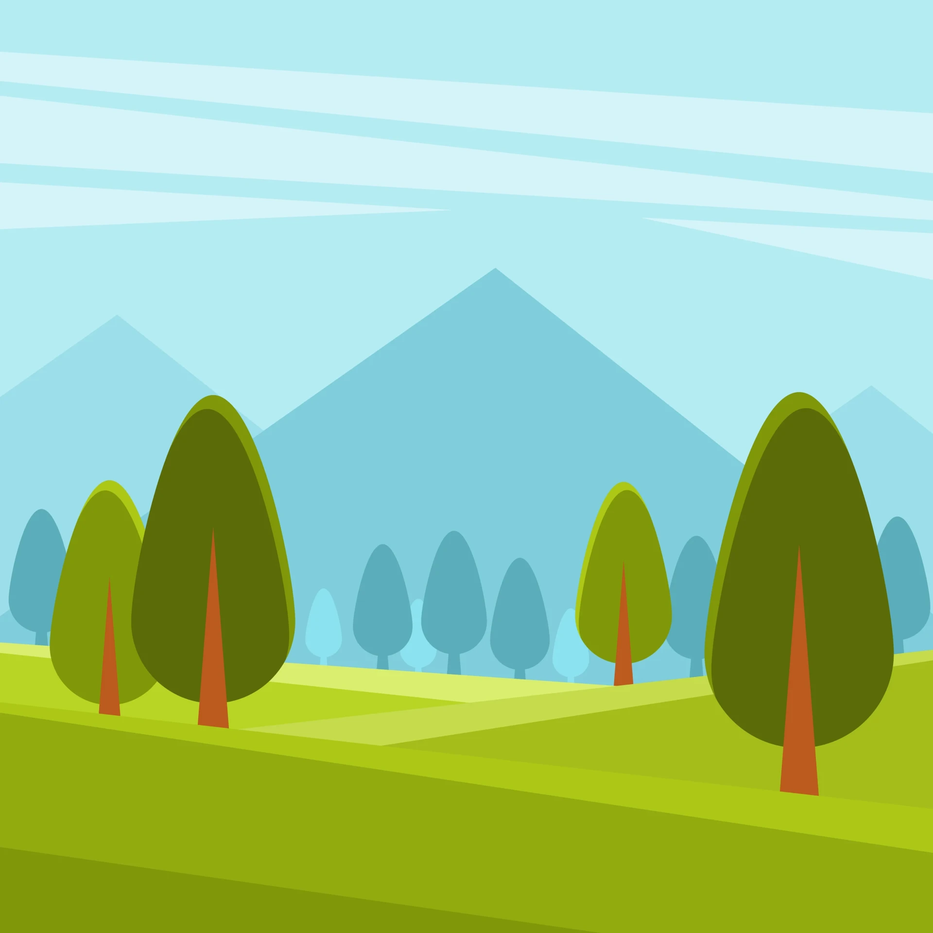
Atmospheric perspective is based on three parameters that decrease as an object moves further away:
- Difference in contrast: the foreground concentrates the lightest and darkest tones, while the background tends towards an almost flat appearance, without extremes.
- Loss of detail: as we move further away, elements become indistinguishable and eventually turn into simple, undefined shapes.
- Cooler colors: the farther away an object is, the more air there is between it and our eyes. This invisible air gives distant objects a progressively bluer and less saturated hue.
The origins of atmospheric perspective
Perspective, in almost all its forms, emerged during the Renaissance around a fundamental question: how to give depth to an artwork. The Flemish had already made progress on the subject, but it was Leonardo da Vinci who refined the idea and gave it its definitive form, which is still visible in his most iconic works.
How to analyze atmospheric perspective on a reference
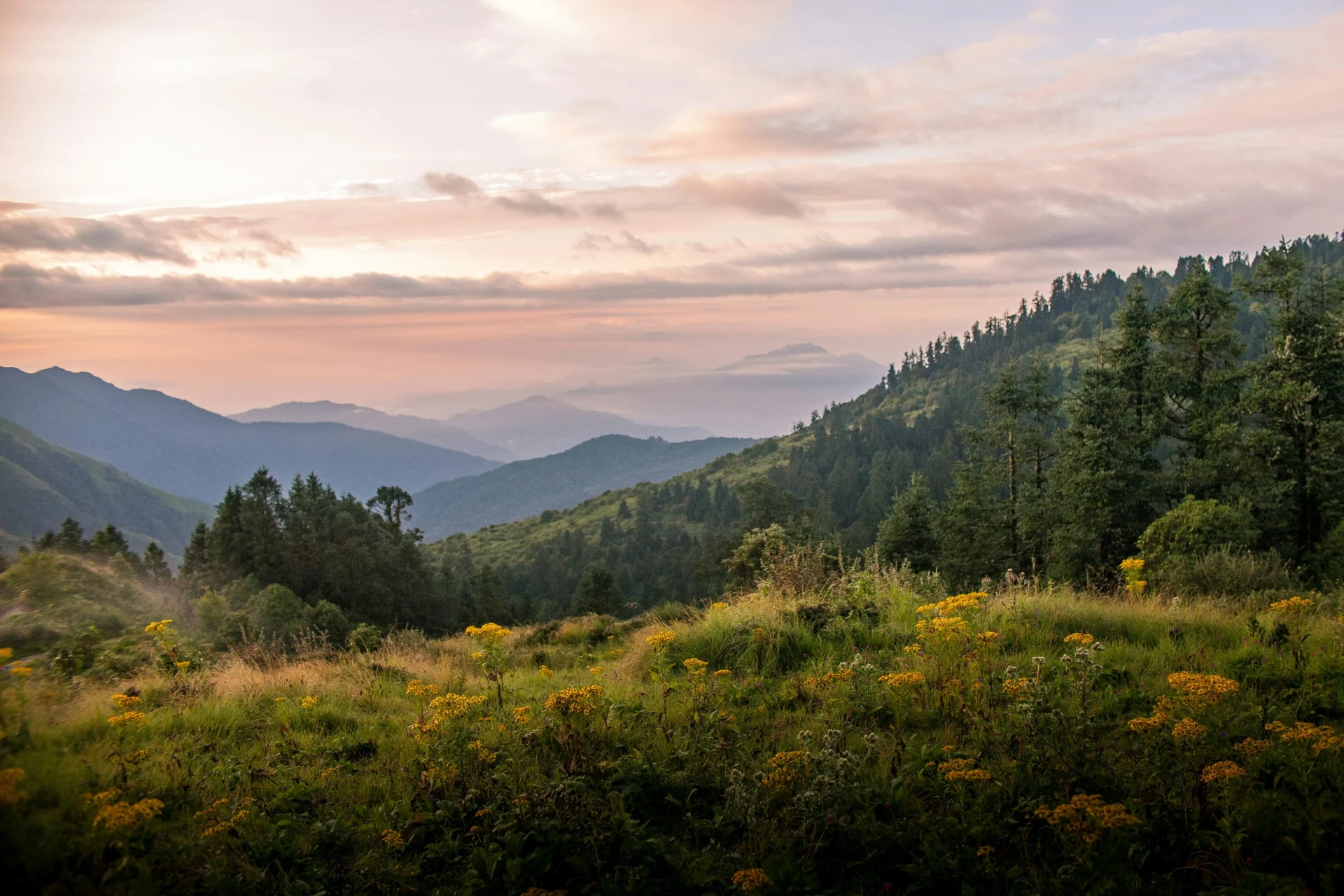
To apply this effect in your drawings, keep in mind the three values that should decrease as you move away: detail, saturation, and temperature. Start by defining your planes: which elements are closest, which are at a medium distance, and which are really far away, then apply a different intensity of values to each.
To help you visualize this, take a reference and observe it layer by layer:
The foreground is closest: the details are sharp, and the colors are intense and contrasting.
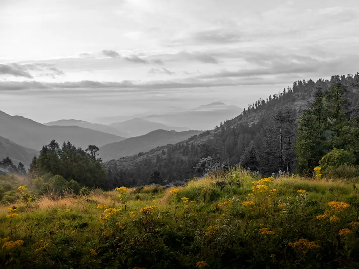
The nearest section of the middle ground is slightly further away: fewer details, flatter colors.
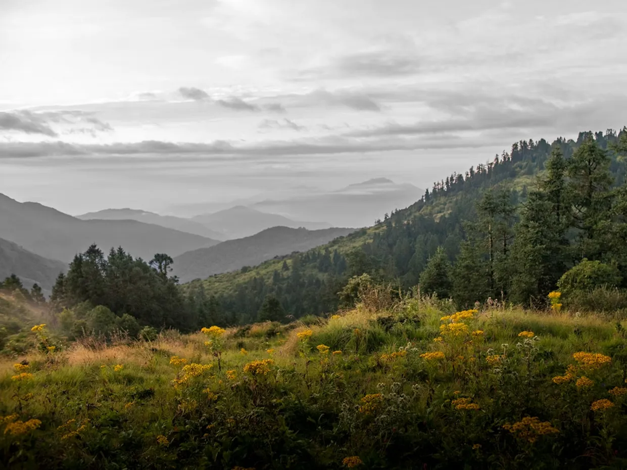
The furthest section of the middle ground no longer contains clear details; the trees look like smudges on a hill, and the colors lose their vibrancy.
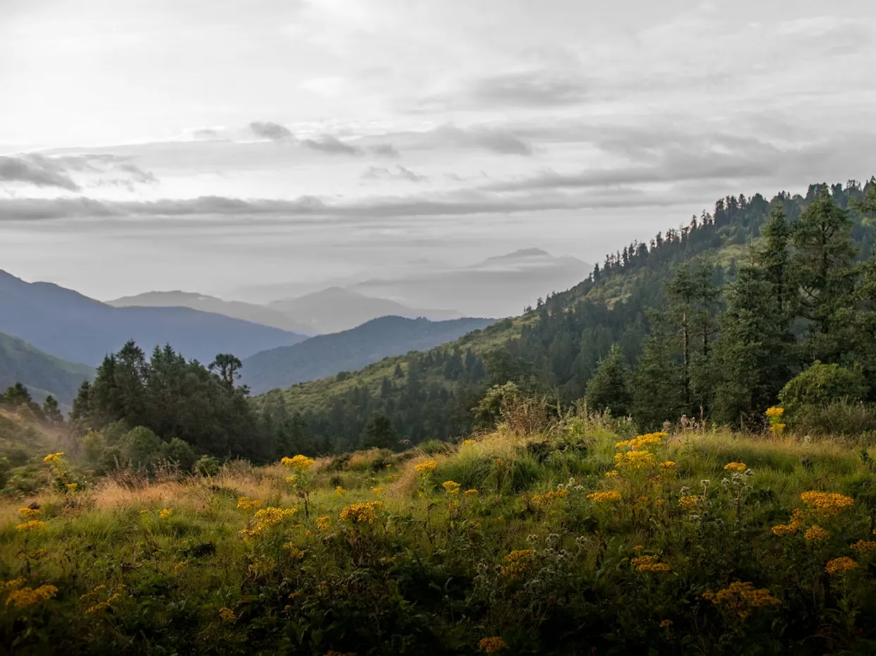
The background, the furthest section with the distant mountain, appears almost translucent: no texture, no trees, a completely flat appearance.
Draw a landscape with atmospheric perspective step by step
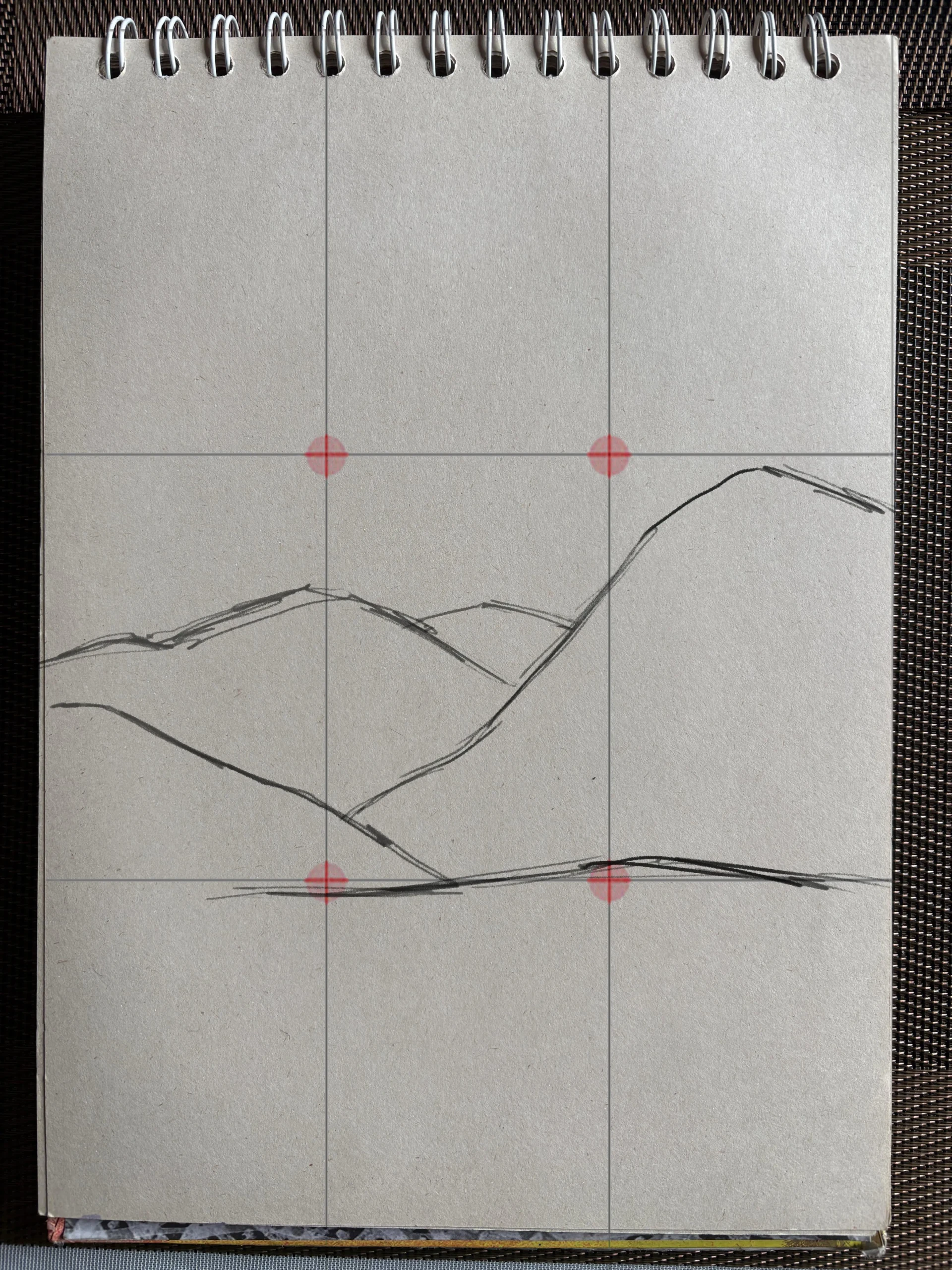
Start by defining a horizon using the rule of thirds, placing it on the lower horizontal line. Place a few mountains along this line.
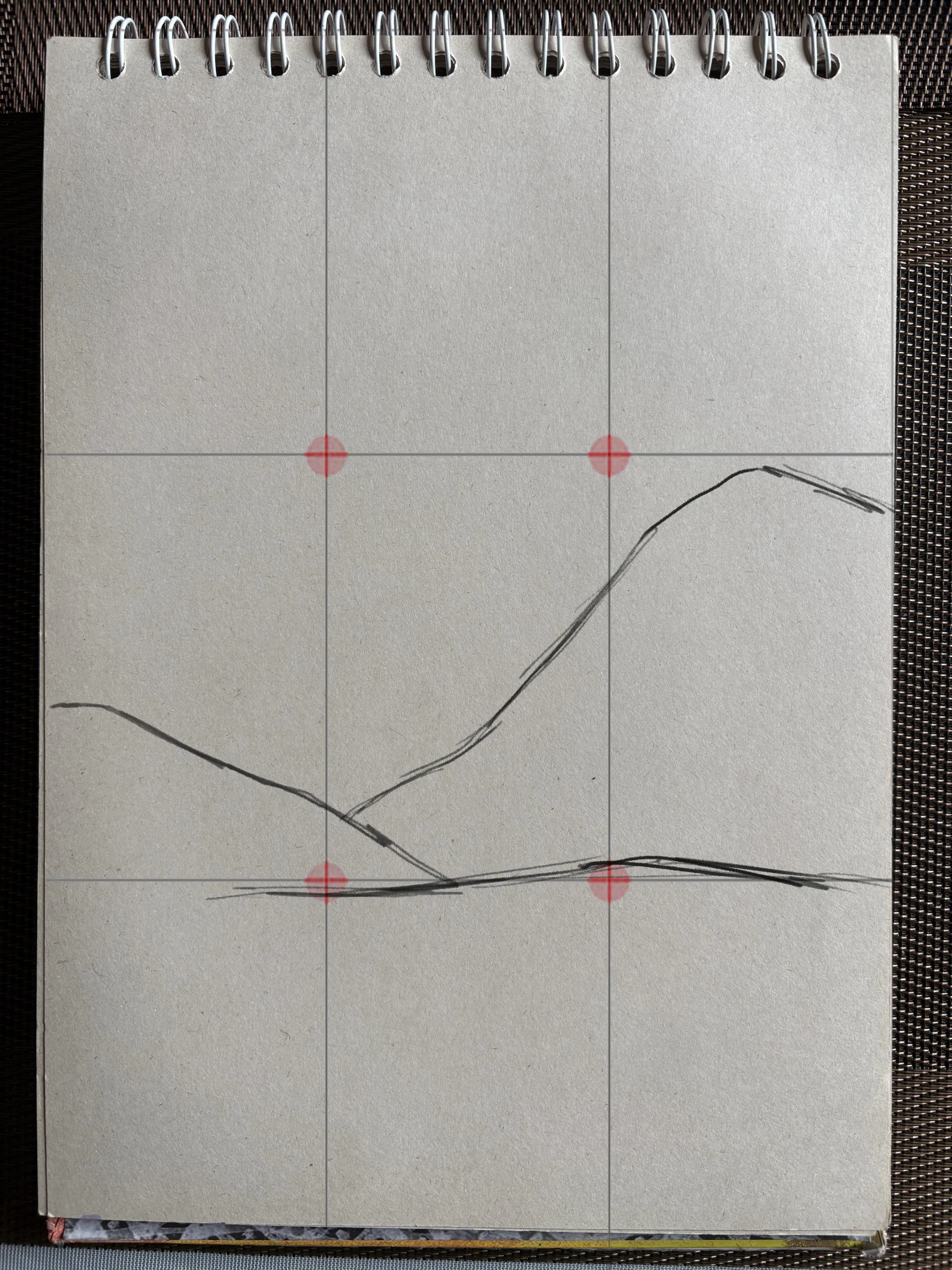
In the middle, add two more smaller and simpler mountains; they should not exceed the height of those in the background in any case. You can also add a third level of distance if you wish.
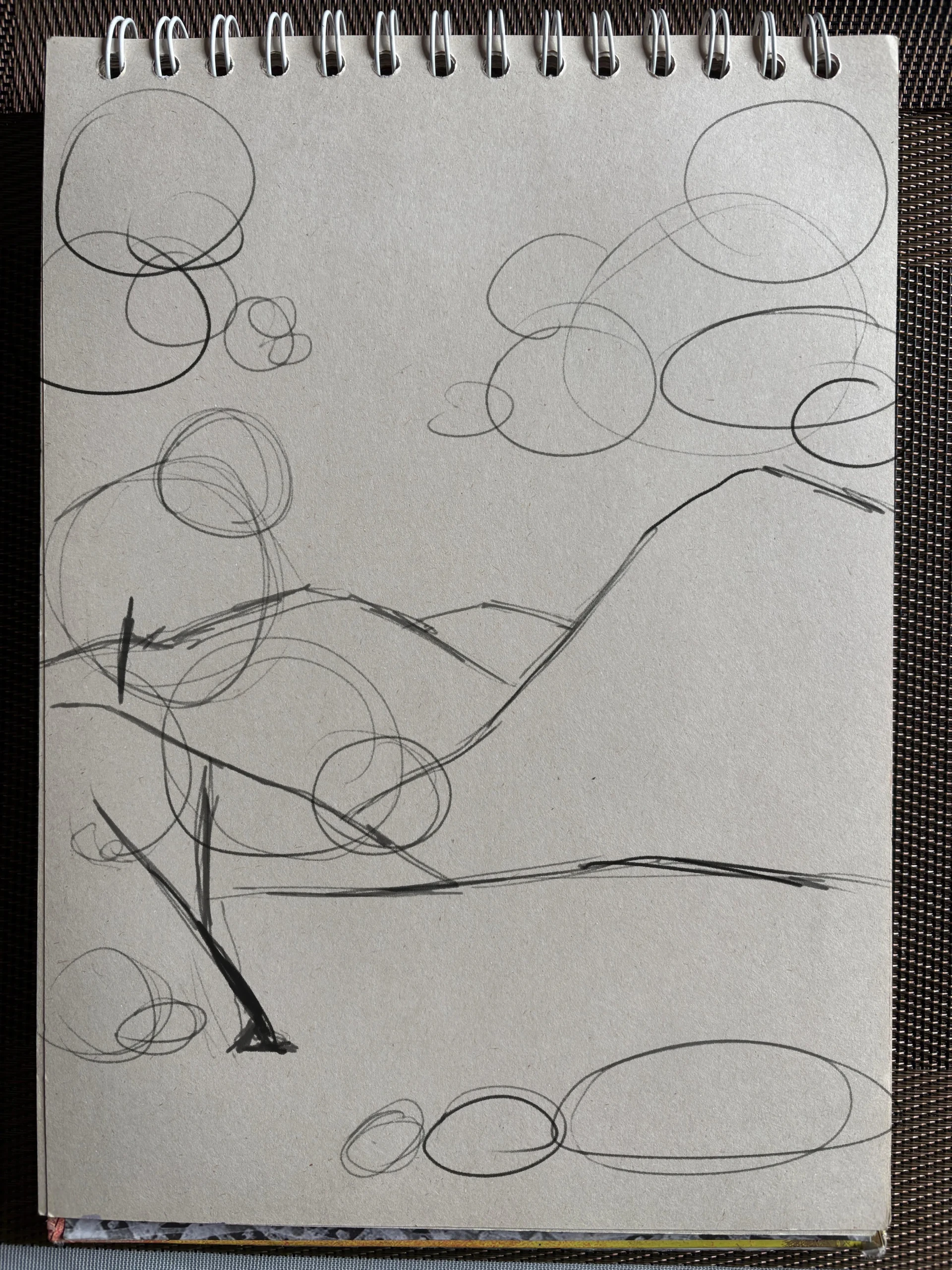
Draw the features of the foreground
On the lower part of the sheet, add a few decorative elements, seeking visual balance; sketch a tree and some rocks with simple circles.
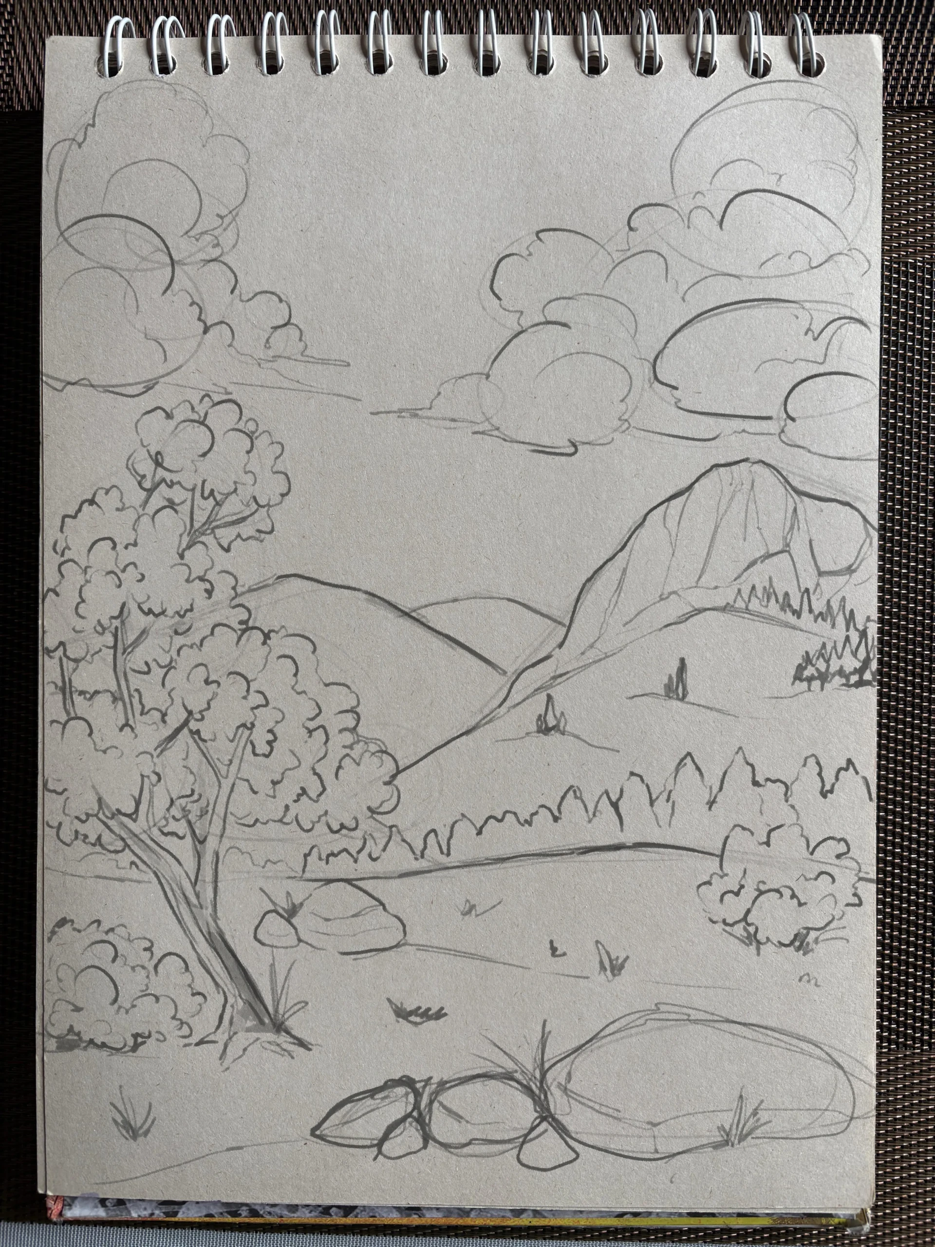
Next, draw the outlines: straight and irregular lines for the wood, wavy lines for the foliage, long curves for the rocks.
In the background, wavy lines are enough to suggest a distant forest where the trees blend into a single mass of green. The mountains in the far distance, on the other hand, remain without any visible detail.
Work on the grayscale contrasts
To better understand the dynamics of contrasts, start with black and white. Position the sun between the mountains to simulate a sunrise; this will enhance the overall contrast of the scene.
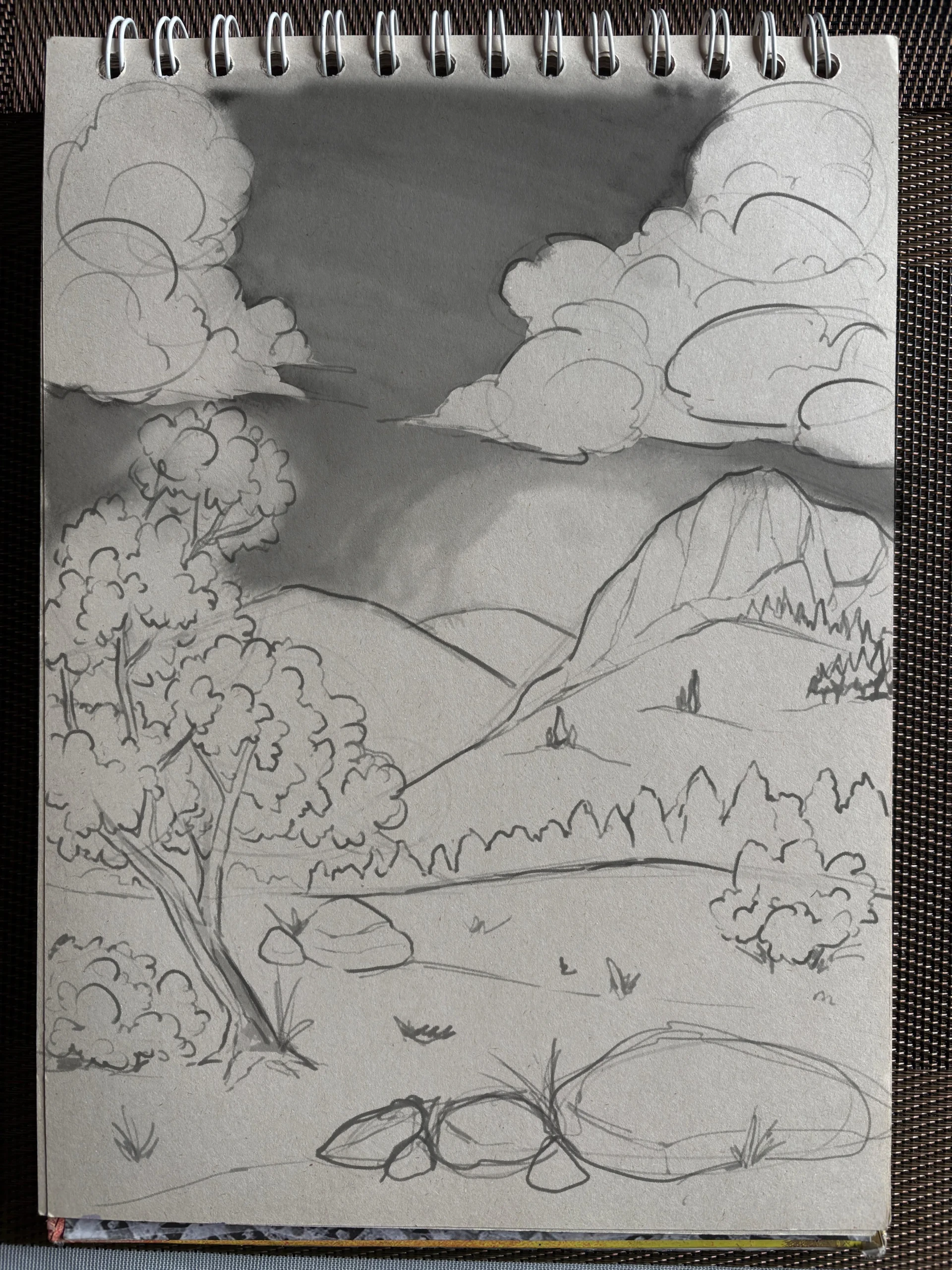
In the foreground, make full use of the entire range of grays, from the brightest whites to the deepest blacks.
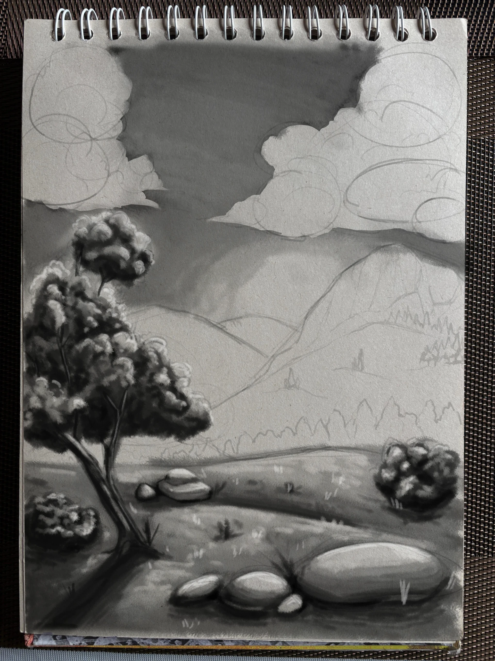
For the middle ground, limit the color palette: a dark gray for the forest, a lighter gray for the rest of the mountain, without using extreme colors.
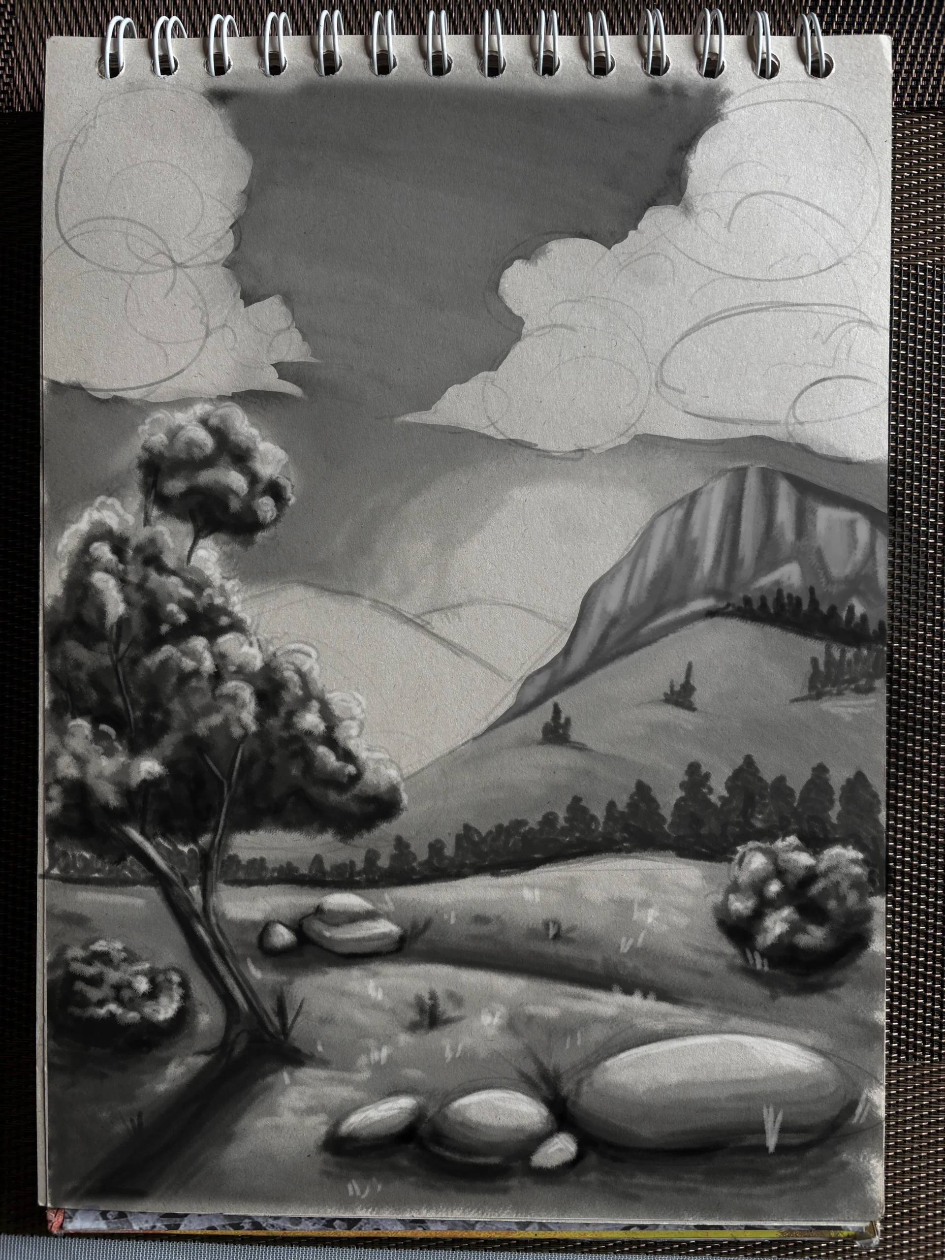
The mountain in the background will be a medium gray, slightly darker than the sky, influenced by the fading light.
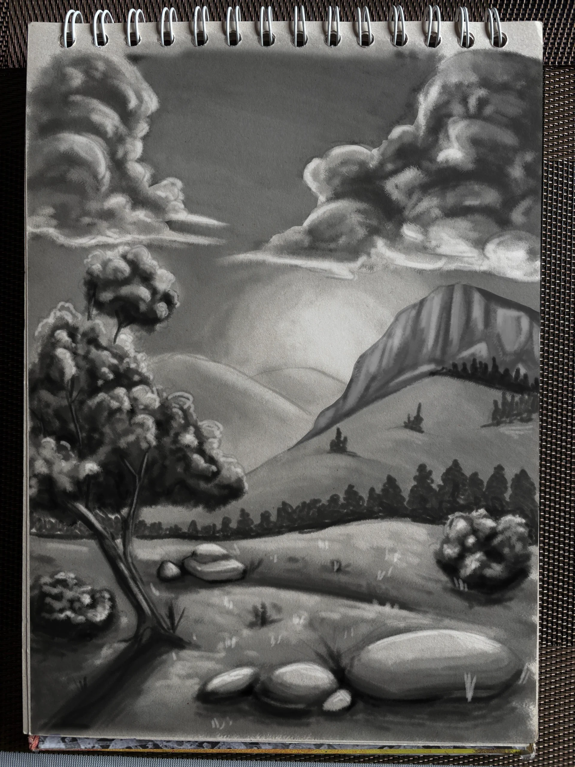
Add color
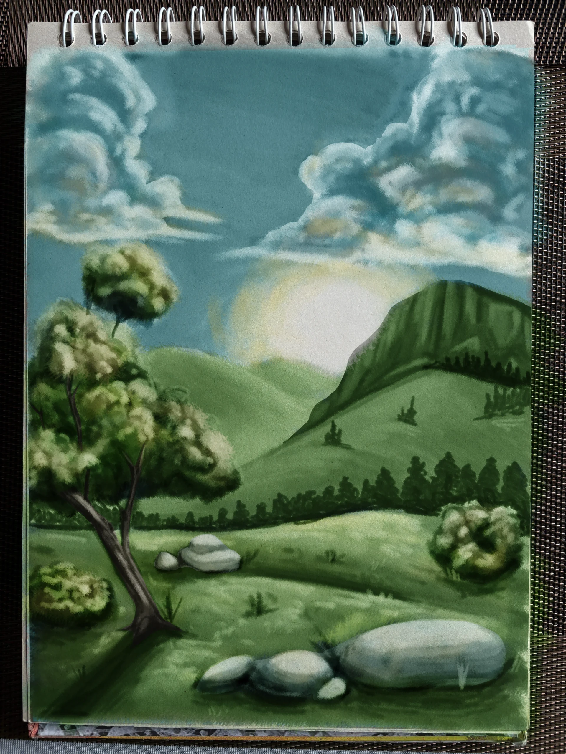
Now that the contrasts have been established, apply a color base that follows the same approach: saturated and bright colors in the foreground, with increasingly muted colors towards the background.
 :
:
Apply the glaze to finish your drawing
There remains one essential detail: distance is not only a matter of saturation; it is also about temperature. Apply a soft, almost transparent layer of blue to the middle ground, then one or two more layers to the most distant mountains. This final step completes the effect of atmospheric perspective.
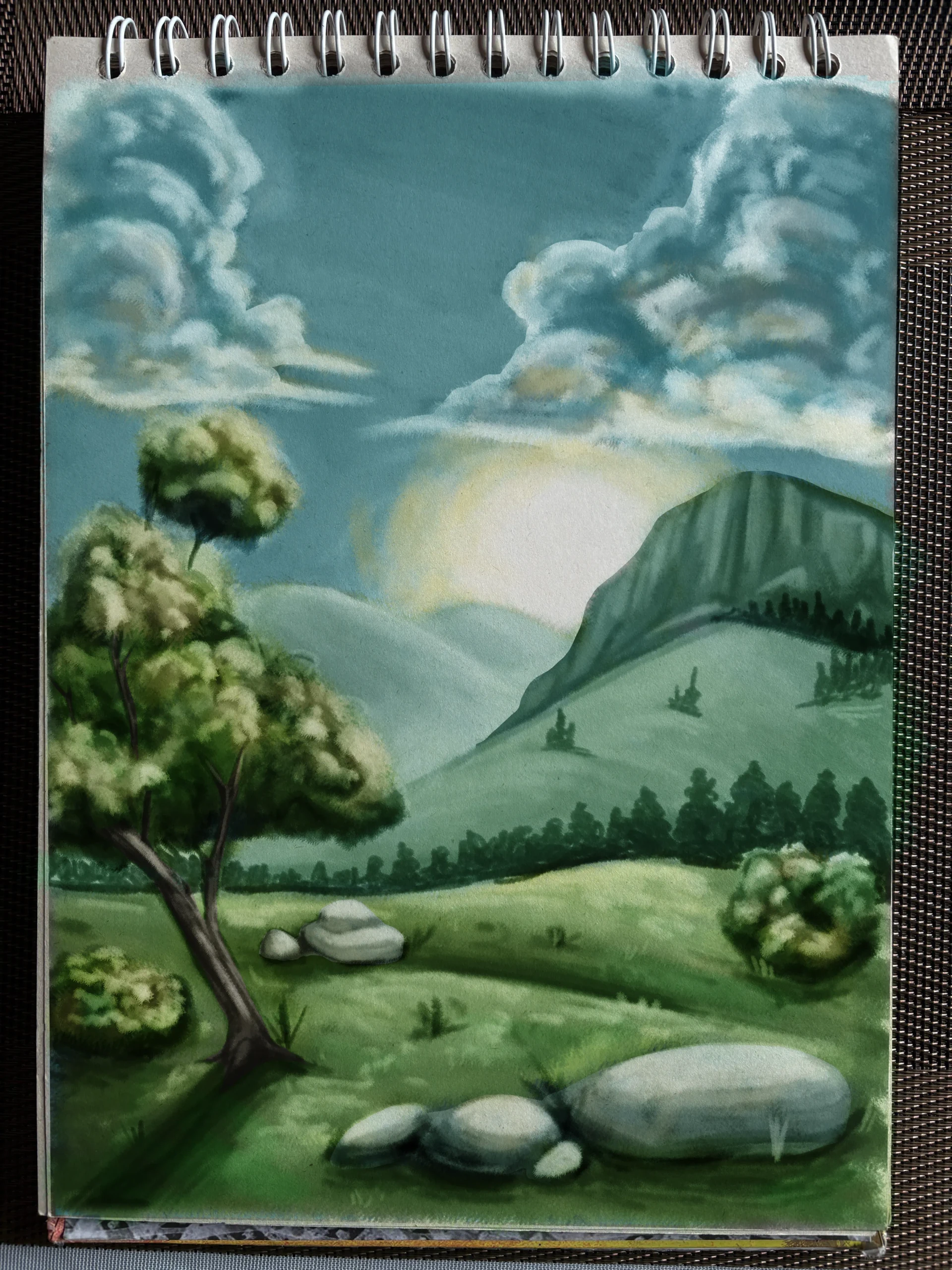
Atmospheric perspective is one of those techniques that changes everything once you truly understand it. It’s everywhere in nature, and yet we easily forget about it when we’re working on our paintings. By keeping these three rules in mind - contrast, detail, and temperature - you now have all the tools to give depth to your landscapes.
Discussion
No comments yet.