How to Draw a Knight
The influence of the Middle Ages is undeniable. This period of history gave birth to a universe that still generates fascination and wonder today. In popular culture, it is enough just to mention the era of imposing castles, legendary dragons, and heroic knights ready to give their lives for noble princesses, as well as all the fantastic imagination stemming from this time.
Today, I encourage you to explore a world rich in possibilities, by drawing an emblematic symbol of the Middle Ages: the knight, recognizable by his shining armor, his mastery of the sword, the shield, and other weapons. Follow this step-by-step tutorial to learn how to draw a knight.
Draw a knight step by step
Before we start, it is essential to understand the role of the knight. Far more than just dragon fighters or tournament participants, knights are primarily associated with protection, mainly in the service of the crown. Therefore, we need an imposing silhouette, one that expresses power and authority.
Draw the sketch
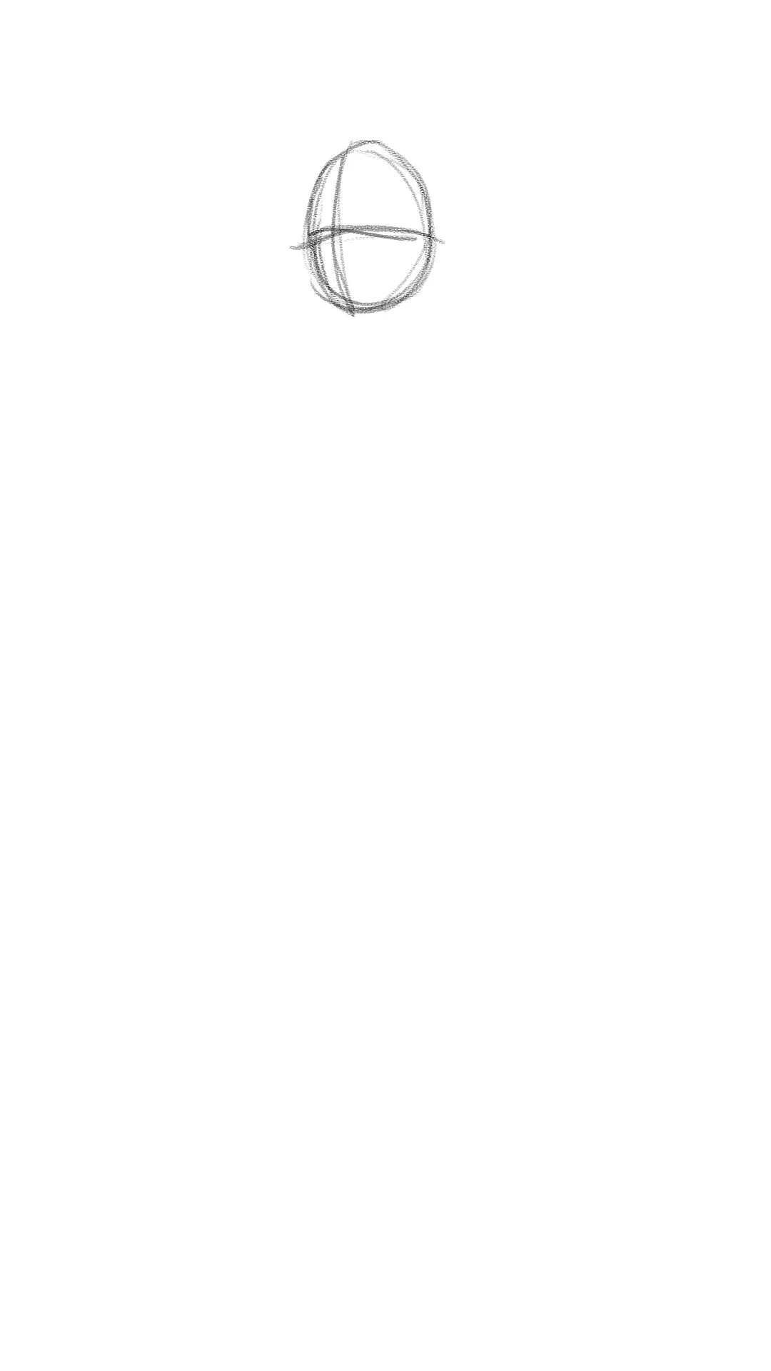
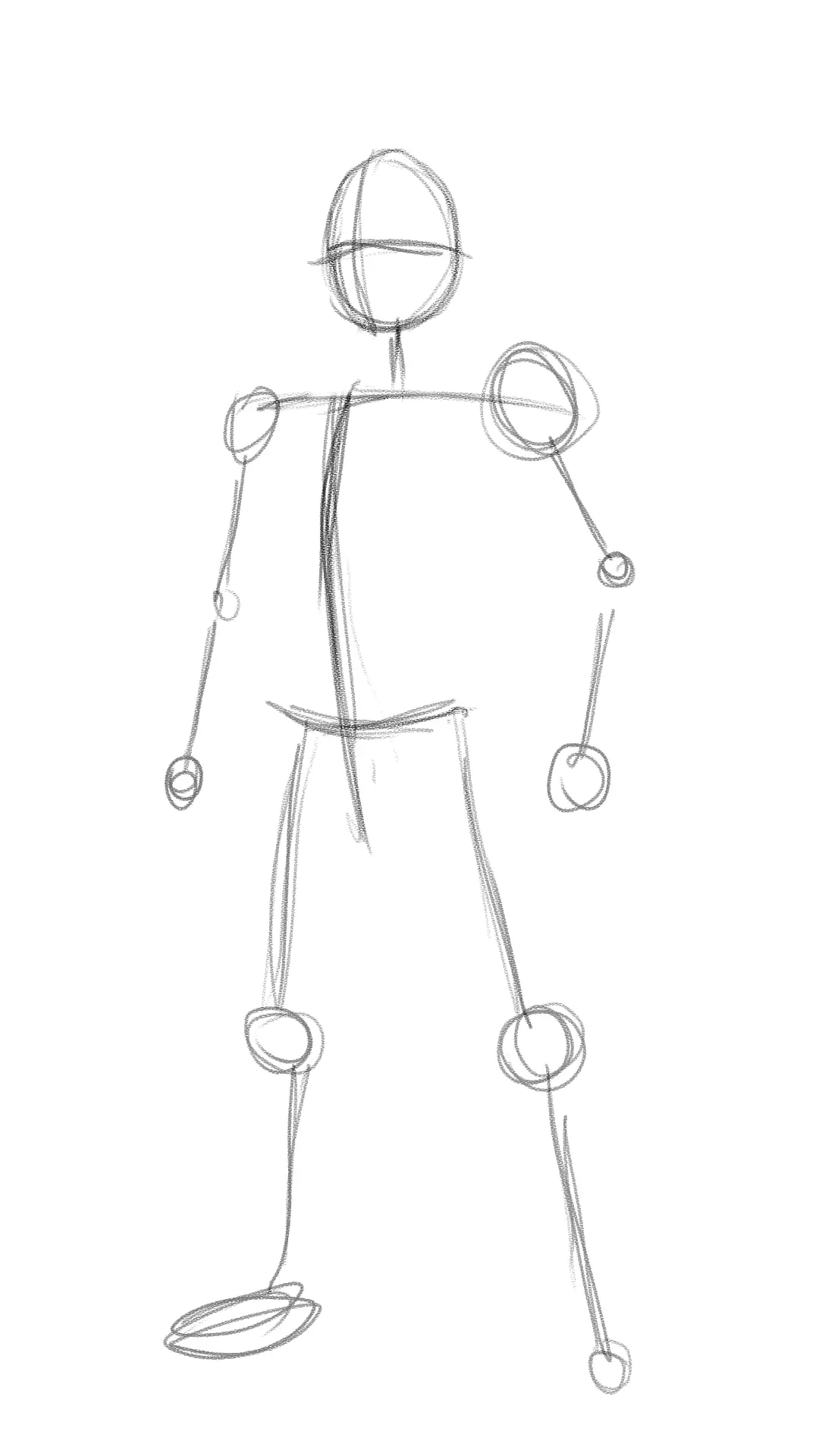
Let's start with the head. There's no need to go into detail: it will be covered by a helmet. However, it is important to define the direction of the gaze, here, in three-quarter view, a perspective that will be maintained for the entire body.
Then draw the character's line of action, representing an upright, proud posture, with a wide-open chest. Add a transverse line across the chest to mark the width of the shoulders, and do the same for the waist.
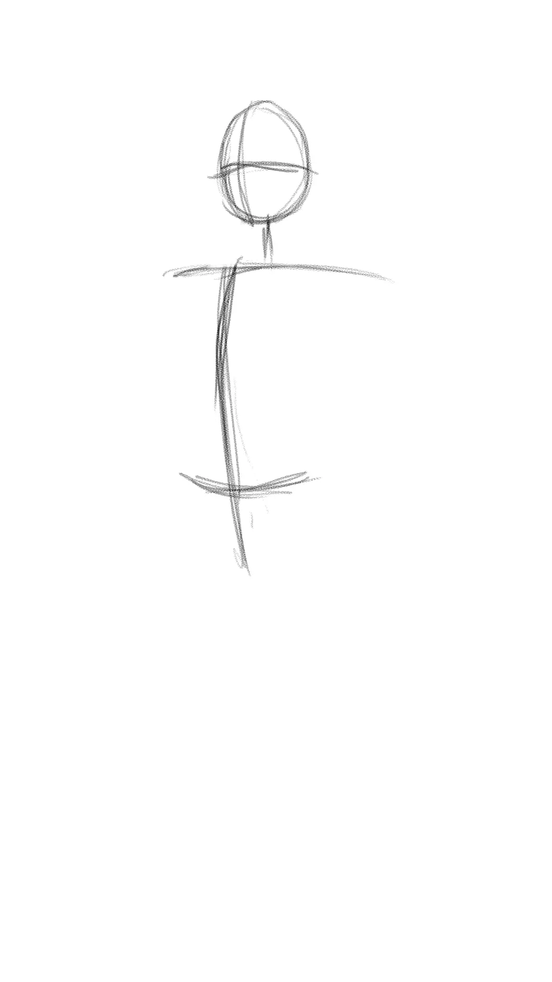
From these references, position the body joints. Here, there is no dynamic posture: aim for a neutral but powerful position, which visually conveys the character's robustness.
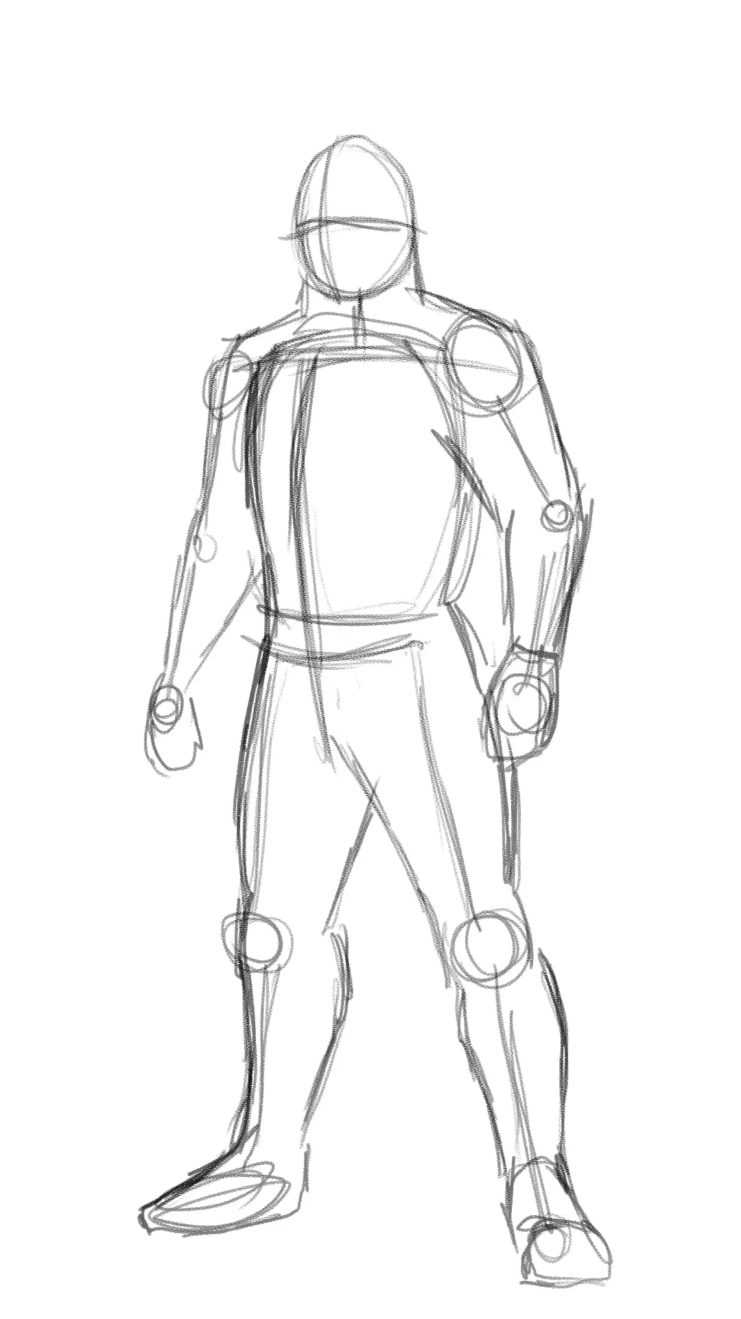
Once the basic outline has been established, you can move on to drawing the body parts. Give him broad shoulders, muscular arms, a thick neck resting on a massive torso, and of course, sturdy legs capable of supporting the weight of the body and armor.
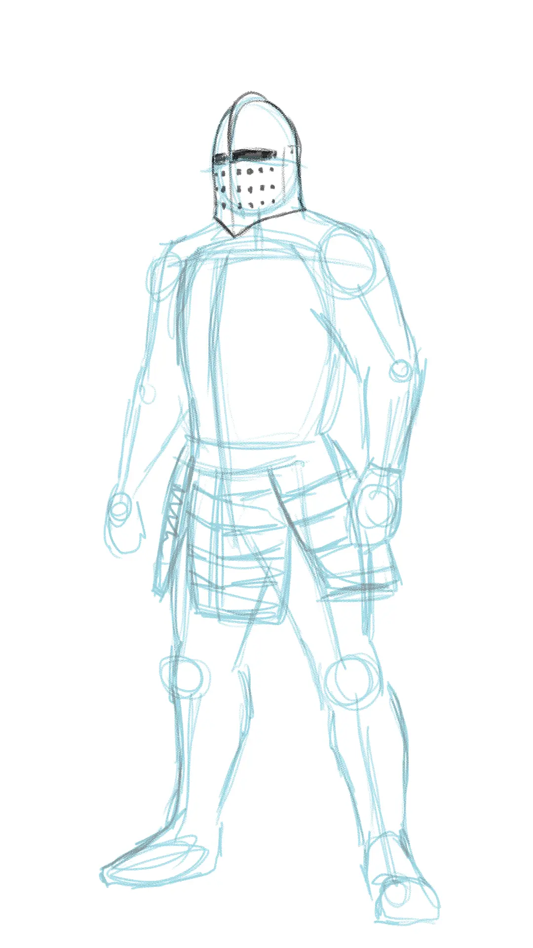
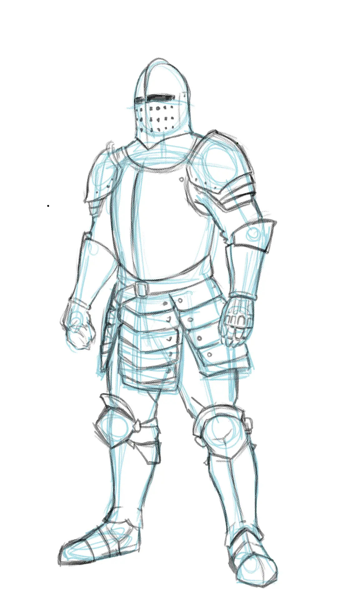
Add the elements of a knight's armor
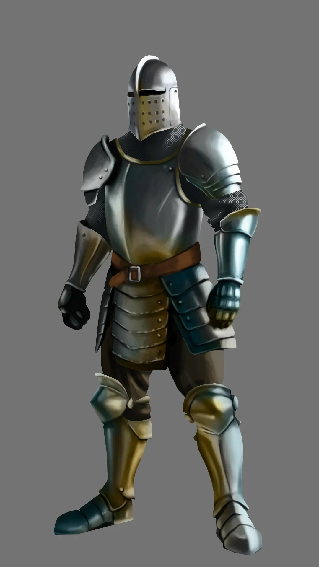
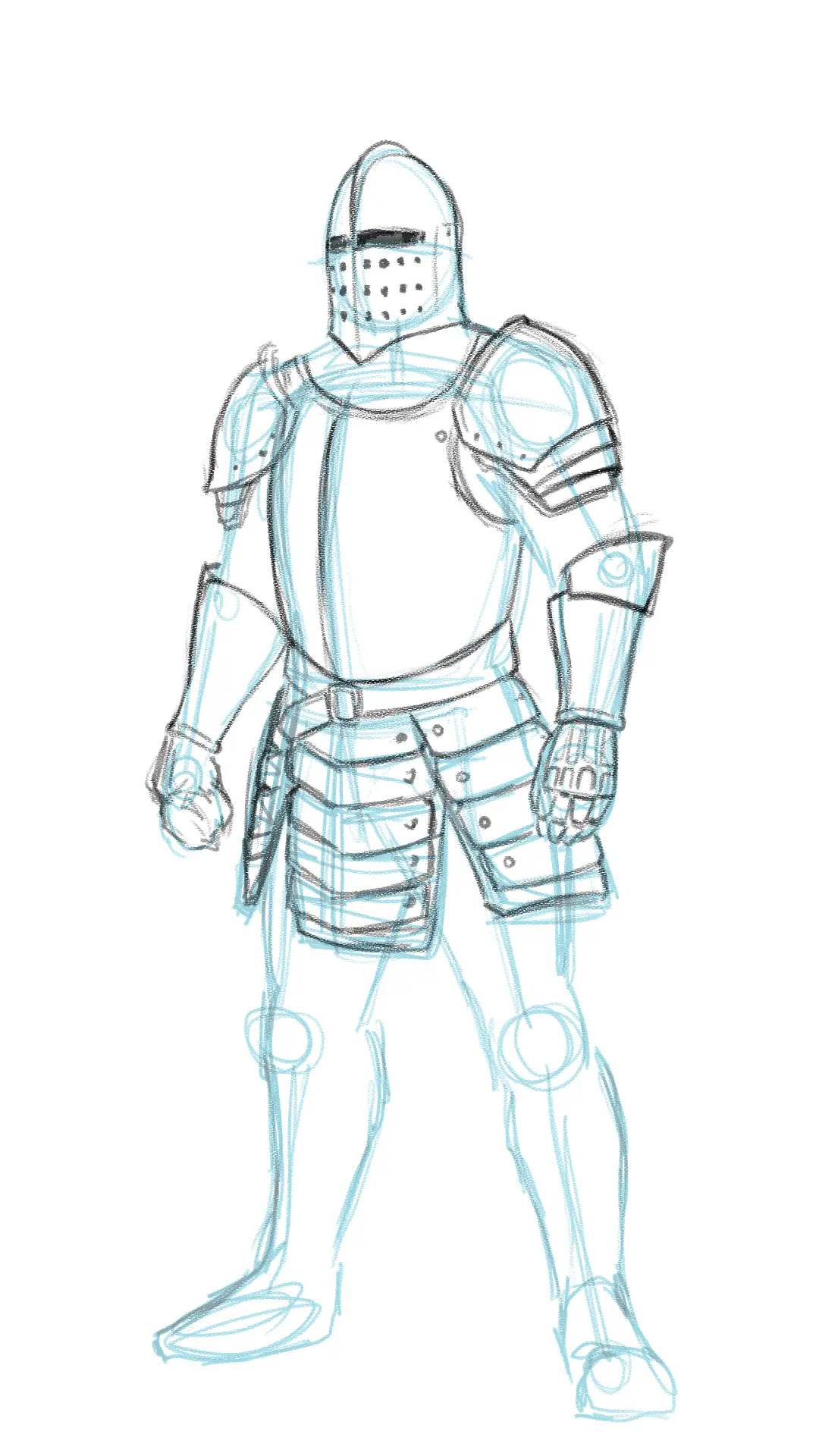
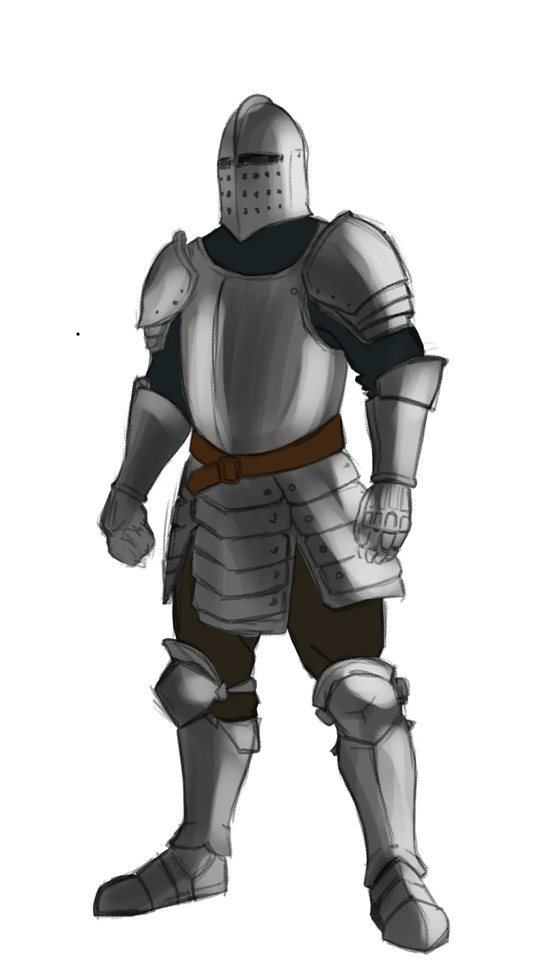
Helmet: We are now moving on to inking. Let's start with the helmet: a metal piece covering the head and neck, leaving only a few slits for the eyes and holes for breathing. Add a slight crest for ornamentation.
Shoulder pads and gauntlets: To protect the arms, draw massive shoulder pads, made of overlapping plates. At the top, add a small fold and some rivets. For the gauntlets, cover the forearm with a plate extended by a movable piece at the elbow. The gloves themselves will be fully articulated.

Breastplate: The breastplate is a simple piece: a rigid shell with a central fold and wide openings for the head and arms.
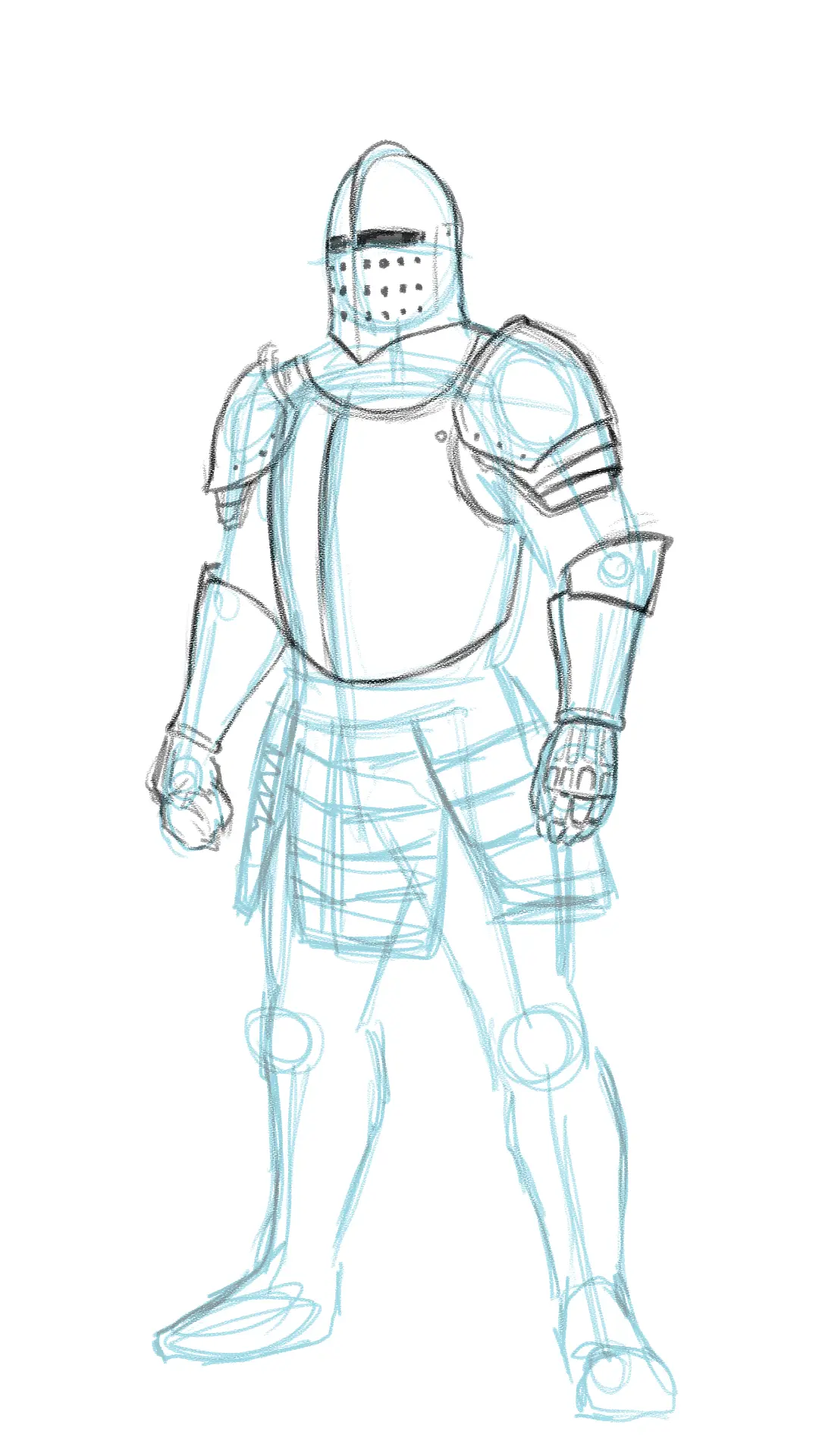
Armor skirt: This is the part hanging from the belt. Draw three rows of hanging metal plates, attached by screws on the sides.
Knee pads, greaves, and sabatons: The knee pads will be slightly pointed, fastened to the legs with straps. Then draw the greaves to protect the calves, and finish with the metallic shoes, divided into segments.
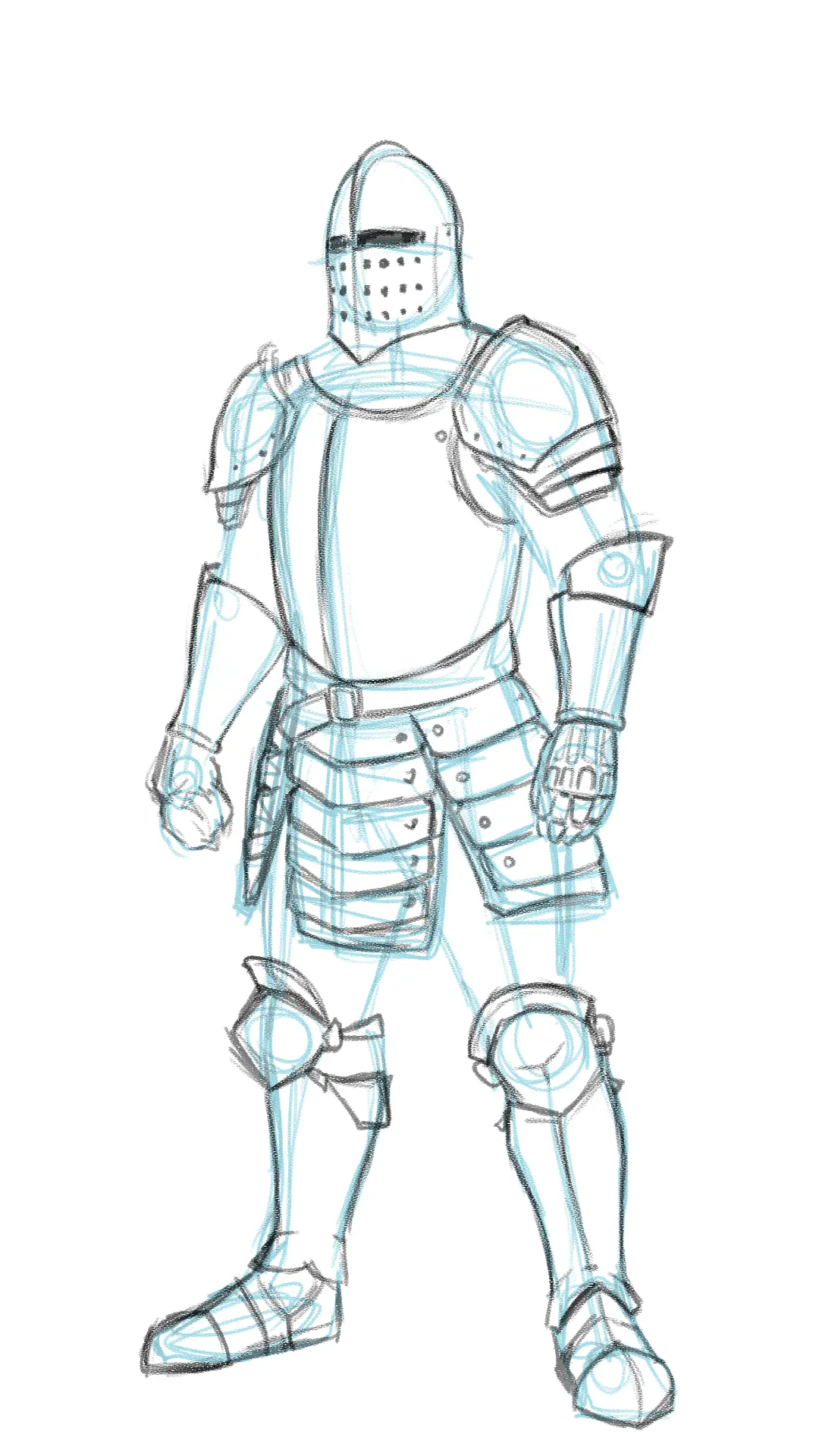
Chainmail, pants, and straps: Finally, add the garments worn under the armor, usually chainmail with its characteristic folds, as well as pants and leather straps.
Add color to the drawing
To add color to our character, we must consider the material that makes up most of his outfit. Metal and its shiny appearance often represent a real challenge for artists, and this example is perfect to give you some tips on how to depict it.
Base color: Since metal is highly reflective, it would be incorrect to use a simple neutral gray. It is better to integrate the colors of the environment. Let's imagine here a setting with earthy and blue tones, used in muted shades to ensure harmony.
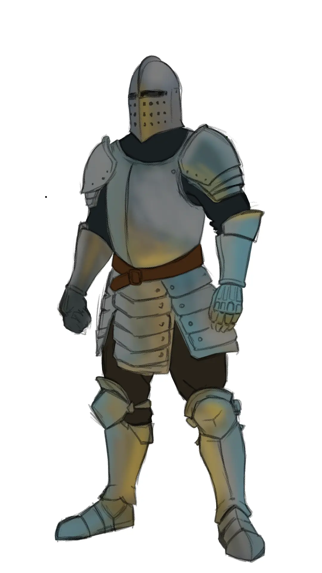
When depicting areas exposed to light, consider that metal requires strong contrasts: bright lights against deep shadows. This is the first rule to follow for painting metallic surfaces.
Starting from this principle, begin by adding color to the helmet. Keep the crest almost white, and create smooth transitions from dark gray to white. Also incorporate bright highlights on the edges and the back.
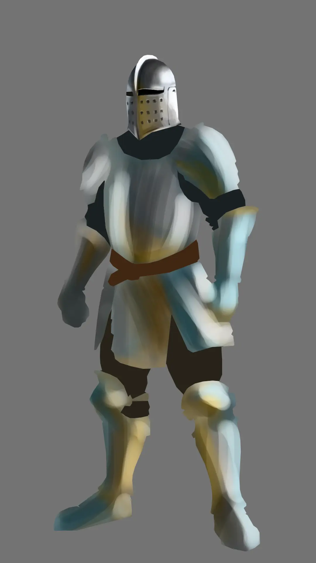
The left arm: Let's move on to the arms. The one exposed to light requires sharp light outlines almost along its entire length, as well as slight highlights on the forearm. The details of the hand, however, naturally blend into the shadows.
The right arm: This arm, which is less exposed, presents softer contrasts: there is no pure white here. Shadows dominate, and details become almost invisible.
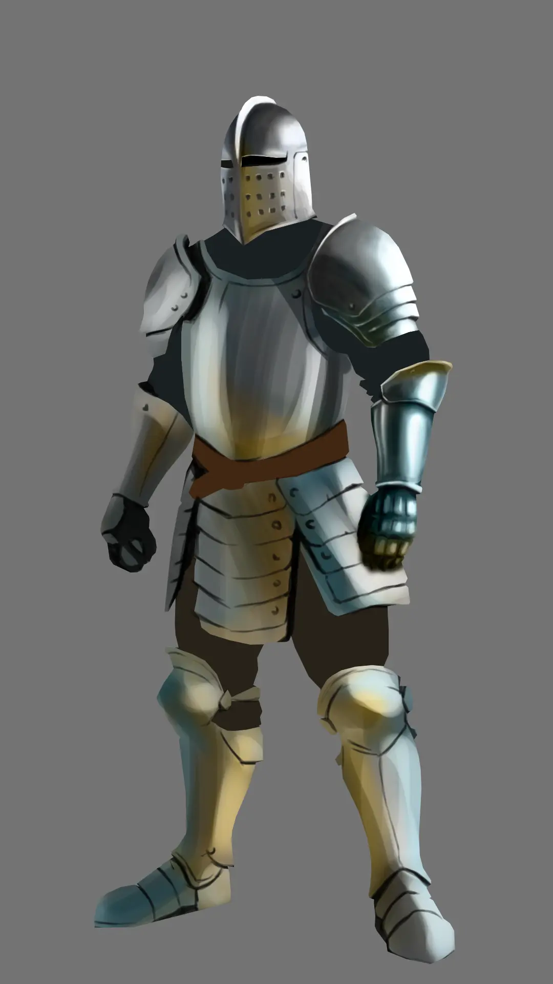
The breastplate: Larger than the previous elements, the breastplate allows for longer and smoother transitions. The light areas are subtle. You can add golden borders around the collar and arms.
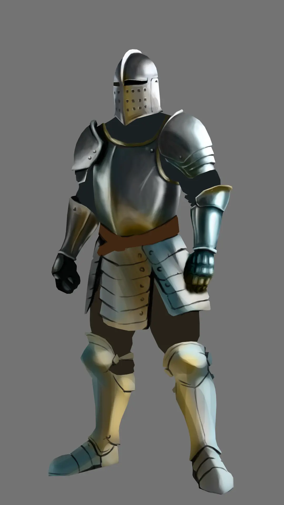
Armor skirt: For this piece, combine the techniques seen on the arms: light on the edges, darker right part, and some details deliberately lost in the shadows.

From the knees to the feet: This is where the most reflections will be found, coming both from the main source and the ground. Add diffuse bright spots, placed almost randomly, following the natural reflections.
Other materials: Fortunately, not everything is metal. For chainmail, apply light in the conventional manner, with regular highlights. For the pants and straps, made of leather, the reflection is more muted: apply soft shading, concentrated in the folds and contact areas.

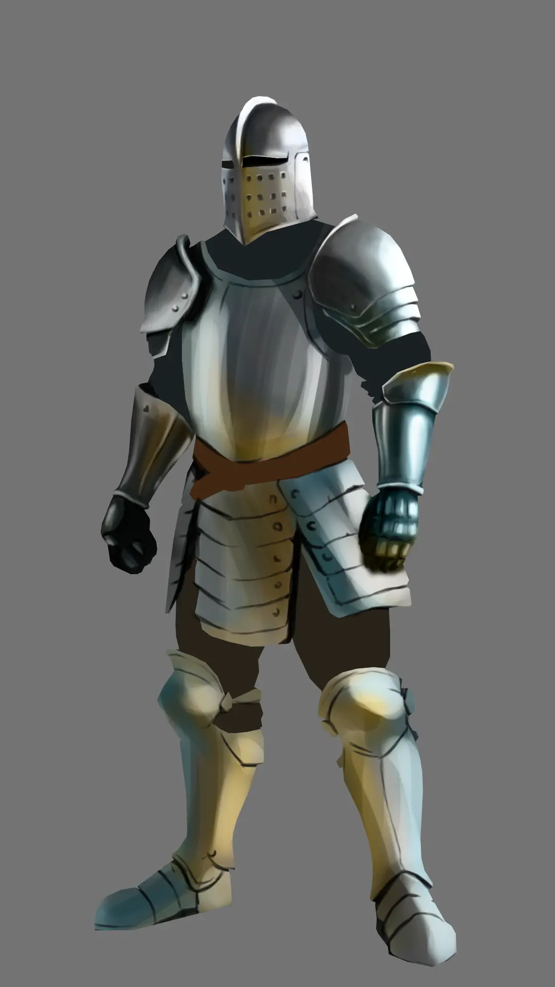
And there you have it, mission accomplished! This tutorial wasn't easy, a real battle, but the results are worth it. I encourage you to put into practice all the concepts covered here, especially those related to depicting light on metallic materials.
In summary: strong contrasts (deep shadows and almost white light spots), more subtle secondary light areas, contours outlined by light, uneven shading, areas deliberately lost in the shadows.
Discussion
Magnificent Bryam, he is alive!
what is the technique used for coloring?
Reinette
Hello Reinette!
For this demonstration, I used digital painting, but the mechanics are equivalent to those of oil painting. You could try to recreate this effect with watercolor by layering and taking advantage of the "wet on wet" technique.
Thank you Bryam, as soon as I have some time I will try
Good day
Wonderful result. Thank you for sharing and for the feedback 🙏😀
Thank you so much for this little tutorial, I love it 😍
Tutorial full of interesting tips. A big thank you and kudos 👍 Bryan 🙏