How to Draw with Oil Pastels
Today, we will discuss the subject of oil pastels. The technique of oil pastels is fairly versatile, and resembles both drawing and painting. I will teach you how to use them in this article.
Introduction to oil pastels
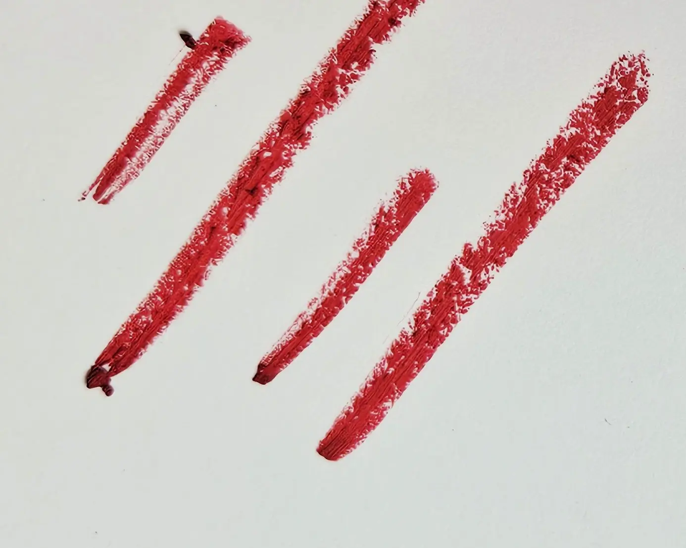
Pastels are divided into two categories: dry pastels and oil pastels. Oil pastels have a very creamy, opaque texture, and can be used like oil paint. The colors are generally very intense and pigmented.
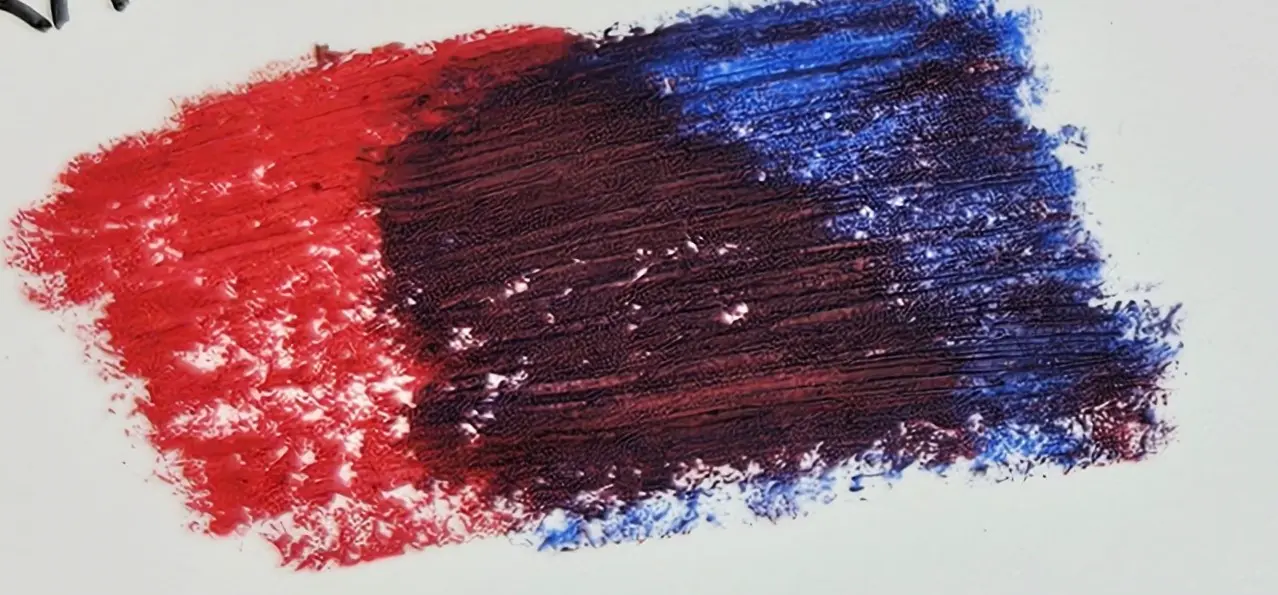
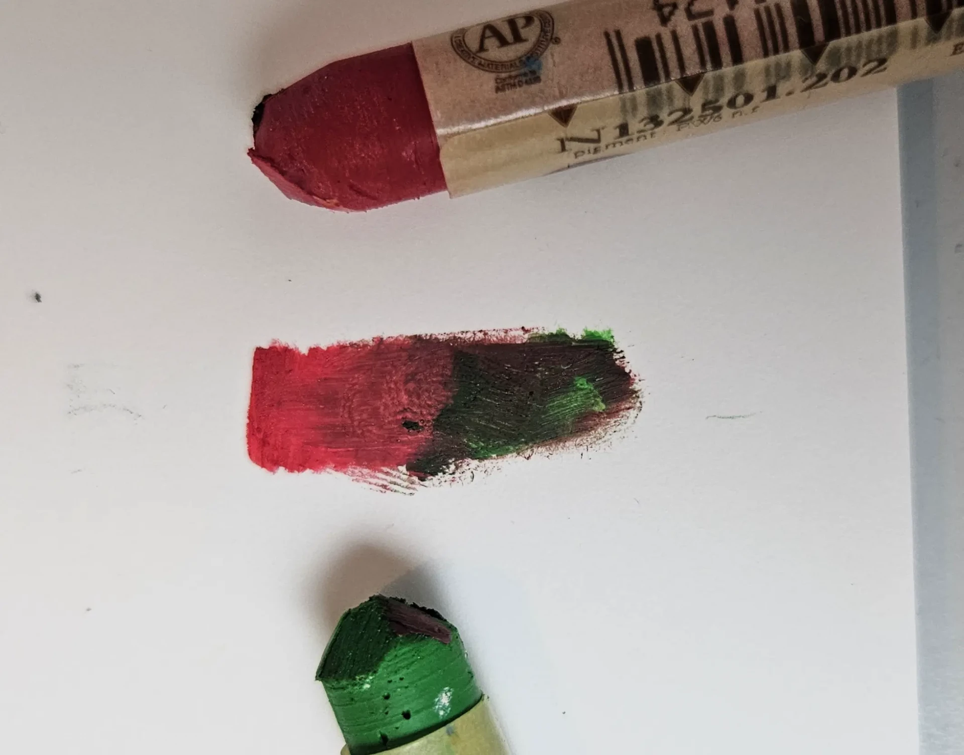
However, they do not mix very well, and the layers cannot be superimposed infinitely. Here we take the example of 2 quite distant colors. The "direct" mix is really not very nice, which is why in such cases it is necessary to use "indirect" mixes, which we will look at later. We also see in the center that after 2 layers, we quickly reach saturation.
It is also difficult to erase or correct a drawing made with oil pastels. No eraser can truly erase oil pastel without leaving any trace. However, you can use a kneaded eraser that will allow you to erase on the surface.
With this kind of medium, you can use solvents like turpentine if you want to create effects similar to oil painting and mix the colors more easily with each other.
Material
Oil pastels adhere to a wide variety of surfaces: paper, canvas, wood, ceramics, glass.
Level of detail
Oil pastels are generally in stick form, which does not make them very precise. Pencil formats exist, but they are much less creamy and are often of lower quality than sticks. They are therefore more suited to large compositions than intricate lines.
Equipment
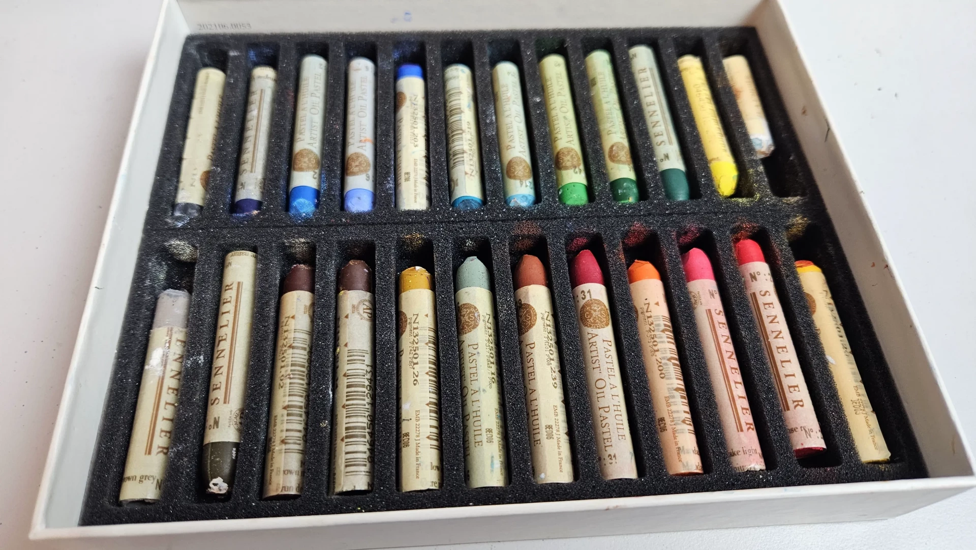
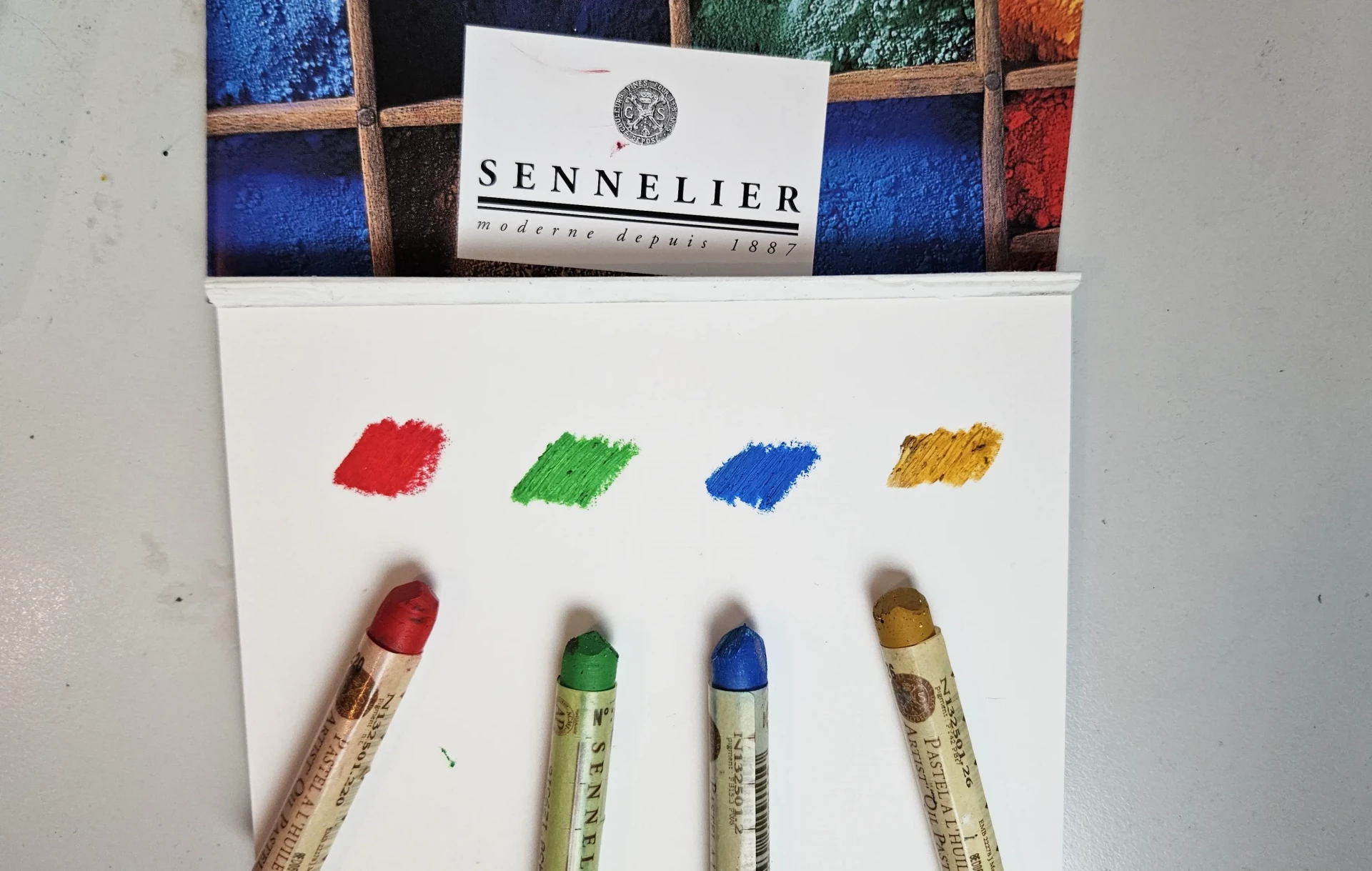
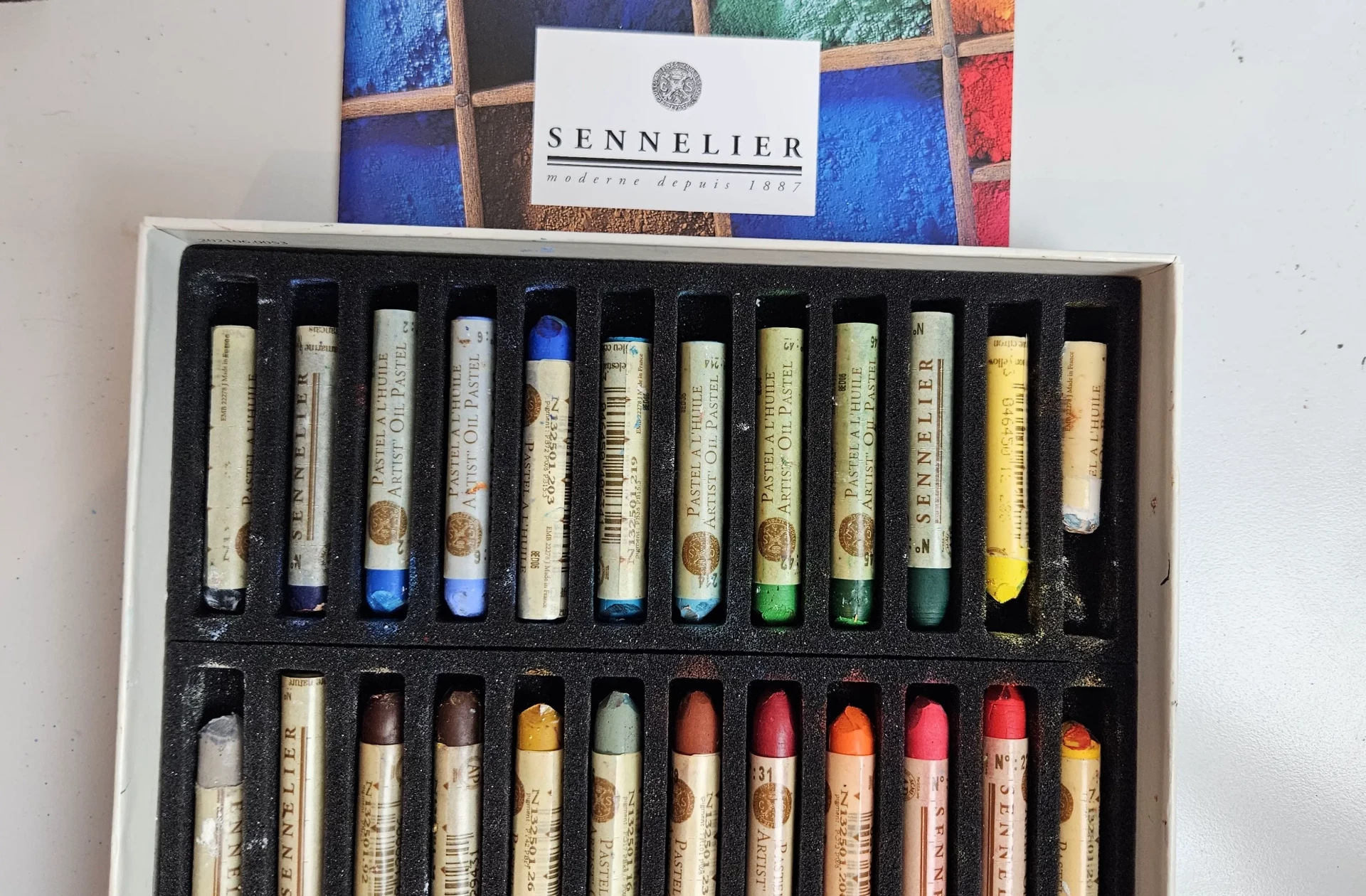
In this article, I will be using Sennelier oil pastels. They are known for their creamy texture and strong pigmentation. The most common ones are the small sticks. However, they are quite expensive. If you wish to start with a more affordable range, and of fairly good quality, I recommend Faber-Castell or Staedtler oil pastels. However, they are much less creamy and blends are not as smooth.
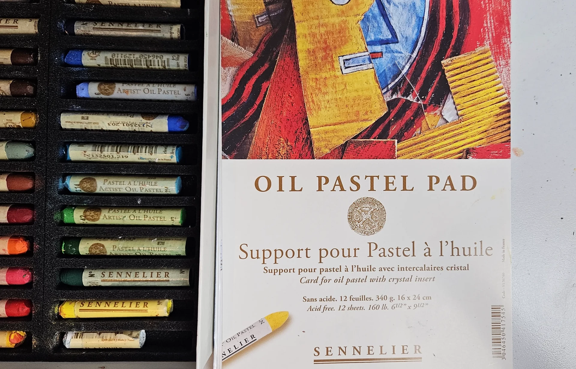
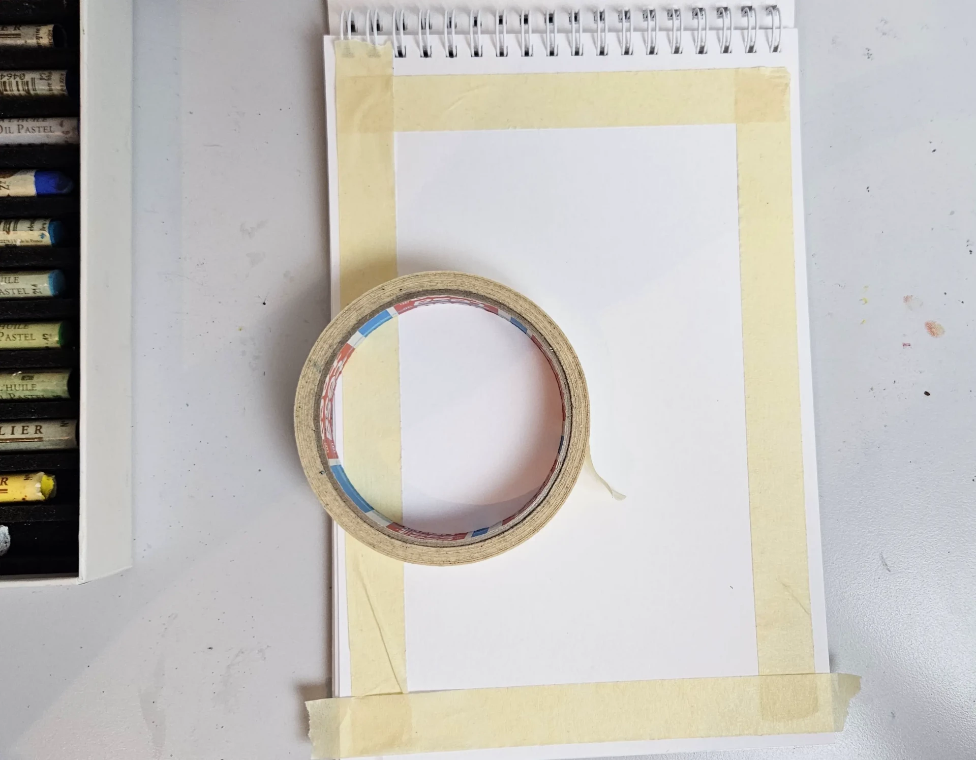
We can also use the "Oil Pastel Pad". This Sennelier spiral block is specially designed for the use of oil pastels. This block consists of 12 sheets meticulously separated by crystal interleaves. This protects the paper and the drawing.
This paper has a texture of 340g/m² and is made acid-free. However, the price is quite expensive... 20 euros for 12 sheets. If you are looking for more versatile paper, you can opt for the Paint On multi-technique paper. In fact, it's on this type of paper that I will be conducting my tests.
Grading and blending techniques with oil pastels
Blending with a finger or stump
It's one of the methods I use the most. Simply apply a color to your sheet and blend it with your finger, a brush, or a blending tool.
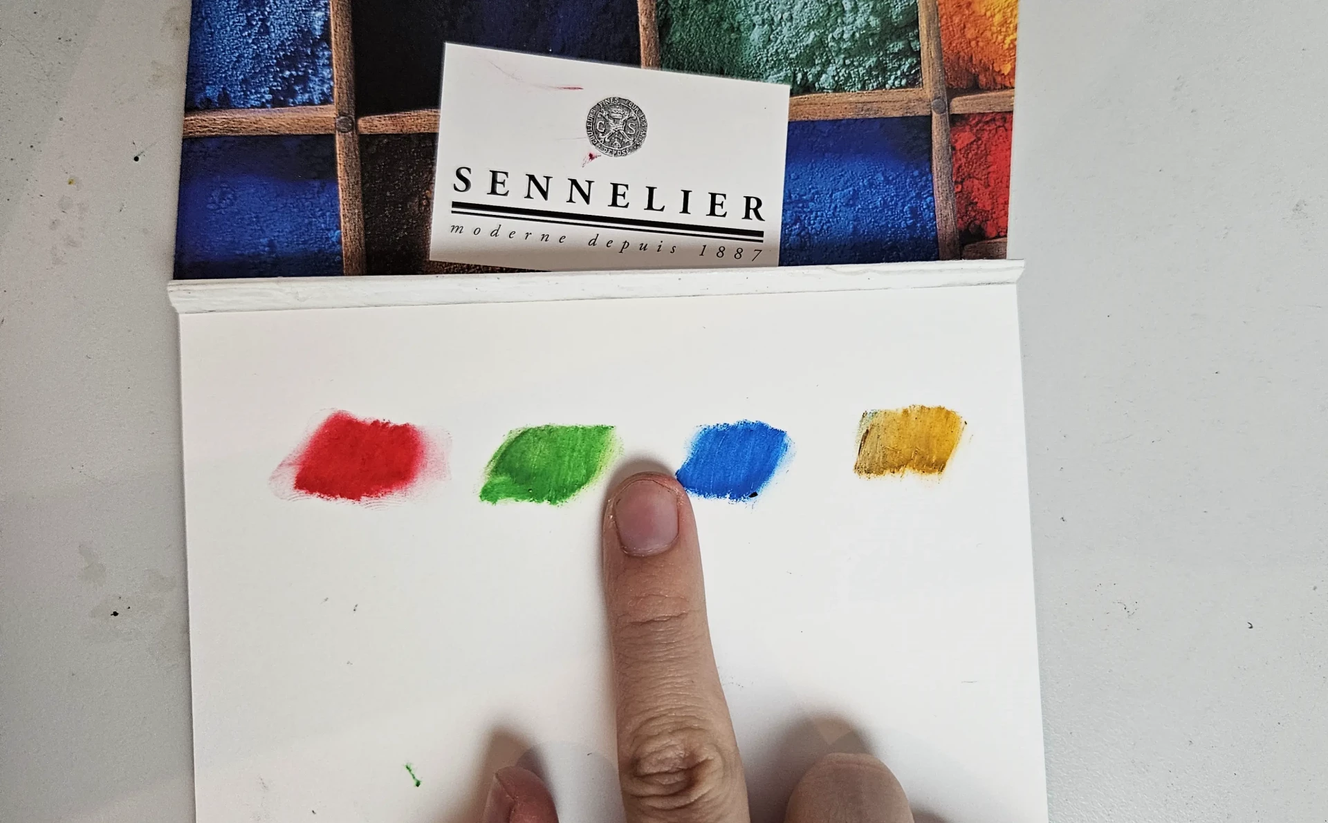
To mix two colors in this way, you just need to draw two colors side by side, then use your finger, a tissue, or a paper stump to smooth the transition and "blend" the colors together. I call this method the "indirect" blend.
You can make gentle circular or linear movements (depending on the desired effect) for example. This method is widely used in landscapes to create smooth transitions in the sky.
Color overlay
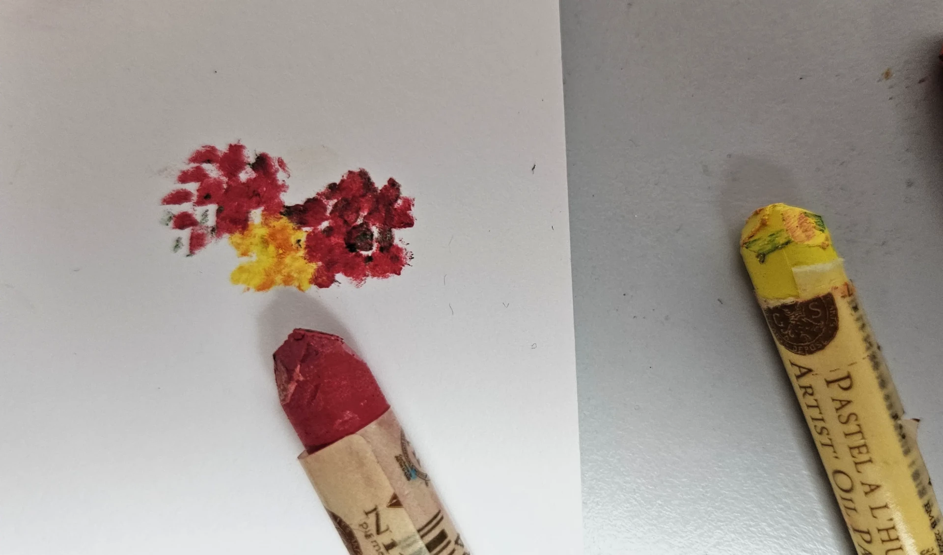
You can also overlay colors for blends (the number of layers not unlimited). The goal is to apply the first color, for example the darkest color. And apply the second color over part of the first color.
A new color will then form, and you can also create gradients in this way. I call this method the "direct" mix.
Avoid overlapping too many incompatible colors together, as the colors will become "mold color" and will mix very poorly. You should always mix colors that are quite close on the color wheel (example: blue & violet, yellow - orange & red, etc). Or use the "indirect" mixing method.
Dilution with turpentine essence
When I was starting out, I used this method a lot because it allows for super fluid gradients and color washes. You no longer see the traces, and you can color without worrying about your mixes. You simply need to use a brush soaked in turpentine to "paint" on your oil pastel directly on the paper. This creates an effect quite similar to oil painting.
Personally, I am not a fan of this method because I find it dulls the drawing a bit. You shouldn't overdo it; you should dilute very lightly to maintain the texture of the pastel.
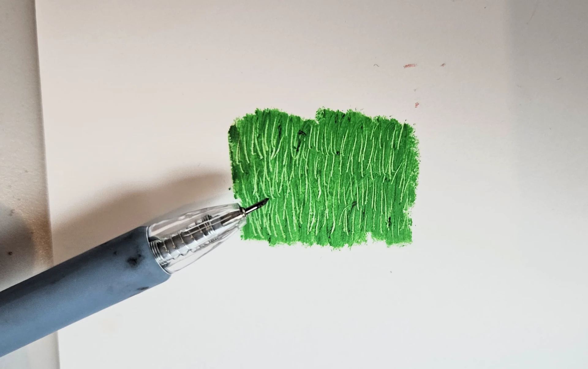
Scratching
After applying one or more layers of oil pastels, you can scrape the surface with a point, like a toothpick, a cutter, a palette knife, etc. This method can, for example, be used to create a texture of grass, bark, or a rocky texture. It can even be used to create fur and hair.
Pointillism
The method consists of placing small touches of color side by side without mixing them too much.
I rarely use this technique, but it gives a very interesting impressionist effect, somewhat in the style of Claude Monet. You have to imagine this style on a larger canvas.
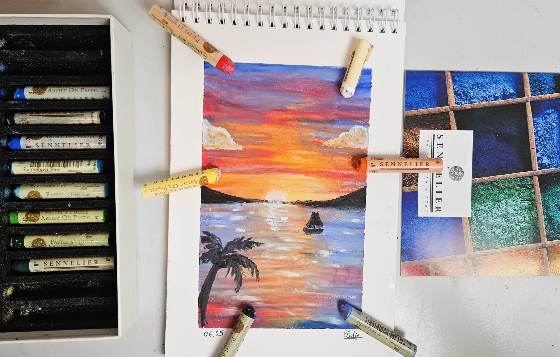
Drawing a sunset with oil pastels
I admit that most of the time, I create landscapes with oil pastels. It's ideal for this type of material. You don't need too much detail, and the gradients are very soft. The sunset over the sea is the ideal landscape to draw for beginners, because it's easy, quick, and very adaptable. You have complete freedom.
For this drawing, I am using the Oil Pastel Pad paper that I mentioned earlier. It will enable us to absorb colors well and make color blending easier.
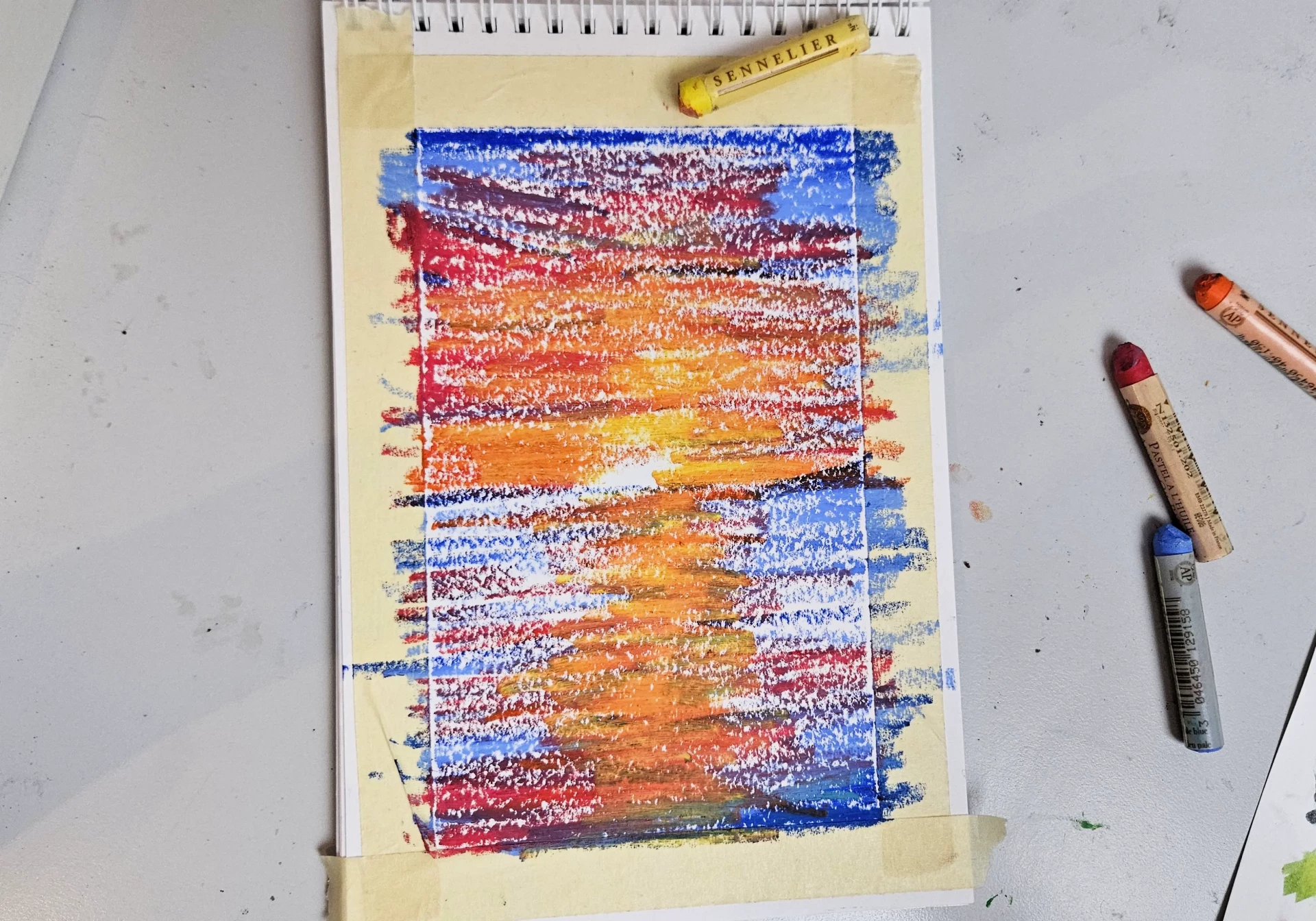
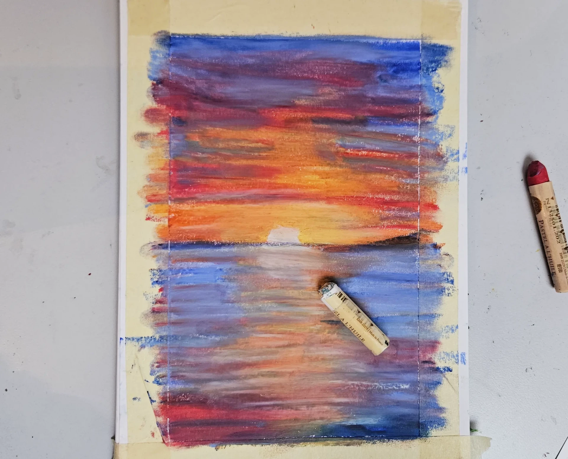
We start by protecting the drawing with masking tape. This will help us keep clean edges, especially with oil pastels which are very messy.
In general, I start with the dark color, I outline all the dark areas of my drawing. Here we take a dark blue color to mark the horizon line, outline some waves, and create a bit of sky.
The sunset will tend to have warm colors in the center of the sheet, where the sun is often located in drawings, and cooler colors on the sides, where the sun does not shine, revealing only the colors of the sky.
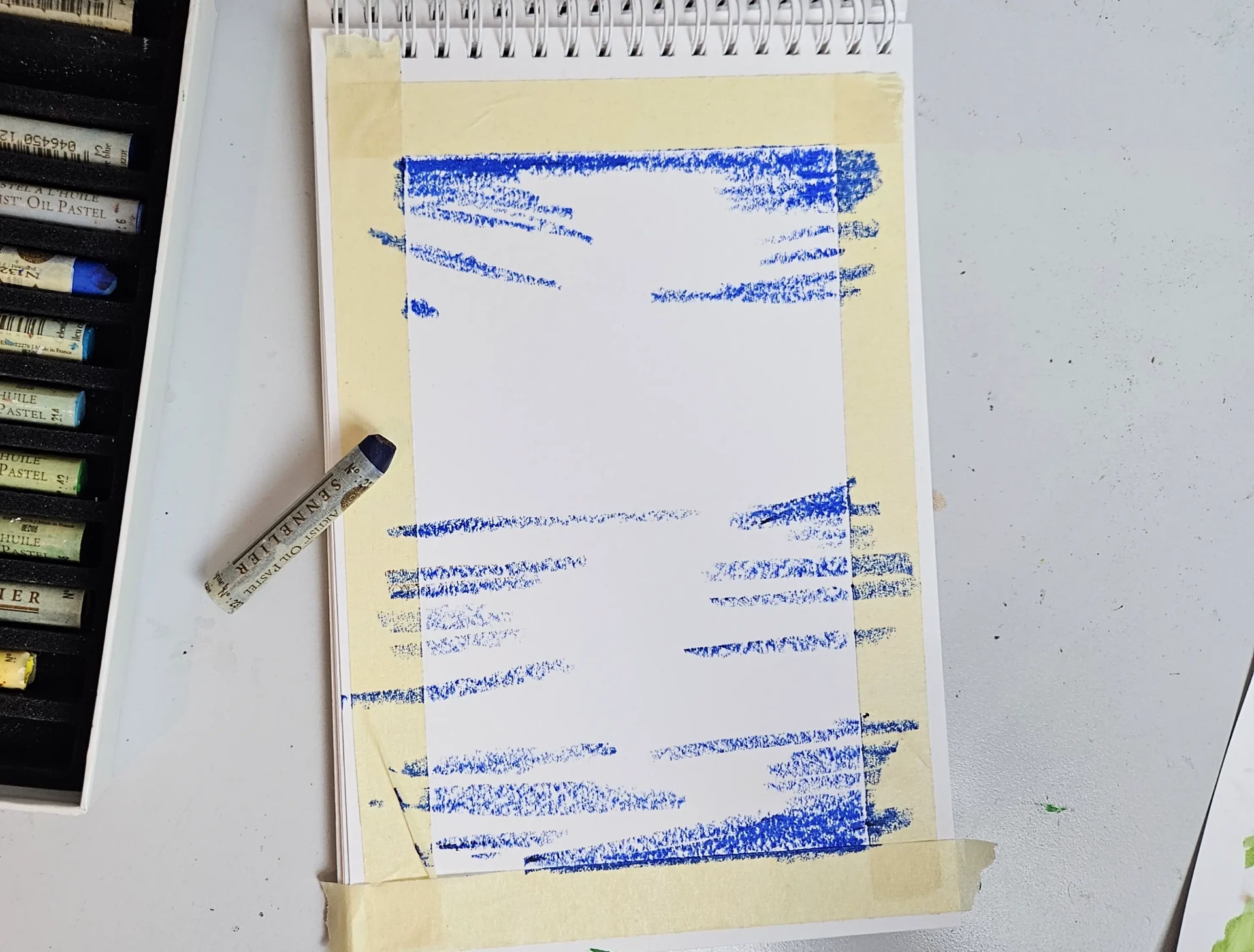
I then use a slightly lighter blue to go over my dark blue and add horizontal lines. The horizontal lines are important because they simulate both the volumes of the sky (partly the clouds) and the movements of the sea and waves.
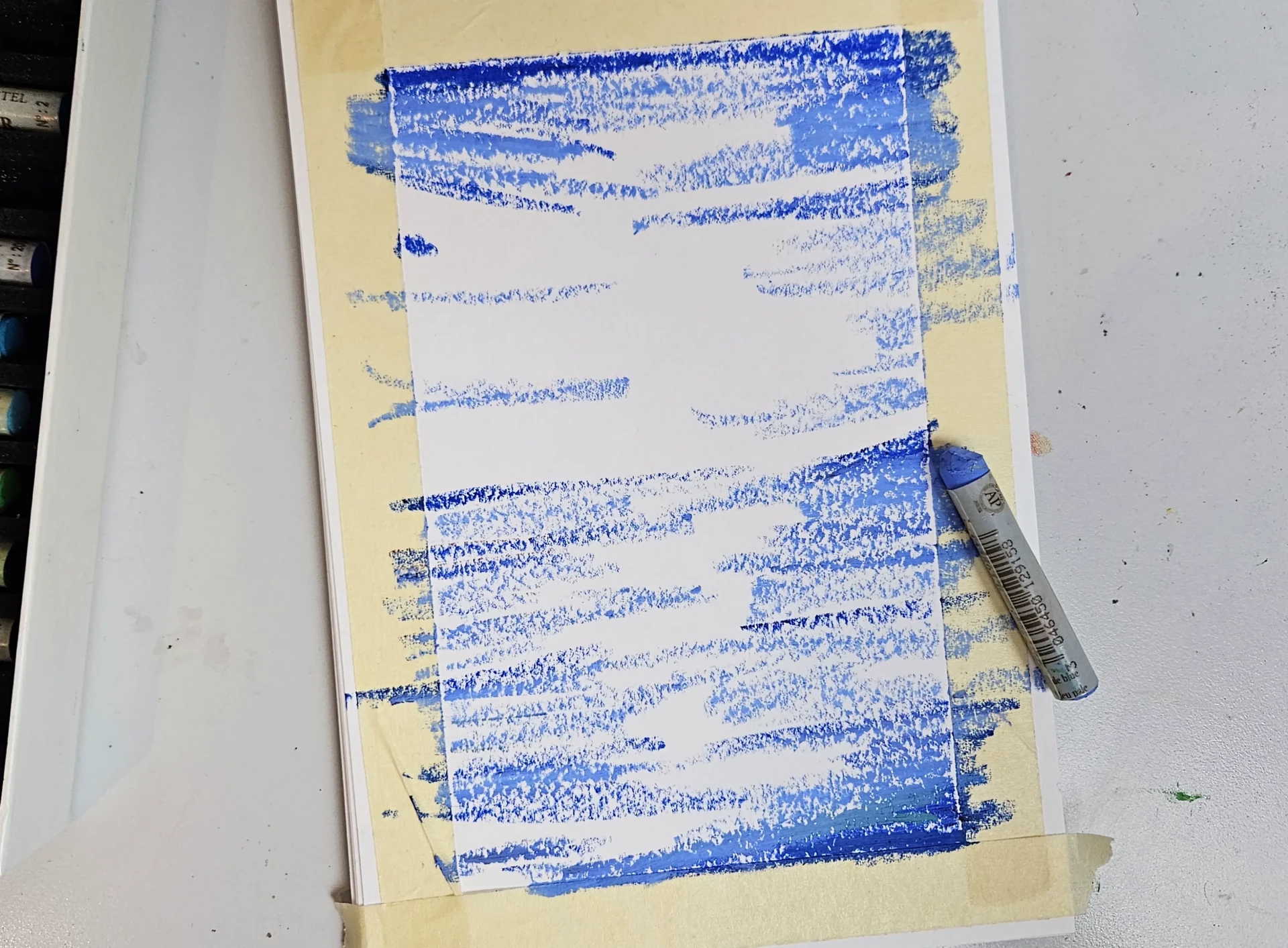
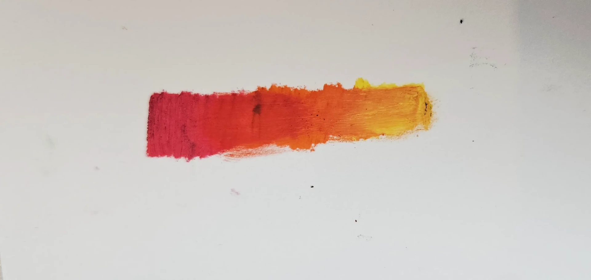
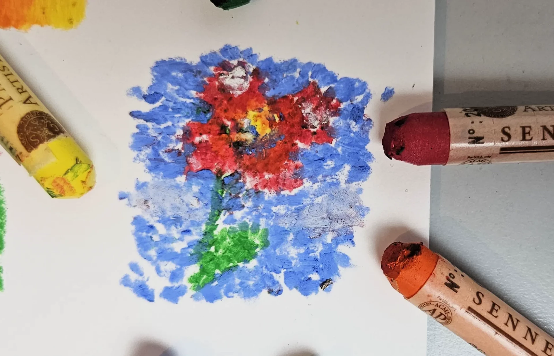
Once our sides are filled with blue, I move on to warm colors, starting with the darkest one: red. I slightly blend the red into the blue, and I continue adding strokes.
It is important not to overlap too much red on blue, because as mentioned above, when the colors are too different, the color becomes "dirty." It is better to go through the "indirect" mixing of the 2 colors side by side as specified in the paragraphs above.
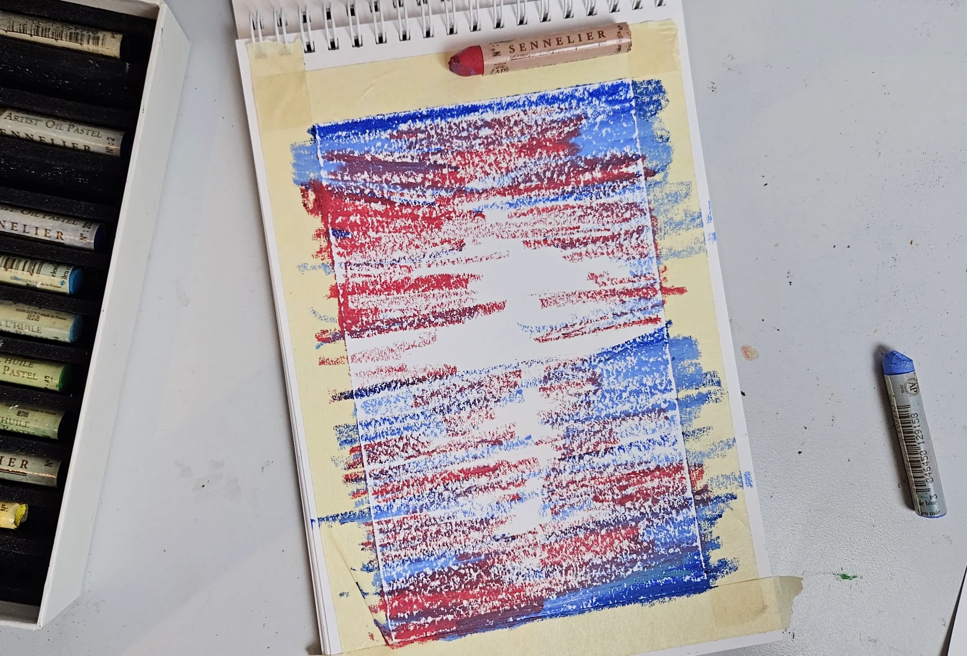
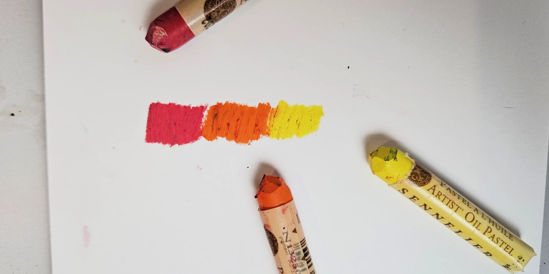
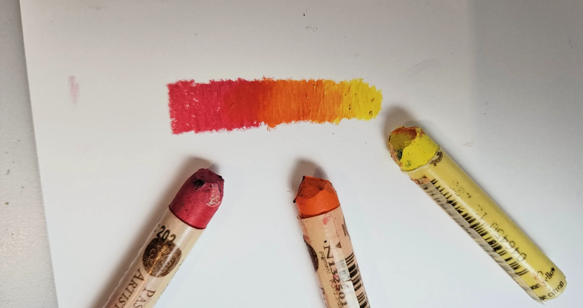
I immediately follow with the orange, and this time I fade into my red.
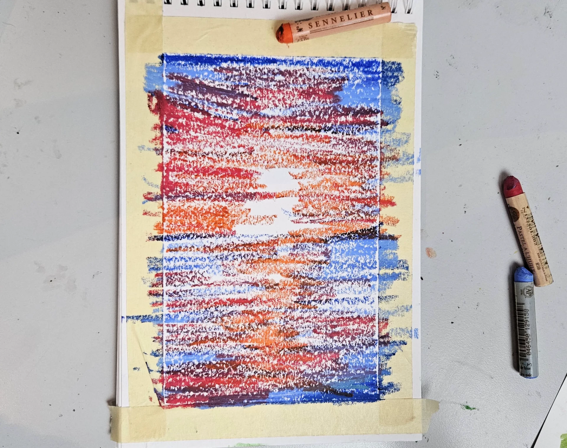
Yellow is added to complete this range of warm colors. I only go over my yellow on the areas with warm colors to homogenize the color transitions.
Blurring your drawing
And this is the blending step. Take your finger or a tissue, or a blending stump and start blending all your colors.
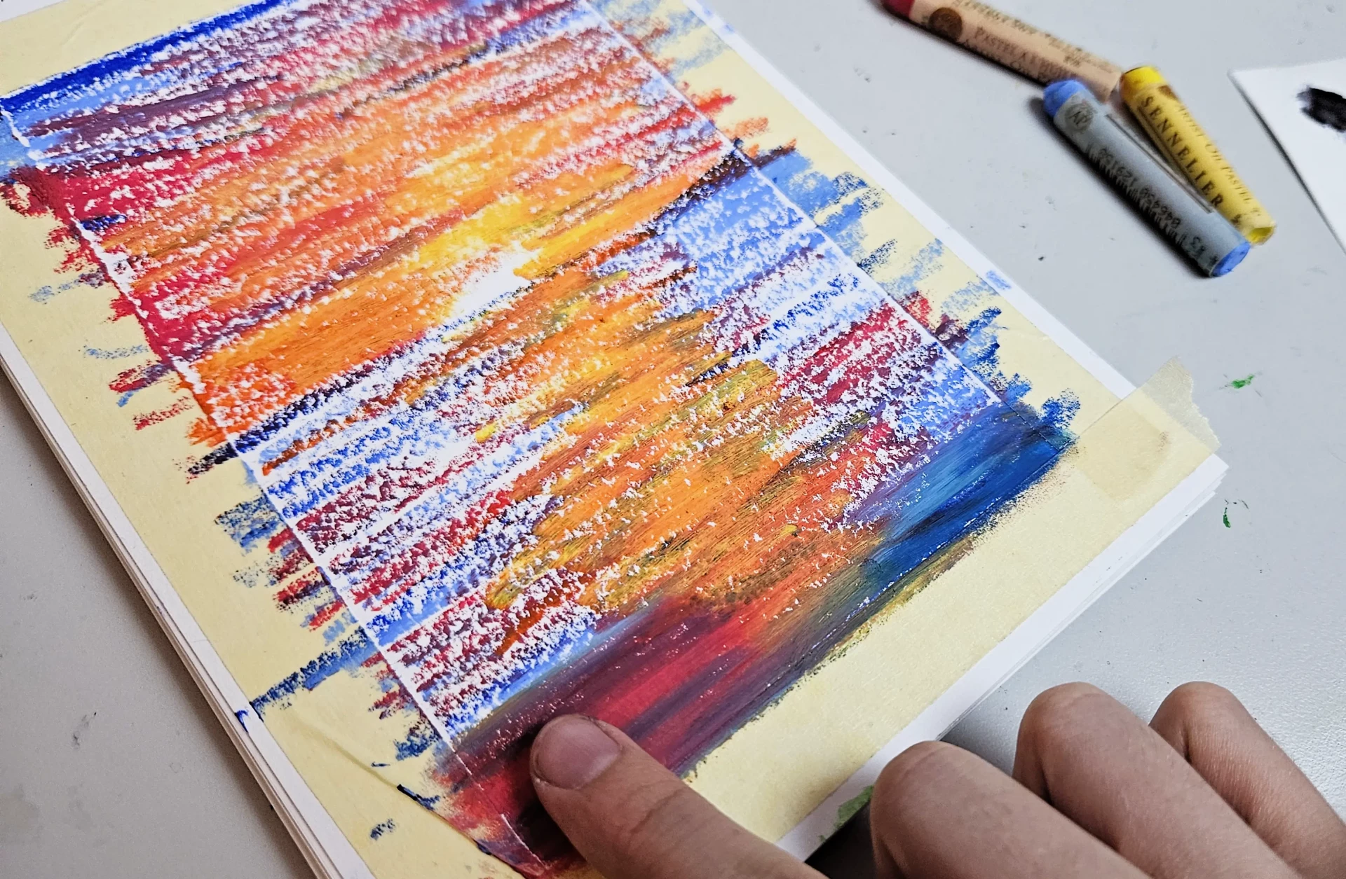
Remember to blend properly in the right direction: you need to follow the movement of the drawing. Here, the sea and the sky will be blended with horizontal strokes, and if we add clouds, they will be blended with soft circular movements.
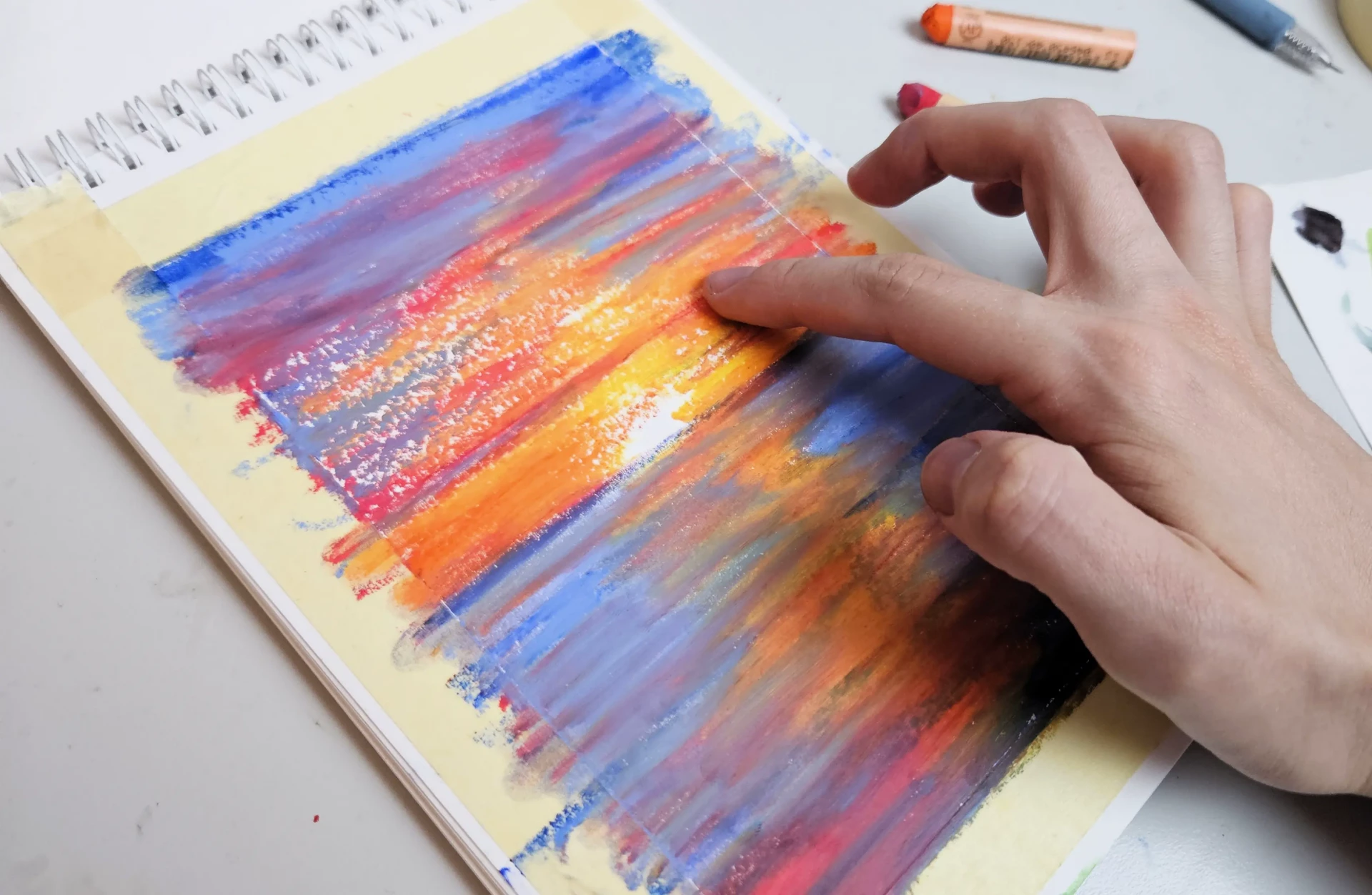
We get this result. We still need to fill the void.
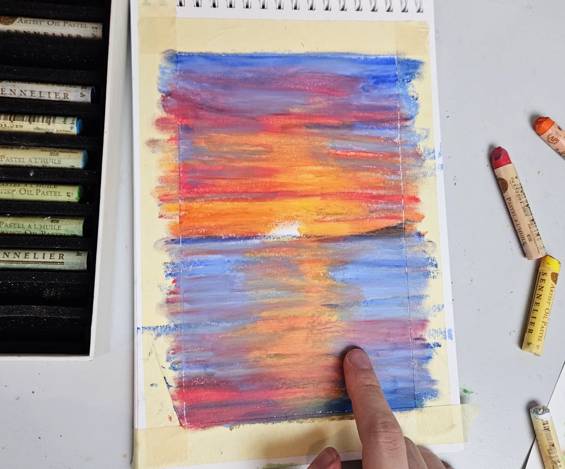
I can add some light reflections on the water using my white oil pastel, and gradually blend my strokes.
I take a black oil pastel and add some decorations: hills, a boat on the water, a palm tree, and you can add whatever you want.
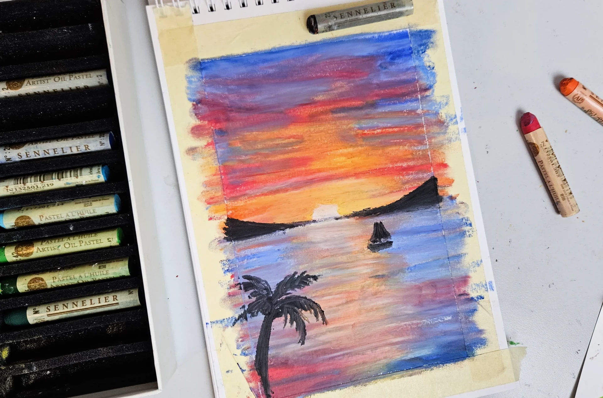
I add a few touches of white in the water and a few clouds. I must admit that I think I preferred the drawing without the final addition of white.
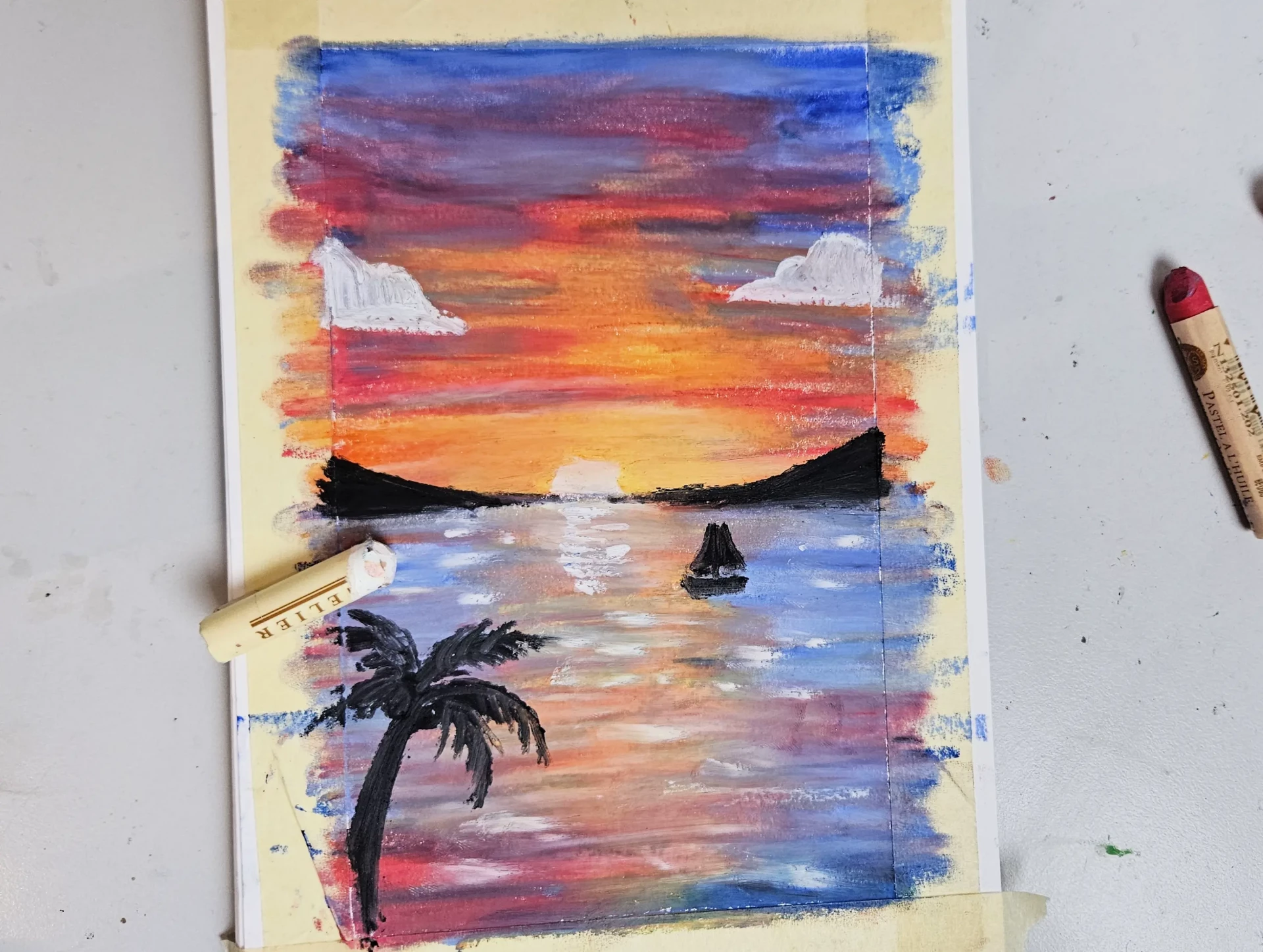
The drawing is now complete.

I hope this article on oil pastels helped you discover this amazing medium and encouraged you to create some artwork with it! You can quickly achieve a very clean result without necessarily having a lot of knowledge and methods!
Discussion
Good evening,
It's really pretty, I look forward to trying this medium. Every summer near my place, there is an exhibition of pastel artists, and I am always impressed by their work, their creations; it's really beautiful.
Eric.