How to Draw a Portrait with Dry Pastels
Dry pastel is a unique medium. Halfway between drawing and painting, it can be used to create intense colors, delicate blends, and rich varied textures.
When it comes to portraits, dry pastels are particularly useful: they capture light, render the softness of the skin and enable subtle detailing of features and contours.
But they can also be tricky to use. As they can be powdery, fragile, and difficult to correct, dry pastels require a specific approach.
In this article, we will explore how to tackle a dry pastel portrait, step by step.
Why choose dry pastels for a portrait?
Dry pastels offer real advantages for creating a portrait. First of all, they provide instant rich color: the highly concentrated pigments create intense and luminous colors. They also facilitate gradients by making the transitions between the skin, shadows, and areas of light particularly soft and nuanced.
Finally, they encourage a more instinctive approach to drawing, as the artist works directly with the material, either with a finger or blending stump, with a very tactile relationship to the surface.
Unlike pencil, pastel enables the artist to create masses of color quickly rather than by using lines. It is a vibrant, expressive medium that is more forgiving than you might think.
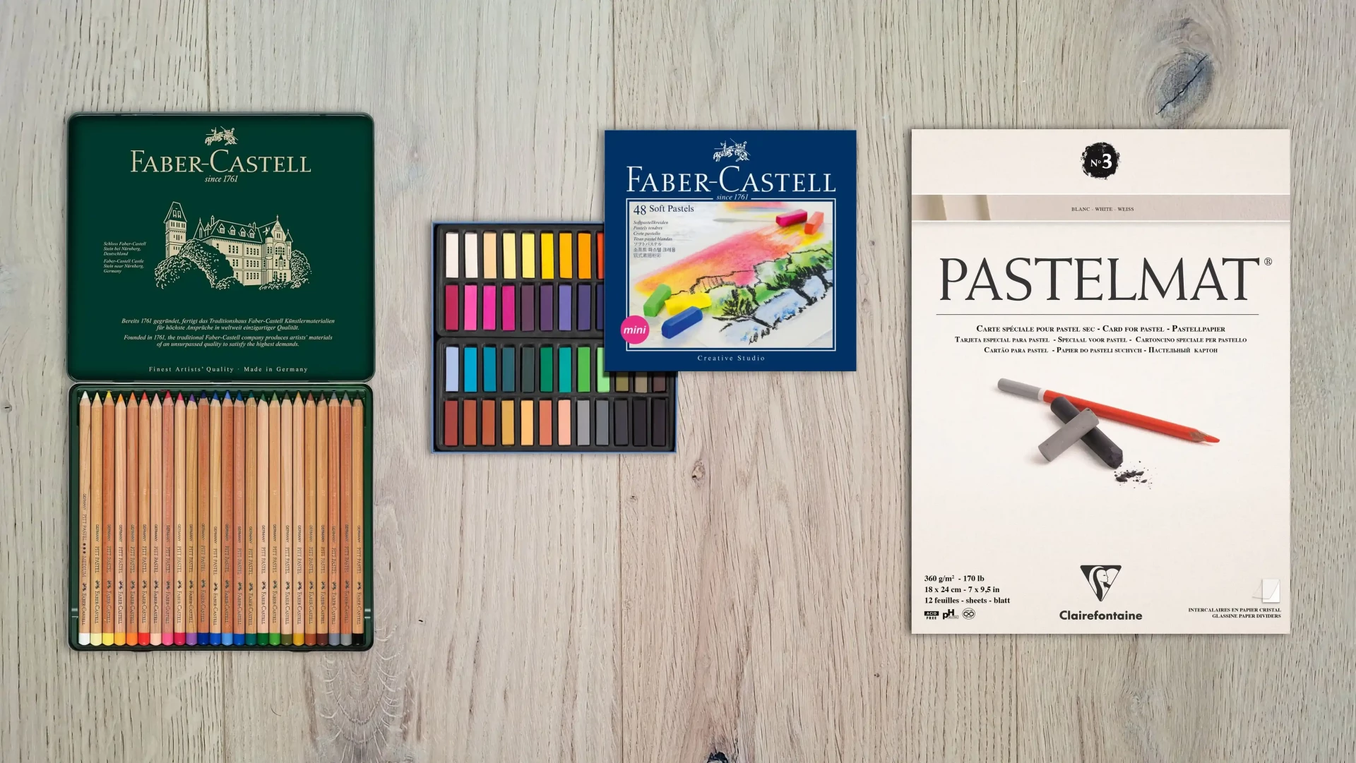
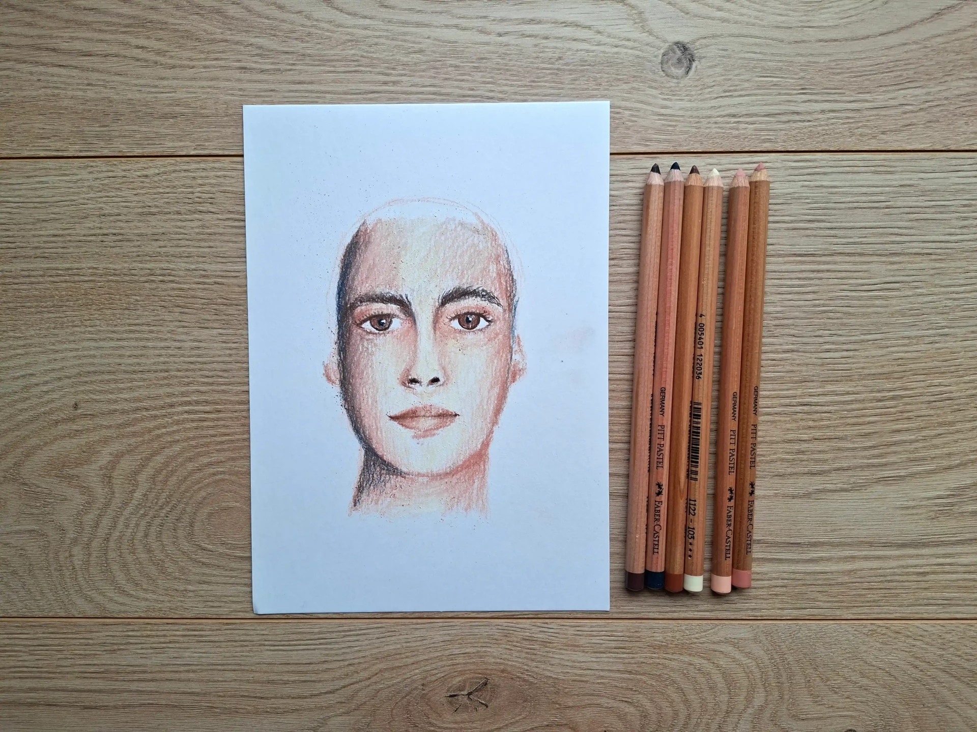
Essential materials
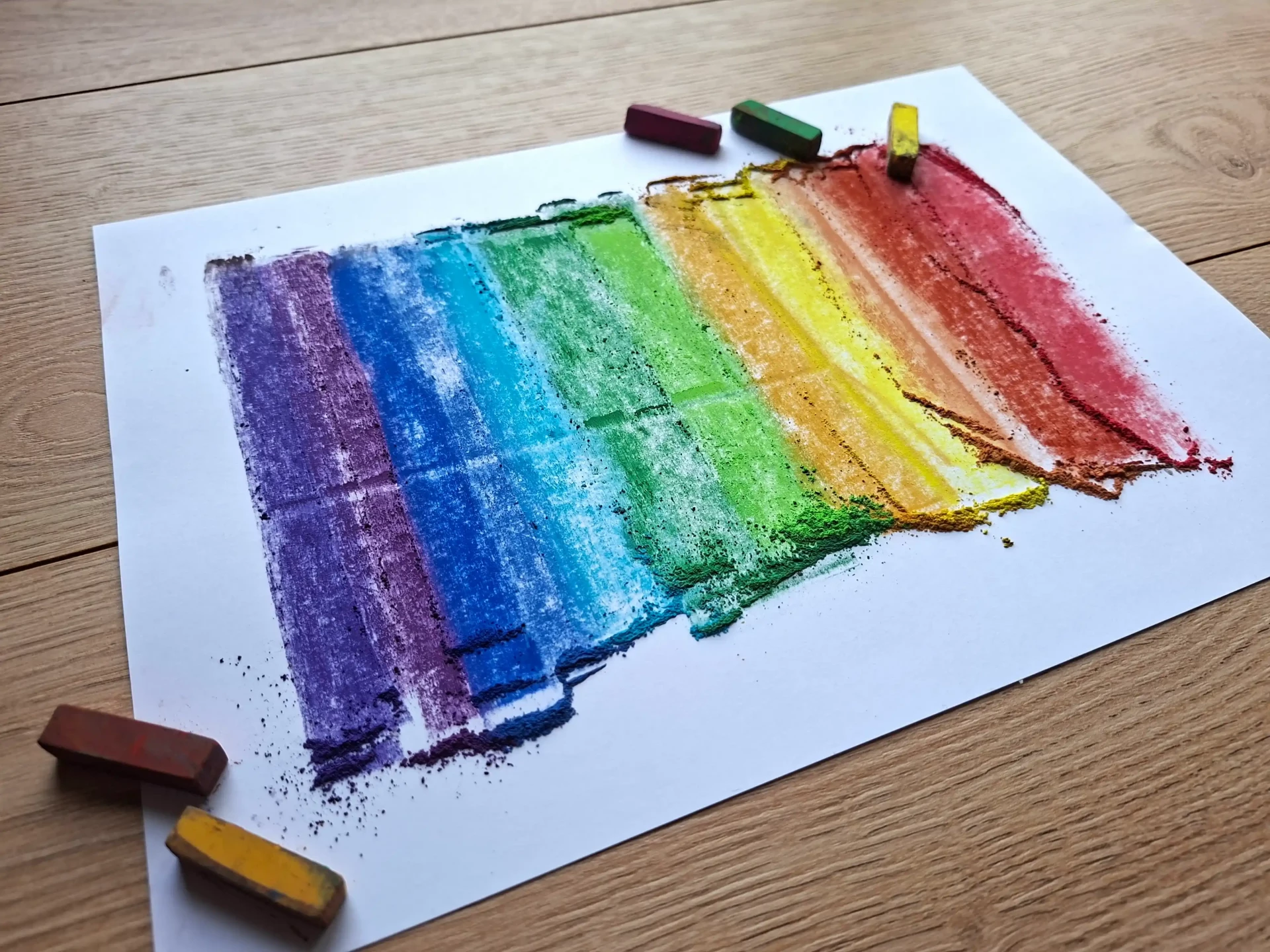
There is no need to have 200 colors when just starting out. Use good quality pastels focusing on flesh tones, ochres, a soft red, a brown, a gray, a white, and a black (use sparingly).
Choose an appropriate paper that is textured or specifically designed for pastels. Pastels need grip: paper that is too smooth will prevent the layers from properly overlapping.
In addition to this, you can add some useful accessories like a kneaded eraser or blending stump.
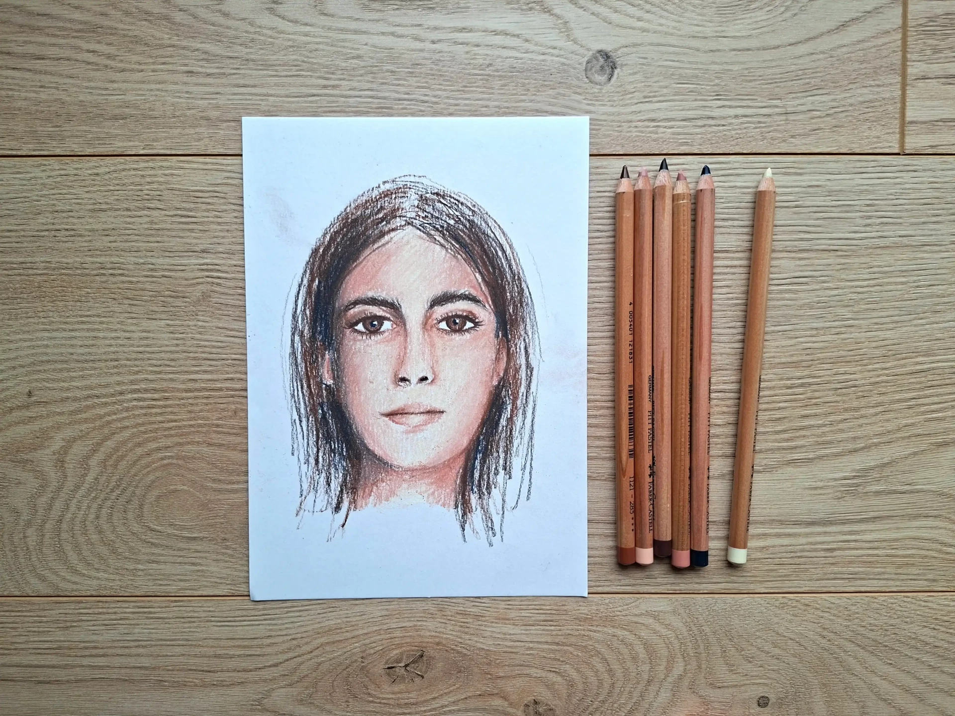
Drawing a dry pastel portrait step by step
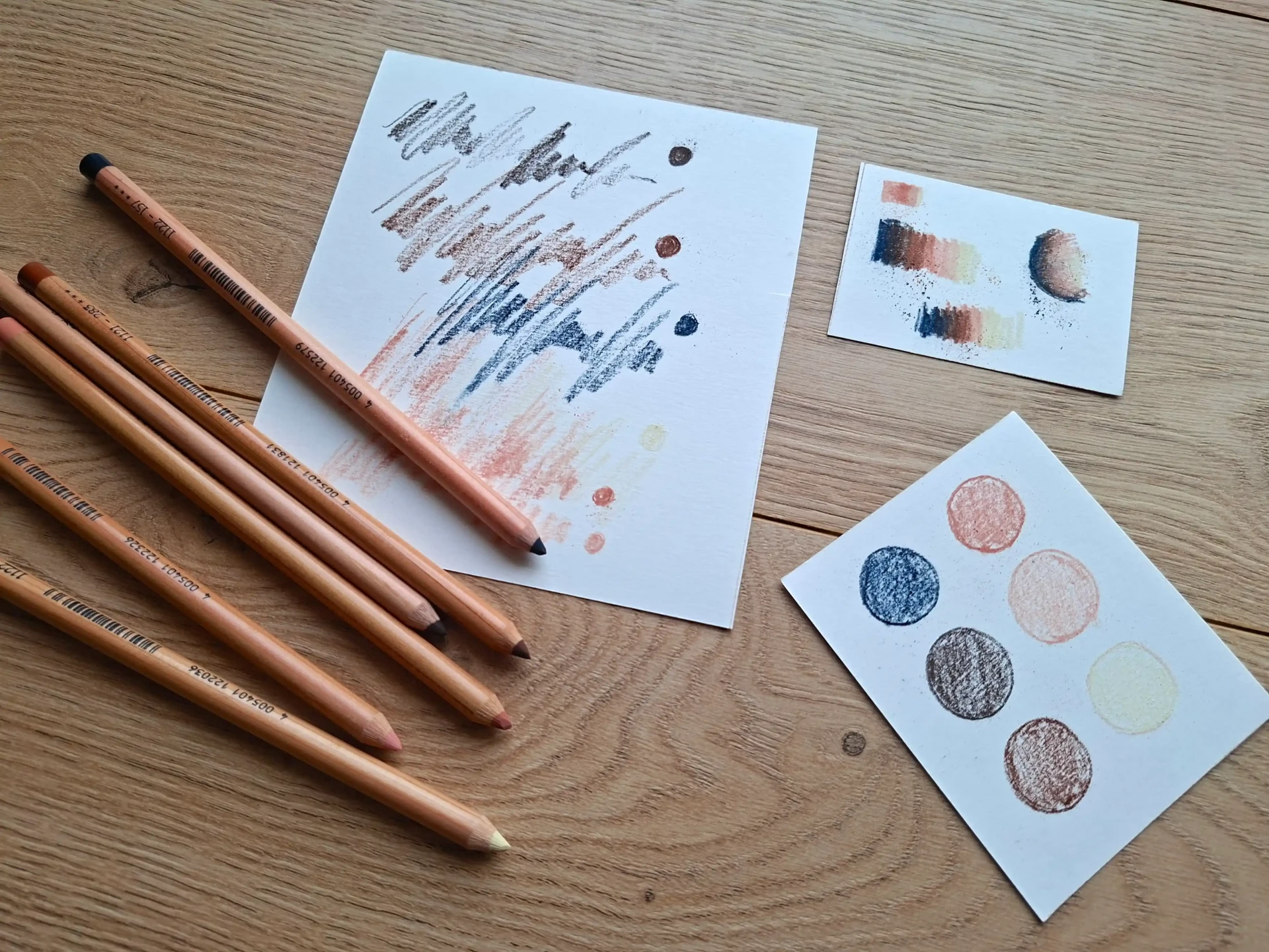
First, I recommend that you select your colors beforehand and test them in order to understand the different effects that are possible. This will help you to avoid errors in colors and familiarize yourself with pastels.
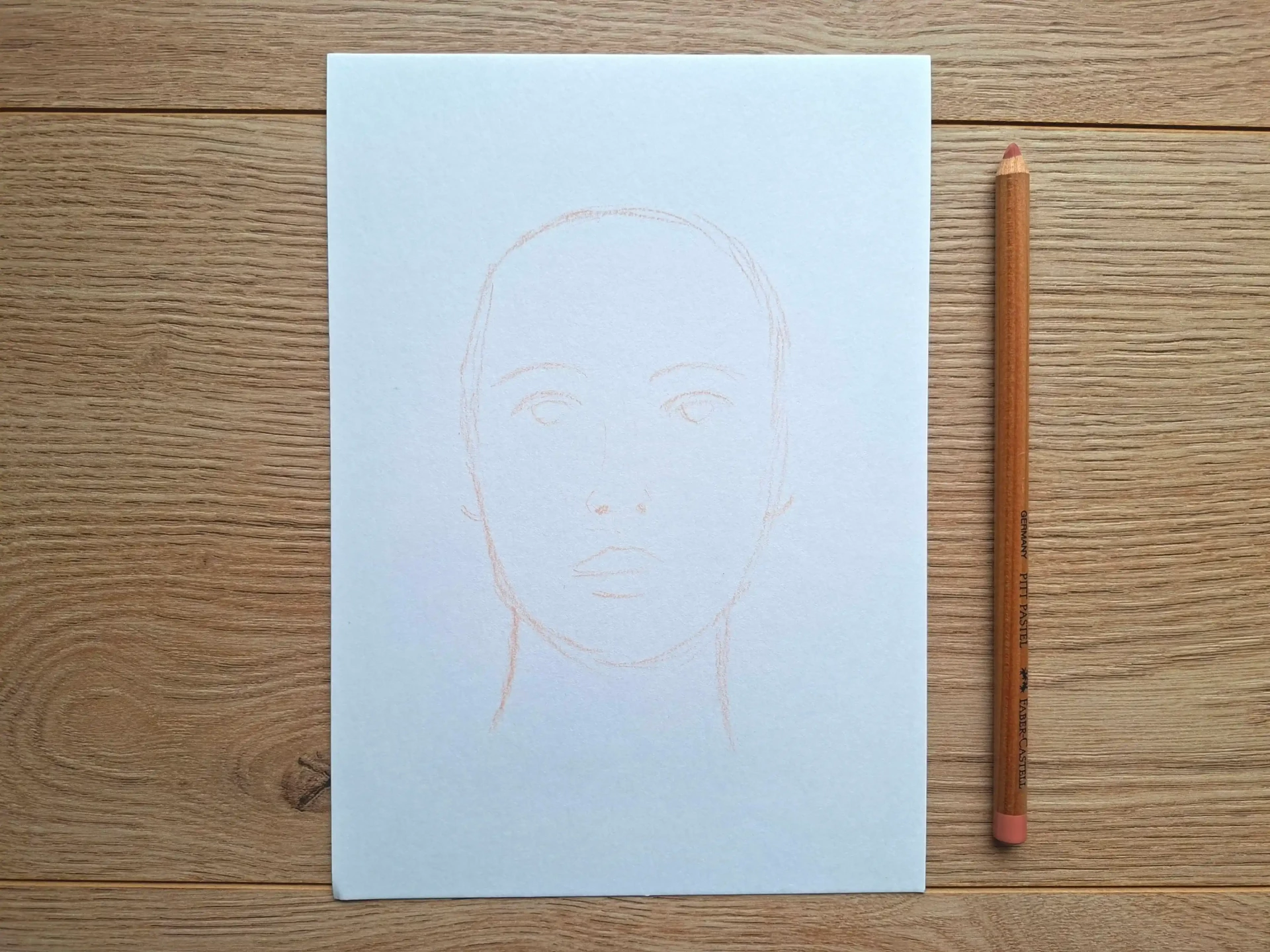
Use a light color to draw the oval of the face and place the main features. Keep in mind that the idea is not to draw these elements in detail, but to know where they are located. The drawing should be faint.
Lay down the main shadow areas gradually. You can start with a light shade. Work in broad strokes without trying to be precise. Dry pastel works through light layering. It is better to add gradually rather than to load all at once.
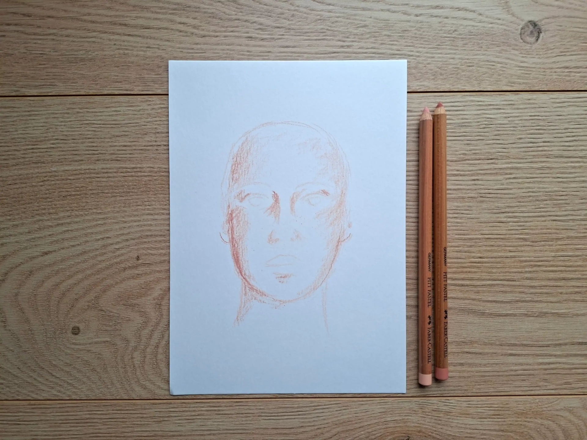
A successful portrait primarily relies on contrasts. Consider carefully where the light and shadow areas are. Even with just a few colors, a portrait can work if the values are accurate.
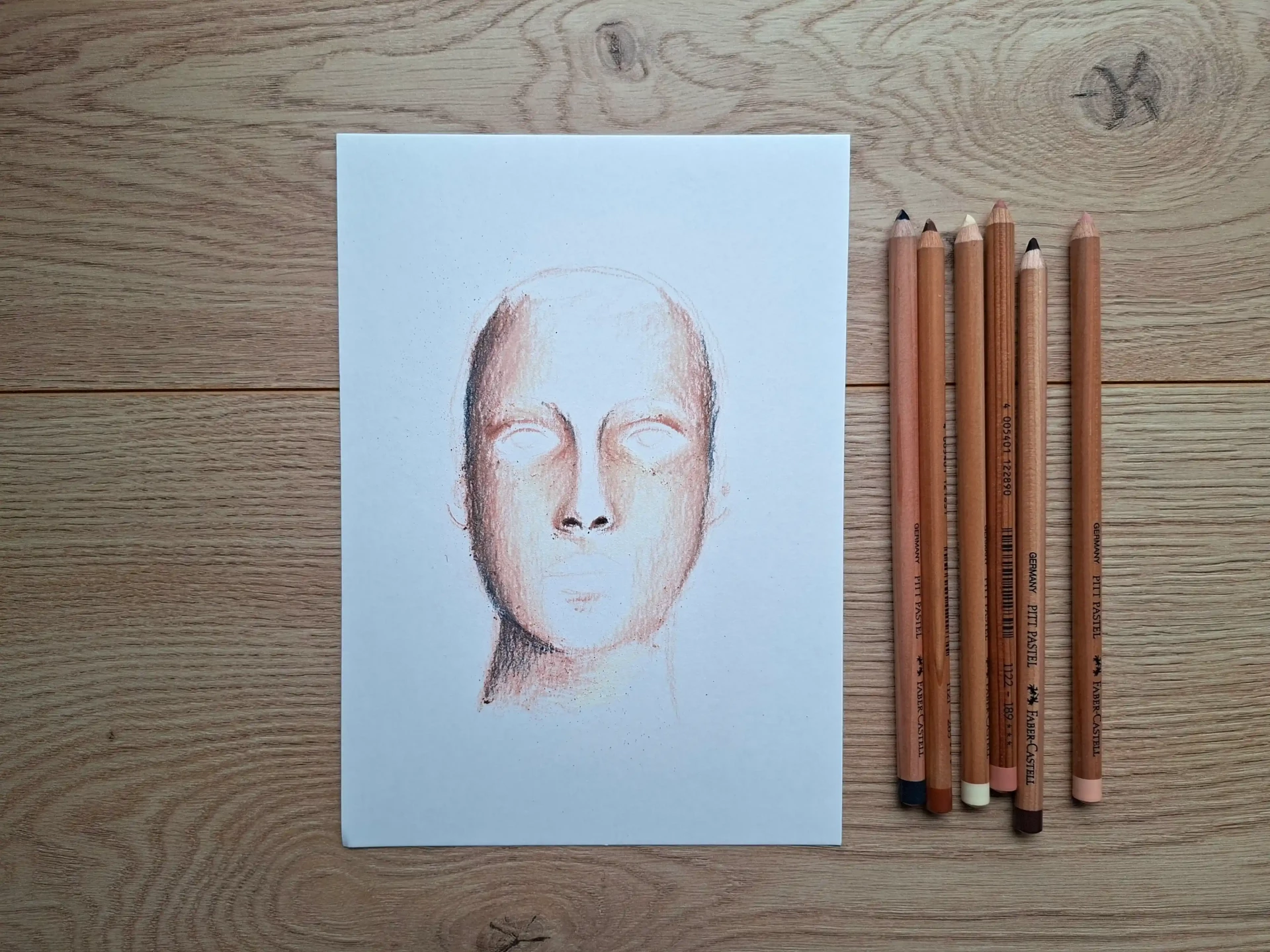
Add details to the drawing
Once the large areas of shadow and light are in place, you can begin to work on the details of the eyebrows and eyes. Be sure to use well-sharpened tools to achieve precision.
Above all, take your time and don’t hesitate to step back and take breaks to check the overall harmony of your drawing. A piece of advice: never focus too long on the same area. This helps you maintain spontaneity in your strokes.
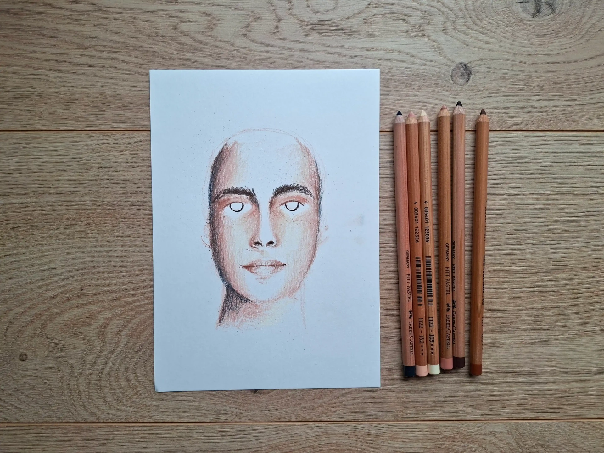
Add hair to the portrait
With a medium shade pastel (such as brown), add the outline and movement of the hair.
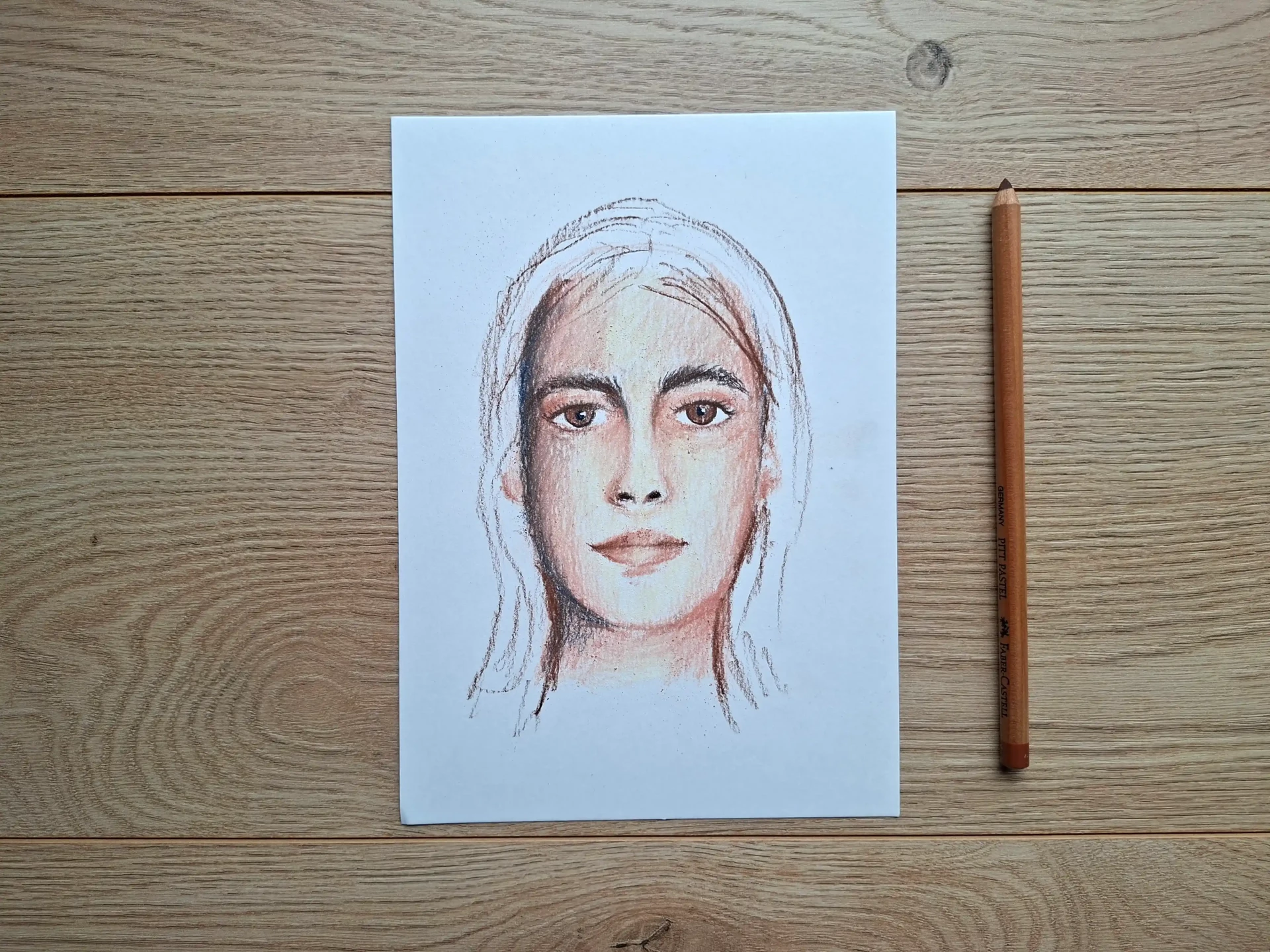
Using a darker brown pencil, you can intensify certain areas and further define the hair. Check your shadow and light areas to ensure the shapes and contours of the face are balanced. Make sure that you know when to stop: a portrait that is too detailed can lose its luminosity.

Some common mistakes to avoid
1. Pressing too hard from the start: dry pastel layers. If you press too hard, the paper will become saturated and won’t take any more layers.
2. Using only one skin tone. Skin isn't "pink": it contains ochres, grays, sometimes cool or warm hues depending on the light.
3. Using too much black. Pure black hardens features. Instead, try mixing browns, dark blues, or grays to create more natural shadows.
Drawing a portrait with dry pastels means working with light as much as color. It is an expressive, tactile medium that can sometimes be unpredictable... but is very vibrant.
By starting with the large shapes, respecting the values and avoiding overloading, you will achieve vivid and delicate portraits.
Over time, you will learn to trust your movements and let the material breathe.
Discussion
Thank you for all this advice.