Drawing in Negative
Negative drawing is a very fun practice that involves drawing something with inverted colours. In this article, we will see how to easily create these kinds of illustrations.
COLOUR VALUE, SATURATION, AND HUE
Negative drawing is based on inverting the colours of an image. The first step is to understand how a colour is constructed. There are several ways to define a colour, but what we are interested in for negative drawing is the decomposition into three elementary components: value, saturation and hue.
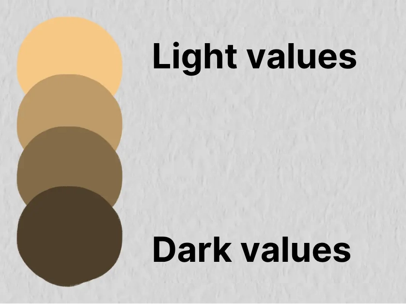
The value of a colour is its degree of brightness. A light colour has a high value, and a dark colour has a low value.
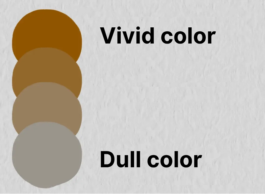
Saturation determines the vibrancy of a colour. A colour with low saturation is described as dull, and conversely, a very saturated colour is vivid.
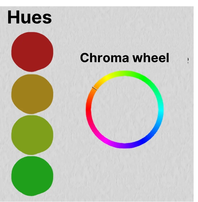
Finally, the hue is what determines the nature of a colour. It is generally the name that we give to our colour (blue, green, cyan, etc...). Unlike value and saturation, hue is not found on a scale but on a circle: the colour wheel.
Using these three components, it is possible to create any colour. For example, brown is a dark, rather dull colour with a red or orange hue depending on the type of brown. Neon yellow is a light, bright colour with a yellow hue.
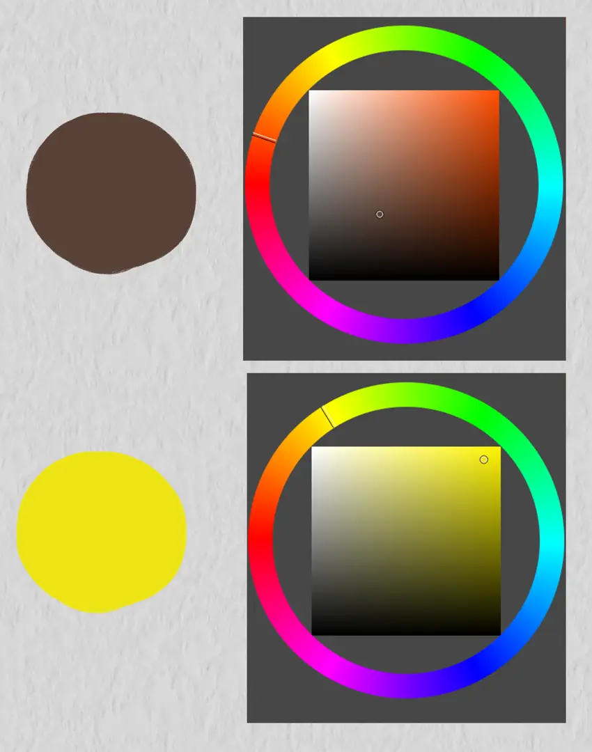
Finally, gray is a unique colour. It can be obtained from any colour that is fully desaturated. The value of gray can be varied to obtain all its shades from black to white.
UNDERSTANDING THE NEGATIVE
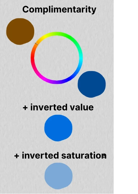
The negative of a colour is the opposite of that colour. As seen previously, a colour is determined by its three components. Therefore, these must be inverted to obtain the negative.
Value and saturation being scales, it is easy to invert them. The negative of a dark colour is light, the negative of a dull colour is bright, and vice versa. The more extreme the colour (very high or very low value or saturation), the more extreme its negative is.
The case of the hue is a bit special. Since hue is not on a scale but on a circle, it has no opposite per se. Instead, we speak of complementarity. Thus, the “opposite” of a given hue would be its complementary hue. The complementary of a hue is what produces black when mixed with our original hue. It is located directly opposite the original hue on the colour wheel. For example, the complementary of magenta is green, the complementary of blue is orange, etc.
DRAWING IN NEGATIVE, STEP BY STEP
Having set out the theory, let's get down to practice. You can start immediately with an imaginative drawing, but I recommend starting with an existing model. This model can be a photo or another drawing. For this article, I have chosen to start with this model:
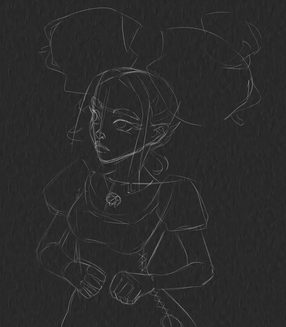
I will first make a sketch of my model. This will make it easier for me to colour it later.
Once my sketch is done, I can start applying my colours in negative. For each colour area, I try to visualize its complementary colour: If my colour is dark, then my negative should be light, and vice versa. Here is an example with an area of my drawing that I have started to convert to negative, and next to it, the same area on my model:

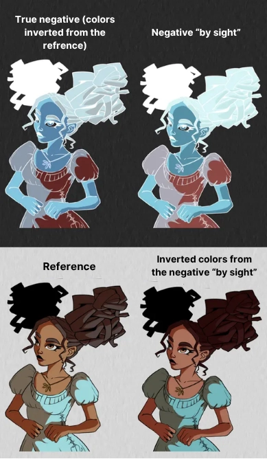
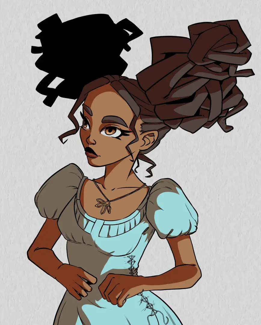
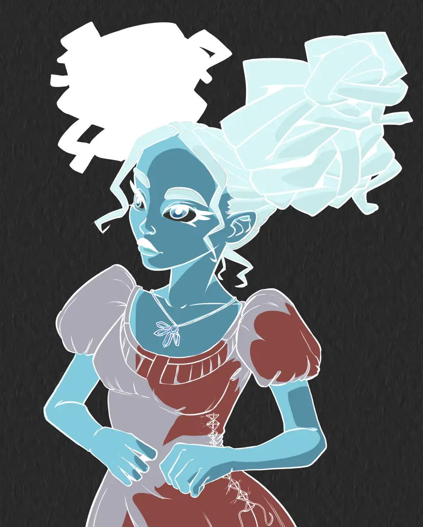
I will apply the same principle across my entire negative illustration. Here is the final result:
I can verify that my negative is correct by inverting its colours, which can be done in a drawing software or through the camera of your mobile phone. Logically, I should end up with colours similar to those of my model.

Since the colours of the negative were positioned by eye, the result is not perfect. However, it is still a great way to train the eye in colour analysis. If you want a perfect result, you can directly invert the colours of the pattern and reproduce them as they are, but then the exercise loses all interest...
Don't hesitate to make several negative drawings with various patterns! Once again, this is an excellent exercise that will make you work on colours in a thoughtful way and help you better understand complementarity.
Discussion
No comments yet.