How to add Depth to a Drawing
Hello everyone, today I propose to explore an aspect of drawing that makes it engaging and captivating: depth! Thanks to our 3D vision, depth is everywhere in the real world, and by successfully reproducing it in the drawing, we lend credibility to our image and increase its visual impact. We will therefore examine several concepts that can add depth to your drawing.
Get your pencils, paper or tablet ready, and most importantly, your creativity! Let's go!
THE CONCEPTS TO BRING DEPTH
To explore these different concepts, I will use this illustration as an example:

THE PERSPECTIVE
The first concept is undoubtedly the most obvious, because it is the very basis of depth: perspective. The closer something is to us, the larger it will appear and, vice versa, to give depth to the design it is important that the elements closer to us are larger than those further away.
It is also important that all elements maintain the same perspective (regardless of the number of vanishing points) to bring coherence to the image.
In our example, it is clear that the foreground represented by the ground is the most important (about a quarter of the image), and the various characters follow the logic of perspective, becoming progressively smaller as they move away.

SCALE RATIOS
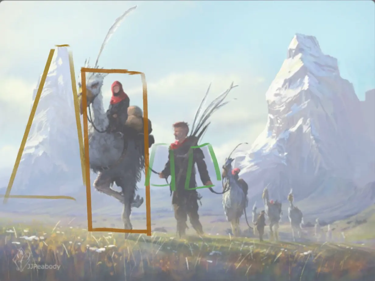
This second point is directly related to the first: in order to add depth, it is important to create a reference scale for this depth through dimension ratios. This reference scale must be something whose proportions we know (a human being, a natural element such as a mountain, an object, a tree, an animal...).
For example, in the illustration below we can see this very clearly: we know that a mountain and a human being are not the same size, yet we can see (in yellow/orange) that these two elements are depicted almost the same size. It is therefore easy to see that the mountain is far behind the character, so that it can be seen in all its height. Other mountains on the horizon (in green) are also positioned to further increase this depth effect.
DOSING DETAILS CORRECTLY
To support depth, it is also interesting to play with the level of detail. This also helps to streamline the image and save time in its creation. As in the case of perspective, the closer an element is, the more perceptible and higher its level of detail, so it is important to convey this in drawings.
In the example below, we can clearly see that the foreground is very detailed, featuring various plants and flowers that add life. The background with grass is not as detailed because small elements cannot be seen with the naked eye. To further emphasize this sense of depth, the same technique is used with the characters; those in the front are well detailed, and the farther away they are, the fewer details we can see. However, this does not detract from the image because our brain easily imagines the other characters based on the details already present in the foreground ones.

ATMOSPHERIC DEPTH
Let's now move on to the coloru part, which greatly influences the impression of depth in a drawing. The most important aspect is what is called atmospheric perspective; broadly speaking, it's the way the air affects visual perception. Distant objects will be paler, less contrasted, and often tinged with blue as if they are merging with the sky. Conversely, elements at the forefront of the image will be more intense, more contrasted, and often in warmer colour ranges to echo sunlight.
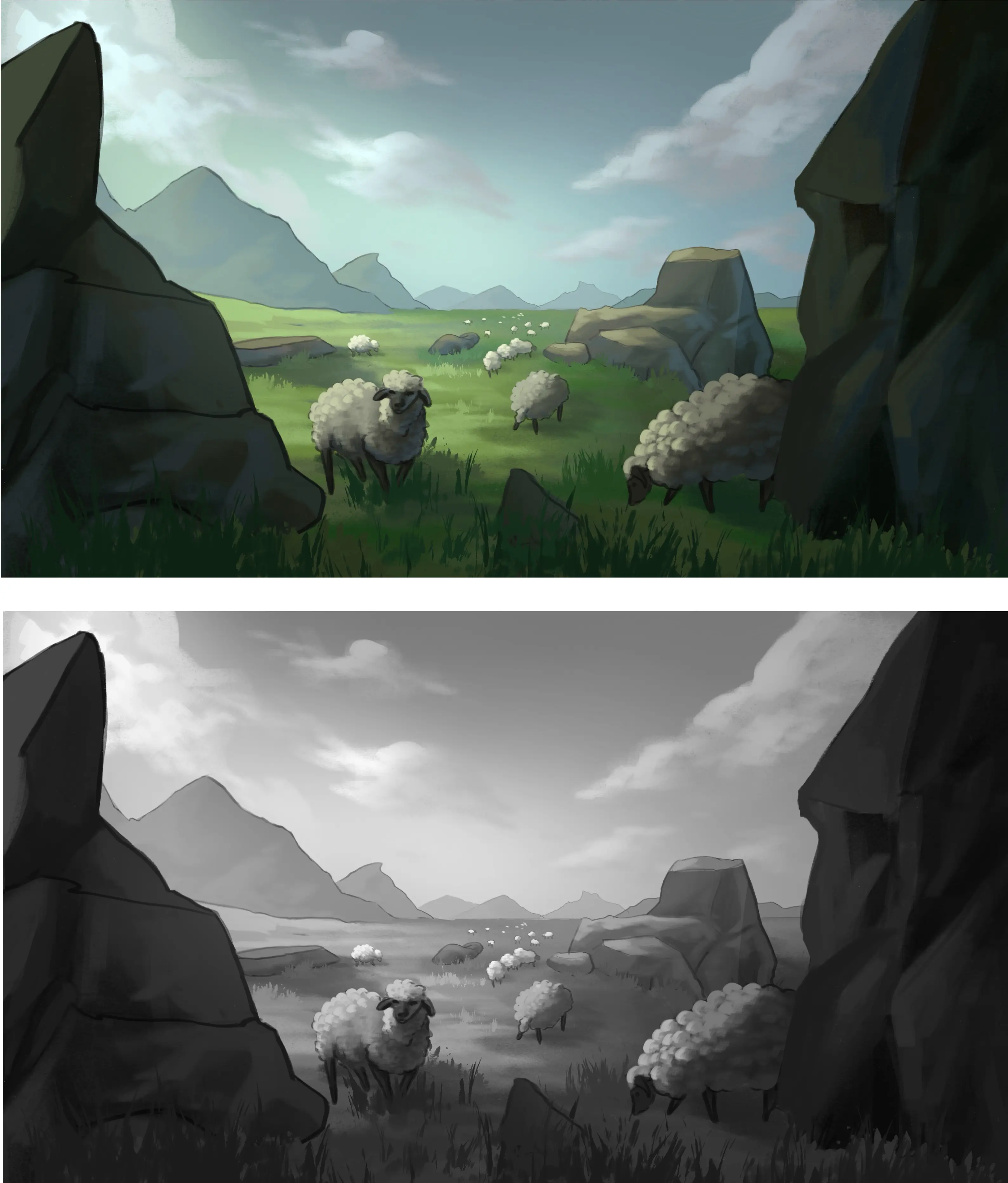
Atmospheric depth is perfectly observed in the example illustration. All elements above the line in the background take on an increasingly bluish and pale hue, which intensifies the further away they are.

THE CONTRAST
This point will underline the previous point and, to understand it better, it is interesting to look at the image in greyscale. Simply put, the closer an element is, the darker and more contrasted it will be, and vice versa, the further away it is, the paler and less contrasted it will be.
This point is really very important to accurately convey the depth, so if you have the opportunity to regularly check your drawing in grayscale to ensure that you are using the right colours. Do not hesitate!

DRAWING DEPTH STEP BY STEP
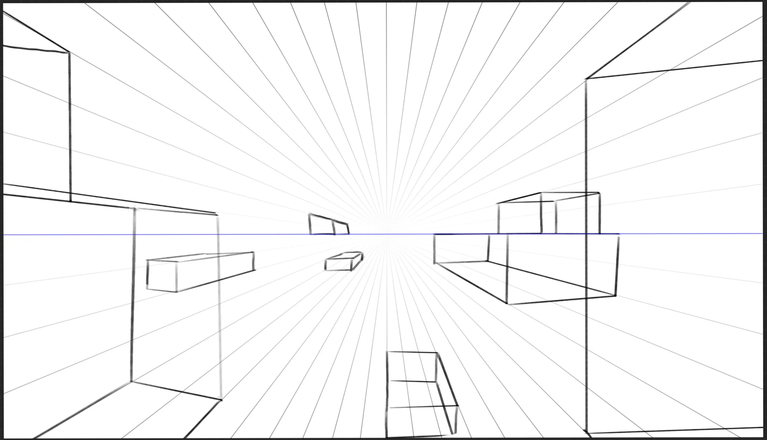
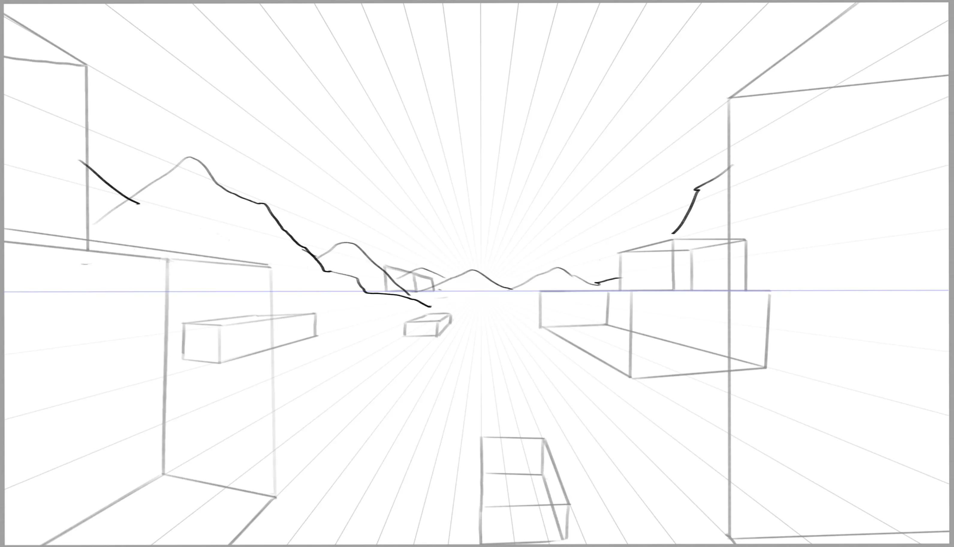
We have just reviewed all the different elements needed to add depth to the design; now, let us apply them through a very simple example.
Perspective: I start by placing elements in the form of cubes, adhering to the rules of perspective: the closer they are to me, the bigger they appear. I introduce variations in size to add a bit more dynamism to the image.
Scale Ratio: To increase the depth of the drawing, I chose to add mountains in the background, some quite large and some much smaller to reinforce the appearance of remoteness.
The level of detail: I chose to add sheep, so I draw the foreground sheep with some details and create simple shapes resembling sheep for those in the distance. The brain understands that these are sheep because they are spread out like a herd, and those in the foreground are detailed.
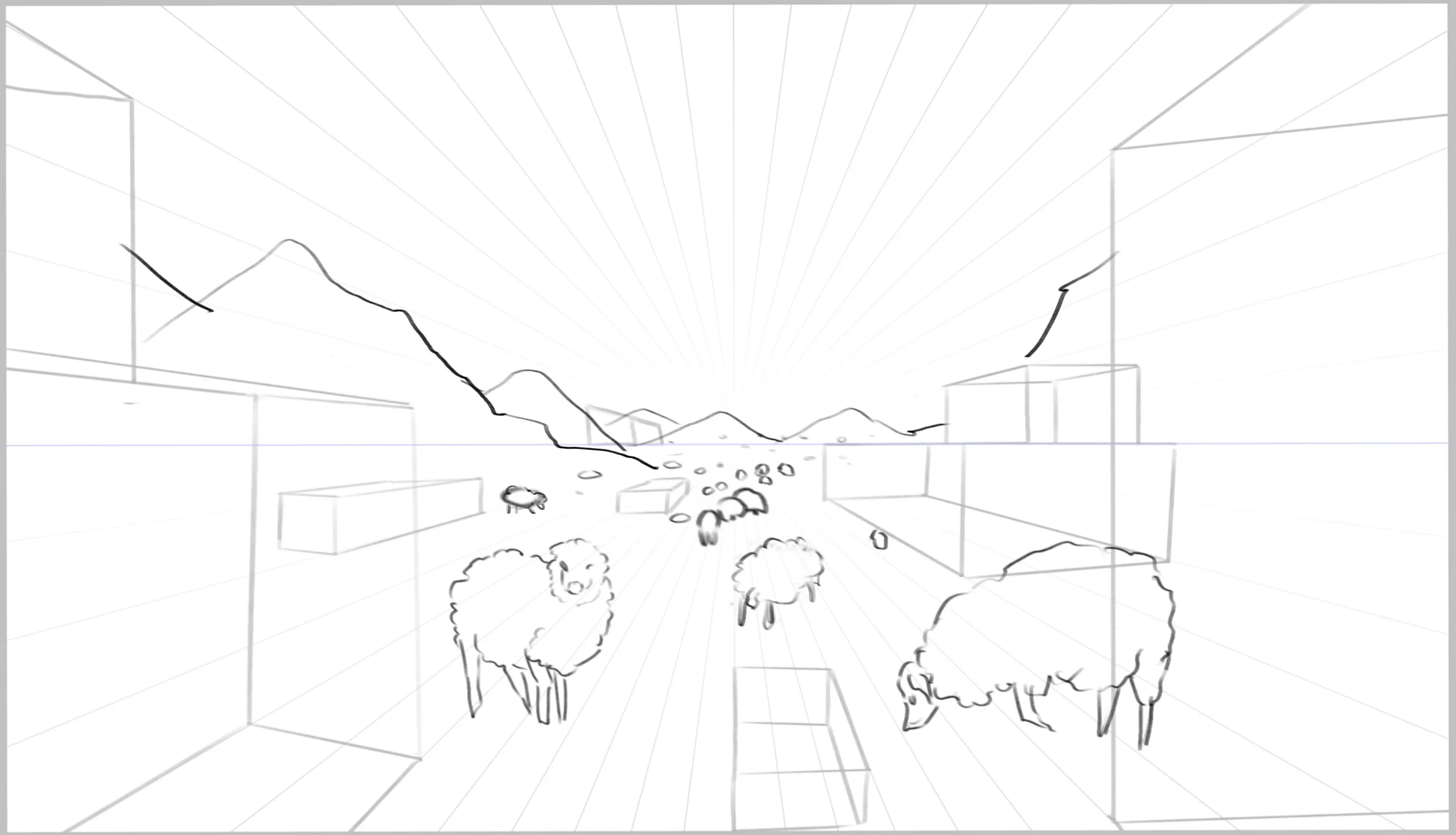
The line: I didn’t expand on this point in the previous example because there was no line, but if you want to add depth with your line, you simply need to use thicker lines for the foreground elements and increasingly finer lines as the elements recede.
I take the opportunity to transform the blocks into rocks and add a few blades of grass.
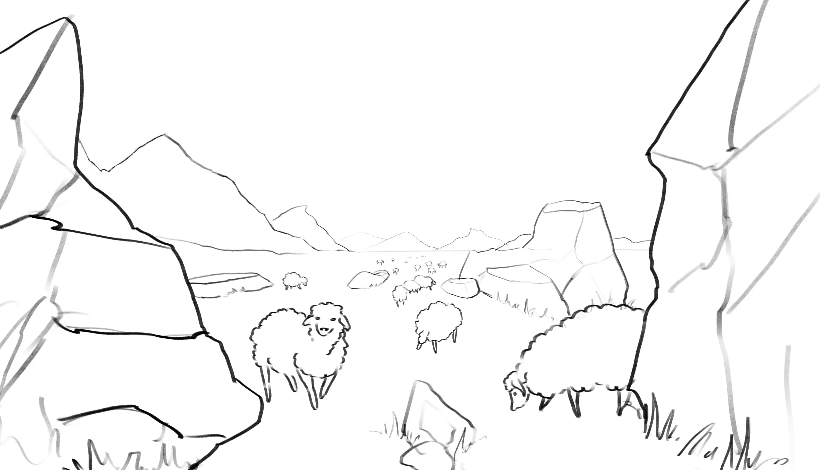
ADDING COLOUR TO YOUR DRAWING
Colour: I start with the basics of colour, choosing more intense shades for the foreground elements and paler, bluish shades for the background elements. I check by converting my image to grayscale to ensure that I have properly maintained atmospheric depth.
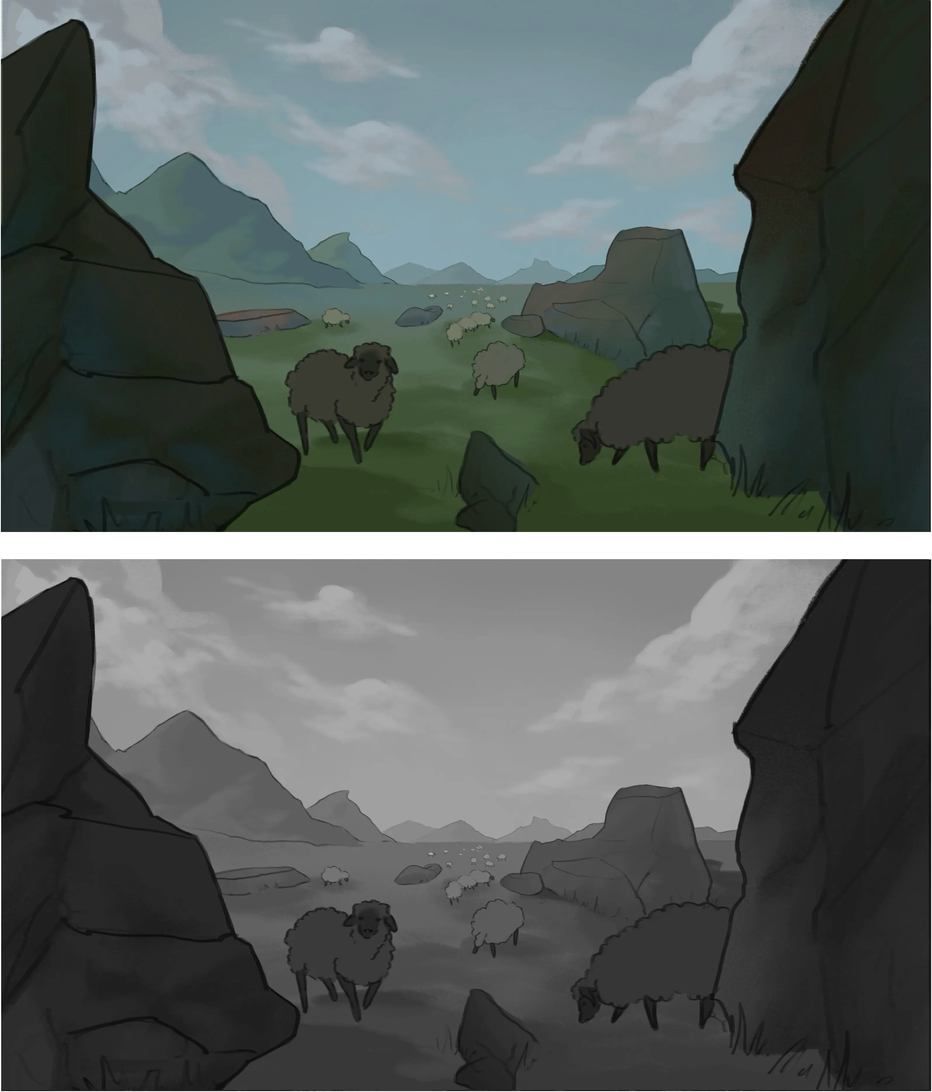
Light: to add some life to the image I add light, I brighten up the sky and the mountains in the background, and I add shades of slightly yellow green to the grass as well as shades of beige for the sheep's wool. I check again that I have maintained the atmospheric depth.

And so, by following these various points, I have created an image that, although simple and unrefined, has its own depth.
As you will have seen throughout the article, adding depth to your drawings can be very simple and does not require very elaborate technical knowledge. By following the different points, you can quickly create drawings that are full of depth and even more engaging! I hope you enjoyed this article
😊
Discussion
Thank you for the tutorial