How to Paint a Sunset with Acrylics
Today, we're going to paint a magnificent sunset landscape together using acrylics. This is an excellent exercise for learning how to create beautiful gradients in the sky, play with warm and cool colors, and add depth to your landscape through different layers. We will also explore how to add beautiful reflections of the setting sun on the vegetation and ground.
Materials needed for acrylic painting
Acrylic paints (basic range: phthalo blue, ultramarine, cadmium yellow, orange, ochre, burnt sienna, white).
Paper/card 400 g/m² or a prepared canvas.
Medium flat brushes (6–12), fine round brushes (0–4), and a fan brush for blending.
Clean water for dilution and transparency control; palette and sponge for transitions; rags for cleaning.
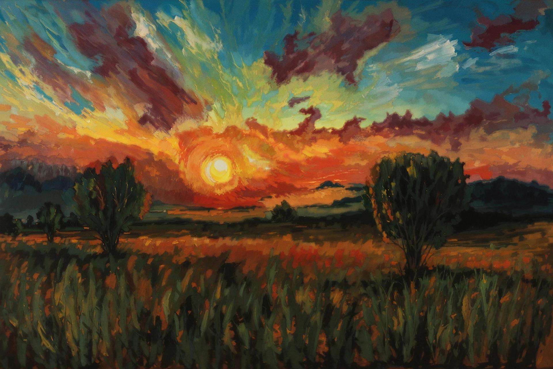
Some examples before we start painting
Before we get started, I suggest we take a look at some paintings for valuable inspiration.
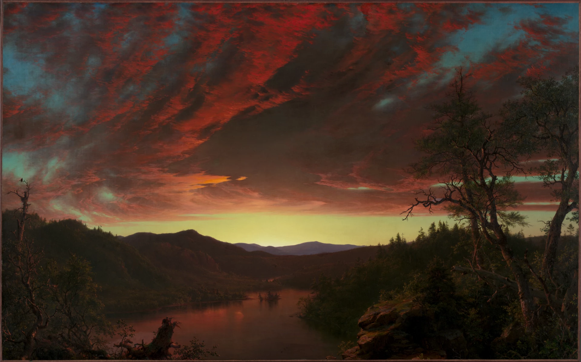
Frederic Edwin Church, Twilight in the Wilderness (1860). A useful reference for studying large-scale tonal transitions and understanding how a luminous core can provide the base for creating a sunset atmosphere.
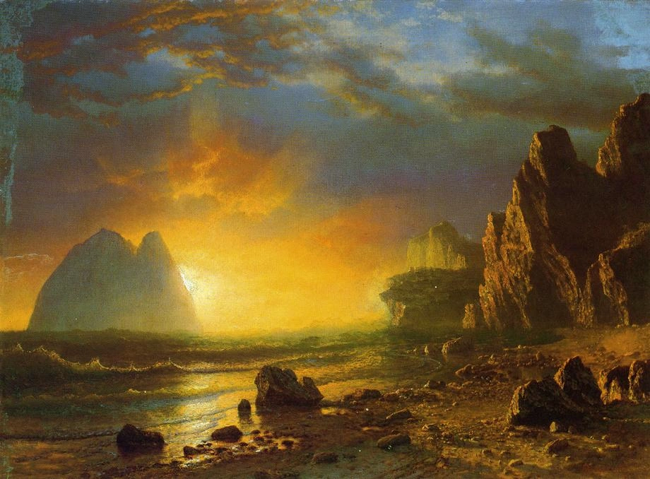
Albert Bierstadt, Sunset on the Coast (c.1870) - Analyzes the interaction between low-level sunlight and natural surfaces; provides examples of warm reflections on the ground and the depiction of clouds at dusk.
How to paint a sunset with acrylics step by step
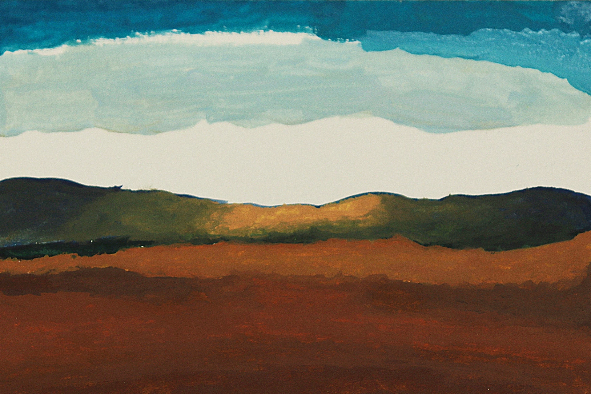
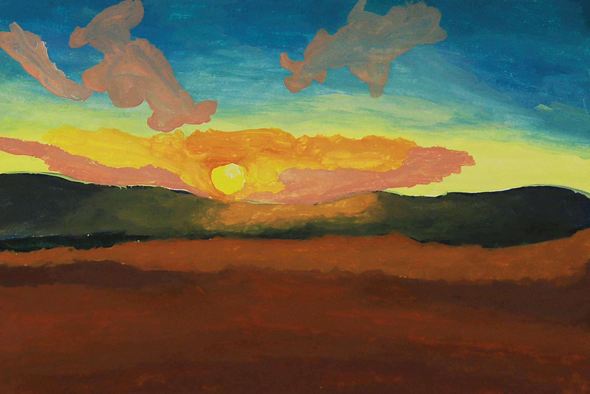
We start by drawing the horizon line with a dark green, separating the sky from the ground. With a dark blue, we draw the outline of the mountains following a smooth and organic path that respects the natural shape of the terrain.
We avoid rigid lines in order to keep the outline fluid. This step enables us to establish the first solid shapes that will define depth between the different planes of the painting.
Next, we paint the mountains on the edges of the composition, leaving the center free to place the main light. This empty space will be essential for building the focal point, where the warm atmosphere of the sun will dominate the scene.
Apply warm ochre tones to the ground, just below the mountains. This initial contrast with the background blues creates a harmony between the warm and cool planes, preparing the transition to the oranges and reds of the sun.
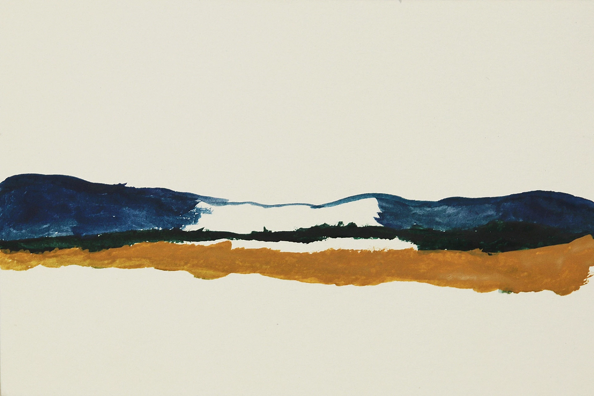
Add a brown tint under the ochre to mark the less lit areas. Complete the plain with an intense orange to highlight the area illuminated by the sun.
This transition brings warmth to the composition and reinforces the contrast with the cool tones of the sky and mountains. This is where the true balance between light and shadow begins.
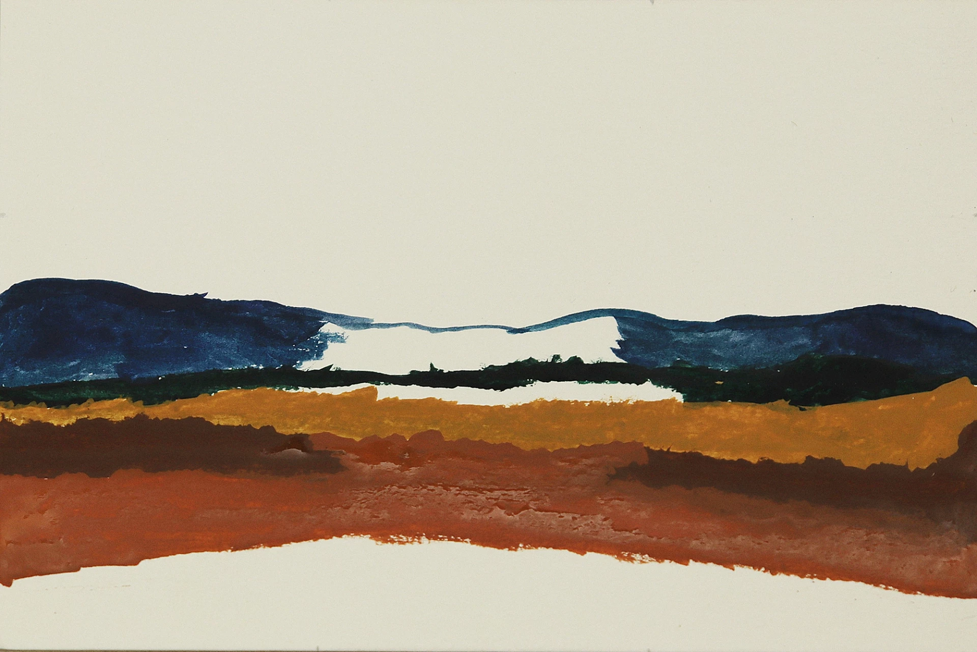
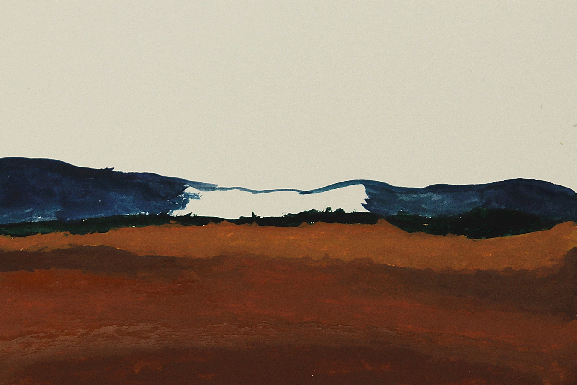
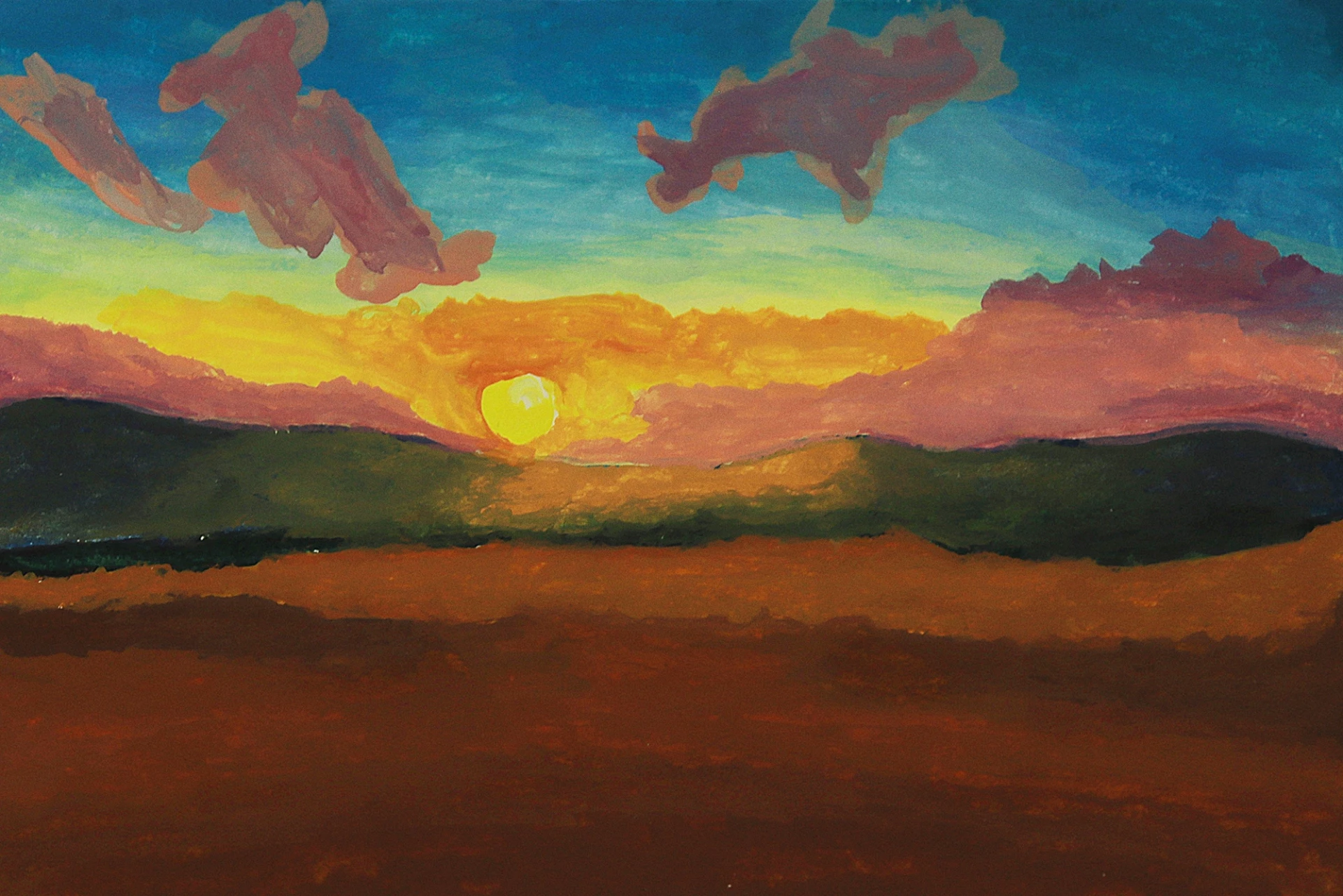
Then we proceed to paint the lower area with a deep brown to enhance the feeling of proximity and volume in the foreground.
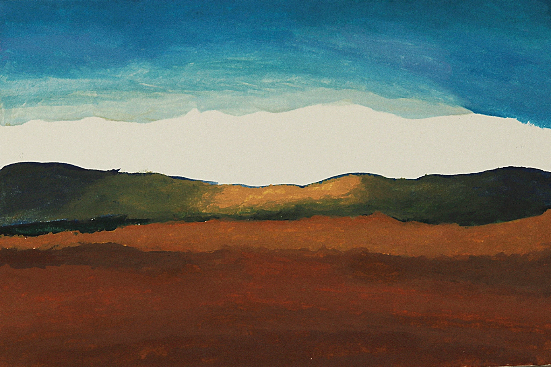
Use clean water to soften the transitions between different colors, creating a gradual blend that enriches the color transition. If needed, add additional layers of the same tones to enhance the intensity and consistency of the colors.
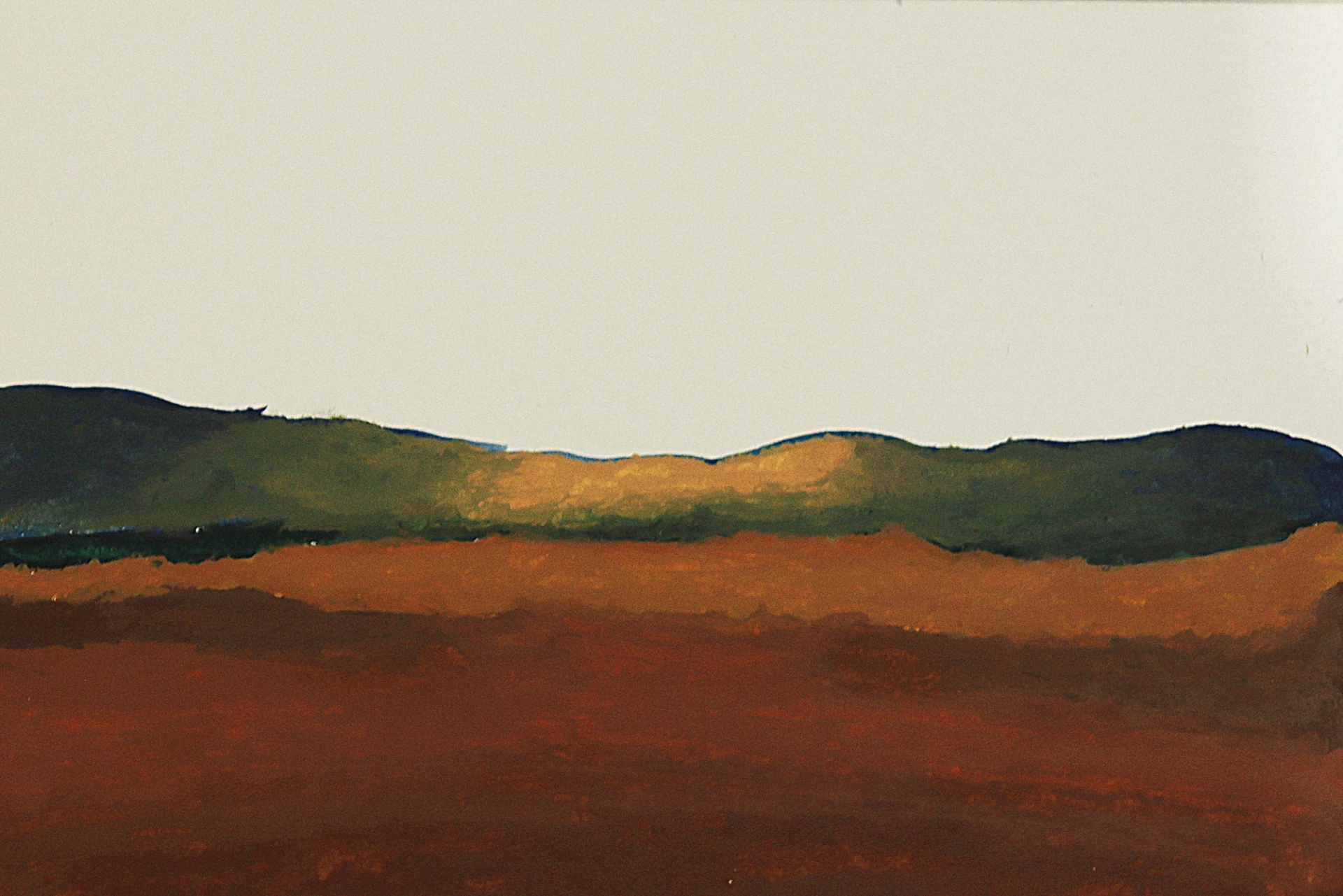
We then apply a bright yellow in the center of the mountains, in the area that we had left unpainted.
By blending with the surrounding blues, this color creates a greenish hue that evokes an atmospheric light and defines the area of strongest light concentration in the composition.
Paint the sky
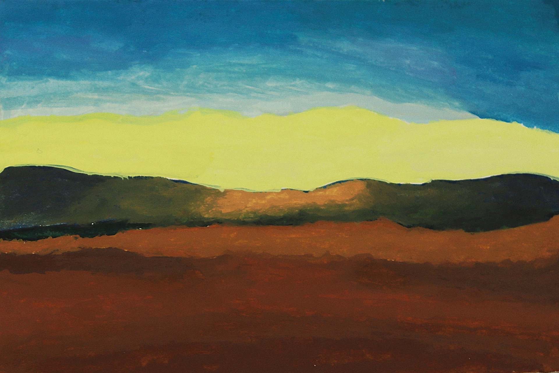
Start painting the sky with a light blue, applying gentle strokes to achieve a clean finish. You can add slight variations in intensity to create texture.
Extend the paint upwards using a darker blue, thereby creating a gradual transition towards a less illuminated area. This variation emphasizes atmospheric perspective and draws the eye towards the bright center.
Use water to achieve different shades of blue and create a smooth gradient that evokes the fading light.
Intensify the upper part of the sky with a deeper blue, consolidating the effect of a day coming to an end.
In the central area, above the mountains, apply an intense yellow to represent the bright core of the sun.
This strong contrast with the rest of the composition clearly defines the main visual attraction point, which will be enhanced in the next steps.
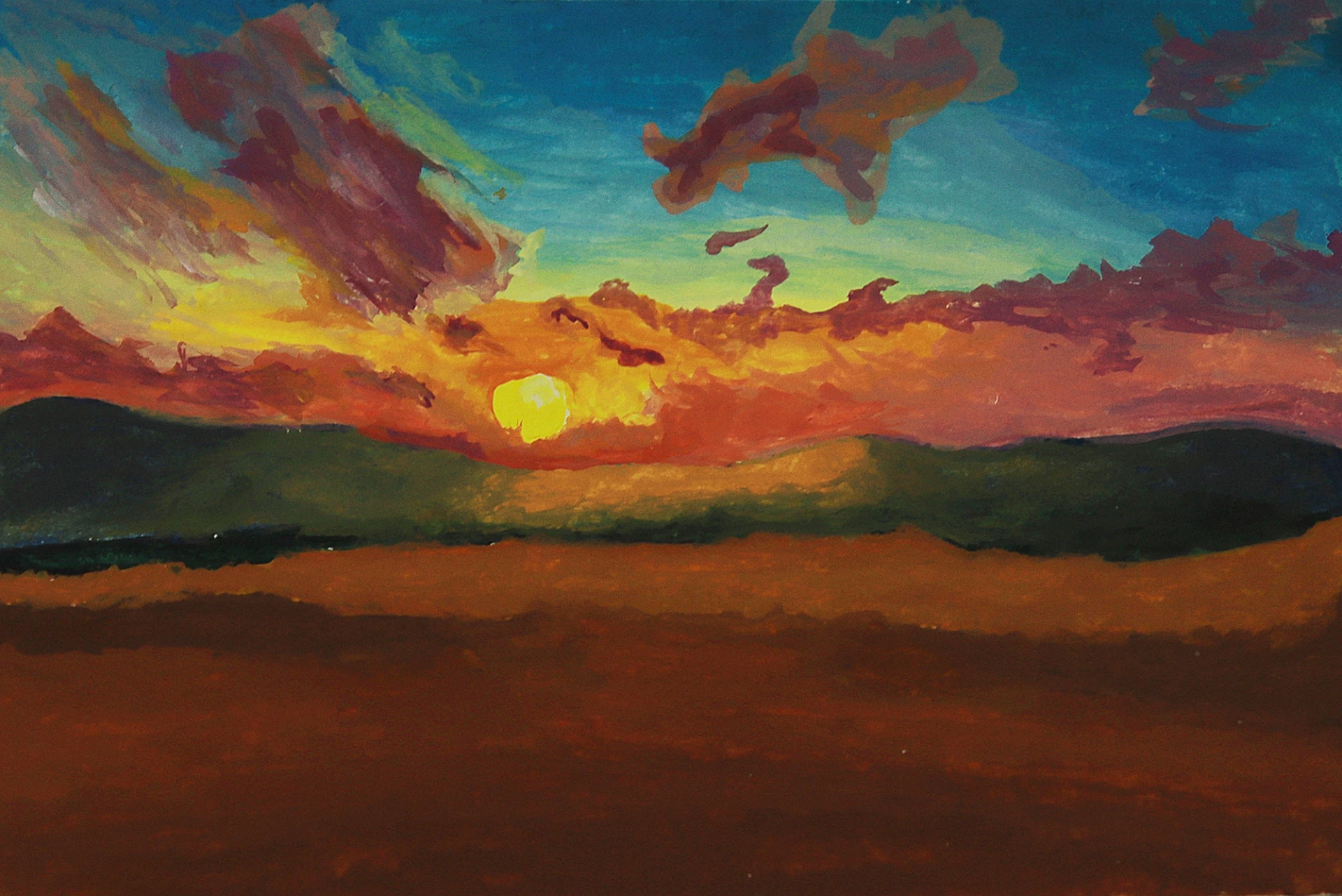
Add the colors of the sunset
Add orange tones to the yellow to show the sun and some light clouds. Subtle gradients between these colors add volume and begin to create the warm atmosphere typical of a vibrant sunset.
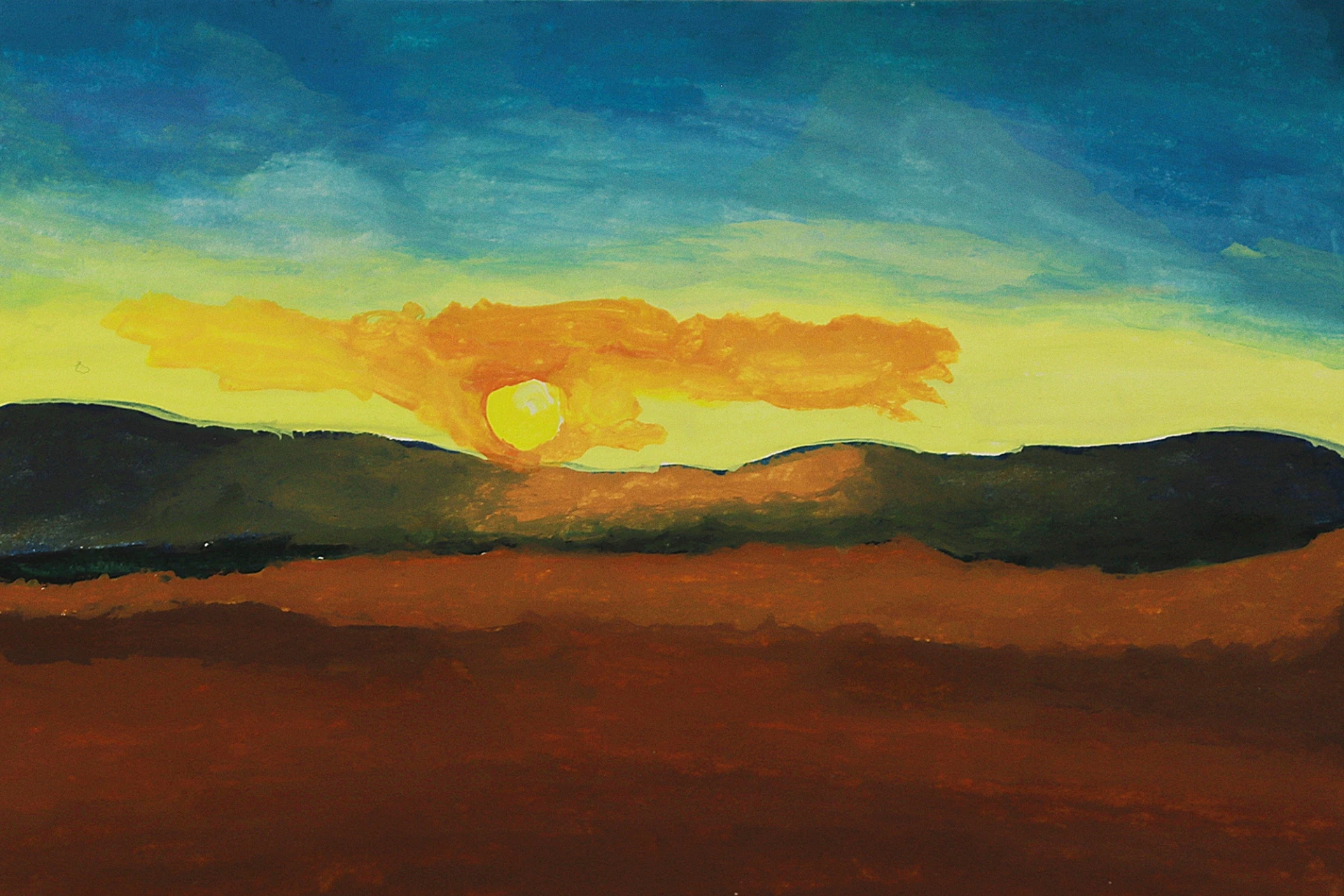
Using soft pink hues, we define the clouds near the sun while maintaining soft transitions.
We are now adding shades of deep purple to add more drama and tonal variety to the clouds as a whole.
Cool hues contrast with the warm colors of the central area, adding three-dimensionality and enhancing the effect of depth in the sky.
We apply vibrant red tones around the sun, intensifying the feeling of warmth and energy.
We work quickly to blend the colors before they dry, aiming to achieve a more natural visual effect and harmony between the oranges, yellows, and pinks.
Here, we are enhancing contrasts by adding shades of darker purple in strategic areas to balance the composition.
This accentuates the strength of warm colors and adds a dramatic visual effect, by simulating the rapid variations of light and shadow typical of actual sunsets.
Apply pure white to a few areas of the clouds to suggest reflections of sunlight. Gently extend the yellows and oranges across the sky to blend them with the neighboring blues, unifying the overall atmosphere.
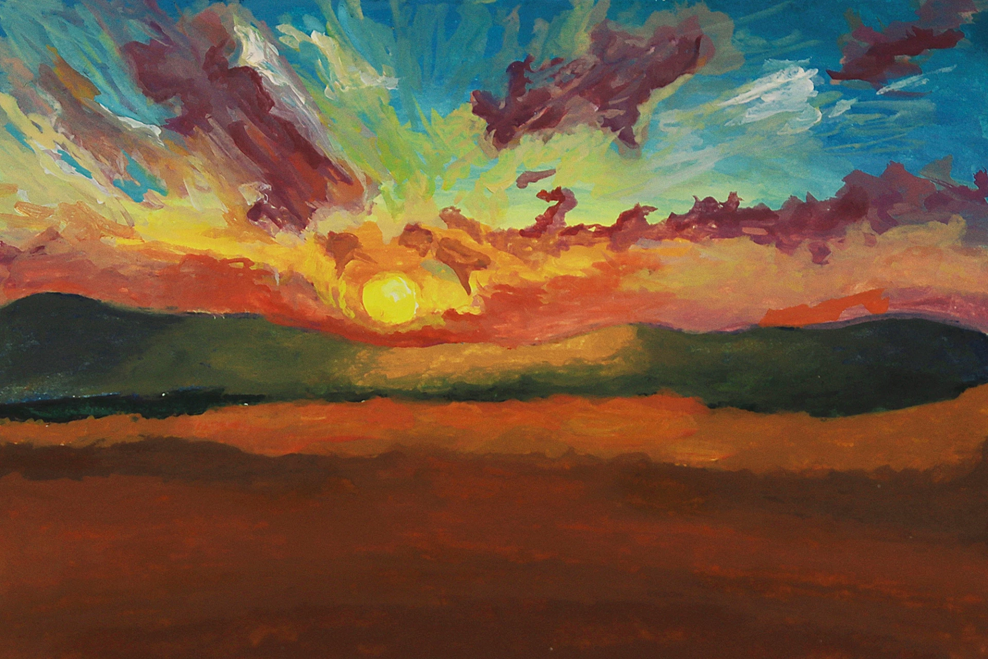
With a dark color, paint the silhouette of trees in the background. These elements break up the uniformity of the scene and introduce a visual scale. Below, paint the field with a deep green to reinforce the various layers of the planes.
Paint the lower area with dark tones, then add lighter greens in places to simulate illuminated vegetation.
Deliberately leave some areas unpainted to allow the reflected light from the sky to enhance the volumetric effect.
Add new layers of warm light green to add more texture and depth to the terrain. The controlled transitions between shadow and light make the field look more visually realistic, while balancing the contrast with the vibrant sky.
Finalize the painting
Apply light reddish orange highlights on the trees and vegetation, evoking the warm light of the setting sun. This step creates chromatic cohesion between all the elements of the landscape and unifies the composition.
Adjust the sky's lights and shadows to enhance the overall drama. Apply touches of ochre and orange to the field to suggest illuminated vegetation. Tweak the details of the sun and adjust its intensity relative to the rest of the scene.
We add intricate details to the mountains, plain, and clouds. We use a fine brush to highlight the textures and accentuate areas of light or shadow.
This level of precision adds more depth and vibrancy, so that each element remains consistent with the overall light.
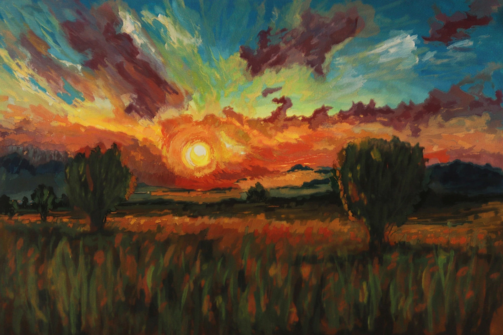
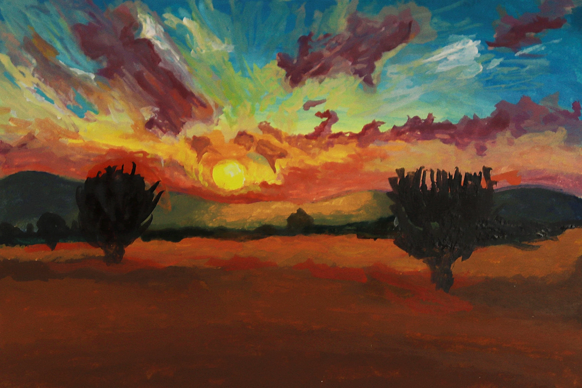
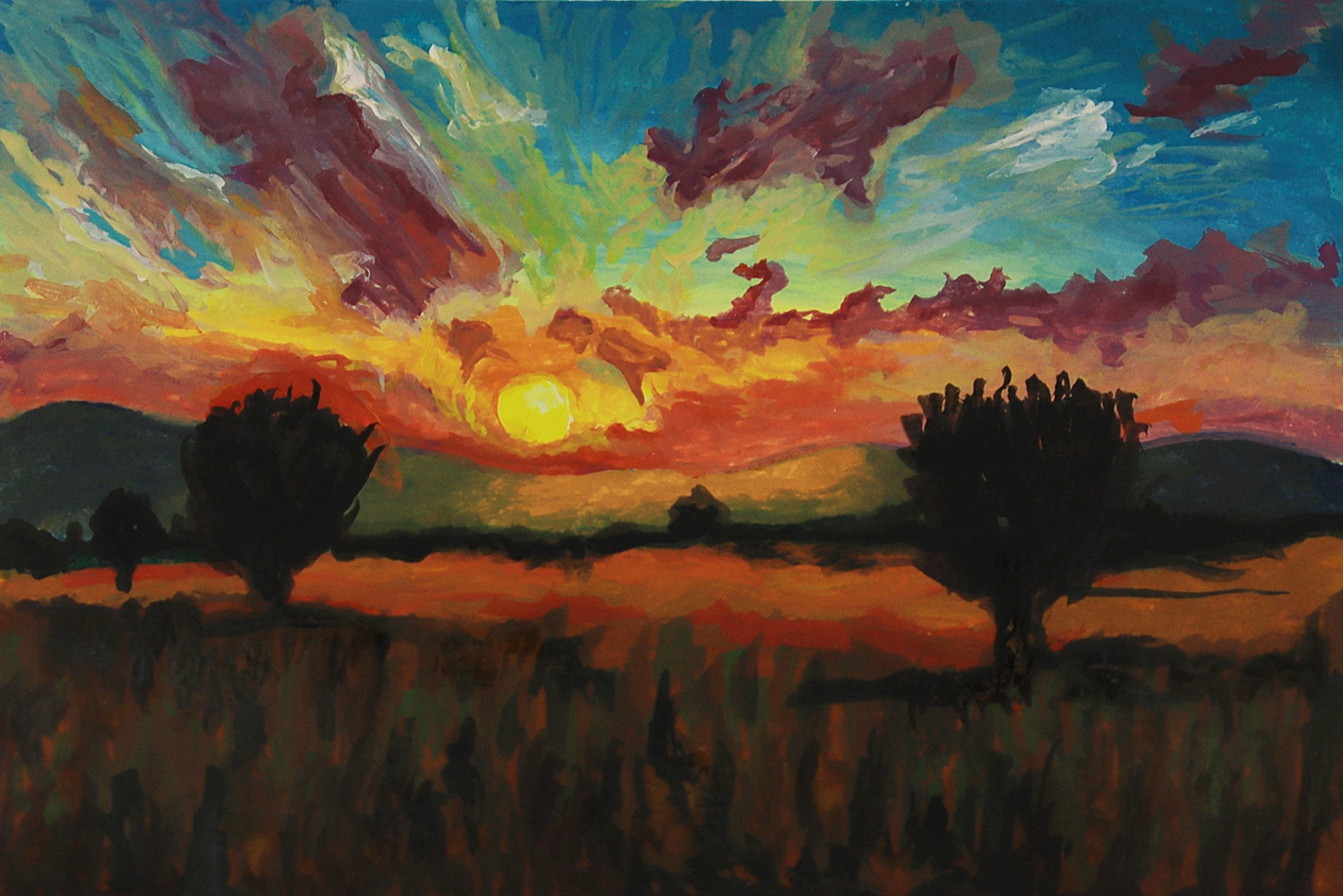
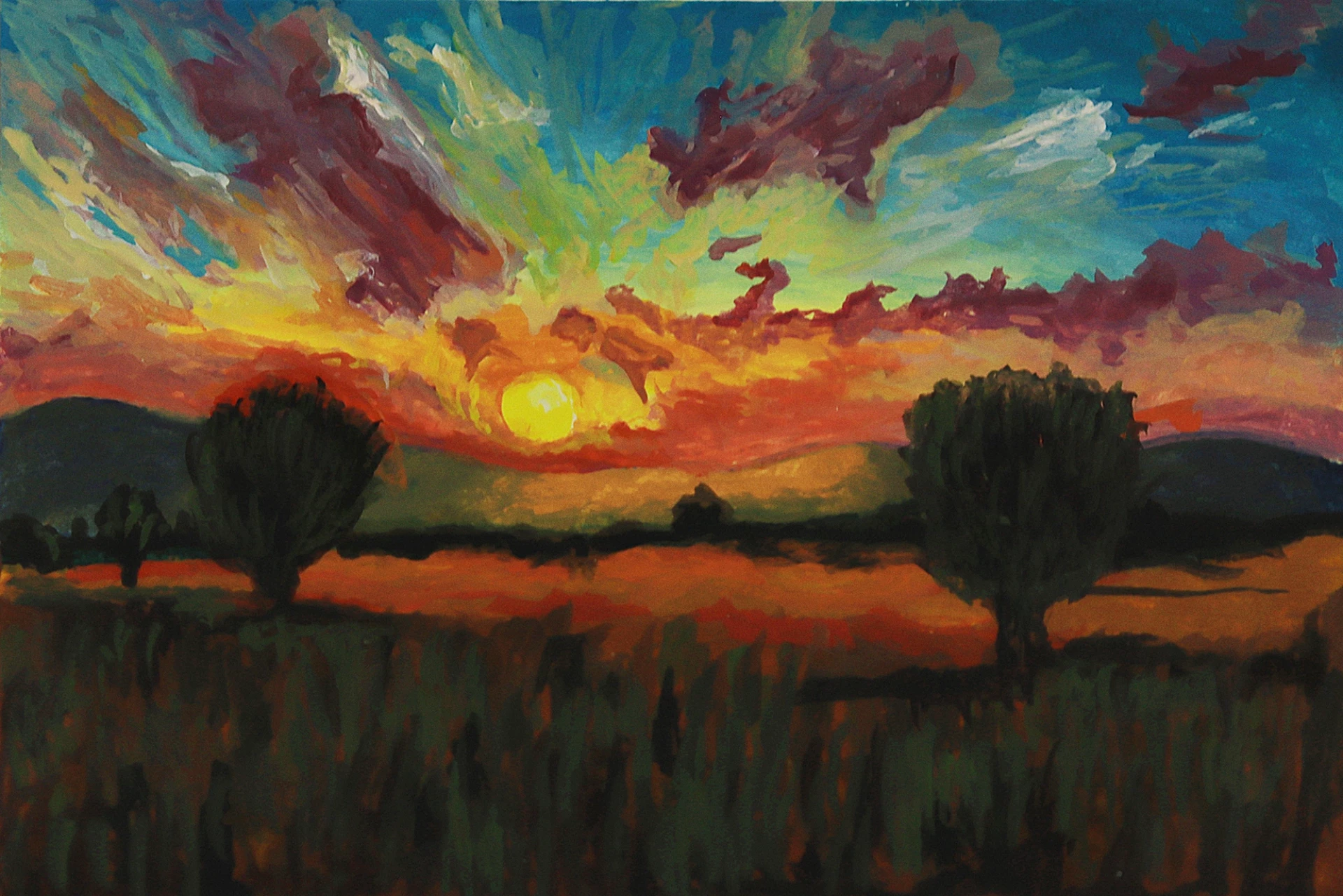
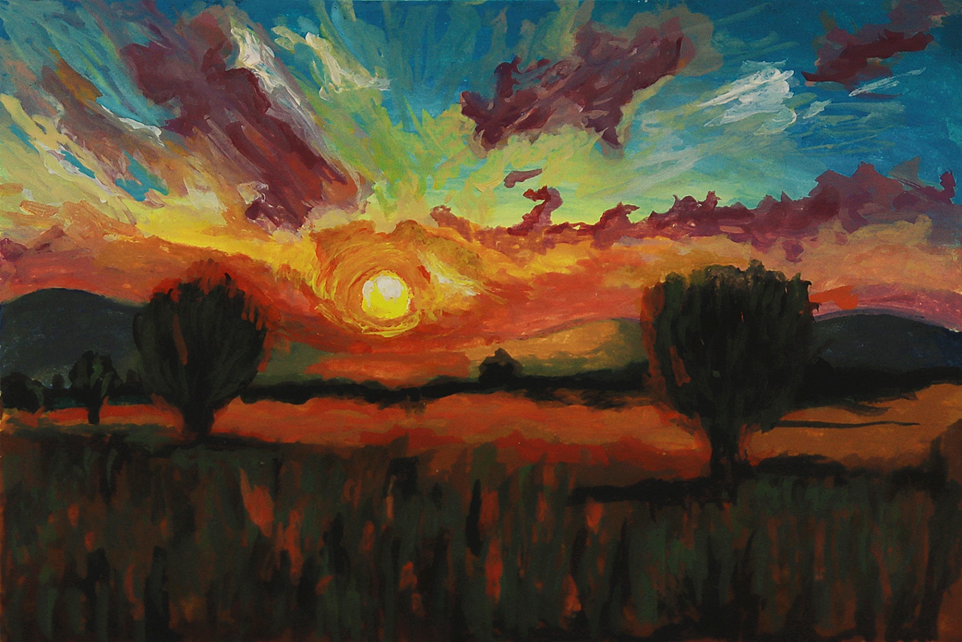
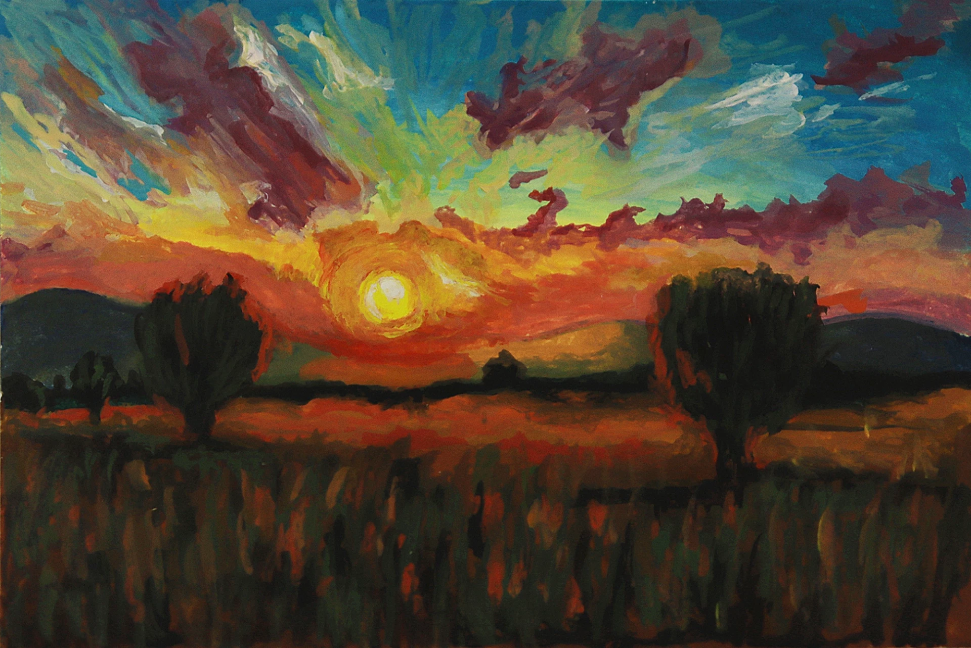
We add the final touches to the trees, field, and sky, integrating all elements into a coherent and unique visual narrative. In the finished piece, the cool tones of the mountains and sky harmoniously contrast with the vibrant warmth of the horizon. The atmosphere captures the exact moment when the light begins to fade.

And our painting is now finished! I hope you enjoyed this tutorial.
This exercise shows how acrylic paint enables us to create an intense atmosphere through layers, gradients, and contrasts. The way we use water, the choice of brushes, and the progression of colors transform a sunset into a true experience of light and depth.
Editor: Julio
Discussion
It's a discovery. The sunset explained step by step with the explanation and photo of each stage is simply brilliant.
I'm going to go over this tutorial again and do the exercise following the instructions, including the specified colors and brushes.
I hope to master the shots and fades, this will be my first sunset!
I would like another tutorial: the foam on the wave that comes to die on the beach.
Thank you for this very interesting tutorial once again 🙏👍
What is the dimension of the prepared paper/cardboard or canvas, please?
Hello,
Difficult to manage color consistency depending on what you want, fade, gradient or cover the previous paint.
My sunset remains very, too bright, unrealistic... but why not!