How to Create a Realistic Drawing with Colored Pencils
Hello everyone, today I'm going to show you how to create a realistic drawing with colored pencils. In this article, we'll cover the main techniques you need to know to create any realistic drawing, then we'll go through a step-by-step example so you can put this into practice.
Prepare your colored pencils, your paper, and especially your imagination! Let's start!
Which materials should you use?
When choosing to create realistic drawings, technique is obviously crucial, but materials also play a big role. I'm certainly not suggesting that you spend a fortune on expensive equipment, but if there are two items you should invest in, they are definitely good pencils and paper.
You can also choose to acquire them individually in order to gradually build up a beautiful collection.
Colored pencils
This is obviously the most important piece of equipment. Good colored pencils can be expensive, but they make all the difference. The colors will be more intense and the leads are not too dry so they will allow you to glide over the paper and create beautiful gradients, in short, everything you need to create beautiful drawings.
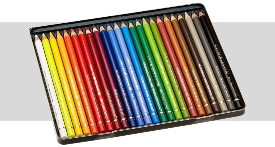
If you can, I recommend that you invest in pencils from the brand Faber-Castell. I personally have a strong preference for Polychromos, but they are very expensive. You can definitely opt for the Goldfaber range, which is much more affordable and also very effective.
The second brand vying for the podium is Caran d’Ache with its Luminance range. Here too, you will find intense colors and lead that moves very well over paper. Finally, you can opt for Prismacolor. They are less expensive and also hold up well.
As you've seen, there are many options, the most important thing being that you use pencils with intense pigments and that glide smoothly on the paper, leaving a smooth, non-grainy line.
Paper
Paper is the second most important element. You can definitely create quality drawings on printer sheets, but if you want the best rendering possible, then the best paper for that is Bristol paper. It offers a nice sheet thickness, which will prevent damage to the surface. It is extremely white, which makes the colors stand out well, and most importantly, its texture is very smooth, which allows the colors to glide perfectly over it.
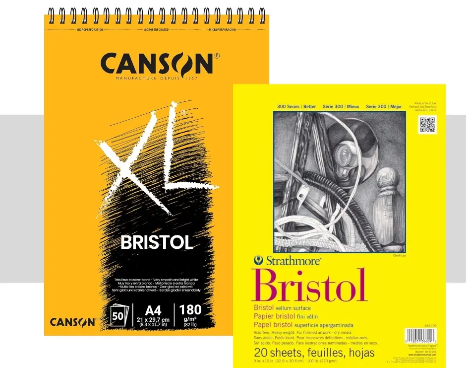
Bristol paper by Canson, in my opinion, offers an excellent quality/price ratio.
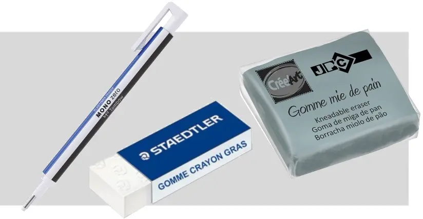
Erasers
Although they are not indispensable, erasers can also be useful. You don’t need to invest here, but I recommend having a white eraser and a kneaded eraser for blending sketches. You can also opt for a precision eraser to increase comfort, but it’s totally optional.
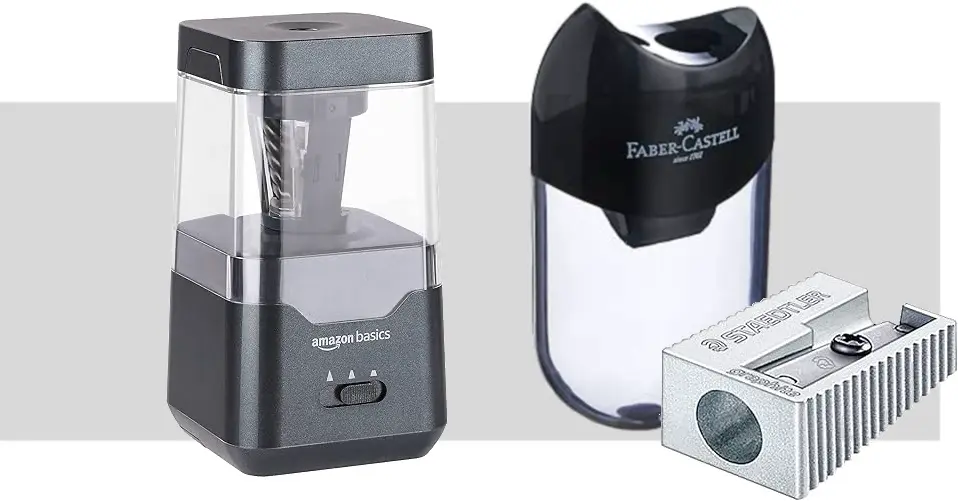
Pencil sharpeners
Yes, we often forget them, but no matter which one, always make sure that you have a sharp pencil sharpener with you in order to have the most precise pencils possible.
Tips: Do not use a blending stump, but a sharp pencil to blend the colors together.
Basic techniques for drawing with colored pencils
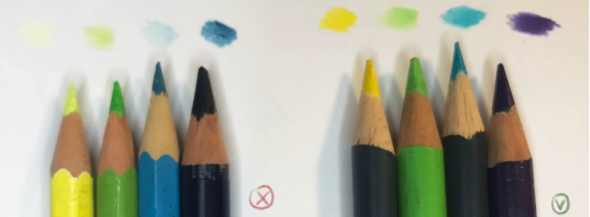
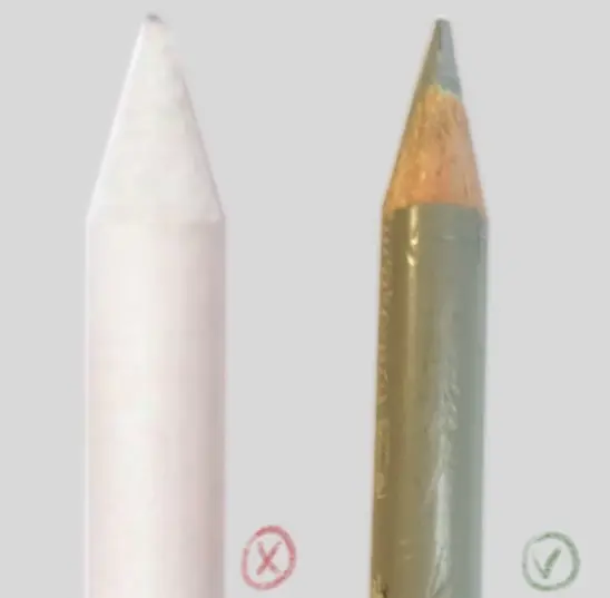
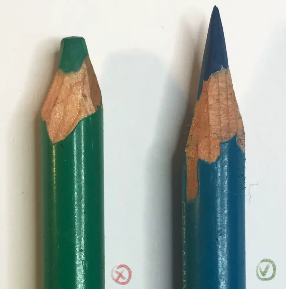
Sharpen your pencils
The first technique we will look at isn't really a technique, but it will be your best ally: keeping your pencils sharp. You will gain precision and intensity of colors, and the results will be all the more brilliant.
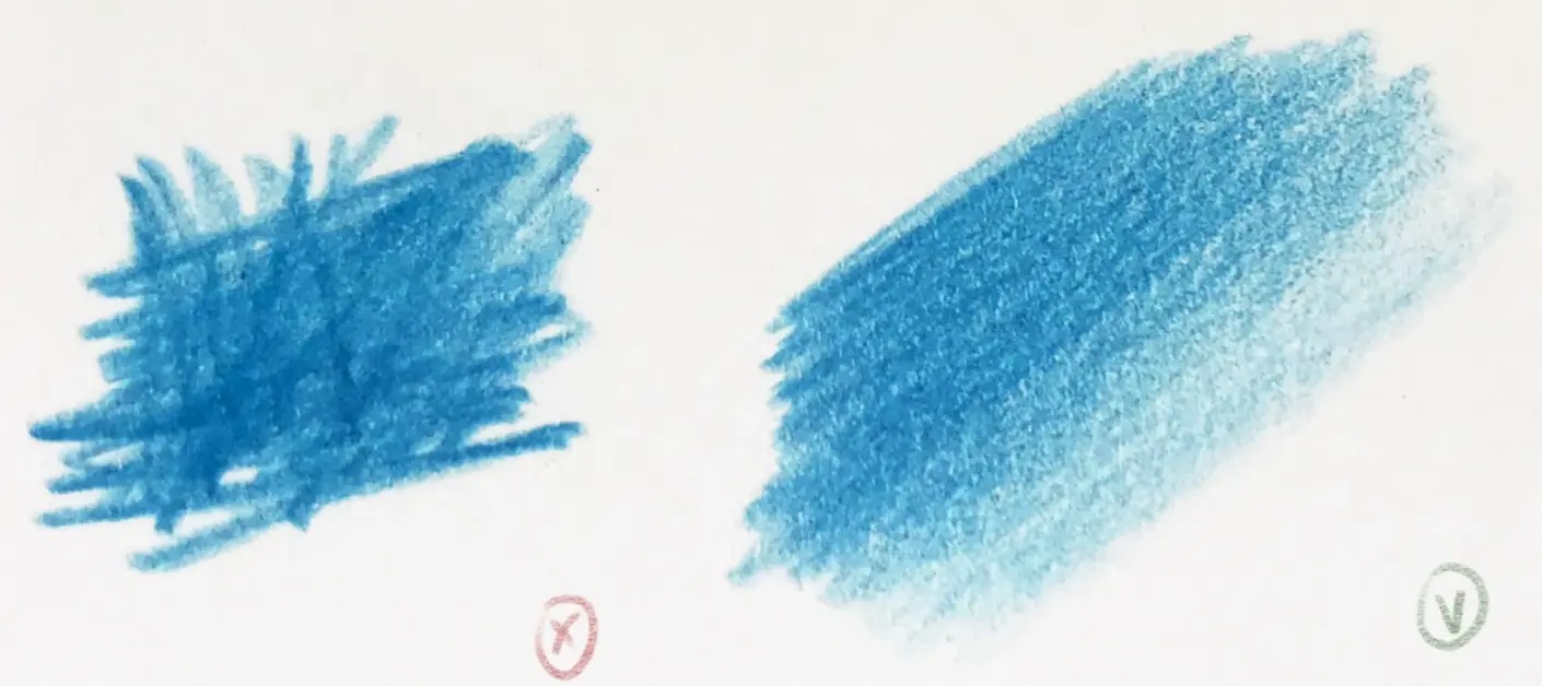
Playing with pressure
When you apply your colors, do so lightly, and learn to control the pressure. If you apply all the pressure at once, your gradients will fail and it will be quite tricky to achieve a realistic rendering. Build up your colors gradually by applying successive layers of pencils; you can apply more pressure only at the end to fully utilize the potential of the pigments.
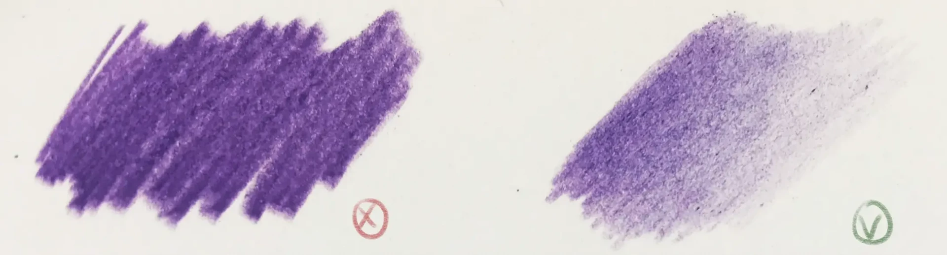
Color in one direction
When you apply the color, apply it in one direction, ideally following the curvature of the part you are coloring. You can draw making lines or small circles, and you can even vary the direction on the same drawing, but when you are working on the same area, use one direction to have a uniform rendering.
Overlapping colors
When you learn to use the pressure of a pencil, you realize that the colors have a slight transparency that allows them to be layered. This is perfect for adding more intensity to a color or for creating a shade you do not have. You will see that for a realistic drawing, many colors are layered to achieve a very varied rendering while keeping it light.
Creating a gradient
This technique is undoubtedly the most important: creating beautiful gradients. For realistic drawings, gradients are essential; they enable you to create color blends and very fine transitions. Here is how to proceed:
1. Apply the first color lightly.
2. Do the same with the second color, lightly going over the first.
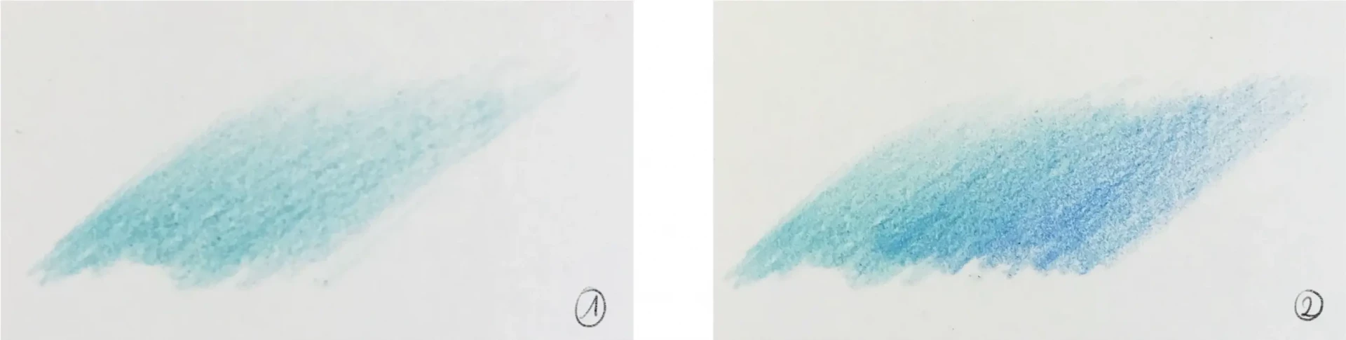
3. Now press a bit harder to intensify.
4. The same process is applied with the second color, making the gradient homogeneous.
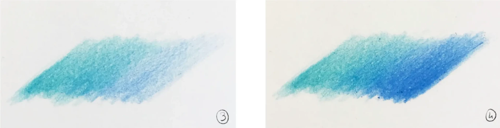
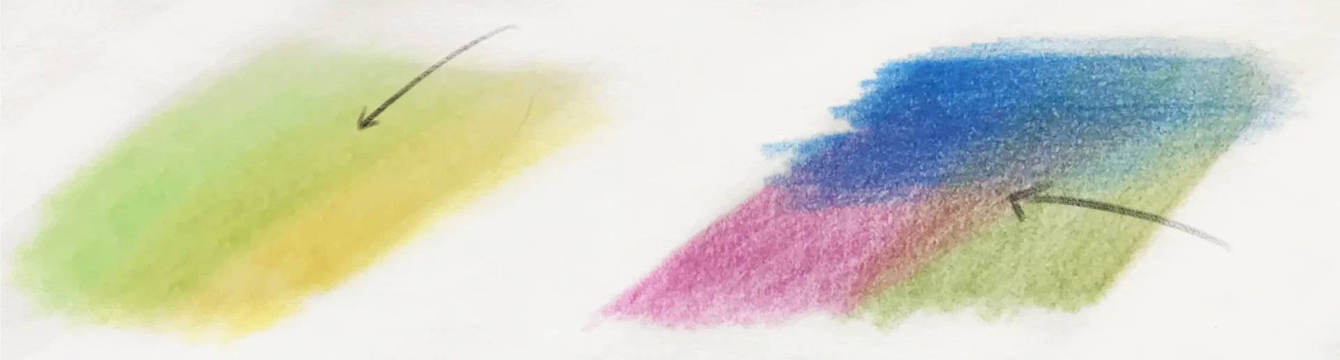
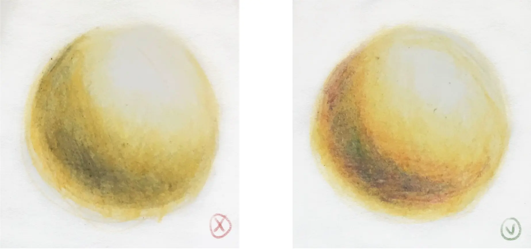
If you want to create gradients with two different colors, the result may not always be very attractive. The solution for this is to use an intermediate color. You can therefore fade the colors gradually into each other. In addition, this has the advantage of intensifying your colors even more.
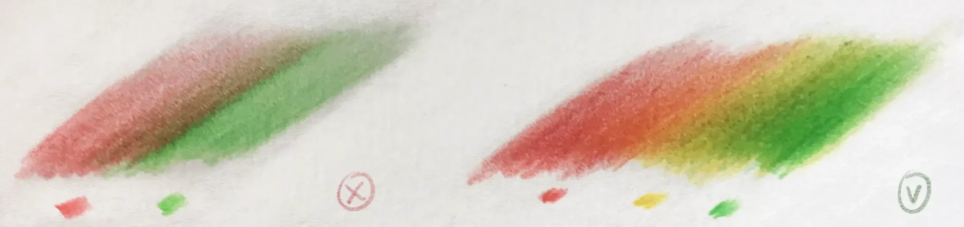
Never use gray or black for shading
Sometimes you might want to darken your color, but you don't have a darker shade of the same color. Don't worry! Use a complementary color (or overlay two colors that together form the complementary color). Black tends to dull all the colors around it, and your drawing will therefore lose intensity and realism.
Create a realistic drawing with colored pencils step by step
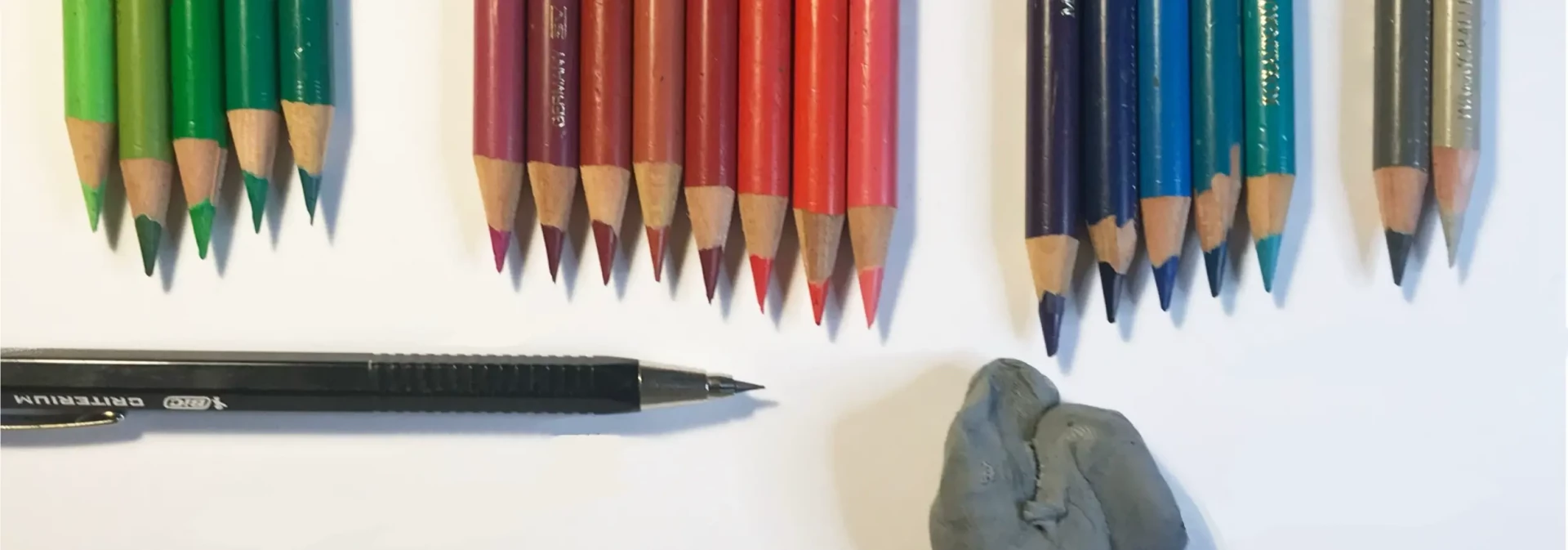
After all this theory, let's look at a step-by-step example. Here are the materials I will use to create this drawing. As you can see, I have many shades of the same color. If you don't have as many, which is perfectly normal, you will need to layer different colors to try and create similar hues. You can practice on a sheet to test first.
Don't forget that even with fewer shades, you can still achieve a beautiful result!
In terms of supplies, you will need a pencil or a mechanical pencil, a white eraser for corrections, a kneaded eraser for blending, and, of course, colored pencils.
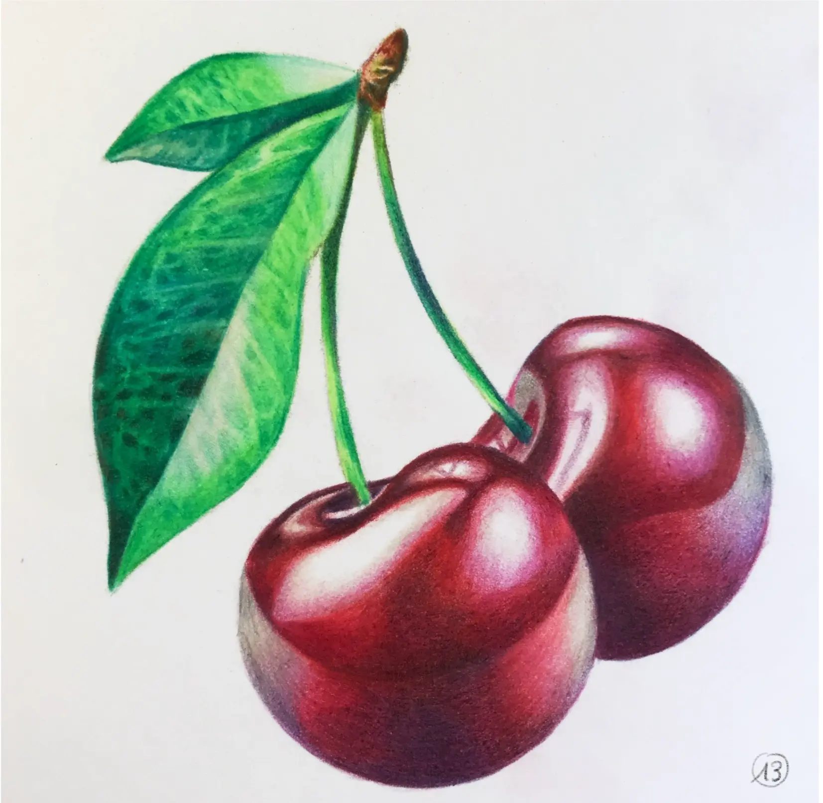
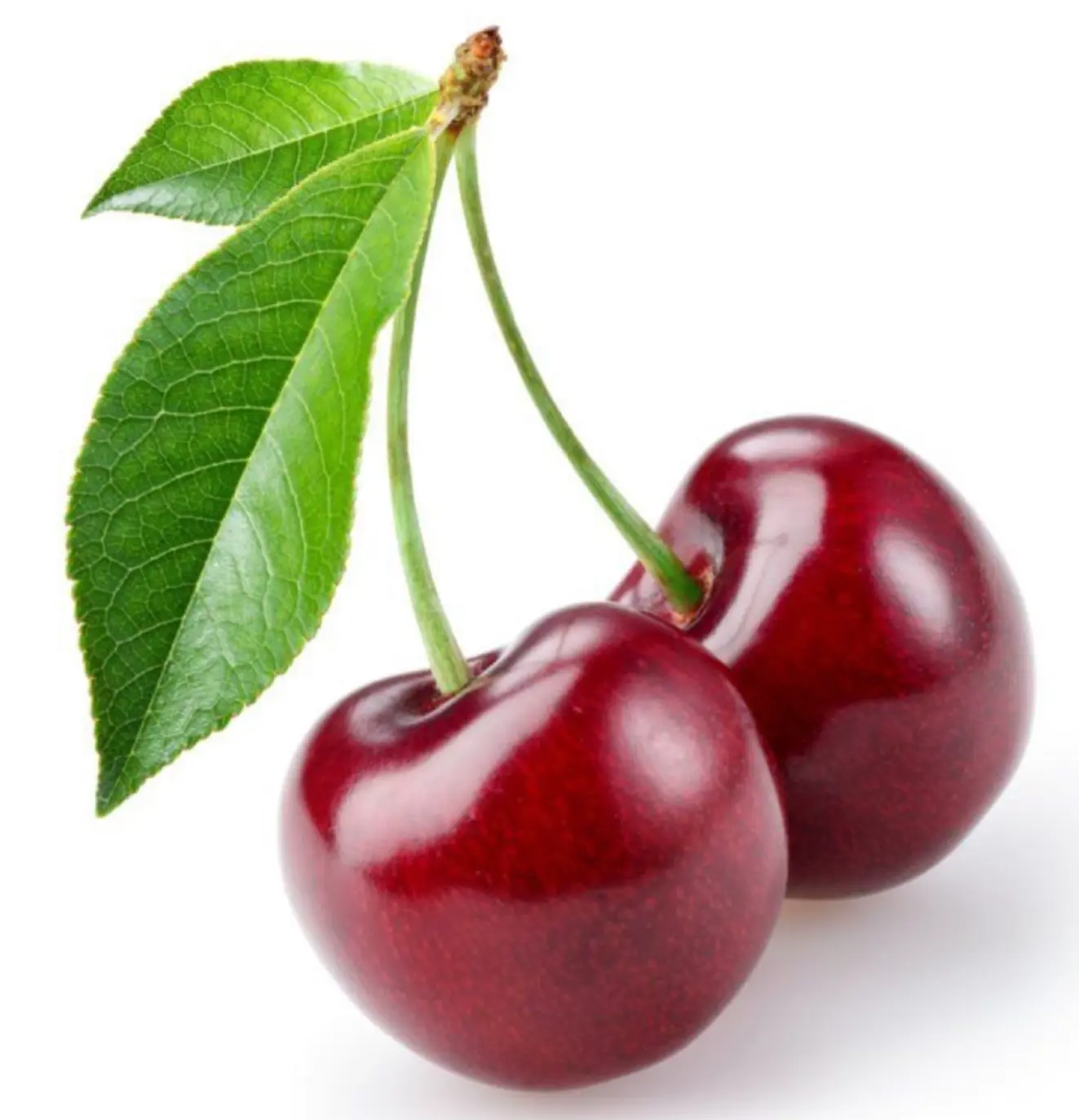
For this example, I have chosen to draw cherries. This has the advantage of being quite easy to sketch, so you can focus more on the coloring rather than the drawing.
Before starting, take the time to observe the reference image and try to analyze the different colors you see. For example: do the shadows tend toward warm or cool hues? Which shades correspond to the reflections?
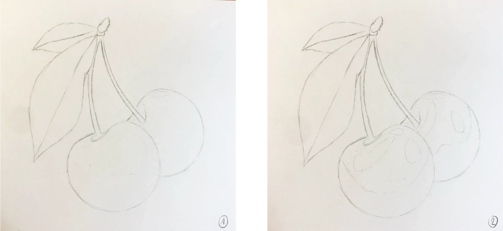
1. Start with a sketch, ideally make it quite neutral and not very marked.
2. To help, you can map out the main light and shadow areas.
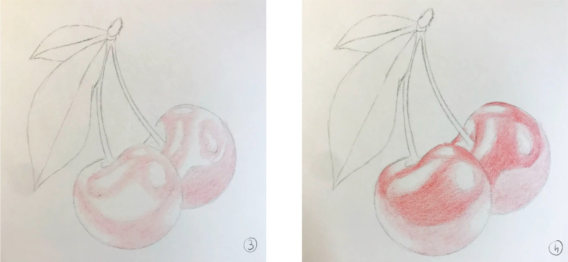
3. Lightly apply a first color, which will serve as a transitional base for the areas of lights and shadows.
4. Add a second color, still lightly; this will be the base shade of the subject.
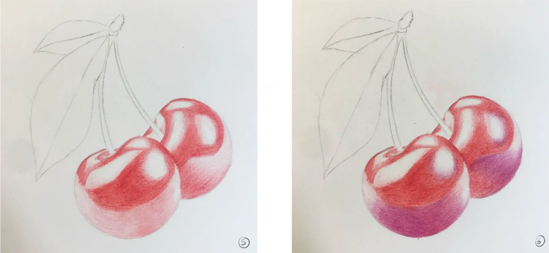
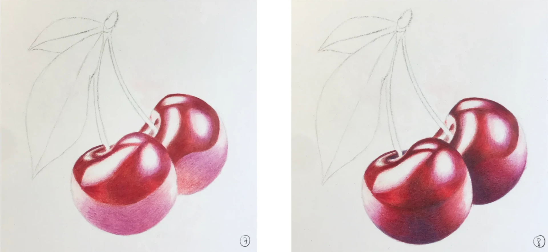
5. Reapply the first two colors to intensify them. Always work lightly to build up the color.
6. Add blue-toned violet to suggest the reflections.
7. Intensify the shapes and shadows by playing with the three colors already used: bright red, dark red, and purple.
8. Use very dark purple to further intensify the shadows. You can use fuchsia to facilitate the gradients and make them softer.
9. Use a neutral pencil, here I chose beige, to blend the colors together. To add some nuance, I also added a few touches of blue.
10. It's time to move on to the leaves. I do the same thing as earlier, applying a base color to start.
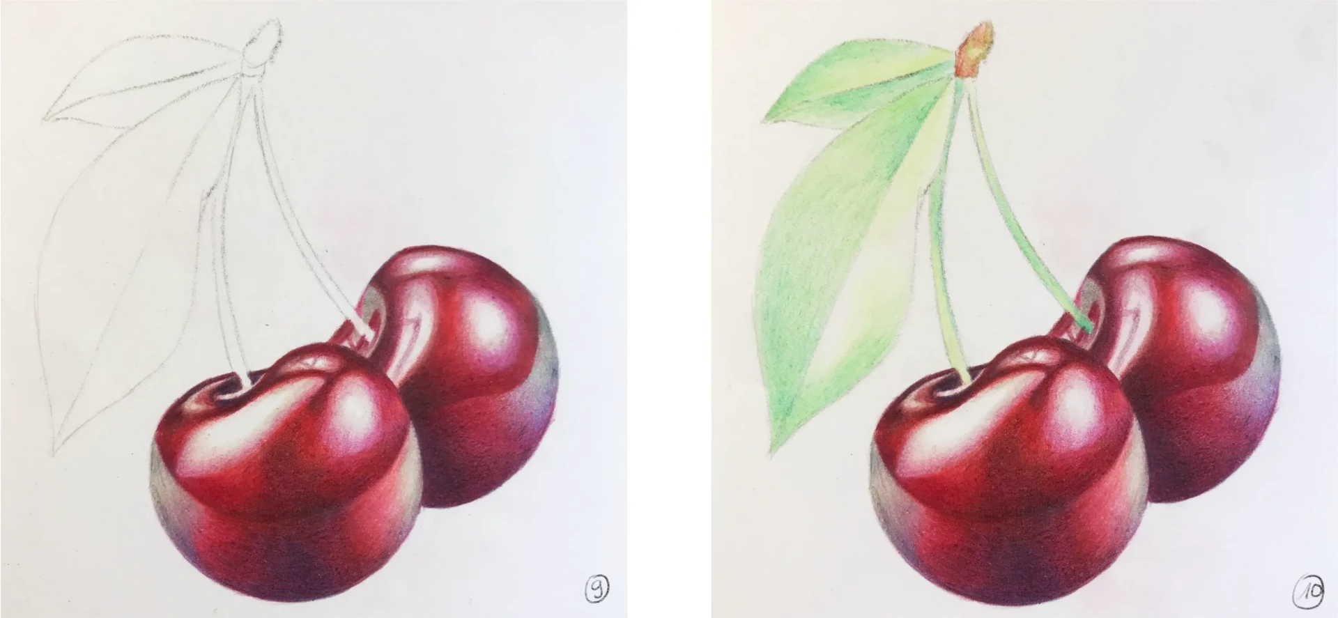
11. To add nuance, I add blue and yellow. Don't forget to carefully analyze your reference to observe all the micro shades, as they are what will give it a realistic aspect.
12. Using a green and a dark blue, create the veins of the leaf.
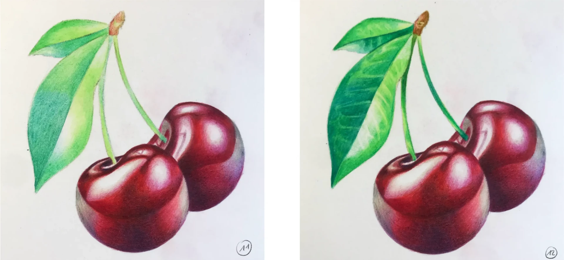
13. Finally, you can add some details and smooth out the transitions.

And there you have it! Now, you have all the tools and skills you need to succeed in creating realistic drawings with colored pencils. One last piece of advice: take your time!
Creating realistic drawings requires time and patience. I hope you enjoyed this article. Do not hesitate to share your drawings with us! 😊
Writer and illustrator: Chloé Pouteau
Discussion
No comments yet.