How to Draw Transparency?
Hello everyone, today I suggest we discover how to draw transparency. Transparency is omnipresent in our world, in plastic, glass, or water, all these materials have it, so it would be a shame not to include it in our drawings.Through these few examples, we will see how to easily transcribe this effect.
Prepare your pencils, your paper or your tablet, and most importantly, your creativity!
TRANSPARENCY, HOW DOES IT WORK?
The concept of transparency is quite simple; it refers to a material, often plastic, glass, or water, that visually allows everything behind it to be seen through itself. This includes both matter and light.
It is interesting to note that some materials are transparent but still distort the object behind them.
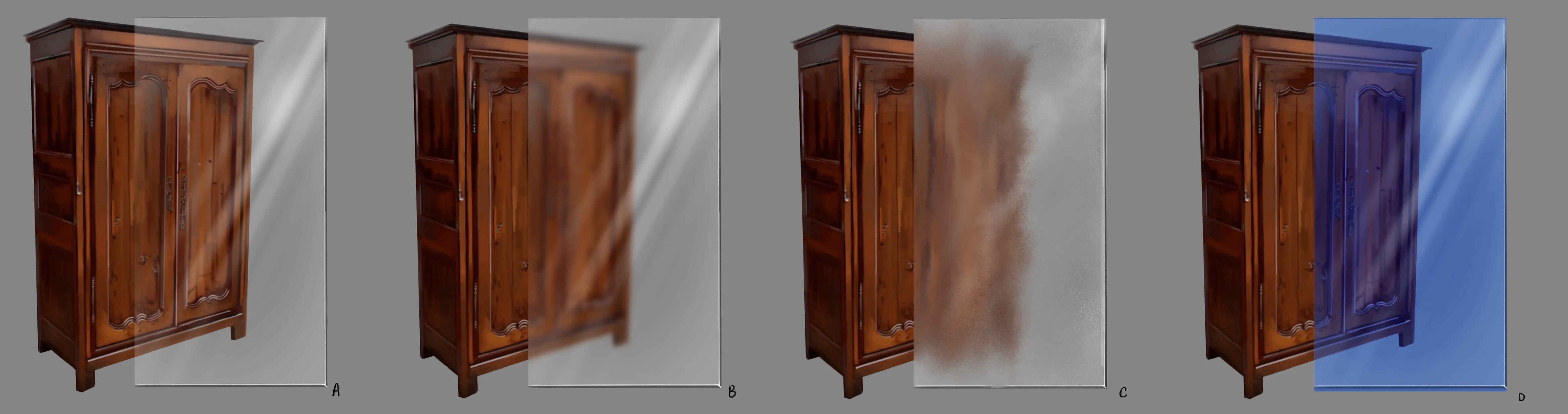
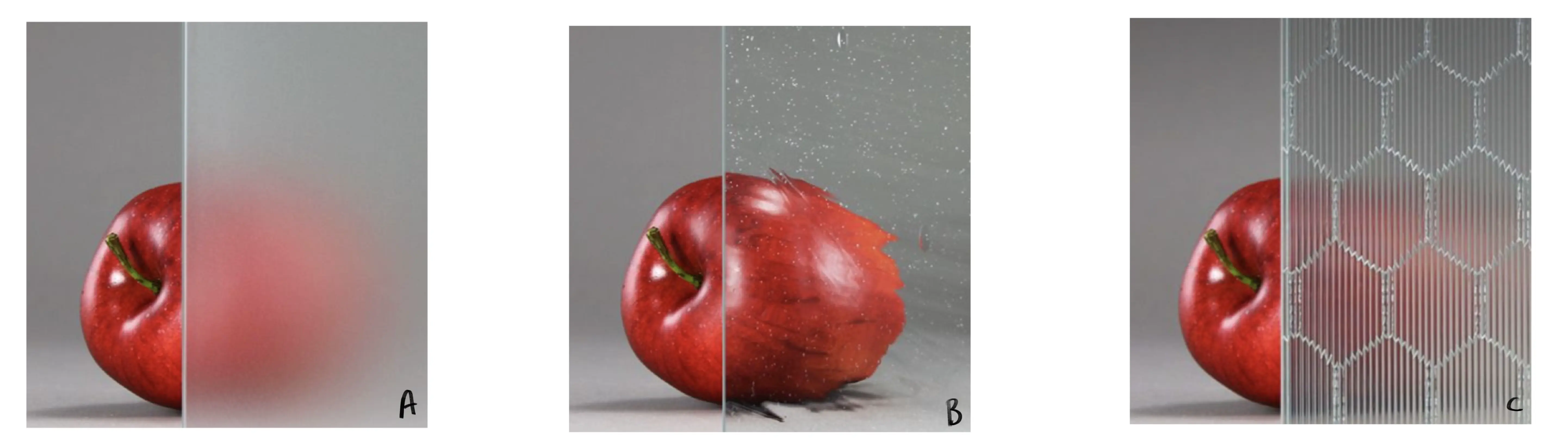
A - This is complete transparency, the type most commonly found, with window panes being the best example; it often seems like there's nothing there. To represent it, the best way is to simply add a few reflections on the glass.
B - This is a blurred transparency, often used when you want to let light pass through but keep a certain discretion about what is behind. To represent it, simply blur and diffuse what is behind the area of transparency and add a few rays of light.
C - This is a distortion transparency; it works somewhat like B, with the difference that often the material (plastic/glass/water) itself will be distorted (by lines, hollows, waves, etc.) and will therefore affect the object behind it by distorting it. To represent this, the best way is to blur the object behind the transparency area and slightly alter its shape.
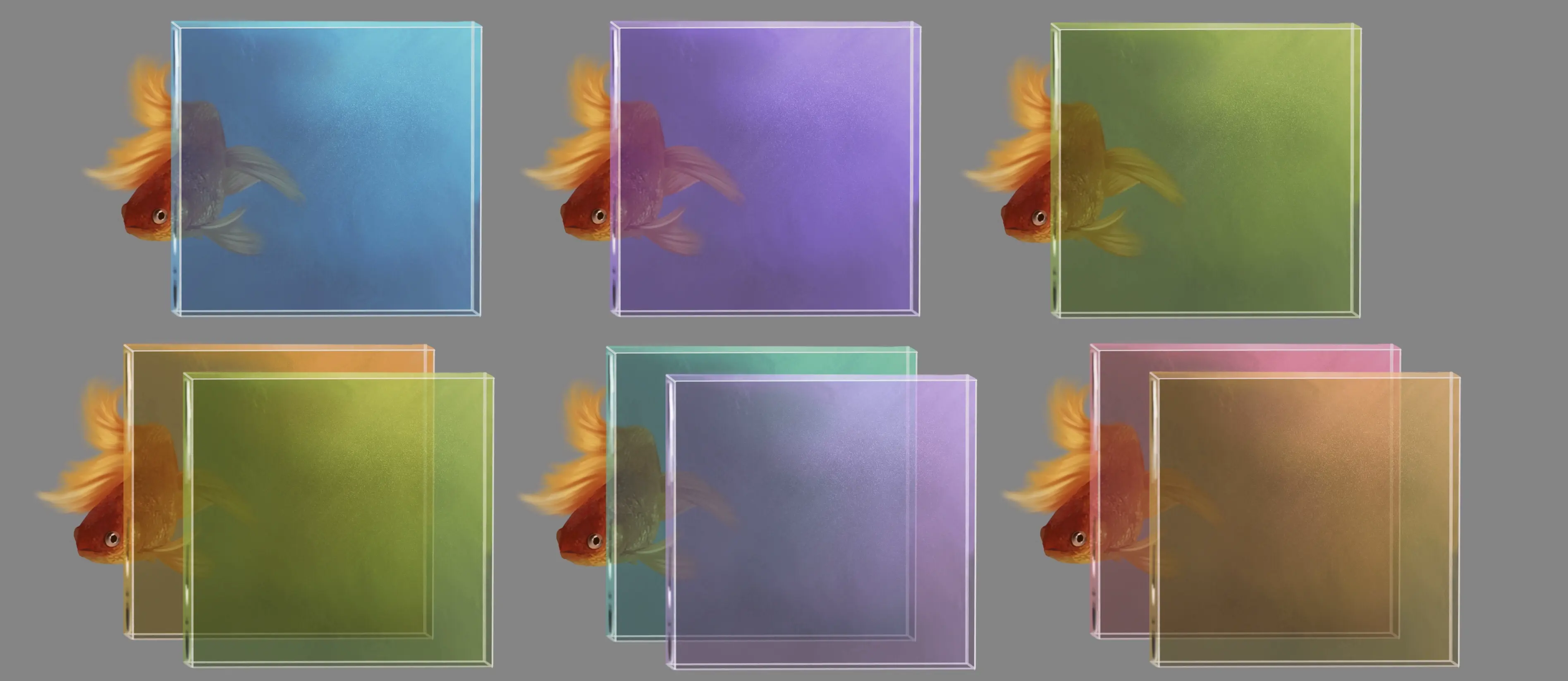
D - This is complete transparency but through a coloured transparency area. It is often found on plastic (water bottle) or glass (stained glass). The only impact it has is to change the color of the object behind it, as if a filter was applied to it. To represent it, it is better to know in advance which area will be affected and by which color, and then to use colours accordingly. For example, here with blue, I will use ranges of purples, blues and some cool browns.
DRAWING THE TRANSPARENCY OF GLASS OR PLASTIC
In this section, I will use the example of glass, but the examples are also valid for plastic, as they have very similar transparencies.
THE CUBE
When learning to draw a material, the cube exercise is always essential, as it helps to learn with a simple volume.
1 - I start by drawing a cube.
2 - I slightly blur the lines of the cube and create the back face by adding a light grey to the top of the face. It is important that this is well blended.
3 - I will create the surface of the ground, and for this I will make small lines that are quite faint, going from dark gray (near the joint with the back face) to light gray in the center, and then back to a darker gray. Using dark gray close to the edges helps to suggest a slight shadow and enhances the volume.
4 - I have completed the right side. I create light grey shaded lines starting from the top right-hand corner and descending diagonally. I alternate light and slightly darker strokes to represent the rays of light.
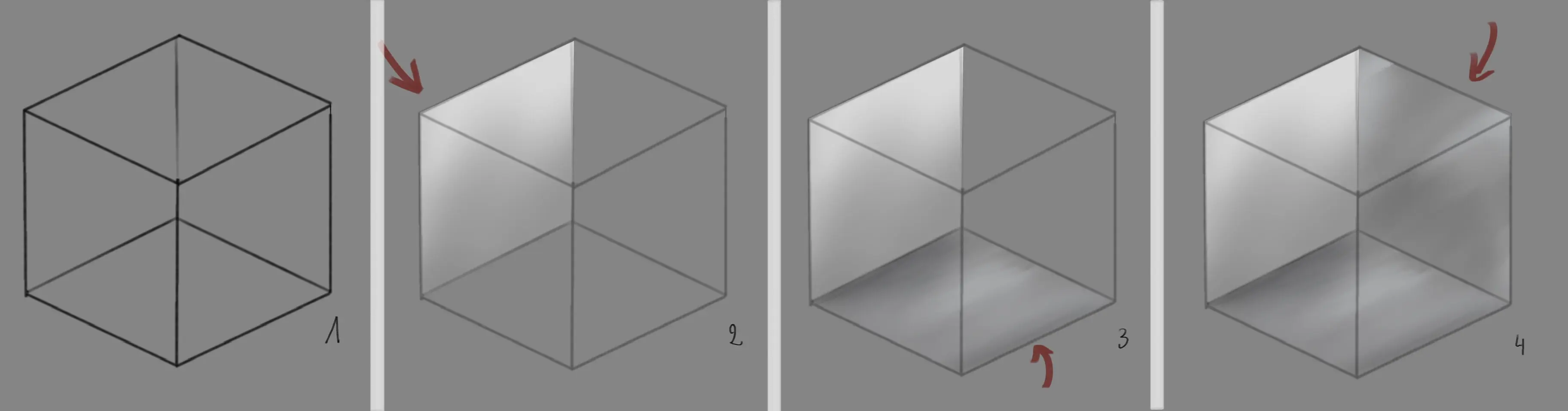
5 - I completed the front side by slightly darkening the triangle of the ground in common with the front side. This will help to better convey the idea of depth and the different walls. I then add light grey strokes, starting from the top right-hand corner.
6 - I proceed exactly as for the previous face, but I darken the triangle created between the upper face and the right face.
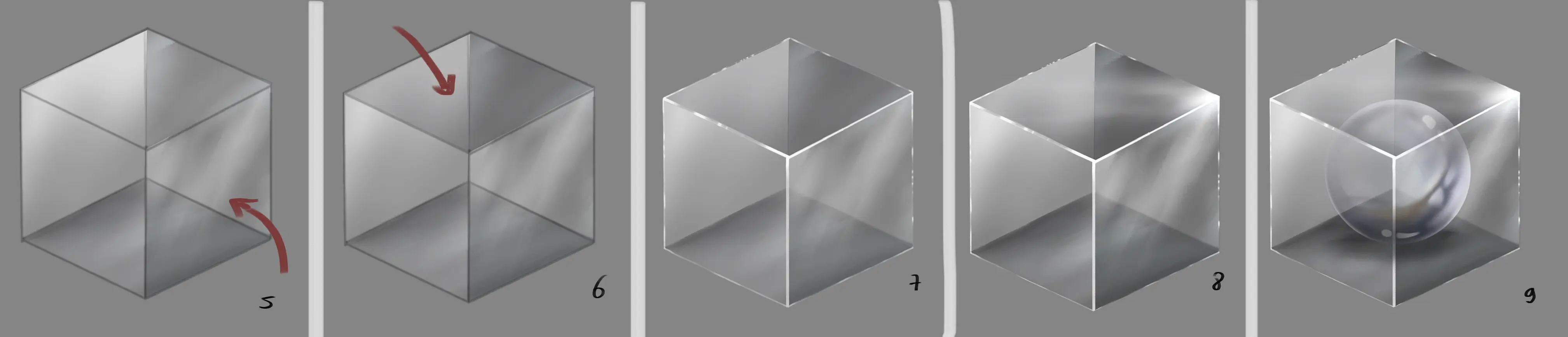
7 - I have redraw the outer edges in white, adding a few more light spots.
8 - Now I add white rays in the right corner, where my main light source is reflected.
9 - To make the exercise a bit more challenging, you can incorporate objects inside the cube.
DRAWING A POTION FLASK
For this part I chose to use a flask as an example, but this works with any type of container (jar, glass, bottle...) If you want to see how to draw a glass bottle, I refer you to this video: https://www.youtube.com/watch?v=tcZjqlrTElw
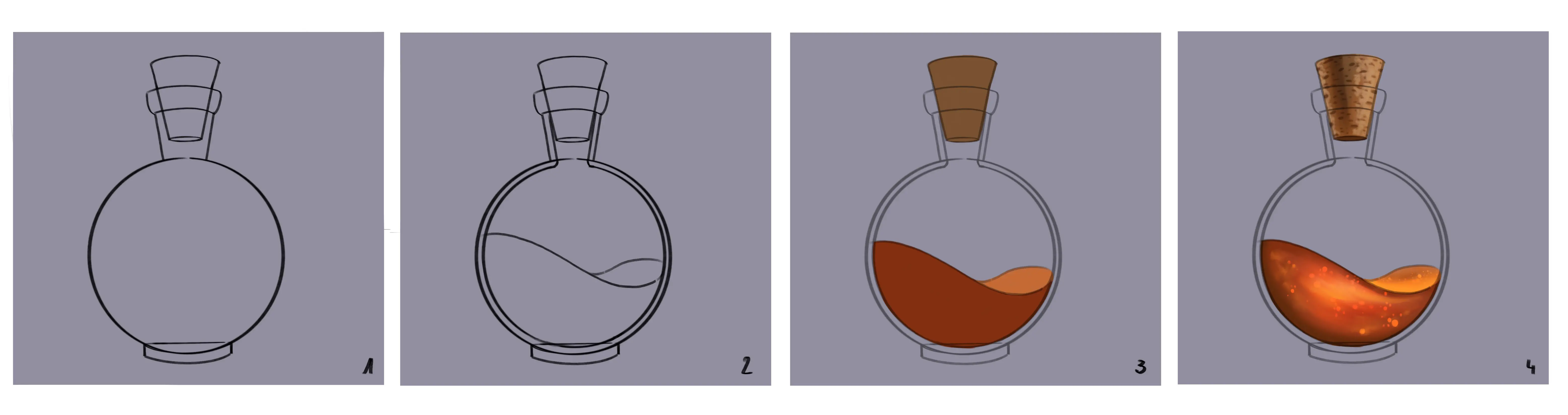
1 - I start by drawing the shapes of my flask.
2 - I add the details, being careful to draw the volume of the glass of the flask.
3 - I start by laying down the base colours for elements that will not be transparent.
4 - I colour them. I take the opportunity to choose my light point, here at the top right.
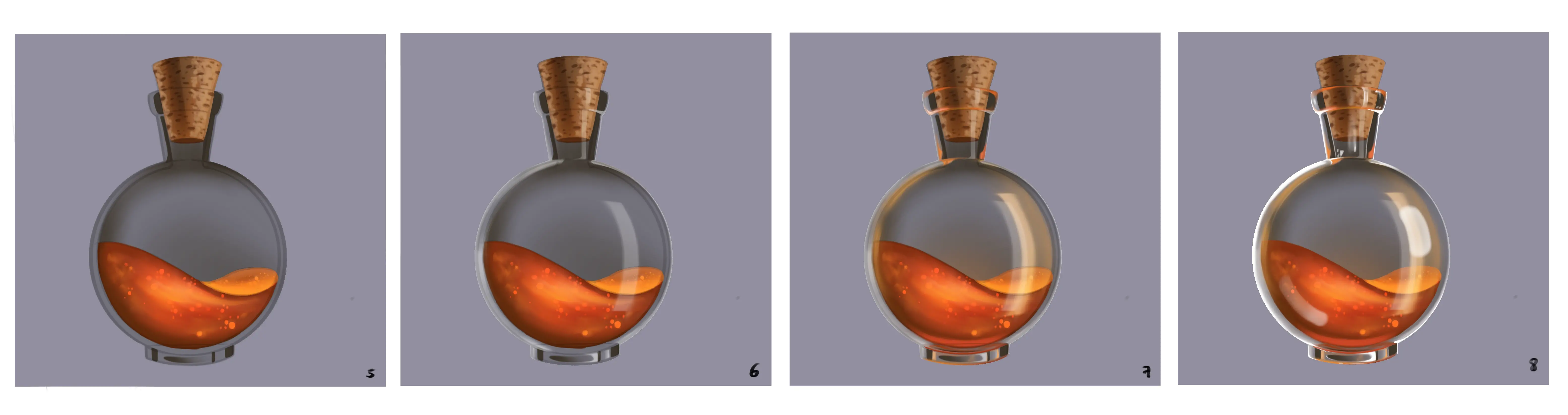
5 - I add all the main shadows to the glass: on the left side, near the cork and the top of the bottle, and at the base. It is important to create shadows that are soft on the circular part of the flask and harder on the rest (a sphere diffuses light more softly than other volumes).
6 - I add the light bases to the volume on the left side, to the base of the right side, to the base of the foot and a little to the neck of the bottle. I also add a light point to the centre right of the flask, making sure it is curved; this will create the volume of the flask.
7 - I add the reflected light of the liquid on the glass, around the base, on the right and left sides of the center of the flask, and some small touches around the neck, in areas where the glass is thicker.
8 - Now I add white highlights to finish giving volume to the flask.
GLASS DEFORMATIONS
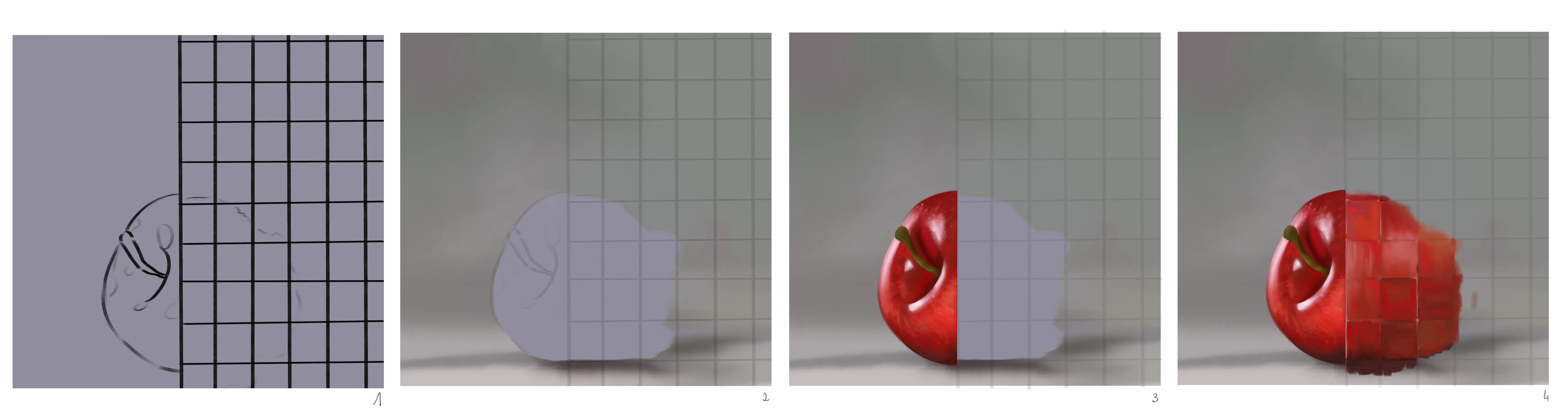
As we saw in part A, some materials are transparent but distort the objects behind them; I am going to show you how we can represent them with the example of an apple behind a mosaic glass wall.
1 - I start by making the sketch.
2 - I heavily blur the sketch and create the background.
3 - I draw the part of the apple that sticks out, it must be as detailed as possible.
4 - I colour each of the different tiles using slightly different shades of red and creating lines horizontally or vertically to add a random appearance. I make sure that the edges of the apple are blurred and distorted.
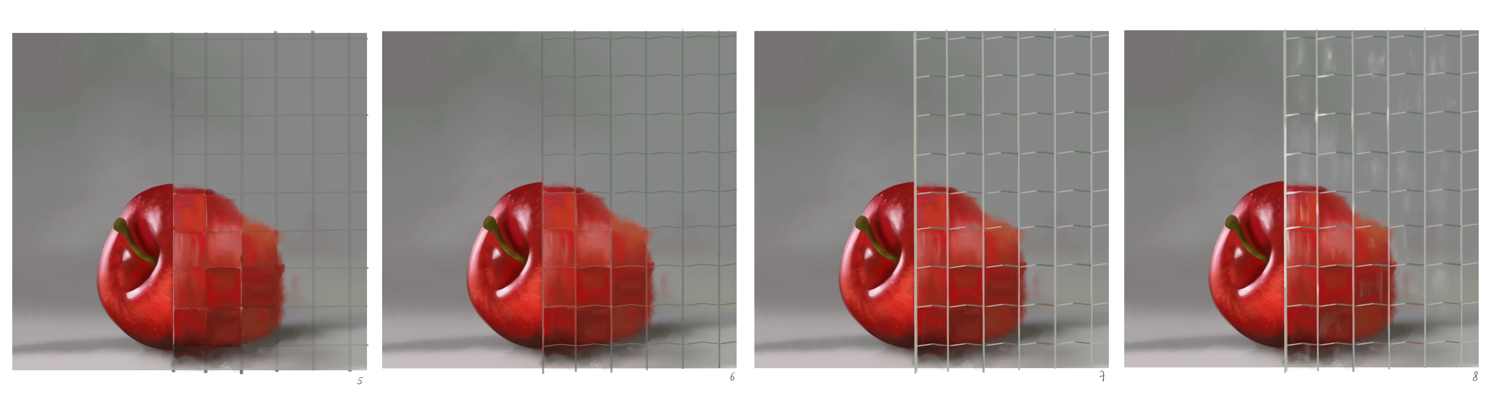
5 - I soften the shadow at the bottom of the apple.
6 - I redraw the tile shapes in light gray by creating small edges on the horizontal lines.
7 - I repainted in white all the vertical lines of the wall and the left side of each edge of the horizontal lines.
8 - I add some slightly diffuse reflections on the wall.
Below are some examples of different walls.
A - I recommend blurring from step 4, not drawing all the squares on the wall, and adding bigger and more diffuse reflections.
B - I suggest creating a slightly rounded diagonal deformation, not to create the squares on the wall, but rather to texturise it by adding small white dots, for example.
C - For this, the majority of the work will be on the wall details. To add transparency, I recommend alternating white and red/orange lines.
TRANSPARENCY AND COLOUR
We have already discussed this at the beginning of the article, so this point will be brief. Some transparent materials are colored and will therefore have an impact on what is behind them.
Here is an example below of the impact of different colours on the same object.
It can be seen that by overlapping the colour plates, the object is less visible behind two plates than behind one, and the colour is also influenced by the two plates.
THE TRANSPARENCY OF WATER
In this last part, we will discuss the transparency of water. Many aspects are similar to those already seen (colour impact, distortions...)
However, I have chosen three examples to illustrate water transparency.
THE BUBBLES
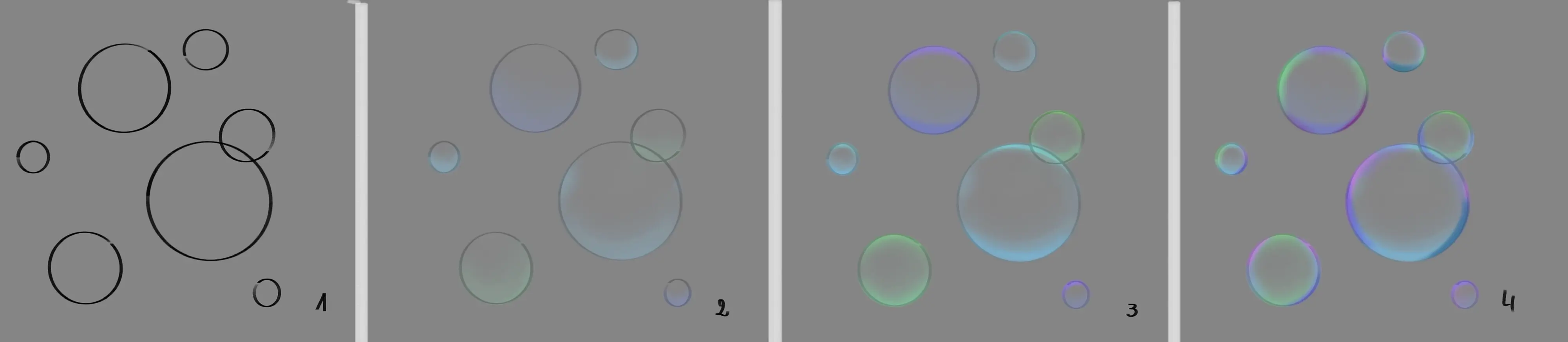
This point is not specifically about water, but I found it interesting nonetheless. Bubbles are mostly made of water and their many colours derive from the fact that they reflect and break up all the white light rays that pass through them.
1 - I trace circles as a base for the bubbles.
2 - I start by adding a bit of very diffuse color to the lower corner of each bubble.
3 - I add a bit more colour to make it more intense on the lower part of each bubble and slightly on the upper part.
4 - I add reflections with other colours around the walls of each bubble.
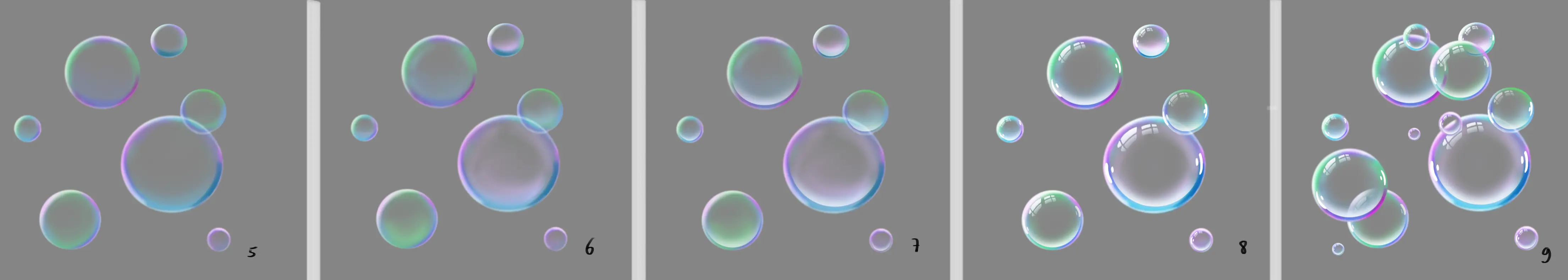
5 - I add light using a white that I blend on the left side of each bubble.
6 - I add a bit more colour to the sides, blending well and being careful to keep the center colourless.
7 - I add a reflection on the inner lower part of each bubble.
8 - I add white highlights on the sides and top of each bubble.
9 - To make the exercise a bit more challenging, you can have fun drawing more bubbles by overlapping them more.
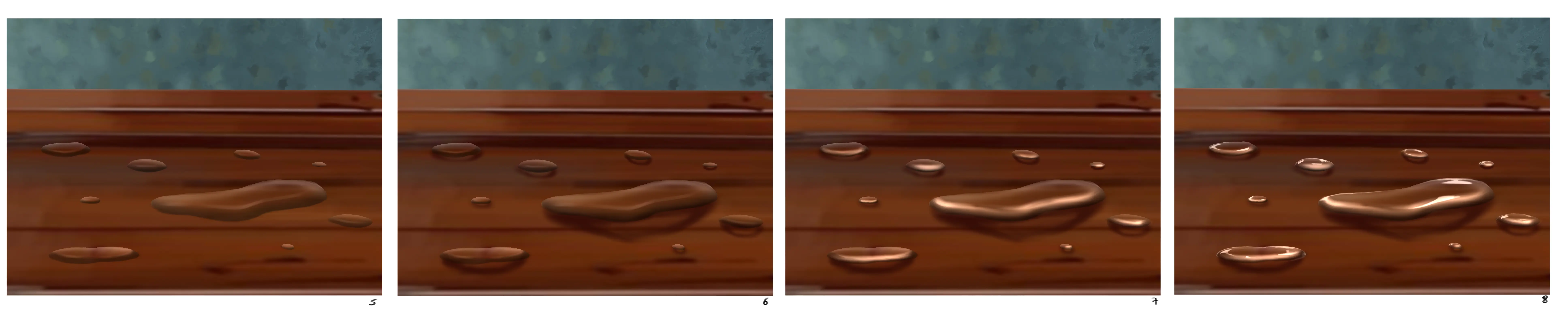
WATER DROPS ON A SUPPORT
Water drops are one of the easiest ways to convey transparency, here we will take the example of a water drop on a wooden table.
1 - I start by drawing my support.
2 - I sketch the shapes of the drops, this will serve as a guide for later.
3 - I start by creating a diffuse shadow on the lower part of each drop.
4 - At the top I created a diffuse light. At this stage, we already have the impression of a drop of water.
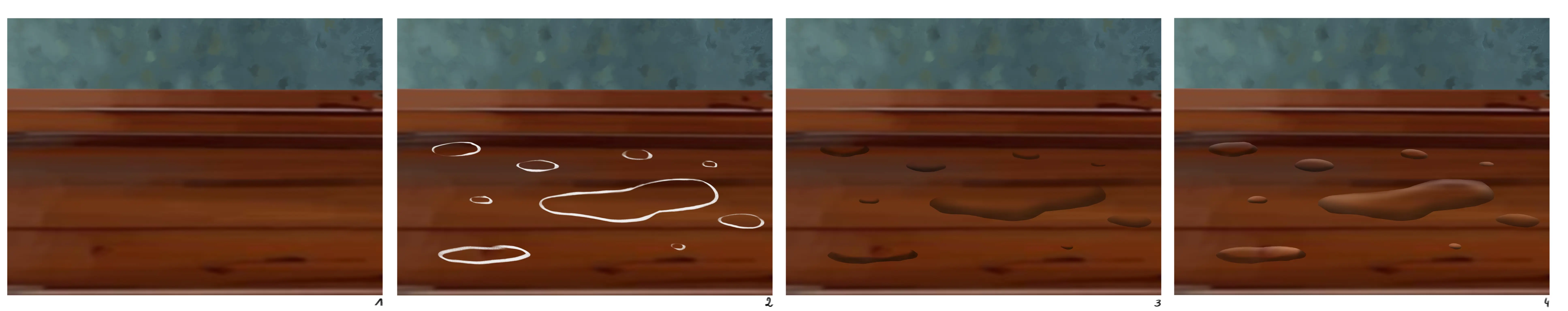
5 - To increase the volume, I add a soft light just above the shadow already created.
6 - To further enhance the volume, I create a highlighted area, being careful not to darken the inside of the shadow. This aims to suggest that the drop is transparent because some light is passing through.
7 - I intensify the light on the lower edge of each drop.
8 - I add intense highlights to the opposite edges.
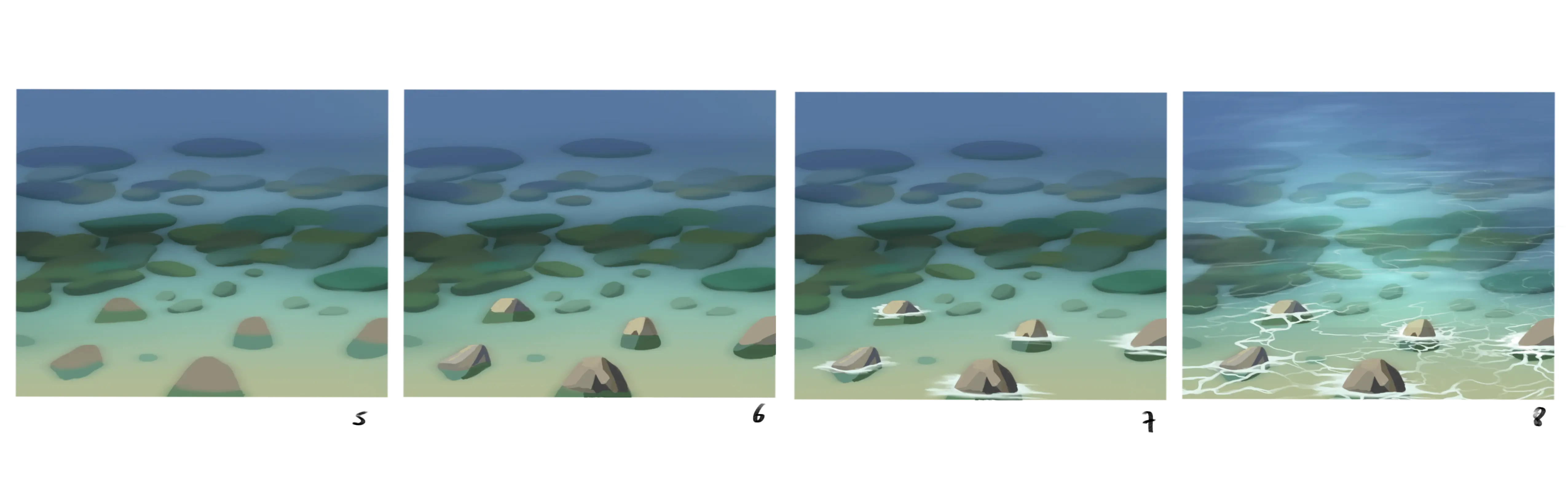
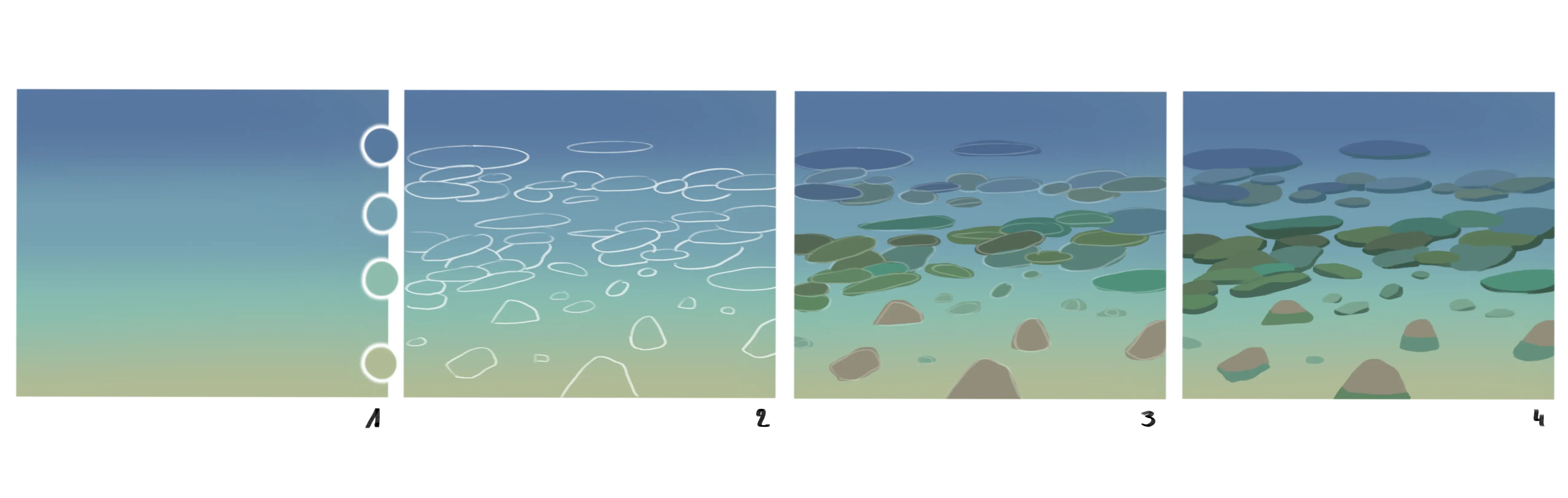
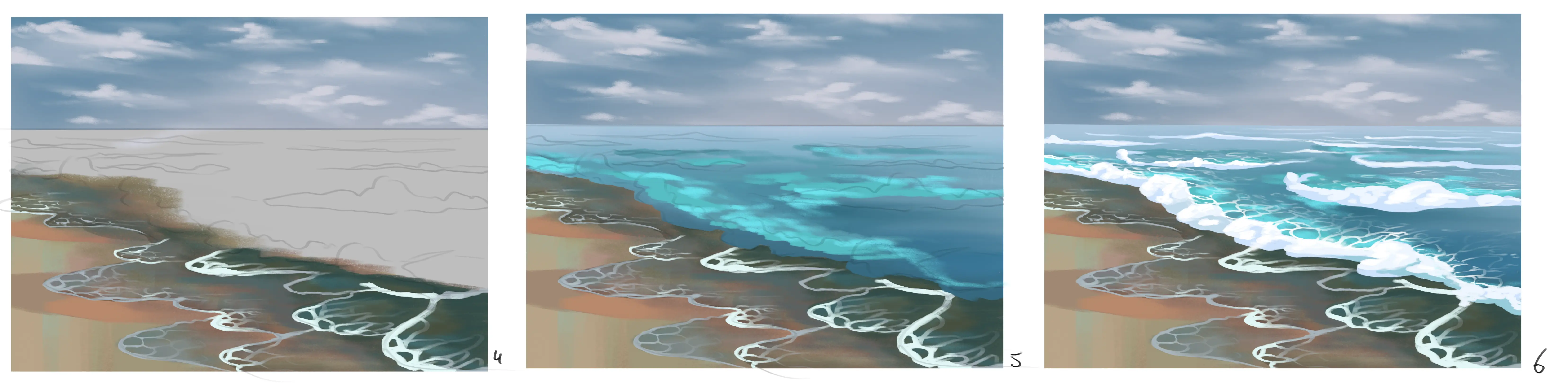
DRAWING THE OCEAN FLOOR
To illustrate this last point on transparency, I used the example of the seabed, which you can also find in this article (article link) talking about water, but this also applies to lakes, streams... in short, any body of water in which one can observe through the clarity the elements present on the ground.
1 - I start by creating a gradient from dark blue to yellow.
2 - I then start sketching shapes of rocks (again, similar to the shape of potatoes)
3 - I apply colour bases; the rocks further back in the image are more submerged and less visible, so I colour them in shades of blue near the water. Those in the centre in shades of blue and green and those near the edge in shades of beige.
4 - I add depth to my rocks by drawing a single shadow that corresponds to their volume. The rocks in the background have a very faint shadow and those in the foreground will have a simple green shadow to show that one part is submerged and the other is not.
5 - I blurred things a bit, because due to the volume of the water they are not as clear as the outer rocks.
6 - I detail the exterior rocks with simple shadows and lights.
7 - I add foam effects around the edges of my outer rocks by making strokes.
8 - I draw the reflections and add a little white to brighten the center of the image.

We've just looked at many ways to draw transparency, I hope you enjoyed this article and that you can include more transparency in your future drawings! 😊
Discussion
This article offers a fascinating overview of the concept of transparency in drawing!