How to Draw the Background
Hello everyone, you have probably drawn something you are proud of only to realise that one small detail is missing to be completely complete: the background. People are often afraid to add one for fear that it will spoil the drawing, yet backgrounds are very useful for improving our drawings.
In this article, I will show you different types of backgrounds most commonly used, as well as some easy techniques so you too can enhance your creations with backgrounds.
Get your pencils, paper or tablet ready and, most importantly, your creativity!
MINIMALIST BACKGROUNDS
Minimalist backgrounds are among the most widely used. Easy and quick to create, they easily highlight the design without too much risk. They are most frequently used for drawings of characters, animals, vehicle objects... in short, for drawings in which only one element is present.
Among minimalist backgrounds, we find the classic rectangle with often a part of the character sticking out to clearly convey volume. It is the simplest to create and can be very effective.
We also find gradients of colours with a simple shadow on the ground suggesting light; this is extensively used in character design because it suggests depth without adding elements that distract our eye from the subject.
Finally, following the same idea as the previous one, we regularly find gradients with a part of the character (often the head) enlarged and with a reduced opacity, in order to show more details of the character without distracting attention from the background and not from the character itself.
COMPLEMENTARY COLOUR BACKGROUNDS
Complementary colour backgrounds are also a classic choice; as the name suggests, it is simply a matter of selecting the complementary colour to the dominant colour of the subject and creating the background with it. This allows the subject to stand out, while keeping the background simple and easy to create.
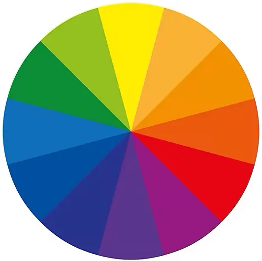
You can choose to create flat colours or add a bit of dimension by adding simple effects (such as smoke). The only difficulty with these backgrounds is choosing the right complementary colour. I encourage you to learn about colour theory and, to give you an idea, there’s a colour wheel right next to you.
ATMOSPHERIC BACKGROUNDS
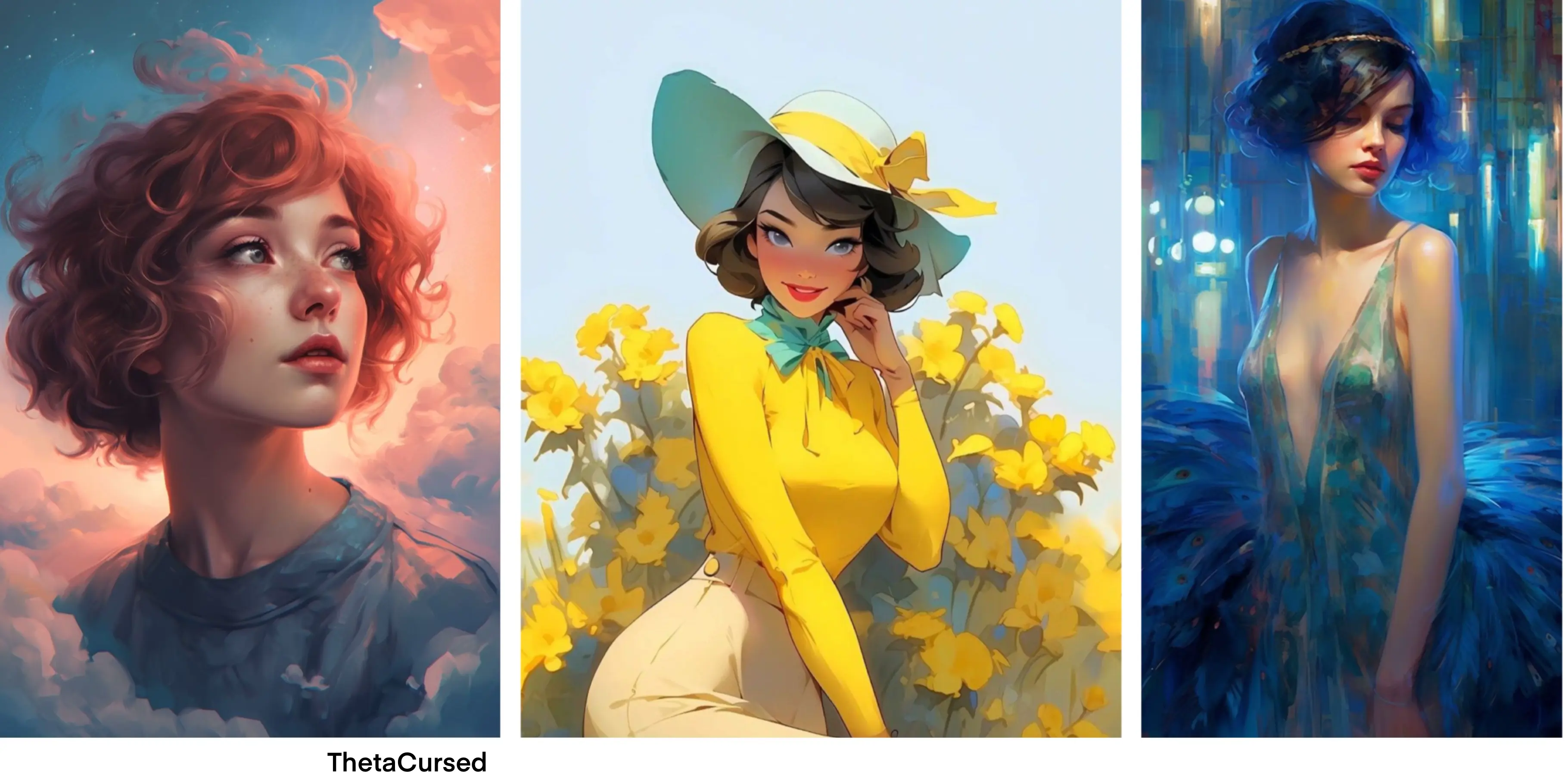
Atmospheric backgrounds are also very common; they are backgrounds that enhance the dynamics of the drawn subject without always following a physical logic. Example 1 illustrates this well: the girl's portrait gives her a dreamy look, but by creating a background with softly coloured clouds, this dreamy impression is greatly amplified, even though physically there is no logic in the fact that the girl has her head in the clouds.
The atmospheric backgrounds are very interesting because they allow you to further emphasize the character or idea you want to convey. Moreover, there is no need for them to be highly detailed; suggested details (as in example 2) or abstract details (as in example 3) work perfectly.
Finally, it can be noted that often the backgrounds of atmospheres use colour ranges close to those of the chosen subject, adding a few small touches of a complementary colour.
MINI-DECOR BACKGROUNDS
Mini-decors, as the name suggests, are rather simple background in which a few simplified décor details are suggested to add some narrative to the subject. It is not necessary to include many elements; often a floor and two or three other details are suggested, but this is enough to start visualising the subject in a lively and believable environment.
Example 3 is perfect to illustrate this, a simple background with a warm color and some parquet allows us to imagine the character in a cozy inn.
Backgrounds with small decorations are really ideal if you want to add some context to your drawing without taking too much time or getting into a complex setting.
BACKGROUNDS WITH DETAILED DECOR
This category straddles the line between being a background for a drawing and a complete illustration. It is by far the one that results in a finished drawing and allows you to tell a story through your creation, but it is also the most technical and time-consuming to create. Often, to successfully create a background with a complete setting, it is best to have already imagined the setting in the sketch phase, so that everything is consistent.
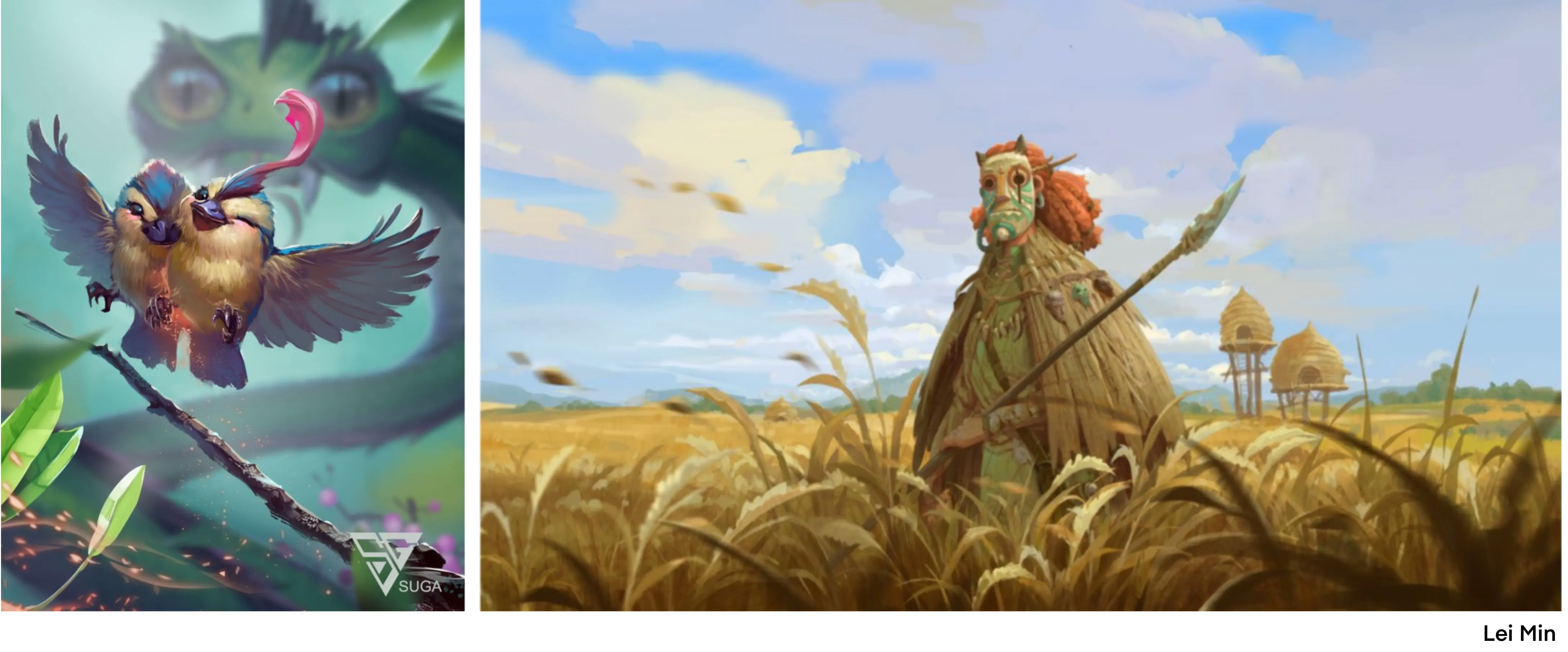
We can see that for a complete decoration to work well and maintain this notion of background, there are two particularly effective techniques. The first can be seen in example 1, namely that of blurring: let us imagine our design as if it were a photo on which we focus, the main element will be very clear and everything behind it will become increasingly blurred and less contrasted.
The second is shown in example 2 and aligns with the idea of the first; it involves suggesting: we create our central element very clearly and in detail with some contextual elements around it (here, wheat) and the rest of the wheat field is not drawn stalk by stalk but painted with variations of yellow, we understand that it is wheat but the lack of excessive details also makes us understand that it is a background (and it saves us time in drawing it!)
If you want to delve deeper into landscape drawing, I invite you to read this article:
https://dessindigo.com/blog/tuto-dessin/draw-landscape
DRAWING BACKGROUNDS STEP BY STEP
Now that we have seen some very common types of backgrounds, I suggest we look at a few easy background ideas step by step. Before we start, it's important to note that the value of your background colour will have a crucial impact on your character. As you can see with the three examples below, overly pure white or black tend to overwhelm the colors and volumes of the character, so we generally work with medium gray levels to ensure good visibility of the character.
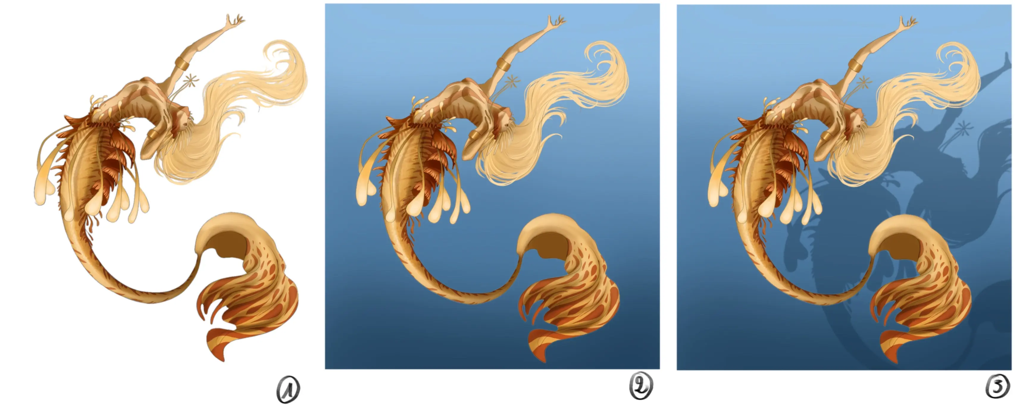
DRAWING A BACKGROUND WITH A COMPLEMENTARY COLOUR
For this first example, we'll start with one of the simplest types of background: the complementary colour.
I drew my character and I find that it does not stand out well against the white background.
So I decide to add a background. The mermaid is in shades of yellow and orange, so I will choose blue for the background; it also reminds me of water, it's perfect! To add a bit more depth, I create a light gradient.
To make it a little more interesting, I redesigned the outline of the mermaid, making it slightly larger and slightly shifted to the right side.
And there you go, my background is already finished! It's very simple, but it helps to highlight the subject and gives the impression of a well-completed drawing.
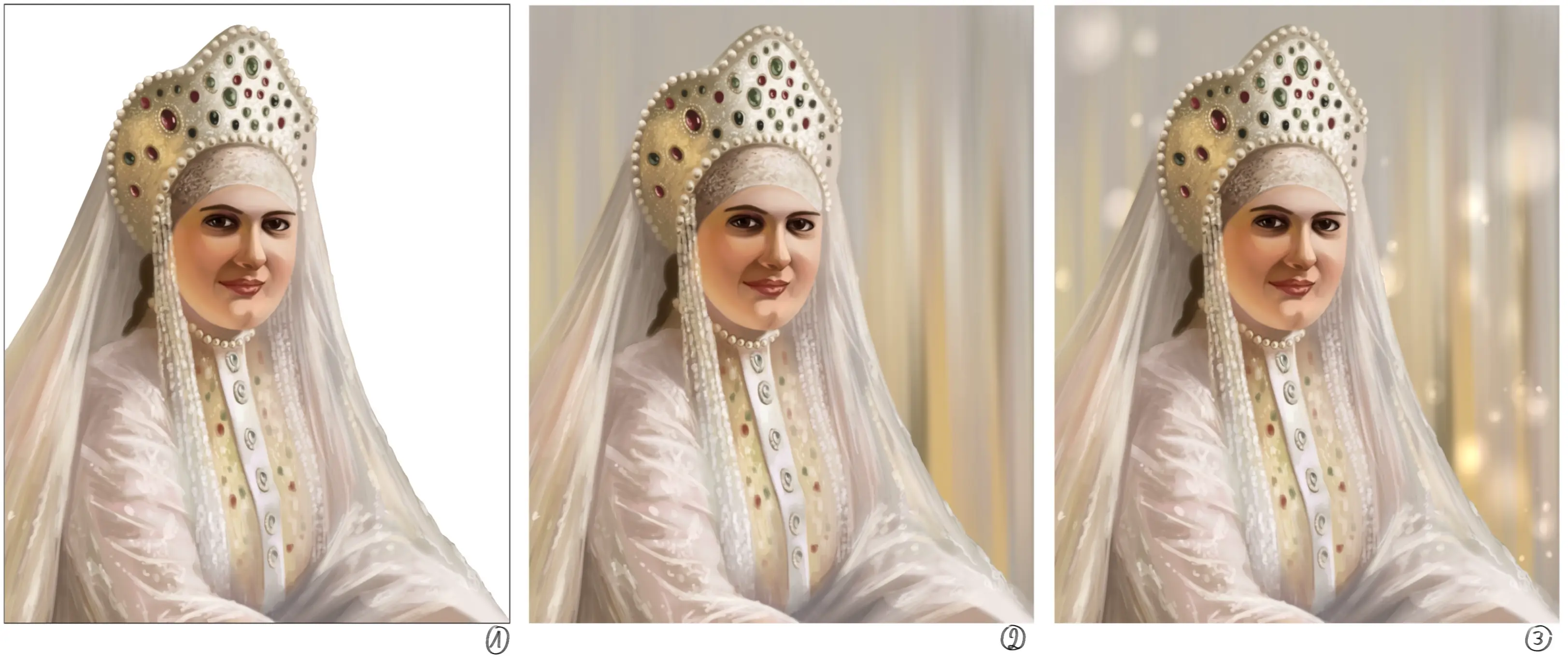
DRAWING AN ATMOSPHERIC BACKGROUND
For this second example, it is still very simple and quite effective.
I have just finished drawing and I find that the white of the paper is a bit too harsh and does not highlight my drawing well.
I want to maintain a very soft and harmonious look, so I choose to reuse the same colours: shades of yellow, beige, and light gray. I create lines because I found them pretty (sometimes you shouldn't overthink it!) and I alternate the shades in order to create some interest without it being too contrasting either.
I add some lighter spheres to change the very rigid lines and bring some poetry and softness to the whole.
And there, this background is also finished! This type of background is particularly relaxing to make because there is no real technical aspect to it, you just use the colours as they come and try to maintain harmony throughout the design. In my opinion, it is one of the types of background that is difficult to go wrong with.
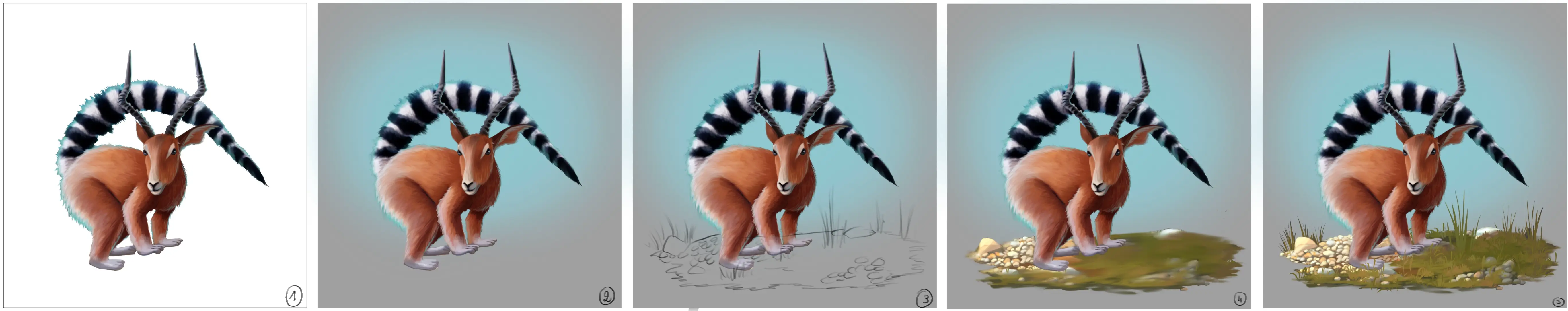
DRAWING A MINI-DECOR SET
Here is another easy but effective example.
I drew the creature, but I find it looks a bit lonely on the white background.
So, I add a background in a medium gray with a gradient of blue in the center. The blue has two advantages: it complements the orange of the fur and additionally evokes the sky.
I quickly sketch out an idea of a setting with very light strokes. I chose to let my creature live in freedom, so I imagine it in an environment with grass and stones.
I add some basic nuances to the pebbles and the grass.
I add the details.
I chose to detail the ground on which the creature lives, but you can definitely create a much less detailed mini-scene that will work just as well as we saw in the earlier examples.
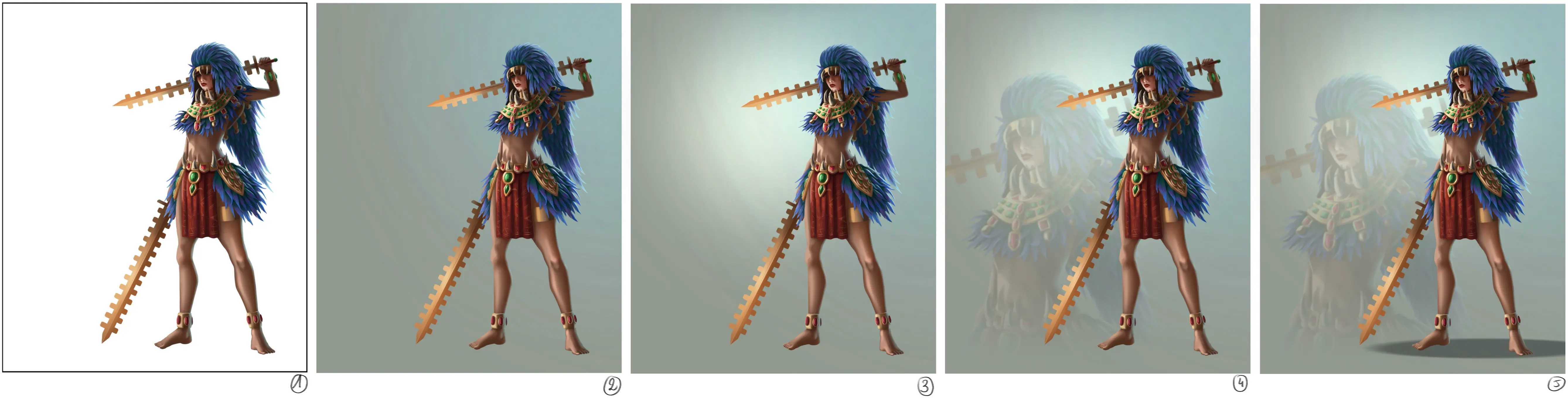
DRAWING A MINIMALIST BACKGROUND (DIGITAL SPECIAL)
This last example is very easy if done with a graphics tablet; you can also do it with traditional drawing, but it will prove to be much more tedious.
I just finished my character who, as usual, looks bad on a white background.
I create a layer underneath my character's layer and fill it with gray. Then using a very soft brush, I add shades of blue behind my character to suggest a second light source.
I created a new layer above the background layer and with the same brush I took a yellow colour and made a circle behind my character. Then I set the layer to “colour density” mode and lowered the opacity to about 50%.
I duplicate the layer on which my character is and I will enlarge the layer at the bottom of the two by moving it to the left until the head of my character is clearly visible. I lower the opacity to around 30 to 40% and I come with a very soft eraser to remove the lower part of my character about at the level of the feet.
I then add a slightly darker gray ellipse under my character to create an impression of the ground, and I add a very slight Gaussian blur to it (5 to 10% maximum)
Here is this final background that, once mastered, takes only a few minutes to complete and is a great way to complete a character illustration.

We have just explored different types of backgrounds and some step-by-step guides for creating them. Now you can add backgrounds to your designs without fear of ruining them.
Feel free to have fun testing different types of backgrounds, you will surely find a way to make them that you like and that enhances your drawings! I hope you enjoyed this article 😊
Discussion
No comments yet.