Add Depth to Your Drawings
If you are reading this article, it's likely that you've already had the chance to make drawings with backgrounds, but for some obscure reason, the result seems very… flat? There's no sense of depth in your image, even though the perspective is good, there are no drawing mistakes, but you don't get the feeling that some things are located further away than others.
It's a problem and there are a bunch of little tricks regarding drawing itself or color to overcome it, and that's what we're going to look at in this article.
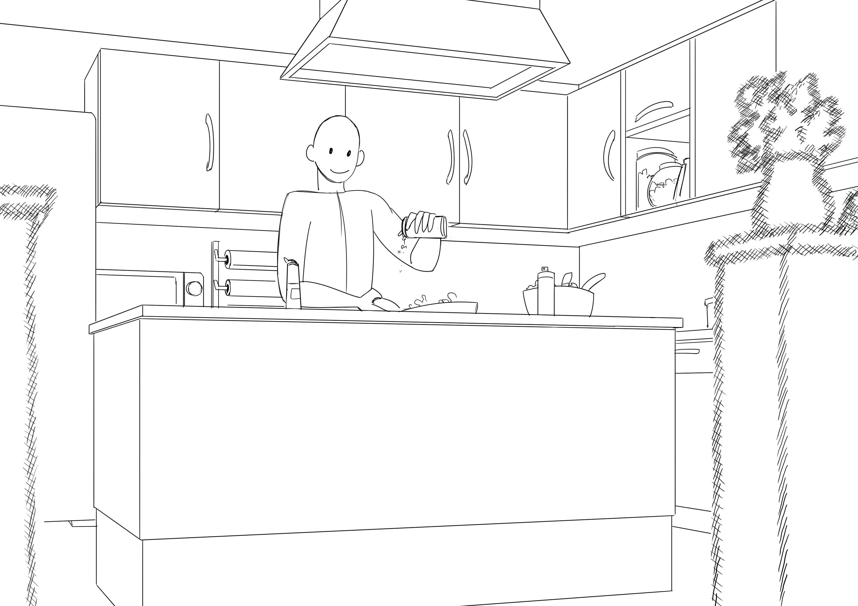
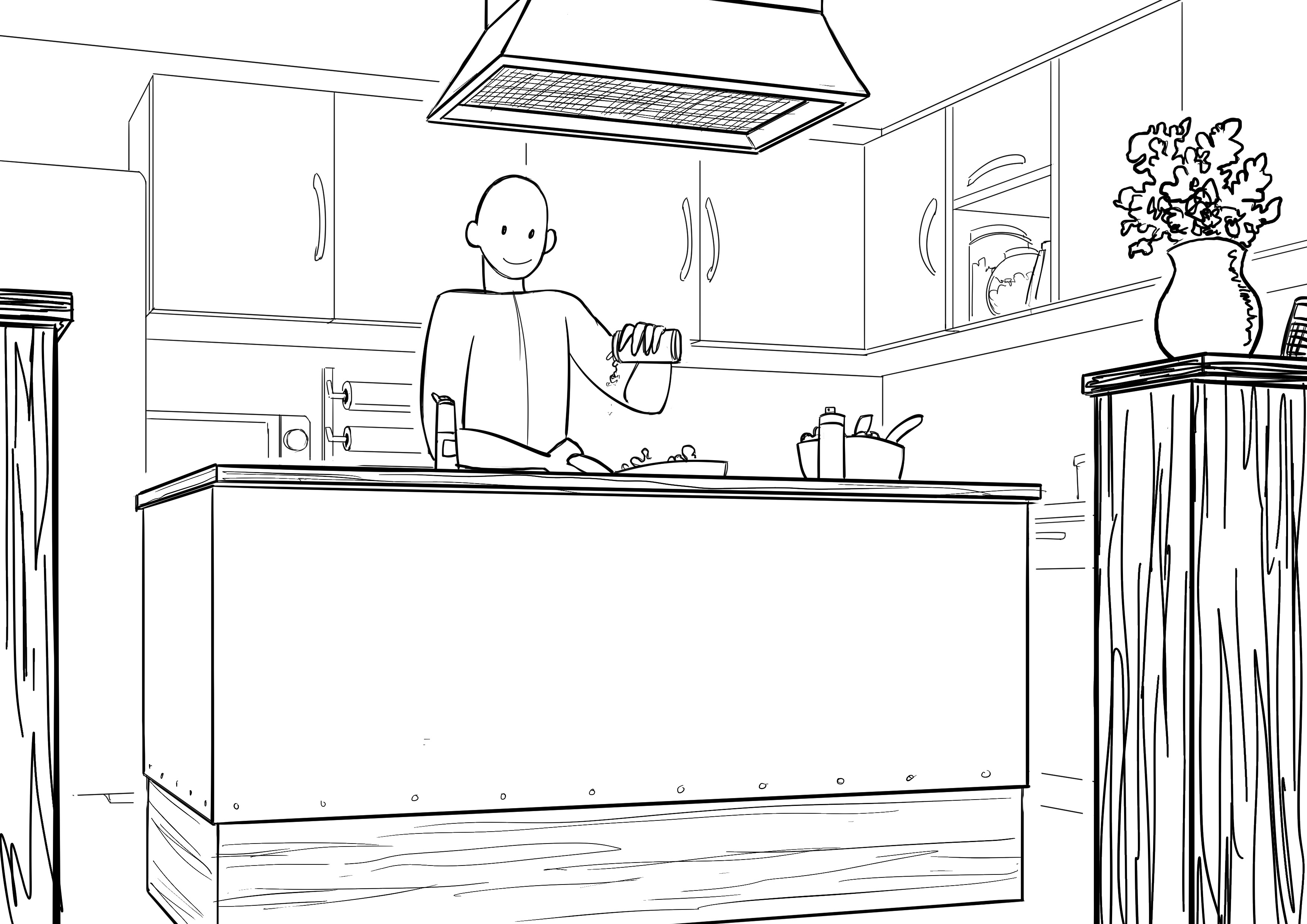
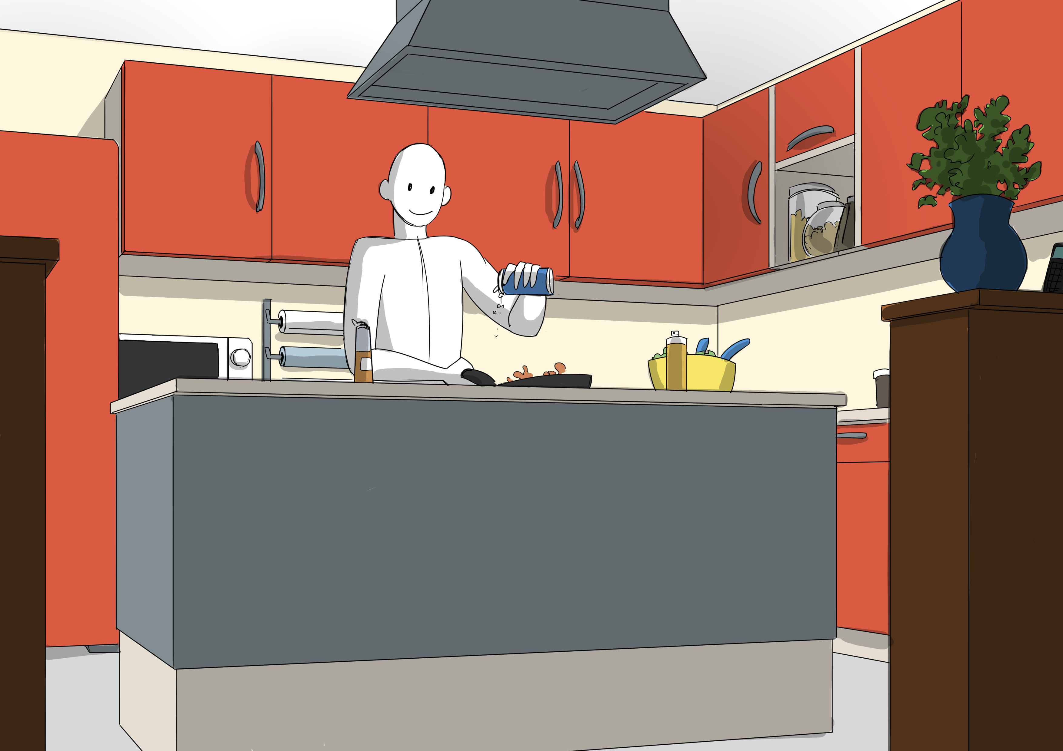
To illustrate my great tips, I will use the little drawing below:
As you can see, in terms of pure drawing, there are no mistakes, but the rendering is quite flat. So the problem must be coming from somewhere else.
CREATING THE EFFECT OF DEPTH IN A DRAWING
Those who attended Grégoire's training, the basics of drawing, will probably have an idea about my first tip: play with stroke values.
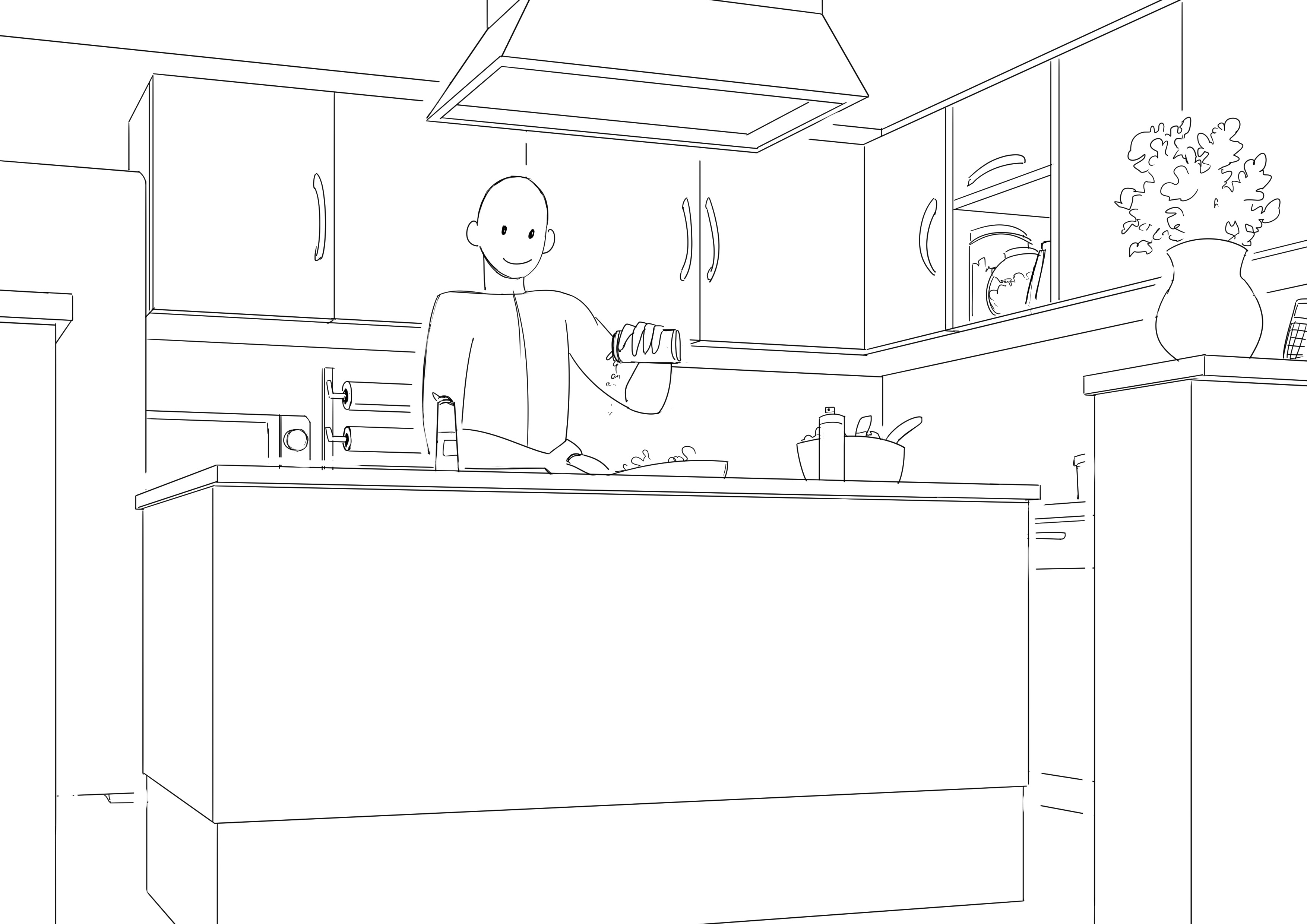
THE LINE VALUE
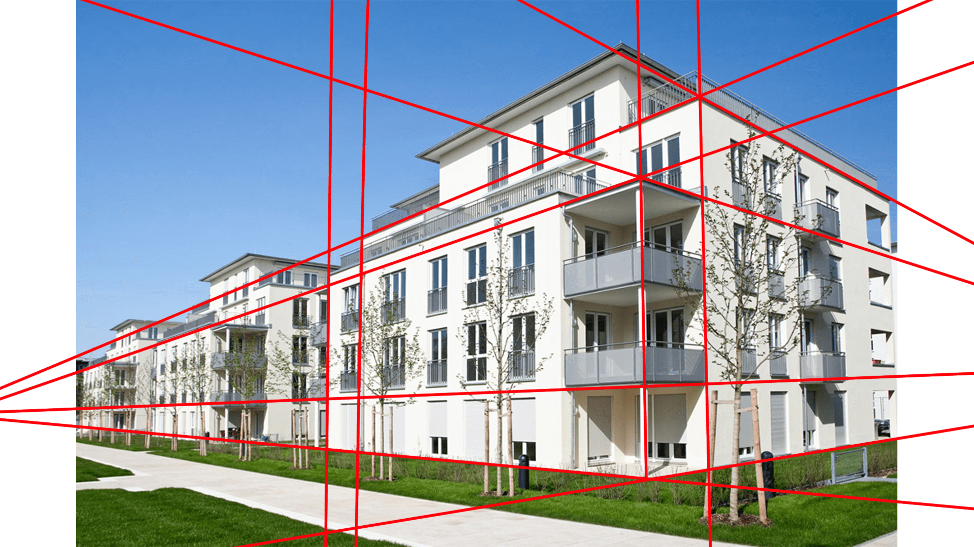
What is this? It's the thickness of the line you use, whether it's thicker or thinner. As in perspective, it is assumed that what is closer to you will have thicker lines than something that is far away. Moreover, there is an article on perspective and vanishing points for those interested, feel free to find it on our blog!
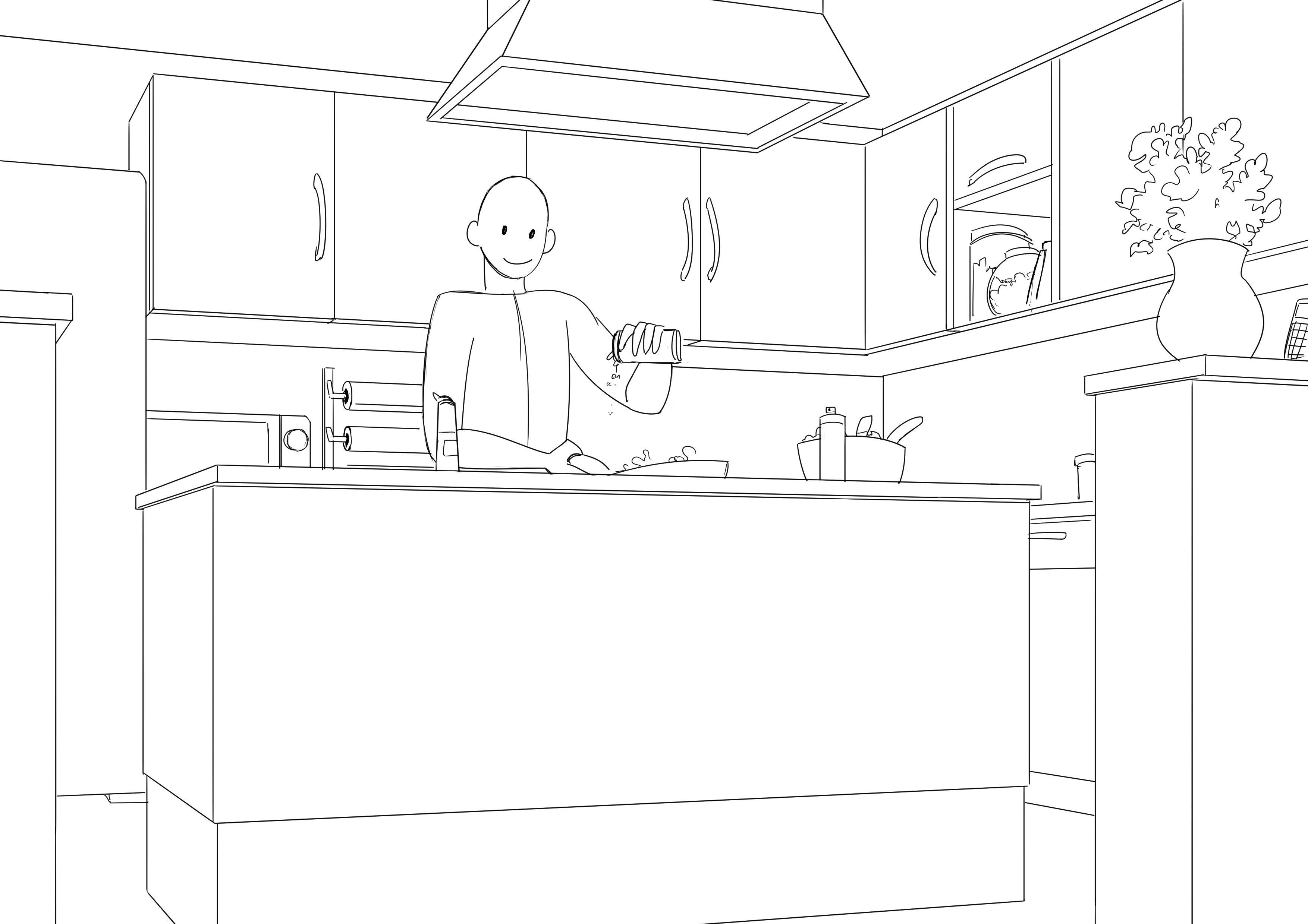
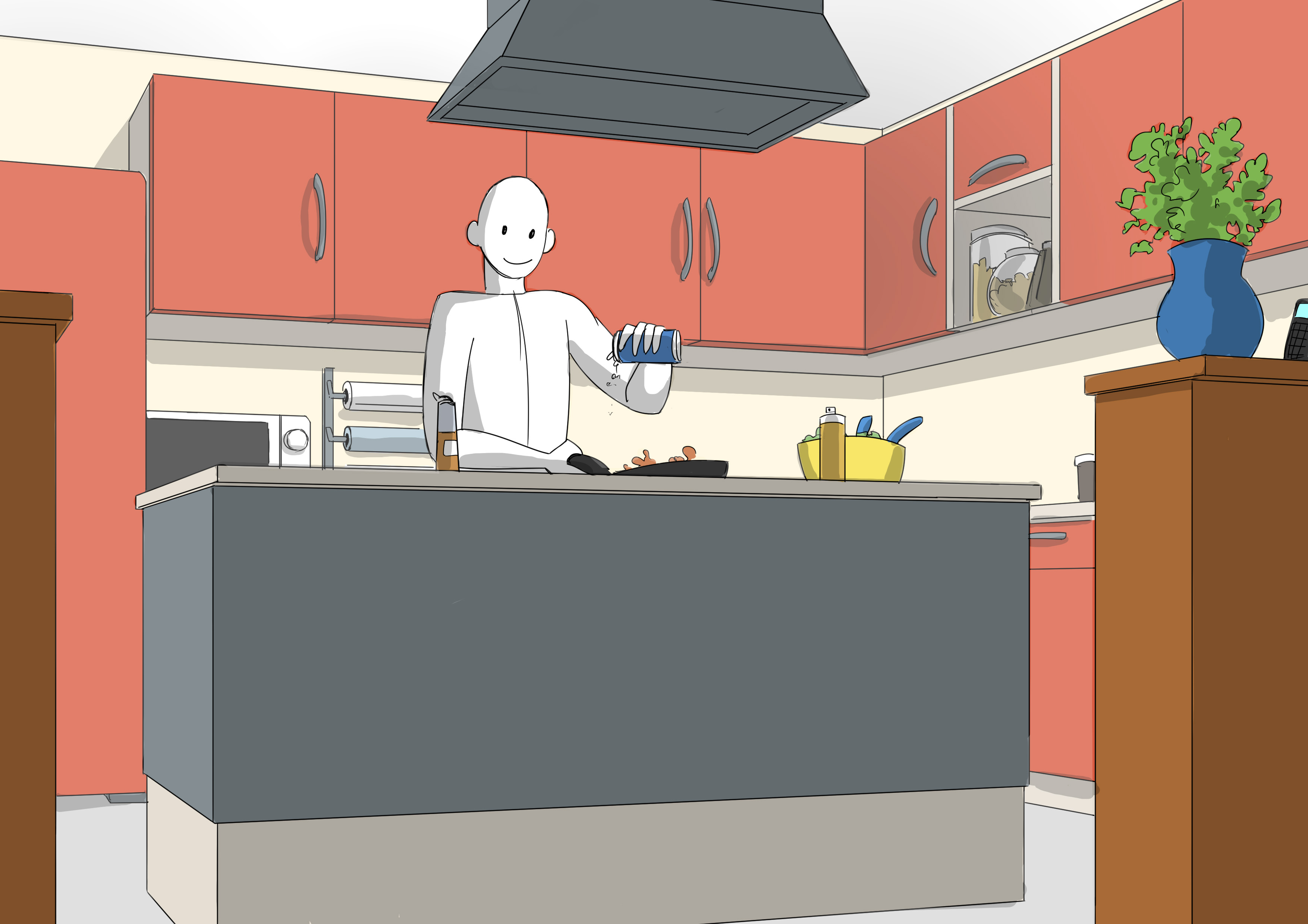
This results in:
I haven't touched the background, which I left with thin lines. But I thickened everything in the foreground. And I thickened the nearest elements even more. Just that alone creates a better impression of depth.
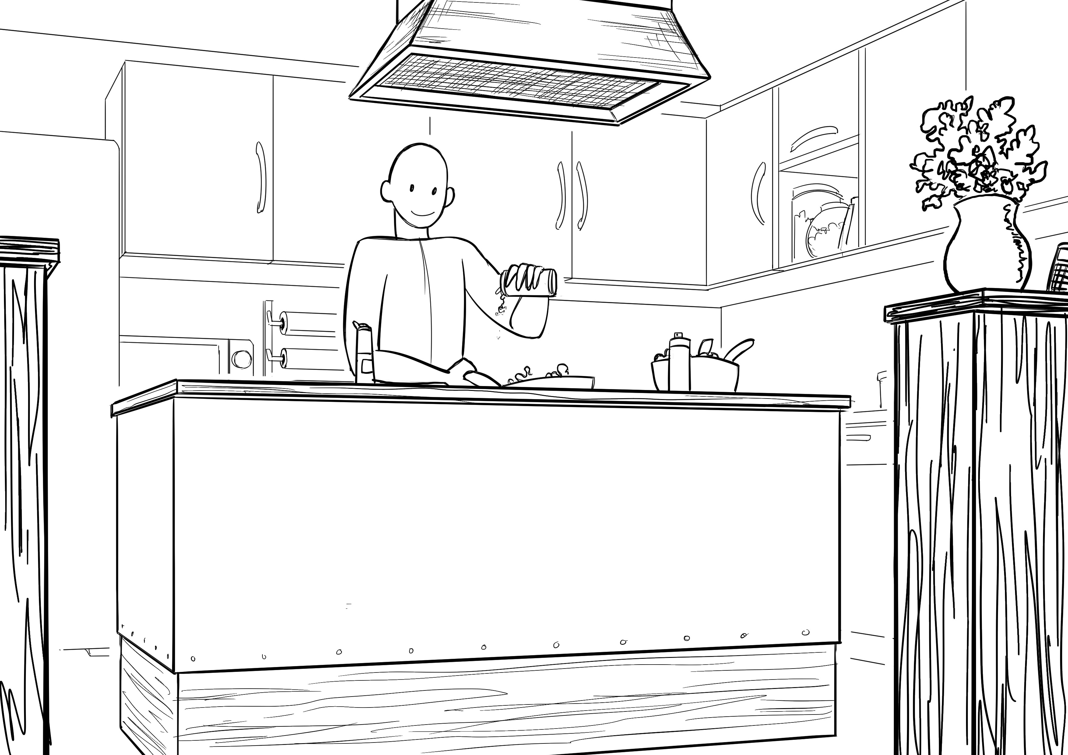
THE DETAILS
In the same way that it is logical to thicken the lines of an object that is closer, we will also detail it more. If I take a book, for instance, and hold it far away, we can see that it is a book, but it will probably be difficult to read. Whereas, very close to me, I can easily make out the letters, even the grain of the paper, a few scratches here and there, etc. The level of detail depends on the object and the distance from which it is viewed by the spectator.
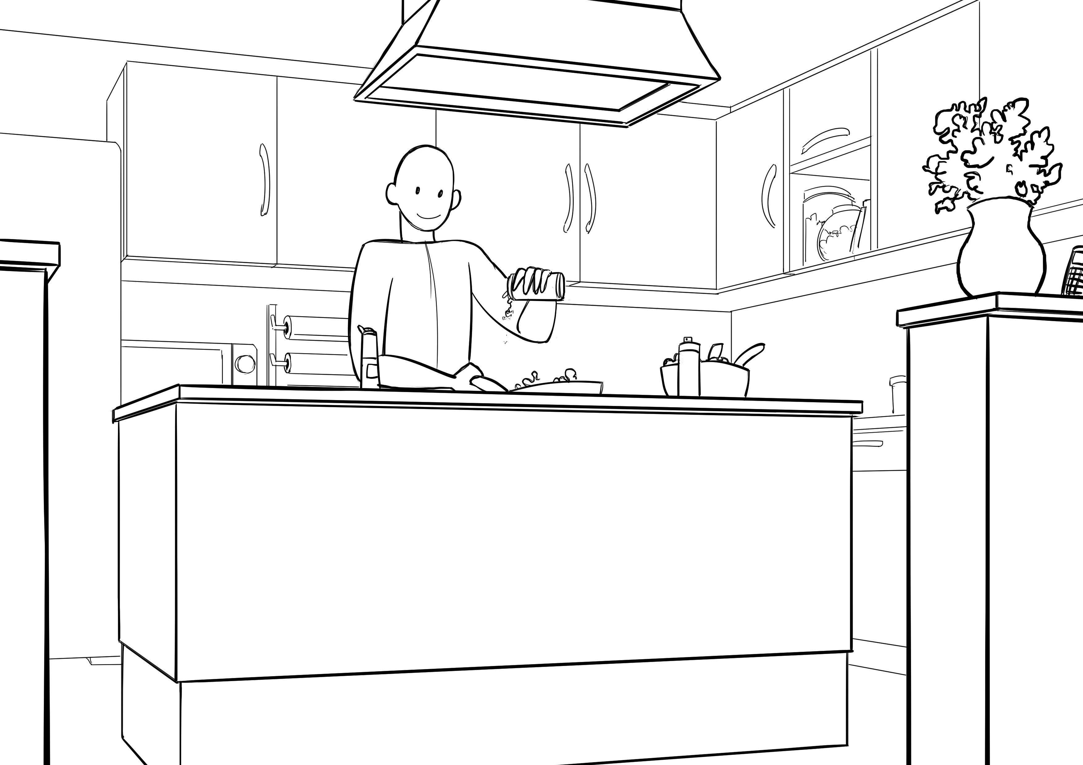
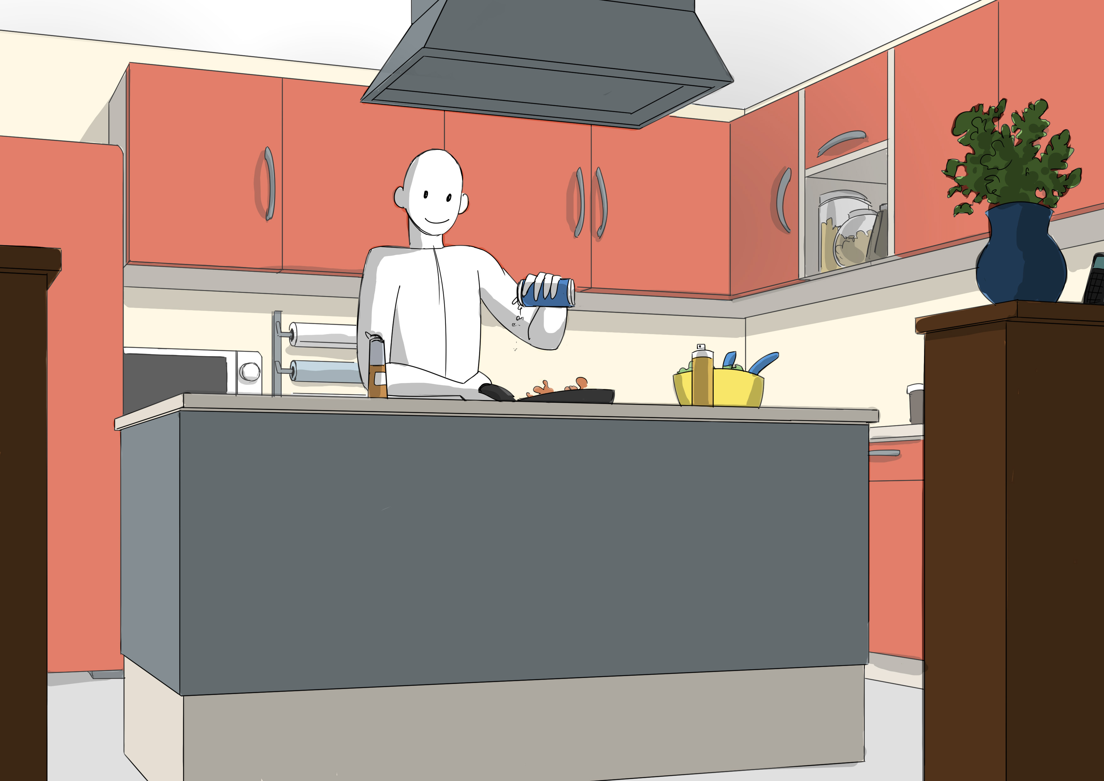
So, we will leave the background undetailed, add some small details to the middle ground, and highly detail the foreground.
You will have noticed that I have used my basic drawing to illustrate my point so that it is clearer for you to gauge the effectiveness of this tip. But we can obviously combine stroke values and details.
Here's what it would look like:
Not bad, huh?
There is one last drawing tip left.
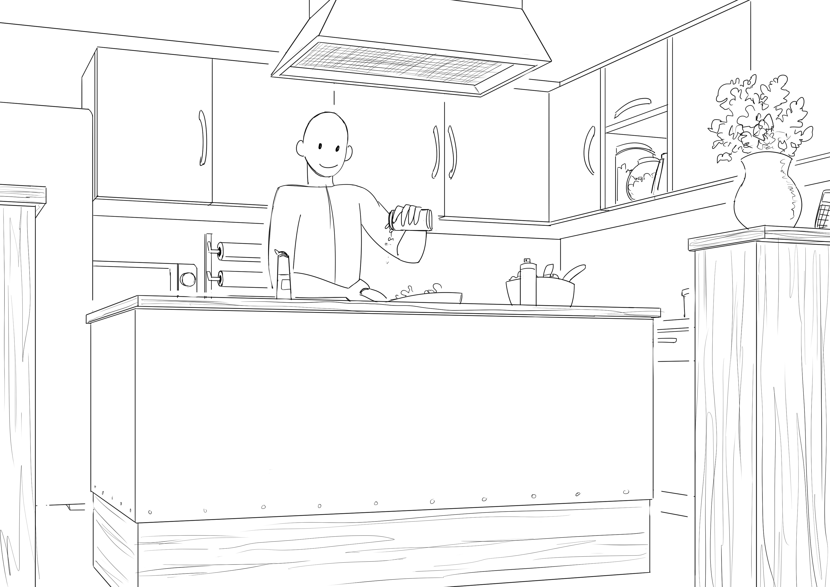
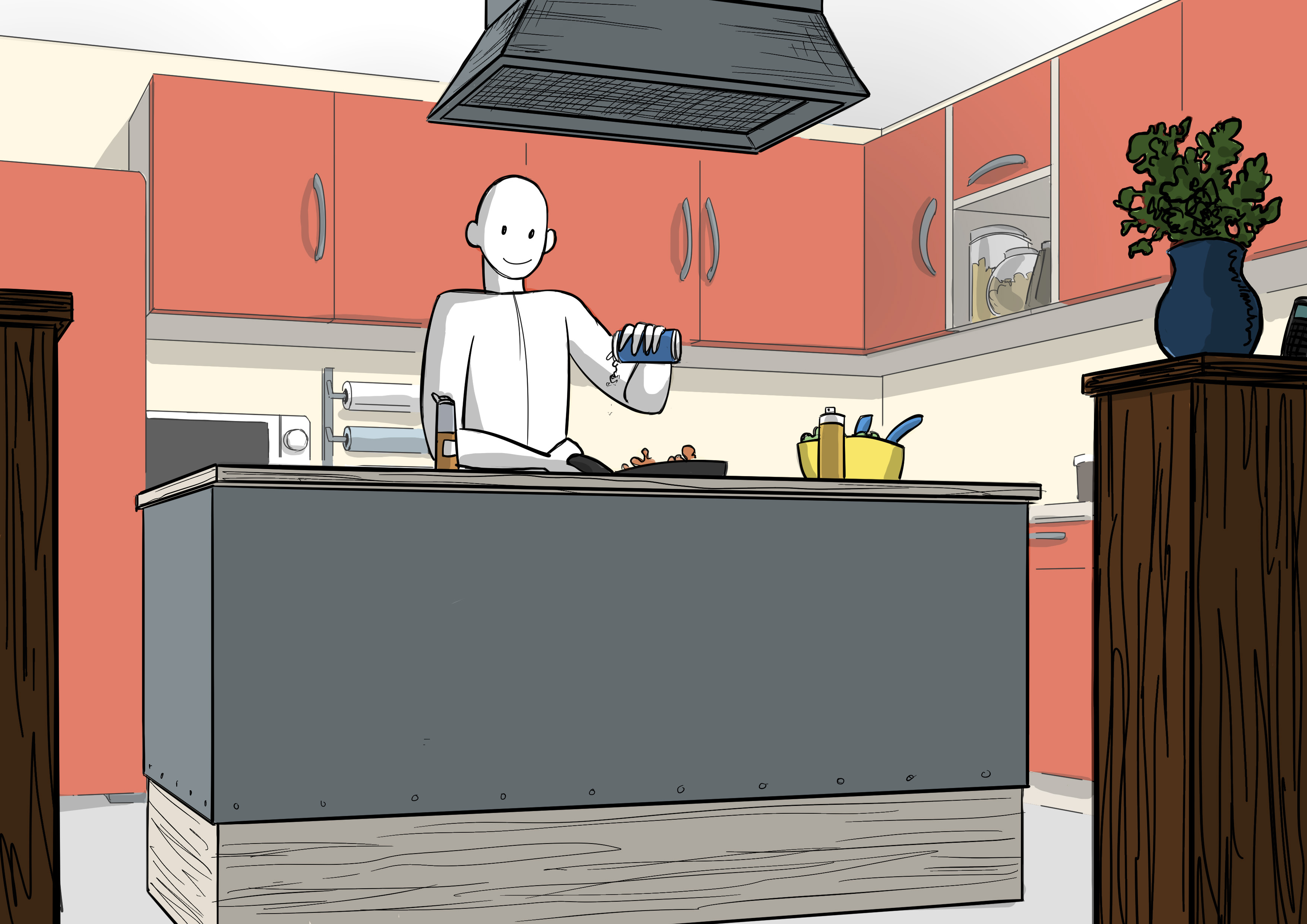
UNFINISHED LINES
We are in the realm of drawing, we can cheat if we wish to make things more visible. Especially if we don't have colors later to help us make the image clearer. For this, we can choose to deliberately stop lines before their normal end.
As always, it will be clearer with a demonstration:
Here I left spaces at certain points to separate my different shots. Alone, it doesn’t necessarily give a clear impression of depth, but combined with the tricks mentioned above:
It's more efficient, isn't it?
ADDING DEPTH THROUGH COLOR
We can play with the design, but also with the color. Speaking of color, did you know that there is an article dedicated to color drawing rules? Don't wait any longer and go check it out if you haven't already!
Here is our basic image with very simple colors.
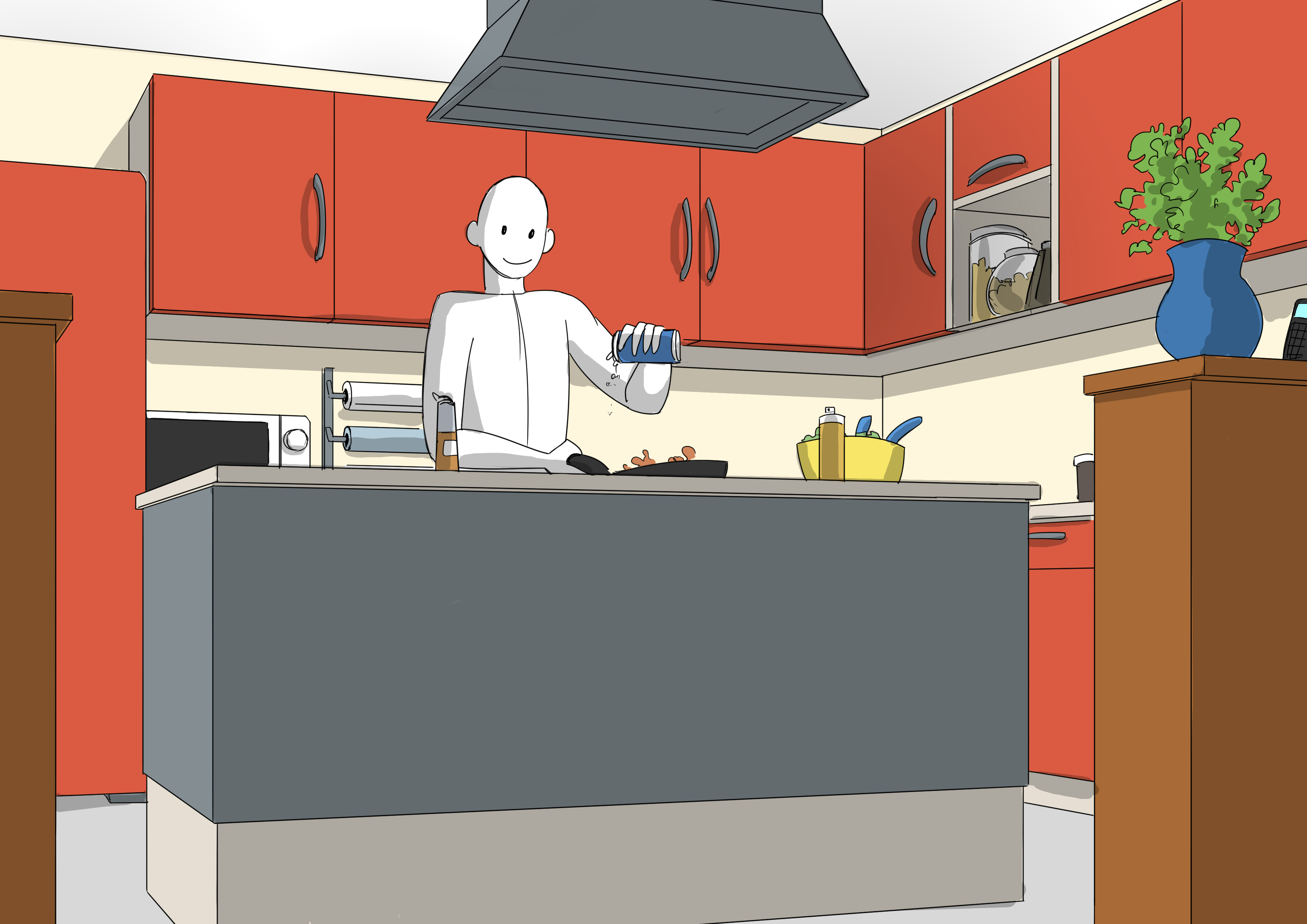
CONTRAST
We can start by playing with contrast. Something close, especially in the foreground (with some exceptions that I won't mention here), is generally darker. And what is farther away is lighter.
Even with an unrefined line like the one in my basic drawing, you can feel a better depth just with this trick.
Please note, we are talking here about light management and not the color of objects. As we can see here, if my foreground was lighter than the background (for example, if the wood was actually painted white, let's assume) we would darken this foreground for a better view of the image and better hierarchy. Generally, do not confuse the color of an object with its light value, these are two different things.
SATURATION
An object that is closer appears more saturated than one that is distant. This means it is more colorful, and what is farther away looks duller.
Demonstration:
It's quite effective as well. Let's combine both color tricks together to see:
Even if my inking isn't the best for aiding in depth perception in my image, it still works.
DRAWING IN DEPTH WITH ATMOSPHERIC HAZE
We could sum up all these tips with the concept of atmospheric haze. If you've ever seen mountains or pictures of mountains, you probably noticed that those in the distance become a bit bluish, more blended with the sky.

Here it's obvious, the mountain in the foreground is darker, more contrasted, and more detailed than those in the distance. It's also notable that the further away you get, the bluer everything becomes. This is the perfect illustration of what atmospheric haze is.
We could also say that what is distant is less defined, so we could allow ourselves to have a less finished drawing with more discontinuous lines for the background, that would work very well too.
All these tricks are typical elements of atmospheric haze. They can be used separately or combined, all used or just one or two. And it's because we unconsciously associate them with atmospheric haze that they work.
Here's what it looks like if we combine all the tips I've given you together:
And a small comparison with the base image:
It's a bit better now, isn't it?
One last thing: we can play with an element that comes more from the field of photography or cinema.
BLURRING
Your eyes, like a camera from elsewhere, always focus on one element. That element will be sharp while things around it will be more blurry. I'm sure you are familiar with the phenomenon of placing two objects on a table, one close to you, the other farther away, and fixing your gaze on one or the other.
If we look at the one in front, the one at the back will become blurry and vice versa.
"Yes, but Rakjah, we're drawing, how could we blur elements?"
Very good question! We can play on the level of features. Manga fans probably have an idea of the method that can be used to create a blurred impression:

It works pretty well actually, it has its style.
< Â >
If you use paint, just avoid having sharp outlines, allow the edges to be quite blended. The same goes for pencils and pastels. As for those on a computer, you generally have filters to blur the areas you want or airbrush style brushes.
Be careful with blurring, as it is also an element of composition. But if you have a foreground, you can apply it there. Demonstration:
And there you have it! You can therefore play with all the following elements to add depth to your image and use one or several depending on your style and personal tastes:
- Value of features
- Detail level
- Contrast
- Saturation
- Blurring
Popular Articles
Discussion
I've often had the feeling that my drawings lacked depth without really understanding why, even though the perspective seemed correct…